
Vercel. Typeset terminal on white paper.
- Developer tools
- Light theme
- 14 colors
- 2 typefaces
Vercel's design system is an exercise in disciplined monochrome: a near-white canvas (#fafafa), black typography, hairline borders, and the complete absence of decorative color. The visual language reads like a developer terminal rendered in print — Geist Sans whispers at hero scale with weight 400-450 and -0.06em tracking, while Geist Mono stamps labels, metadata, and code samples in 11-13px caps. Buttons are sharp 6px-radius pills or rectangles in pure black-on-white or white-on-black. The system trusts contrast and typography hierarchy over color, using the triangle mark (▲) and a two-line wordmark as the only brand ornament. Surfaces stack as #fafafa → #ebebeb → #171717, creating depth through tonal value shifts rather than shadow or color. Every element is built on a 4px grid with compact density, producing an interface that feels like an engineer's notebook — precise, functional, and unafraid of empty space.
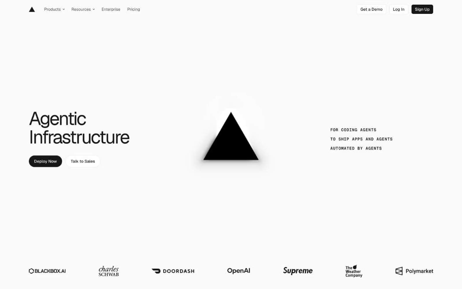
Vercel design system

Accent3
Green text accent for links, tags, and emphasized short phrases. Use as a supporting accent, not as a status color
Decorative gradient sweep for marketing hero accents — the only place color is permitted to exist
Decorative two-stop gradient for feature callouts — yellow-to-blue sweep
Neutrals11
SVG icon fills, logo marks, the triangle brand glyph — pure black reserved for graphic elements only
Primary headings, nav borders, dark button fills, list markers — near-black that avoids pure #000 harshness
Body paragraph text, card descriptions, button secondary labels — where reading weight lives
Muted captions, helper text, and de-emphasized UI labels.
Customer brand names in logo strips, muted heading variants
Footer micro-copy, secondary metadata
Tertiary text, placeholder copy, subtle icon fills
Disabled text, muted labels, brand name watermarks in customer logos
1px borders on buttons, links, and cards — visible at high zoom, invisible at speed
Page canvas, card surfaces, light button fills — the default background that everything else sits on
Elevated card surfaces, inset highlights, input fields
Try a pairing
Pick any two colors from the palette to check whether text stays readable on top.
Aa
Pure White on Terminal Green
5.33 : 1 contrast
- Body textPasses AA 4.5
- Large textPasses AA 3
- StrictFails AAA 7
More DESIGN.md files. Same web, different personalities.

Tailwind CSS
Developer tools
Atoms
Developer tools
Browserbase
Developer tools
Cursor
Developer tools
Deno
Developer tools
Drizzle ORM
Developer tools
Earlydog
Developer tools
Expo
Developer tools
Fingerprint
Developer tools
Flatfile
Developer tools
Flox
Developer tools
Fly.io
Developer tools


