
Vana. A dark protocol interface where electric blue traces the topography of user-owned data across a starfield of ASCII characters.
- Crypto
- Dark theme
- 13 colors
- 2 typefaces
Vana operates as a dark data-sovereign canvas: near-black surfaces host a vivid electric blue that functions less as decoration and more as signal. The hero's ASCII-art world map is not a graphic but a data texture — character density forms continents, suggesting the protocol maps personal data across the globe. Typography is restrained and geometric (Cofo Sans) with a pixel variant for technical metadata labels, creating tension between human-readable prose and machine-precise notation. Buttons are sharp-cornered (2px radius) and minimal, letting the blue carry the action language. The palette is deliberately narrow: one brand blue, two violet tints, and a stack of near-black surfaces, with green and pink appearing only as rare chromatic punctuation on outlined controls and decorative markers.
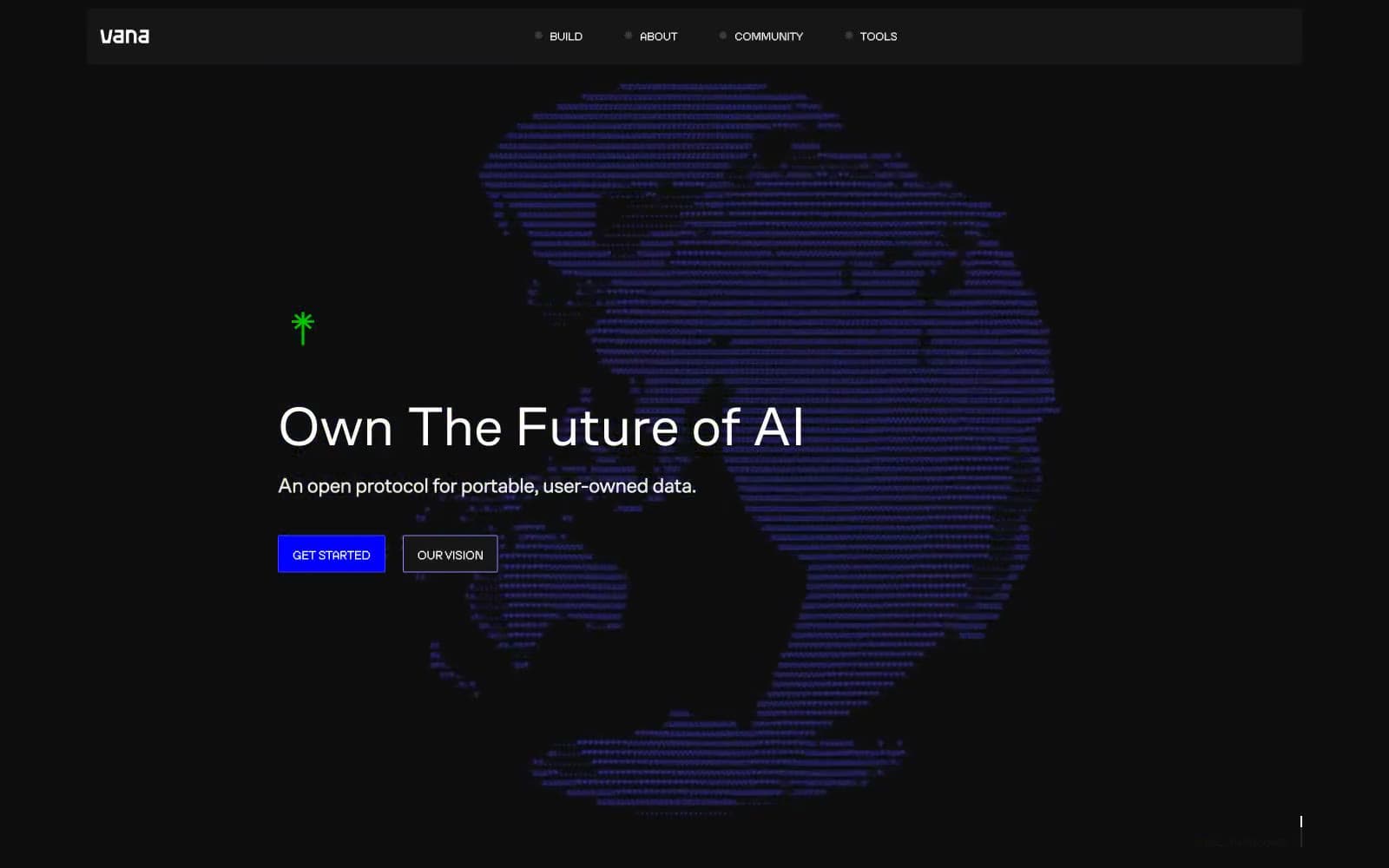
Vana design system

Brand2
Primary CTA fill, brand text, decorative ASCII pattern — the signal color that makes actions switched on against the dark canvas
Button borders, secondary accent — slightly lighter than Electric Indigo for outlined controls and hover states
Accent3
Outlined action border, light violet accent — ghost button outlines and muted decorative strokes
Rare chromatic punctuation — cursor marker, outlined button variant, location indicator on the data map
Rare chromatic punctuation — outlined button variant, decorative icon accent
Neutrals8
Page background — the base canvas everything floats on
Card and panel surfaces — one step above the canvas for contained content blocks
Dark elevated surface for cards, headers, and contained panels. Do not promote it to the primary CTA color
Borders in light sections, link underlines — visible only against the white band
Highest surface elevation, filled neutral button background — the brightest the neutrals get
Decorative SVG stroke and fill — warm-toned accent for abstract graphics and illustration details
Body text, secondary copy, subtle fill — quieter than Pure Signal for paragraphs and descriptions
Primary headings, button text, high-contrast text — the loudest text voice
Try a pairing
Pick any two colors from the palette to check whether text stays readable on top.
Aa
Pure Signal on Electric Indigo
8.59 : 1 contrast
- Body textPasses AA 4.5
- Large textPasses AA 3
- StrictPasses AAA 7
More DESIGN.md files. Same web, different personalities.
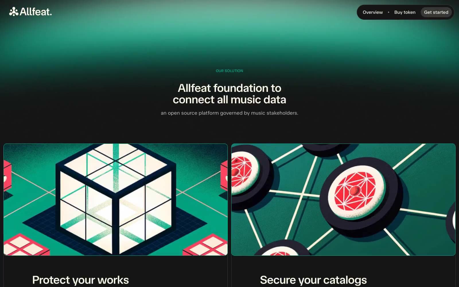
Allfeat
Crypto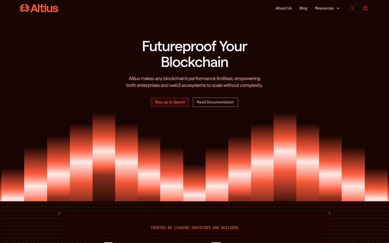
Altius
Crypto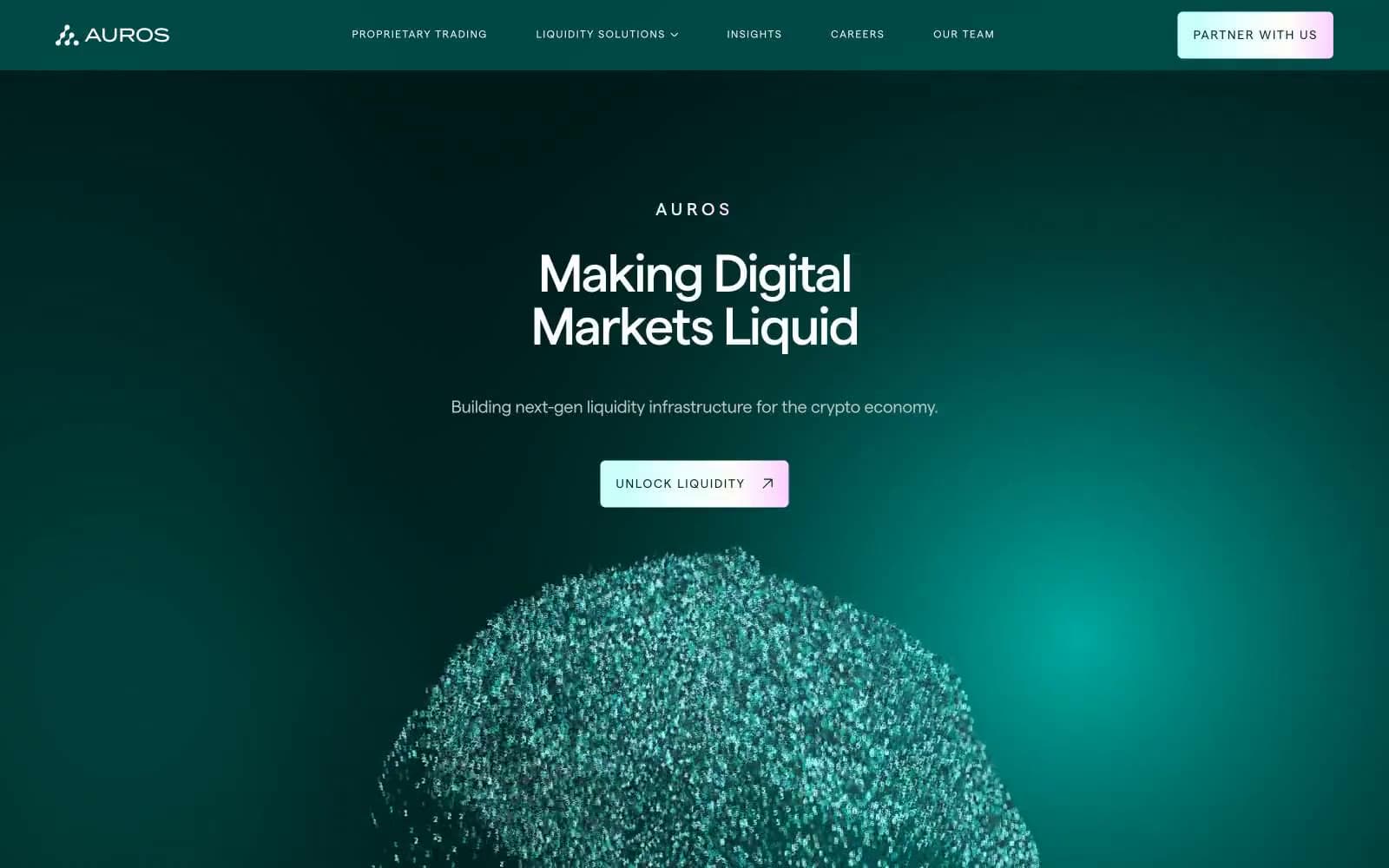
Auros
Crypto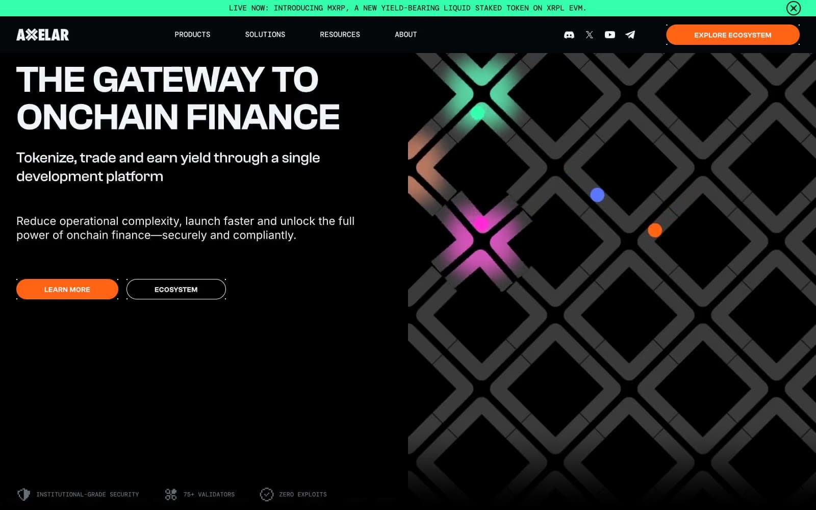
Axelar
Crypto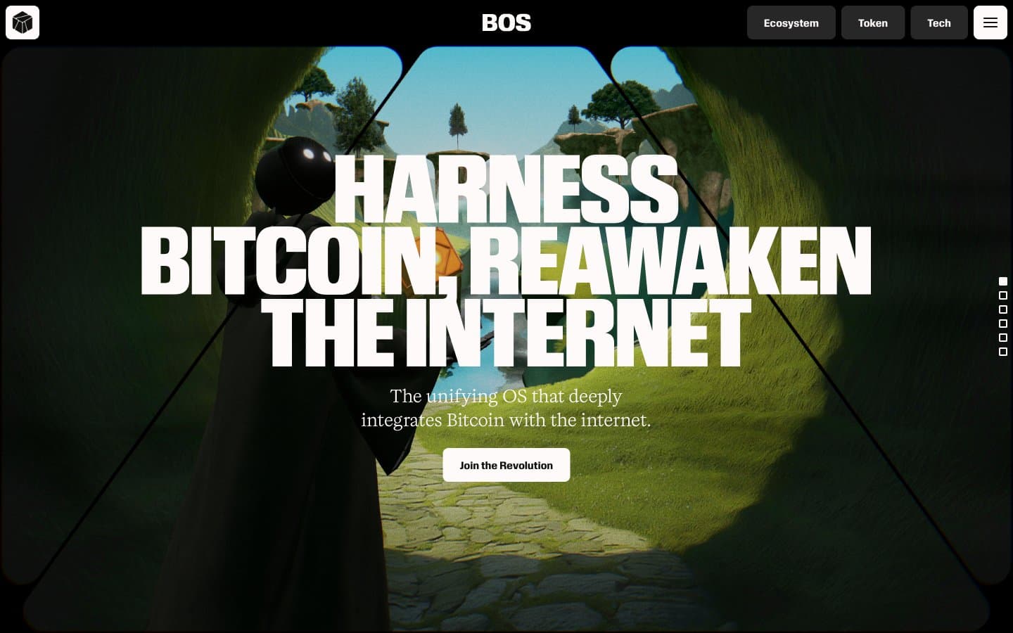
BitcoinOS
Crypto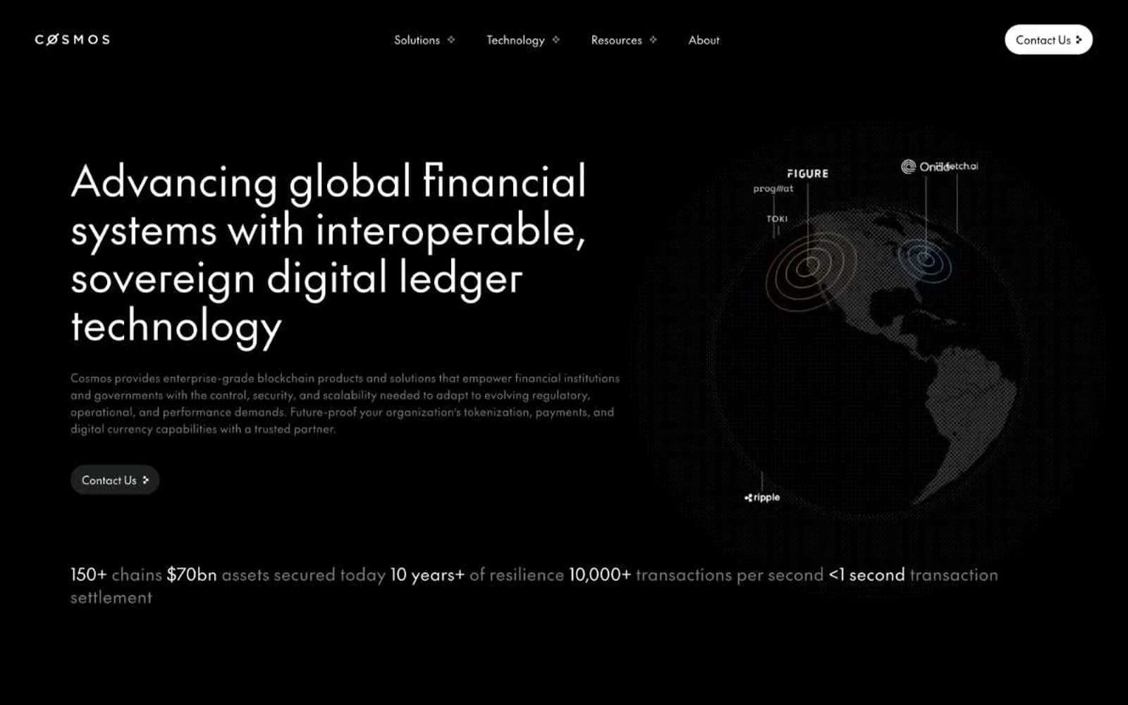
Cosmos Network
Crypto
Hyper Foundation
Crypto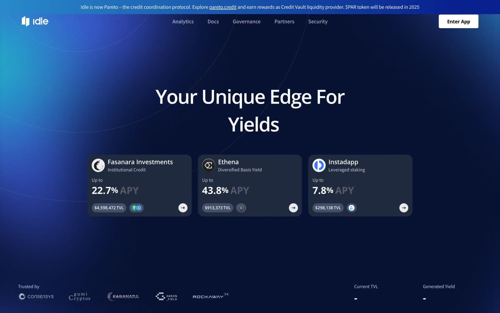
Idle Finance
Crypto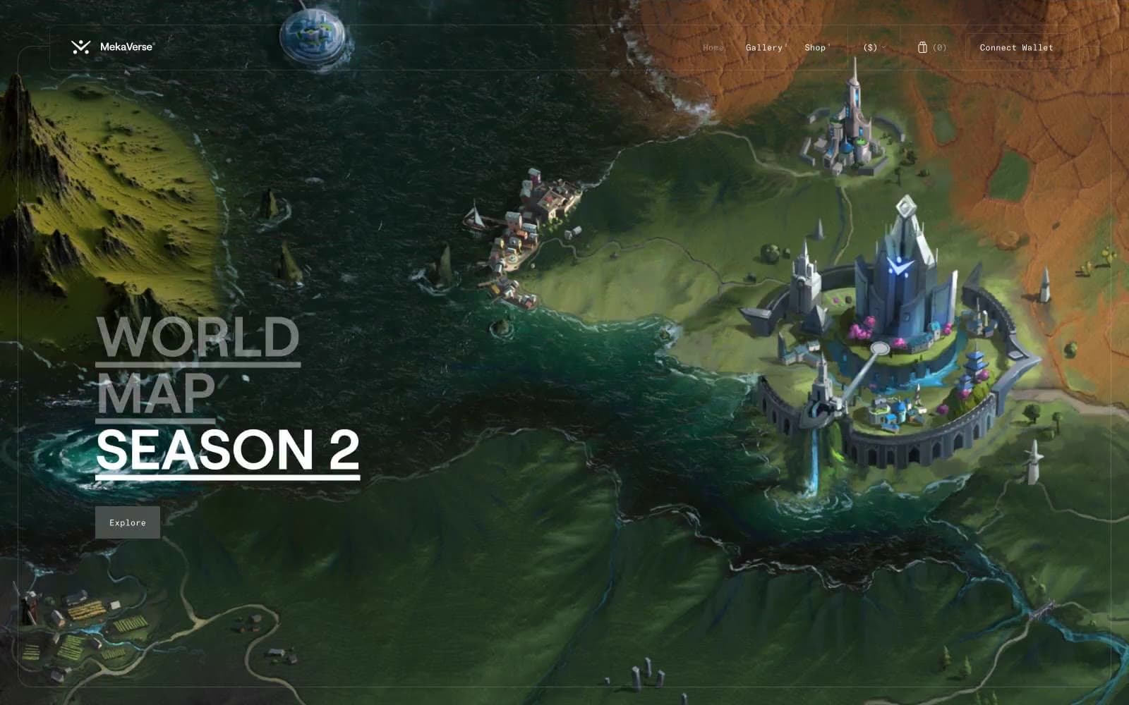
MekaVerse
Crypto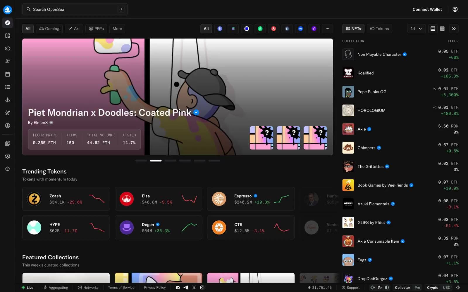
OpenSea
Crypto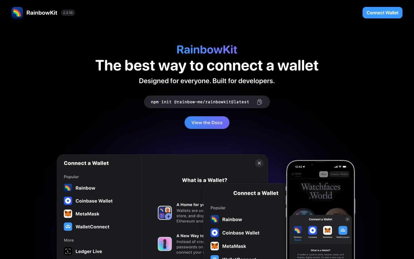
RainbowKit
Crypto
Safepal
Crypto


