
Val Town. Daylight IDE with cyan sparks.
- Developer tools
- Light theme
- 18 colors
- 2 typefaces
Val Town uses a daylight-IDE visual language: a near-white canvas with a single vivid cyan as the "run" button accent, playful magenta and violet used sparingly to energize specific words inside otherwise neutral type, and the hero is always a real code editor mock rather than abstract illustration. Typography carries the brand more than color does — IBM Plex Sans at 400 for body, 700 for headings, and iA Writer Mono for all code, giving every screen the feel of a well-typeset terminal. Components are flat and low-elevation, relying on hairline borders and a cool light-gray card surface (#f1f5f9) to separate layers; depth only appears in the code editor mock where a soft 20px shadow lifts the card off the page. Color is rationed like a developer's cursor: it only appears where state changes, where code is highlighted, or where a single word deserves emphasis — the rest of the UI stays monochrome and quiet.
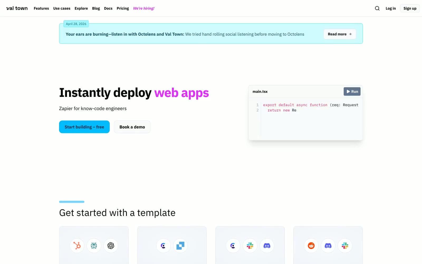
Val Town design system

Brand4
Blue supporting accent for decorative details and low-frequency emphasis. Do not promote it to the primary CTA color
Announcement bar border, decorative code-editor highlights — brighter, more electric than Cyan Pulse, used for outline accents only
Violet supporting accent for decorative details and low-frequency emphasis.
Hiring nav link, emphasis words inside testimonial bodies — a second accent reserved for editorial moments, not chrome
Accent4
Soft highlight wash behind cards and decorative code blocks — desaturated cyan used as a tint, never as text or border
Blue supporting accent for decorative details and low-frequency emphasis. Do not promote it to the primary CTA color
Inline code-editor decoration, soft illustration tint — decorative, not a state color
Red supporting accent for decorative details and low-frequency emphasis
Neutrals10
Dark surface fill (testimonial cards, inverse blocks), strongest emphasis text
Primary body text, icon strokes, heading default — the dominant dark neutral across the entire UI
Mid-tone text, secondary icon strokes, muted body copy
Button label on light surfaces, icon default, disabled-adjacent text
Helper text, tertiary icon strokes, button label color in dark contexts
Captions, timestamps, lowest-priority metadata
Hairline borders, input outlines, divider lines
Page canvas, default border color, subtle surface separation
Card surface, elevated panel, code editor body fill
Inset cards on light gray canvas, button text on cyan fill, modal surfaces
Try a pairing
Pick any two colors from the palette to check whether text stays readable on top.
Aa
Graphite on Cyan Pulse
6.71 : 1 contrast
- Body textPasses AA 4.5
- Large textPasses AA 3
- StrictFails AAA 7
More DESIGN.md files. Same web, different personalities.

Tailwind CSS
Developer tools
Atoms
Developer tools
Browserbase
Developer tools
Cursor
Developer tools
Deno
Developer tools
Drizzle ORM
Developer tools
Earlydog
Developer tools
Expo
Developer tools
Fingerprint
Developer tools
Flatfile
Developer tools
Flox
Developer tools
Fly.io
Developer tools


