
Upstash. Bright white surfaces with one deep green accent that makes every action feel switched on.
- Developer tools
- Light theme
- 16 colors
- 3 typefaces
Upstash presents a developer-first data platform with a bright, airy workshop aesthetic: white canvas, hairline borders, and a single emerald green accent that does the work of a dozen colors. The brand uses deep forest green (#022c22) for all text — not black — which gives every screen a subtle organic warmth while keeping the identity unmistakably technical. Headlines are massive (up to 180px) and use a compressed custom display cut of Inter Tight with tight tracking, creating a sense of confident engineering scale. Components are deliberately lightweight: pill-shaped controls dominate, borders are 1px and barely visible, shadows are reduced to a whisper (0 1px 2px at 5% opacity). The result is a surface that recedes so code, logos, and product chrome can do the talking.
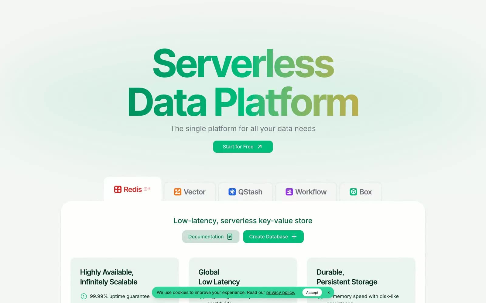
Upstash design system

Brand3
All text, headings, and icon strokes — deep desaturated green replaces black throughout the entire interface, giving the system its organic technical warmth
Green supporting accent for decorative details and low-frequency emphasis. Do not promote it to the primary CTA color; Hero headline gradient flowing from forest green through emerald to amber — makes the display wordmark feel alive
Secondary brand green for darker button states, link text, and icon outlines when a heavier weight than Forest Ink is needed
Accent5
Light accent green for secondary icons, decorative highlights, and hover state washes
Mid-green for outlined button borders, checkbox accents, and form focus rings
Lightest green for link hover states and subtle decorative washes
Red supporting accent for decorative details and low-frequency emphasis. Use as a supporting accent, not as a status color
Soft violet accent for the QStash product icon and category tags that need chromatic separation from the green family
Neutrals8
Code block background only — the single hard-black surface in the system
Darkest neutral for code block backgrounds and high-contrast borders where #000 feels too harsh
Muted secondary text, nav items, placeholder text, and subdued icon strokes
Soft green-tinted surface for hero background washes and the gradient tail stop on decorative backgrounds
Universal 1px border color for cards, inputs, dividers, and table rules — the most used color in the system
Lightest green-tinted background for announcement bars, tag pills, and the hero's left-edge gradient wash
Subtle alternating section backgrounds and disabled control fills
Page canvas, card surfaces, and inverse text on dark code blocks
Try a pairing
Pick any two colors from the palette to check whether text stays readable on top.
Aa
Snow on Forest Ink
15.15 : 1 contrast
- Body textPasses AA 4.5
- Large textPasses AA 3
- StrictPasses AAA 7
More DESIGN.md files. Same web, different personalities.

Tailwind CSS
Developer tools
Atoms
Developer tools
Browserbase
Developer tools
Cursor
Developer tools
Deno
Developer tools
Drizzle ORM
Developer tools
Earlydog
Developer tools
Expo
Developer tools
Fingerprint
Developer tools
Flatfile
Developer tools
Flox
Developer tools
Fly.io
Developer tools


