
Ui. Clinical blueprint on frosted paper.
- Developer tools
- Light theme
- 8 colors
- 1 typeface
shadcn/ui is a monochromatic design-system workshop: pure white canvas, soft warm-gray surfaces, and large-radius cards floating on hairline borders. The interface is almost entirely achromatic — black text, white surfaces, gray secondary tones — with a single destructive red reserved for error states and nothing else. Typography leans on Geist's geometric neutrality with tight letter-spacing on display sizes, creating a quiet, code-adjacent feel that reads as developer infrastructure rather than consumer product.
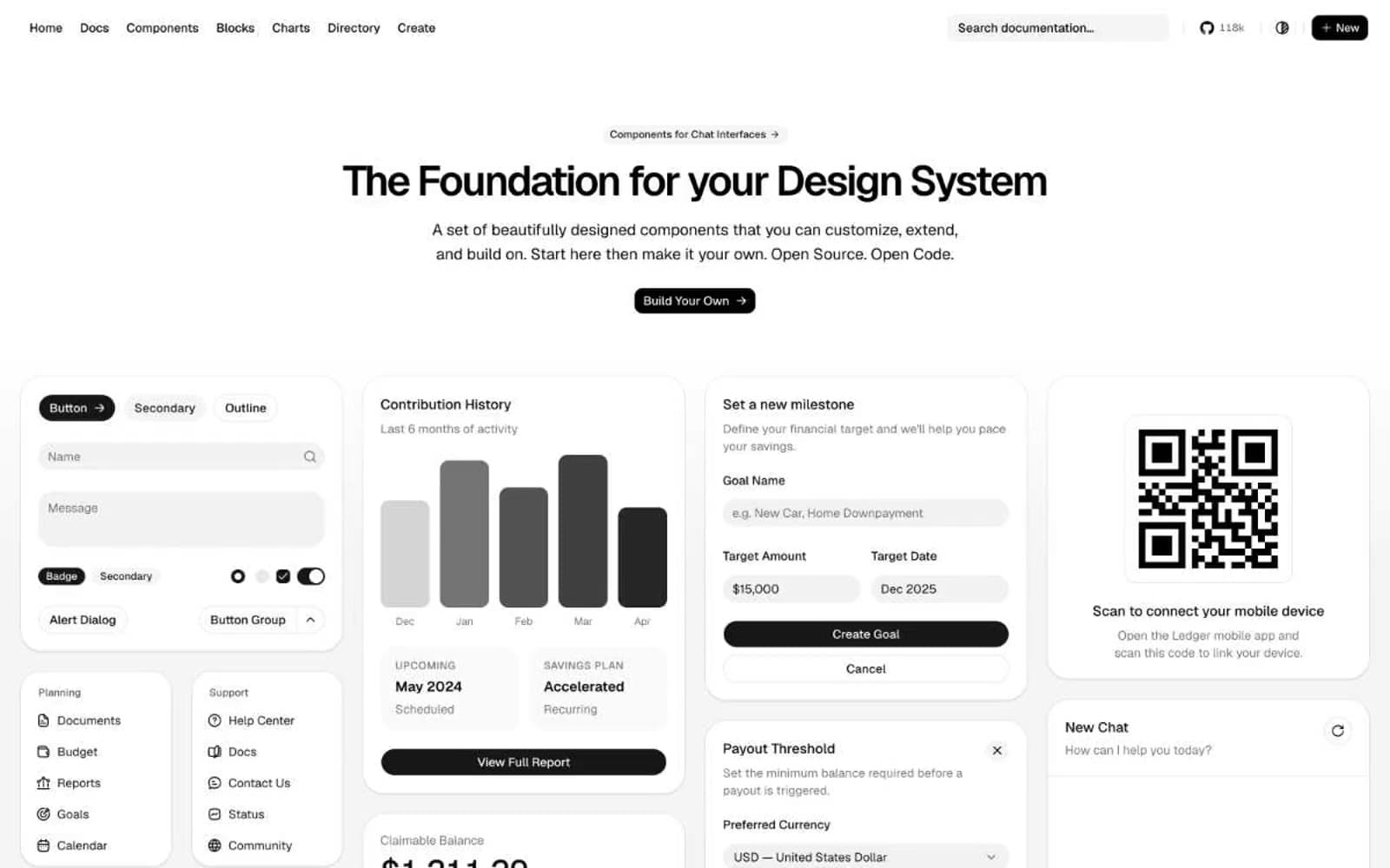
Ui design system

Accent1
Red decorative accent for icons, marks, and small graphic details. Use as a supporting accent, not as a status color
Neutrals7
Primary text, headings, button labels, icon strokes
Filled button backgrounds, secondary text on light surfaces
Muted body text, placeholder text, helper labels, icon fills at rest
Borders, input outlines, card edges, badge outlines
Page background, muted surface fills, secondary buttons
Sidebar background, subtle card variant, input resting state
Card surfaces, popover backgrounds, primary button fills
Try a pairing
Pick any two colors from the palette to check whether text stays readable on top.
Aa
Paper on Ember
4.77 : 1 contrast
- Body textPasses AA 4.5
- Large textPasses AA 3
- StrictFails AAA 7
More DESIGN.md files. Same web, different personalities.

Tailwind CSS
Developer tools
Atoms
Developer tools
Browserbase
Developer tools
Cursor
Developer tools
Deno
Developer tools
Drizzle ORM
Developer tools
Earlydog
Developer tools
Expo
Developer tools
Fingerprint
Developer tools
Flatfile
Developer tools
Flox
Developer tools
Fly.io
Developer tools


