
Tuple. Clean white surfaces, one violet CTA, playful multi-color accents, and a dark band that makes the light sections breathe.
- Developer tools
- Light theme
- 22 colors
- 2 typefaces
Tuple's design language is a developer's pair-programming workshop: bright, airy light surfaces with a single confident violet CTA that makes the primary action unmistakable. The visual identity leans on a four-color accent palette — violet, blue, orange, green — used sparingly as headings, icons, and the product-screenshot wallpapers, while the structural UI stays zinc-neutral and quiet. Typography pairs Inter Variable for everything functional with DM Mono for small all-caps labels and section eyebrows, which is a signature devtool move: mono labels say 'this is a product built by engineers' without resorting to skeuomorphism. Components are mostly flat and bordered rather than heavily shadowed, with a mix of 8px and 12px radii giving cards a modern-but-not-too-soft feel. The page alternates between generous white space sections and one dramatic dark band, creating rhythm without monotony.
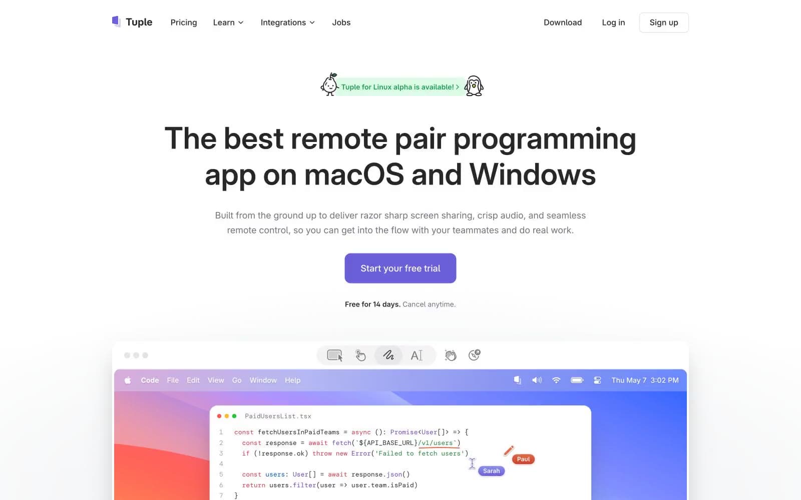
Tuple design system

Brand4
Primary action — CTA buttons, filled links, active nav states
Brand accent — icons, heading highlights, link hover; the most-used chromatic color in illustrations and product chrome
Brand accent — headings, product-screenshot strokes, decorative highlights; warm counterweight to the cool blues and violets
Green text accent for links, tags, and emphasized short phrases
Accent7
Green text accent for links, tags, and emphasized short phrases. Use as a supporting accent, not as a status color
Green wash for highlight backgrounds, decorative bands, and soft emphasis behind content. Use as a supporting accent, not as a status color
Green text accent for links, tags, and emphasized short phrases. Use as a supporting accent, not as a status color
Red wash for highlight backgrounds, decorative bands, and soft emphasis behind content. Use as a supporting accent, not as a status color
Yellow wash for highlight backgrounds, decorative bands, and soft emphasis behind content. Use as a supporting accent, not as a status color
Gray wash for highlight backgrounds, decorative bands, and soft emphasis behind content
Warm section background, decorative wash
Neutrals11
Deepest dark — dark section canvases, near-black surfaces
Primary text color, heading text, dark card surfaces, dark band backgrounds
Body text accent, medium-emphasis text, card inner surfaces on dark sections
Card outlines, emphasized borders, tertiary surface strokes
Secondary text, caption text, helper copy, muted nav links
Muted icon fills, placeholder text, tertiary text
Muted borders, disabled strokes, secondary dividers
Hairline borders, dividers, card outlines, input borders — the most-used neutral, structural backbone of every component
Subtle section backgrounds, footer strips, surface wash
Page background, hero canvas
Card surfaces, button text on dark, raised content backgrounds
Try a pairing
Pick any two colors from the palette to check whether text stays readable on top.
Aa
White on Iris
4.98 : 1 contrast
- Body textPasses AA 4.5
- Large textPasses AA 3
- StrictFails AAA 7
More DESIGN.md files. Same web, different personalities.

Tailwind CSS
Developer tools
Atoms
Developer tools
Browserbase
Developer tools
Cursor
Developer tools
Deno
Developer tools
Drizzle ORM
Developer tools
Earlydog
Developer tools
Expo
Developer tools
Fingerprint
Developer tools
Flatfile
Developer tools
Flox
Developer tools
Fly.io
Developer tools


