
Trawelt. Boarding pass on black marble.
- Studio
- Mixed theme
- 8 colors
- 2 typefaces
Trawelt is a high-contrast, editorial luxury system that alternates between dramatic black canvases and warm cream surfaces, stitched together by a single saturated forest-green accent. The typography pairing is deliberate tension: a sharp neo-grotesk (Labour Grotesk) carries all functional text at one voice — weight 400, tight tracking, no italics — while an ultra-light contemporary serif (Reckless Neue at 250) appears only on large display headings to whisper rather than shout. The mint-green pill navigation bar acts as a constant brand anchor, persisting across both dark and light sections like a boarding-pass stub. Surfaces are flat and paper-like; elevation is replaced by border weight (predominantly 1px black) and generous whitespace, giving the system a print-magazine logic rather than a typical app-dashboard logic.
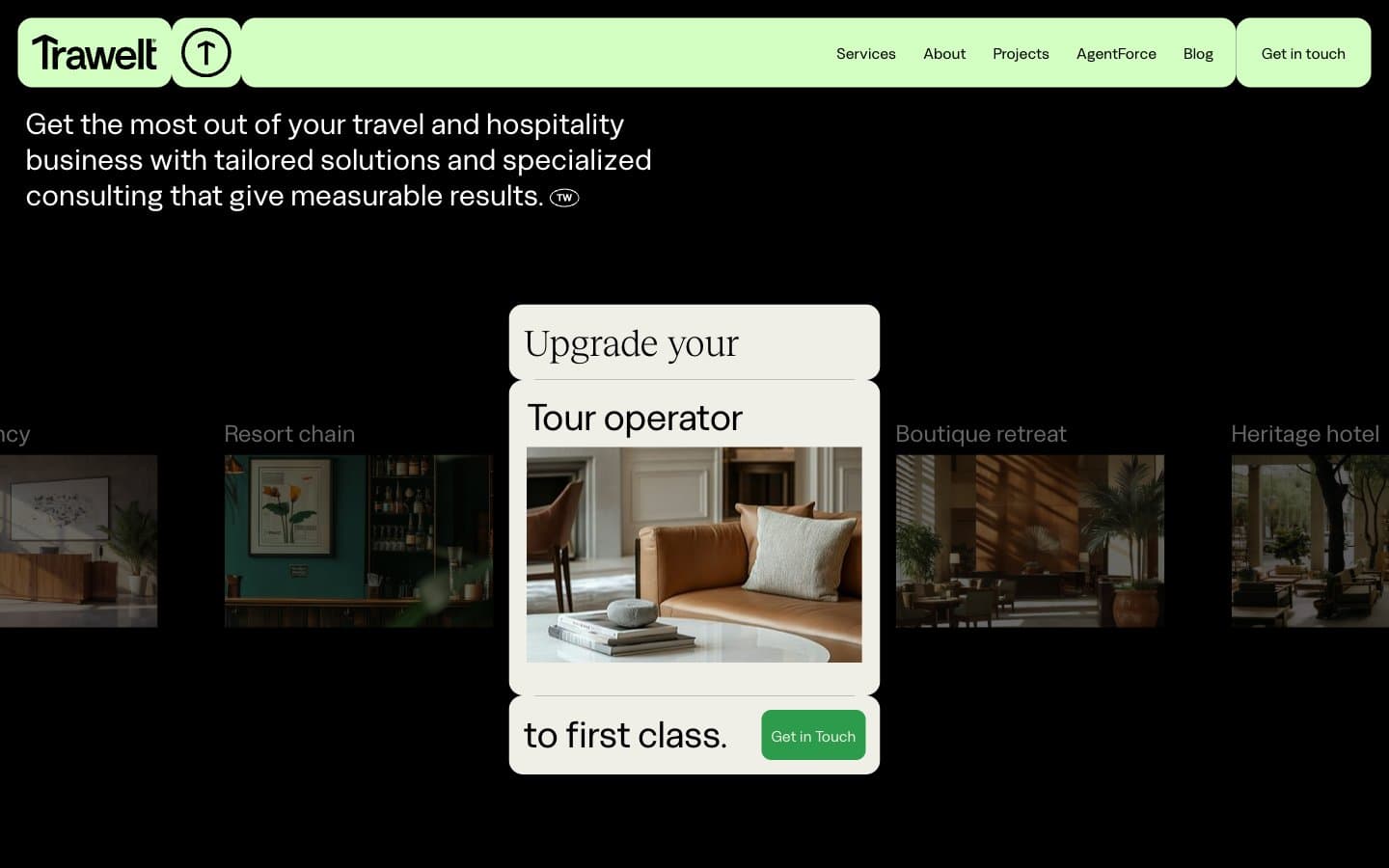
Trawelt design system

Brand2
Primary CTA fills, active nav indicators, footer link accents, tag chips — the single chromatic heartbeat of the system; warm green against matte black creates urgency without aggression
Green wash for highlight backgrounds, decorative bands, and soft emphasis behind content.
Accent1
Hero illustration backdrop and premium accent panel — warm near-neutral that introduces tonal warmth inside predominantly black/green compositions
Neutrals5
Dominant dark canvas, 1px structural borders everywhere, button text on green fills, all text on light surfaces — the structural black that carries the system
Near-black variant for subtle text/background differentiation where pure #000 would be too flat — imperceptible shift that softens edges in dense text blocks
Light-section page background — slightly green-tinted off-white that keeps light pages feeling on-brand rather than clinical
Card surfaces in light sections, secondary fills, ghost-button borders — warmer than pure white, pairs with linen cream for a two-tier light surface stack
Headline and body text on dark sections, card surfaces elevated above black backgrounds, reverse borders on light sections
Try a pairing
Pick any two colors from the palette to check whether text stays readable on top.
Aa
Obsidian on Forest Command
5.90 : 1 contrast
- Body textPasses AA 4.5
- Large textPasses AA 3
- StrictFails AAA 7
More DESIGN.md files. Same web, different personalities.

Cuberto
Studio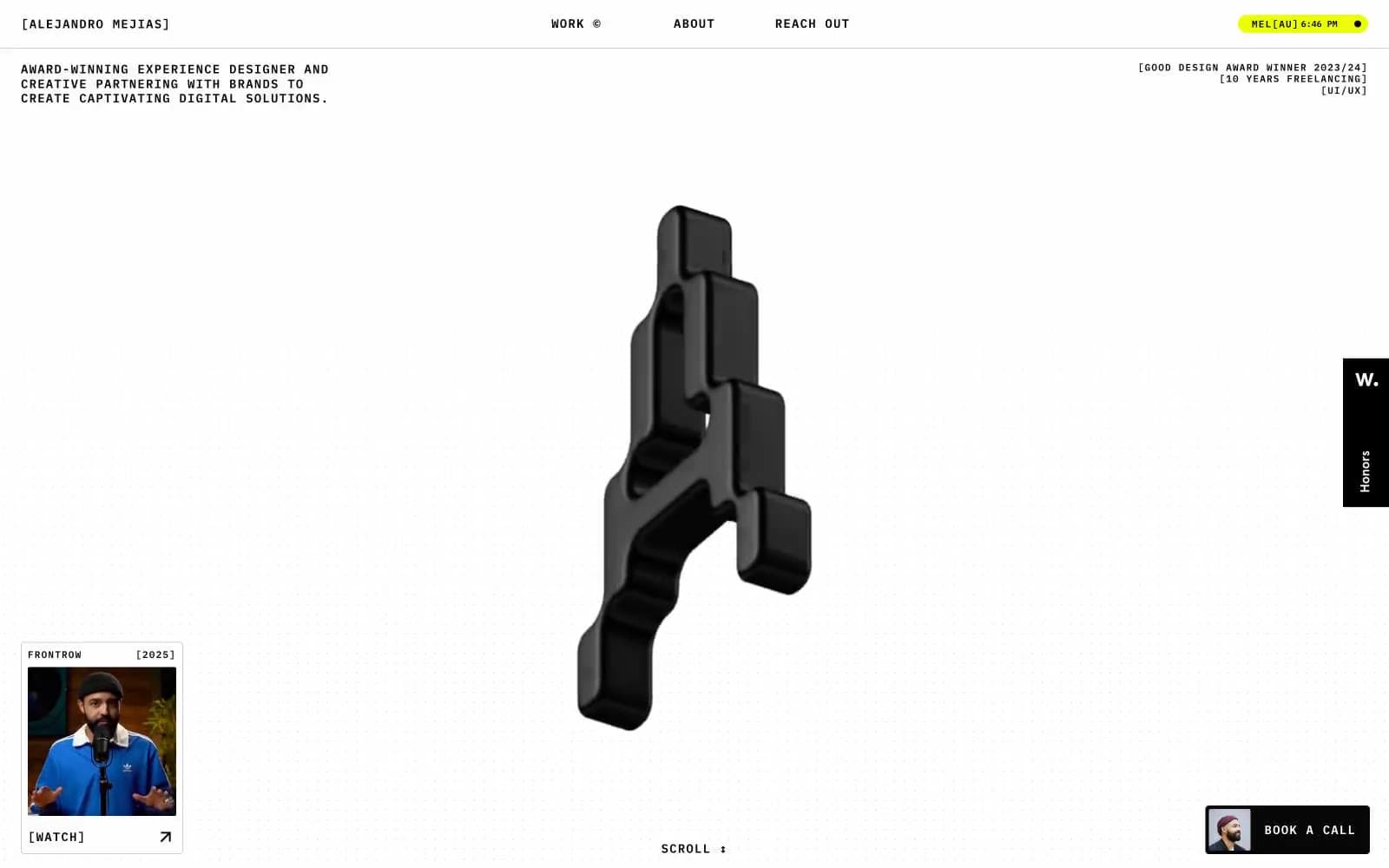
Alejandro Mejias
Studio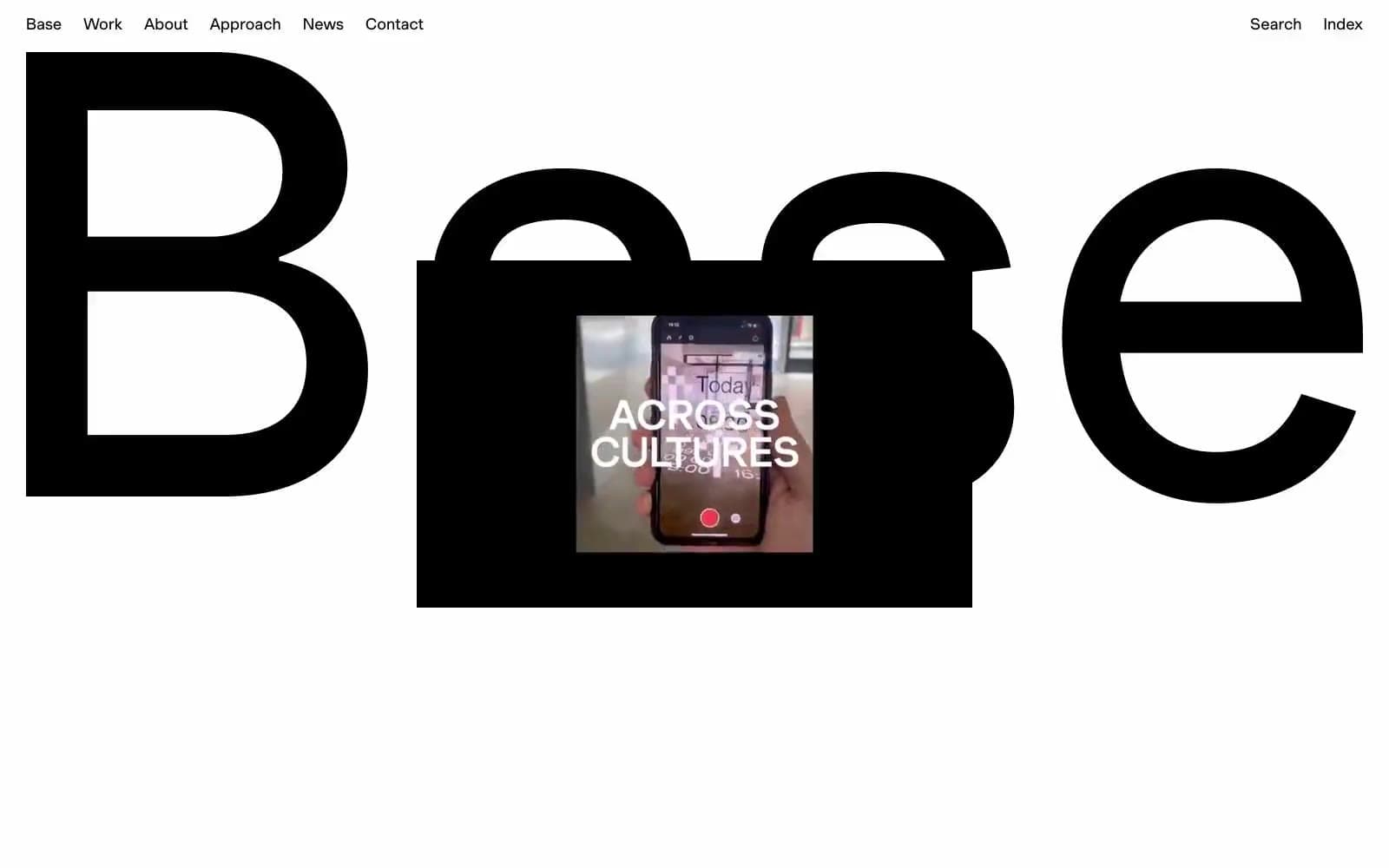
Base Design
Studio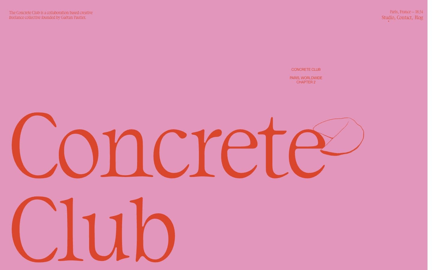
Concrete Club Studio
Studio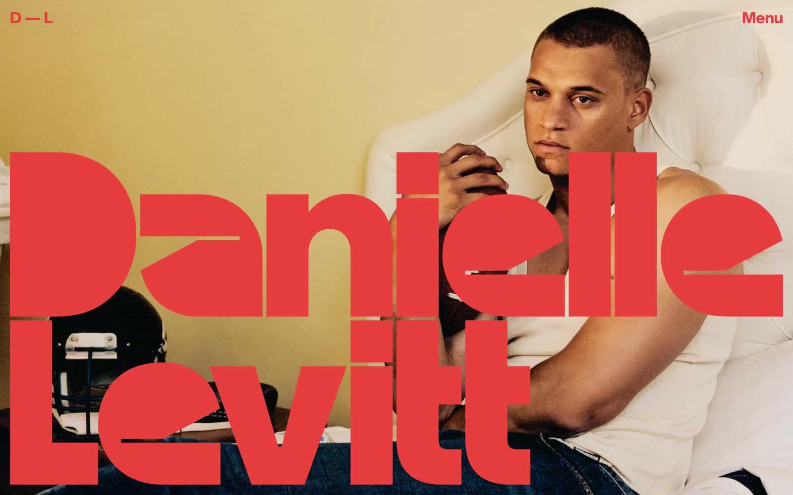
Daniellelevitt
Studio
DrawHistory
Studio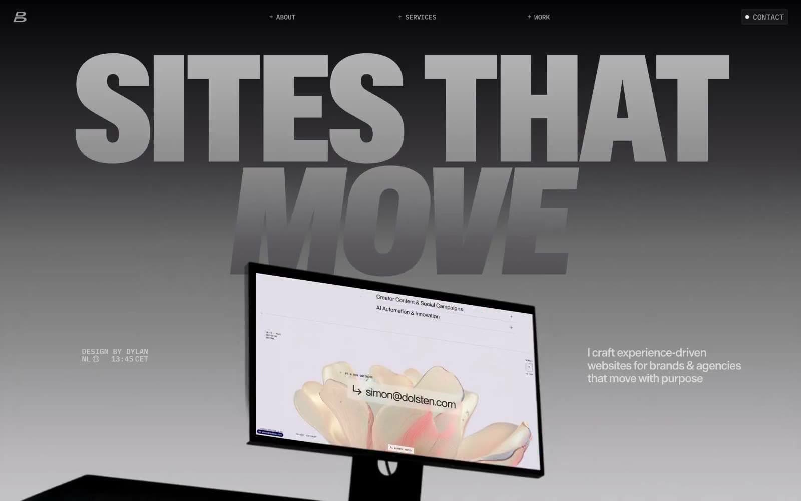
Dylanbrouwer
Studio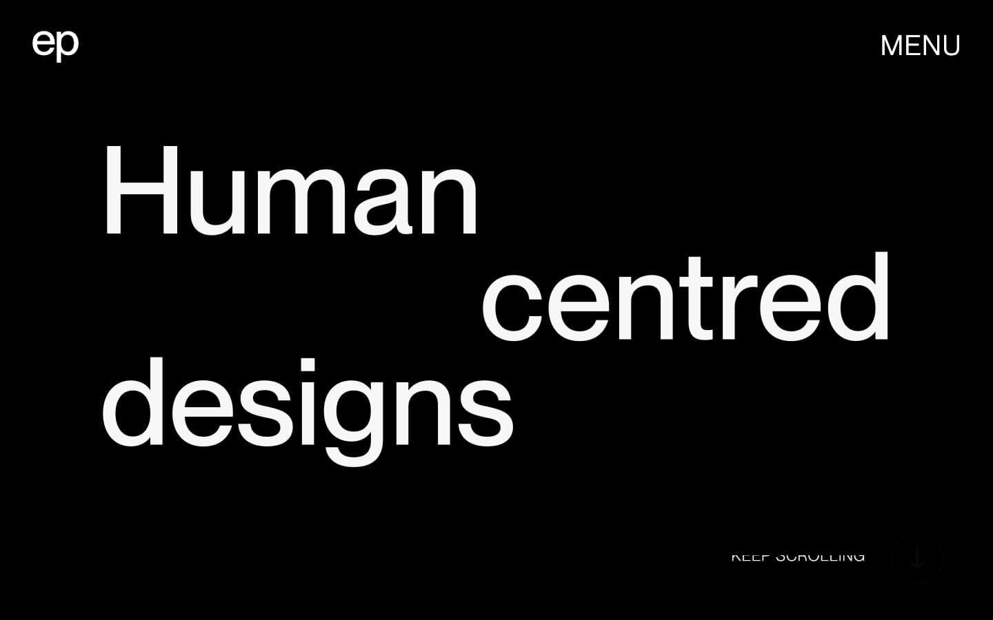
Elvina Prasad
Studio
Freytag Anderson
Studio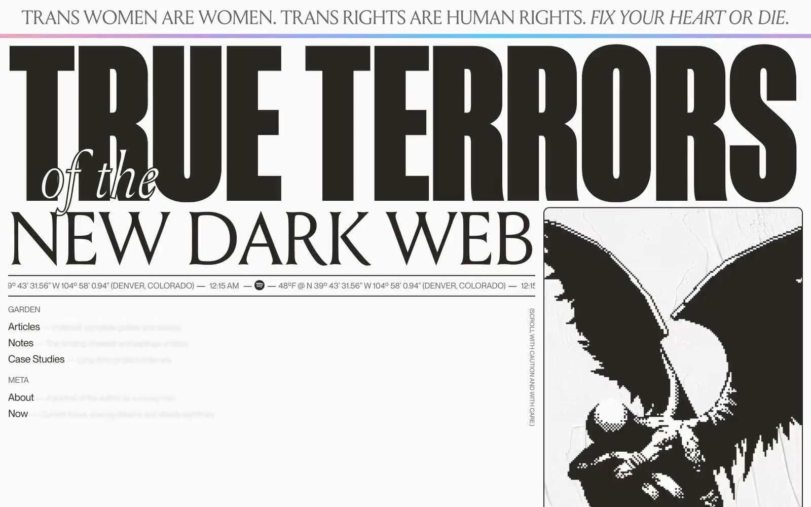
Henry
Studio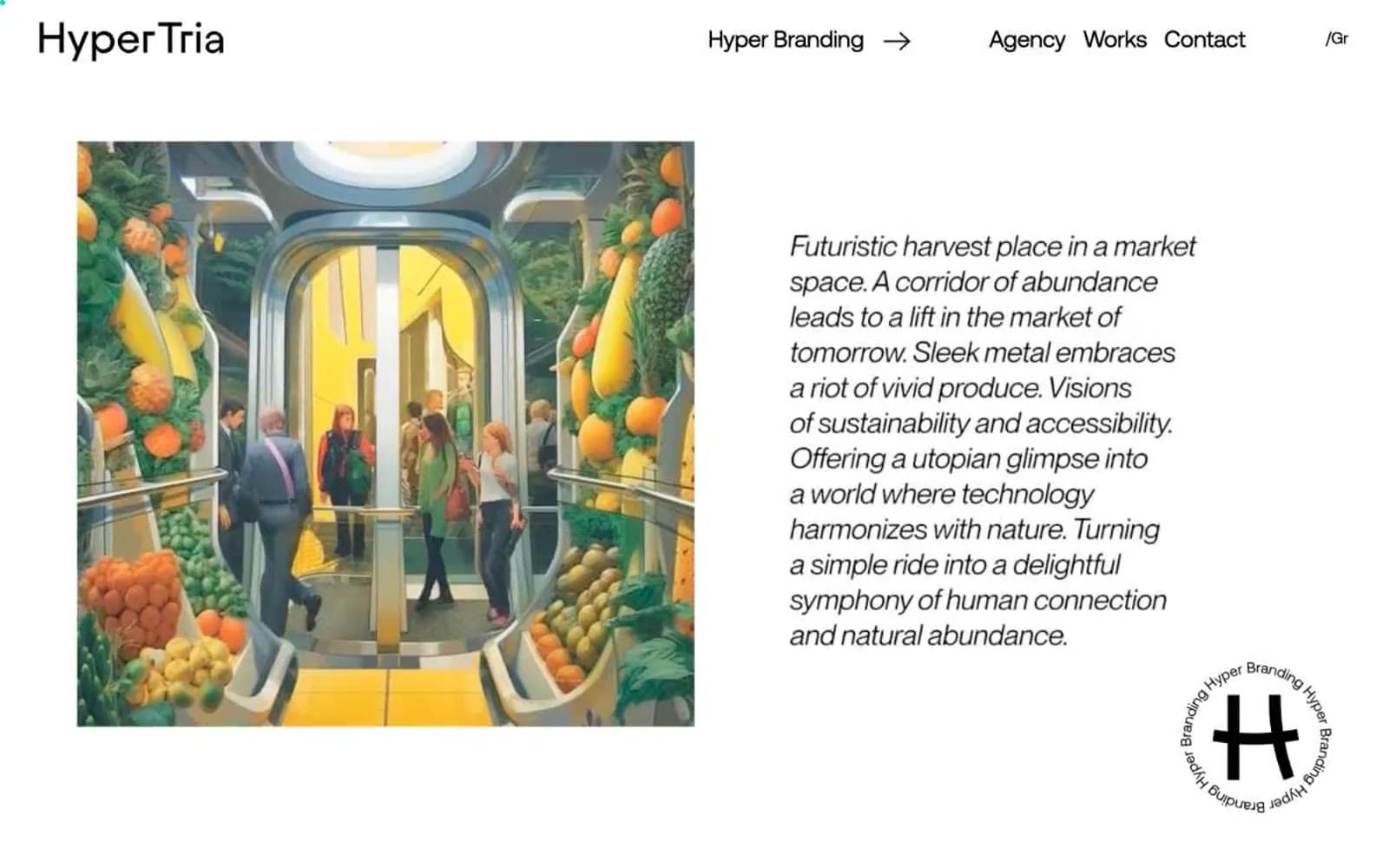
Hyper Tria
Studio
Maëlan Le Meur
Studio


