
Concrete Club Studio. The layout is a printed page, not a screen.
- Studio
- Mixed theme
- 6 colors
- 3 typefaces
Concrete Club is a warm editorial zine on dusty rose: oversized serif wordmarks dominate generous pink and off-white fields, small uppercase sans-serif tags steer the eye, and single warm orange-red ink bleeds through the layout as the one chromatic accent. Sections alternate between dusty rose, off-white canvas, and deep charcoal — each acts as a separate printed page bound into one publication. Typography is the interface: a distinctive humanist serif (DaVinci) carries all display weight, while Helvetica Neue Light whispers at body and nav scale. Hand-drawn line illustrations interrupt the grid at the right margin of the wordmark, softening the bold typographic authority with lo-fi charm. Everything else is restrained — no buttons, no cards, no shadows — the page behaves like a printed art book, not a software product.
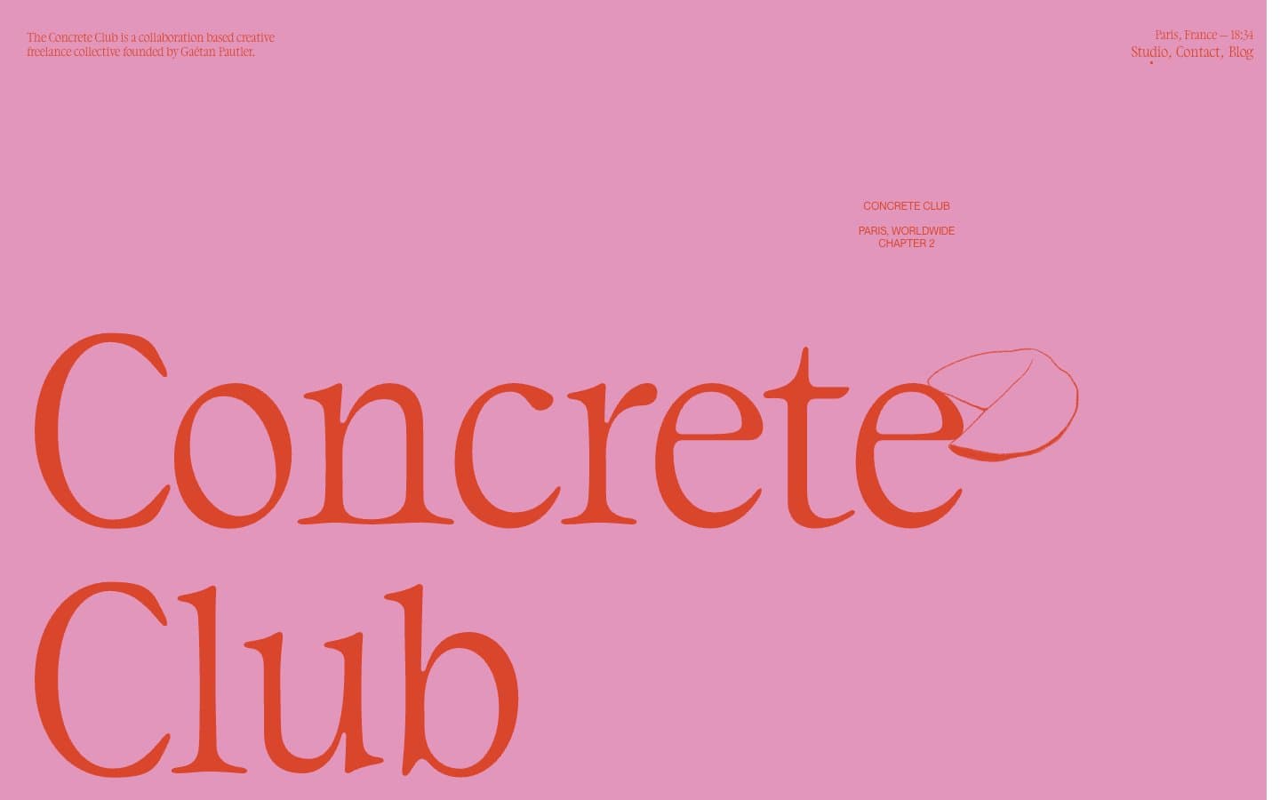
Concrete Club Studio design system

Brand1
Hero wordmark color, accent strokes, and the only chromatic text — a warm orange-red that reads as hand-pressed ink against the pink field. Used on display headlines and select illustration details
Accent1
Primary section background — a warm desaturated pink that carries the hero band and full-width content panels. Sets the editorial tone of the site
Neutrals4
Primary text, wordmark fill on light sections, illustration linework, and borders. The workhorse neutral
Dark section surface — used for full-bleed panels that invert the page to white-on-black editorial spreads
Default page canvas and light section background — slightly warm off-white that pairs with the pink rather than competing against it
Pure white reserved for maximum contrast moments and the lightest content panels
Try a pairing
Pick any two colors from the palette to check whether text stays readable on top.
Aa
Ink Black on Ember Ink
4.86 : 1 contrast
- Body textPasses AA 4.5
- Large textPasses AA 3
- StrictFails AAA 7
More DESIGN.md files. Same web, different personalities.

Cuberto
Studio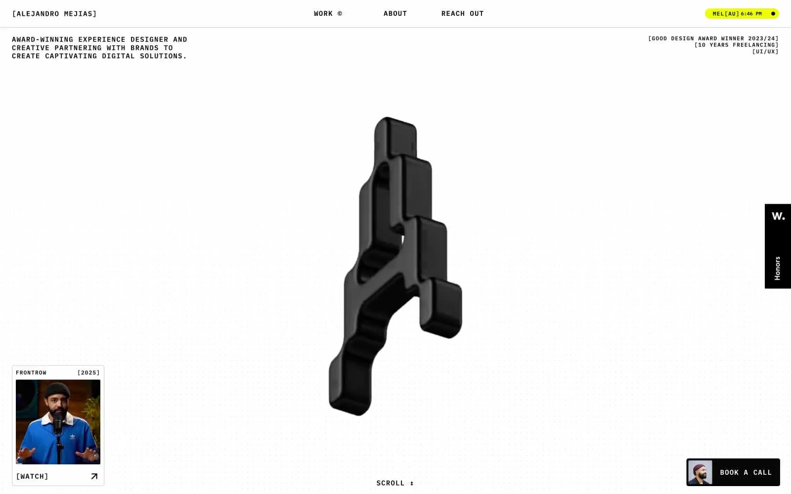
Alejandro Mejias
Studio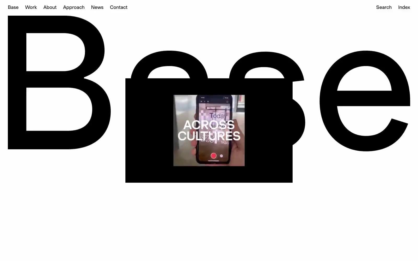
Base Design
Studio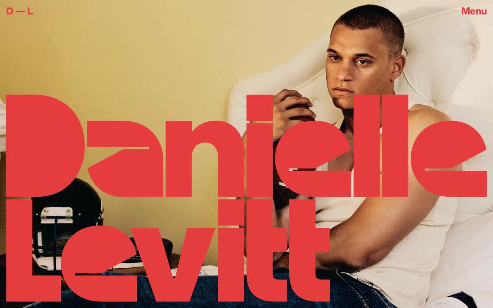
Daniellelevitt
Studio
DrawHistory
Studio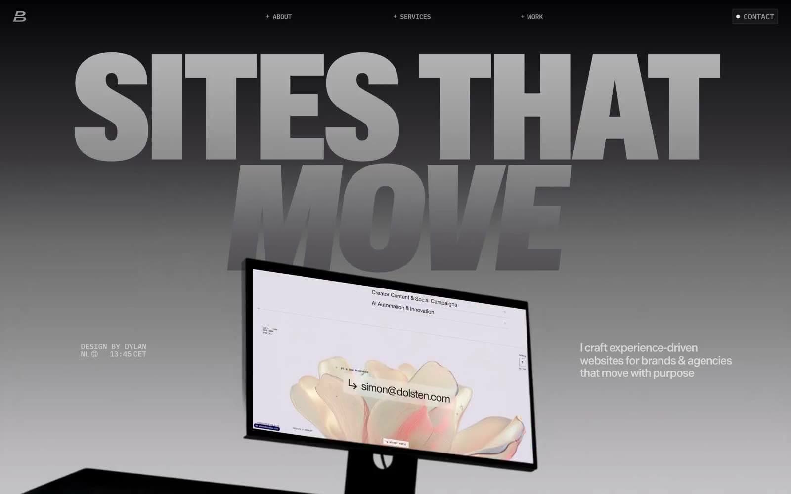
Dylanbrouwer
Studio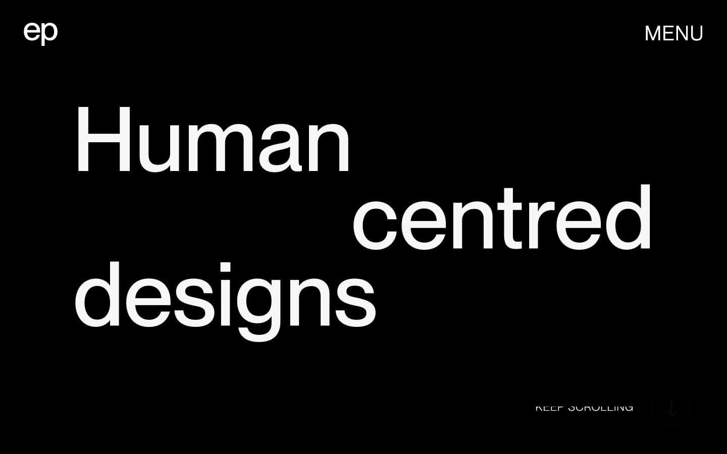
Elvina Prasad
Studio
Freytag Anderson
Studio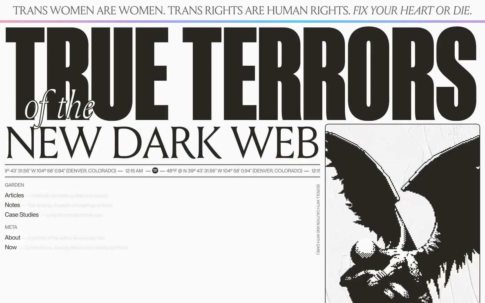
Henry
Studio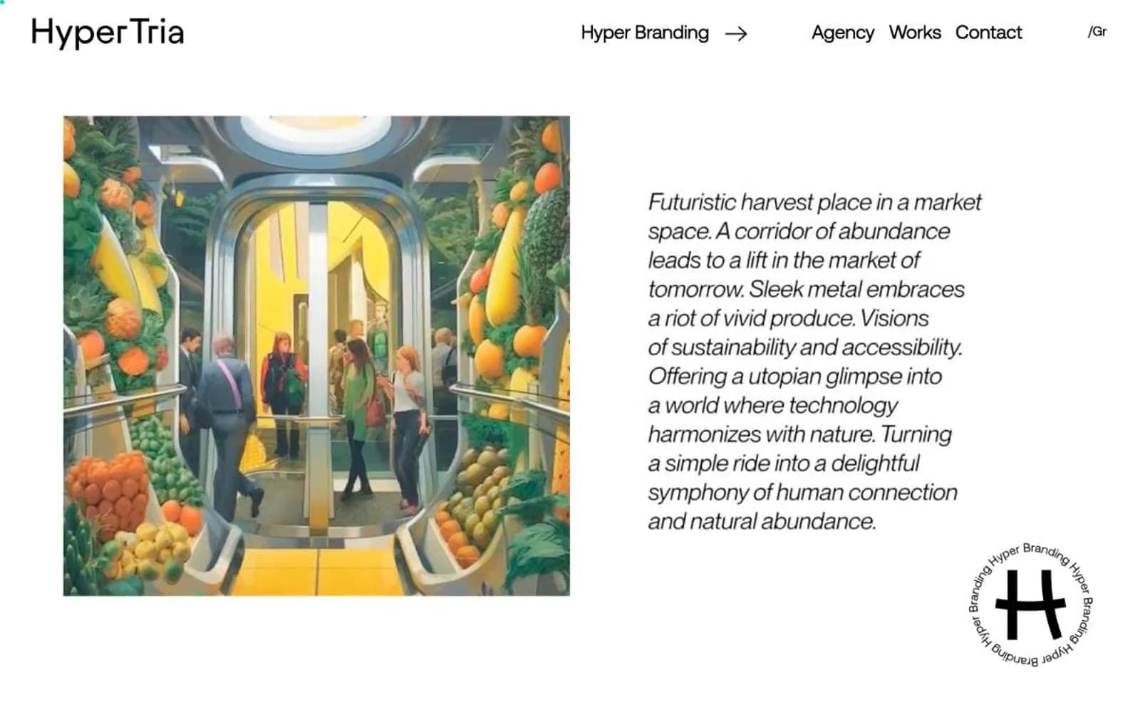
Hyper Tria
Studio
Maëlan Le Meur
Studio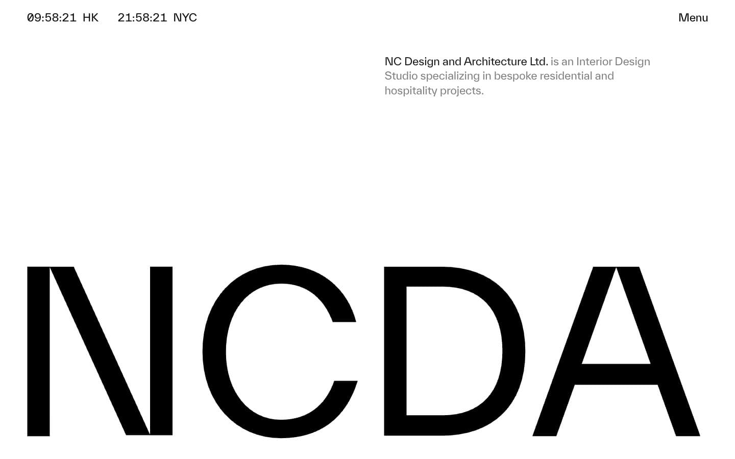
NCDA
Studio


