
Henry. Gothic broadside poster on warm cream paper.
- Studio
- Mixed theme
- 7 colors
- 4 typefaces
Henry Codes reads like an editorial broadside printed in warm ink: near-black headlines carved into cream paper, alternating with full-bleed dark sections where cream serif type glows. The palette is one-hundred-percent warm monochrome — no chromatic accent, no product color, no blue link — every visual move comes from scale, weight, and inversion. Type is the brand: a display serif (Louize) sets poetry and editorial prose, a condensed display sans (Manuka) stamps section headers at 200–370px, and a neo-grotesque (Neue Montreal) carries all UI at 12–24px. The spacing system is austere: 4–32px increments, one radius (12px), no shadows. Sections flip between paper and ink like a broadsheet newspaper, and most screens should be dominated by two or three enormous words rather than illustrated product art.
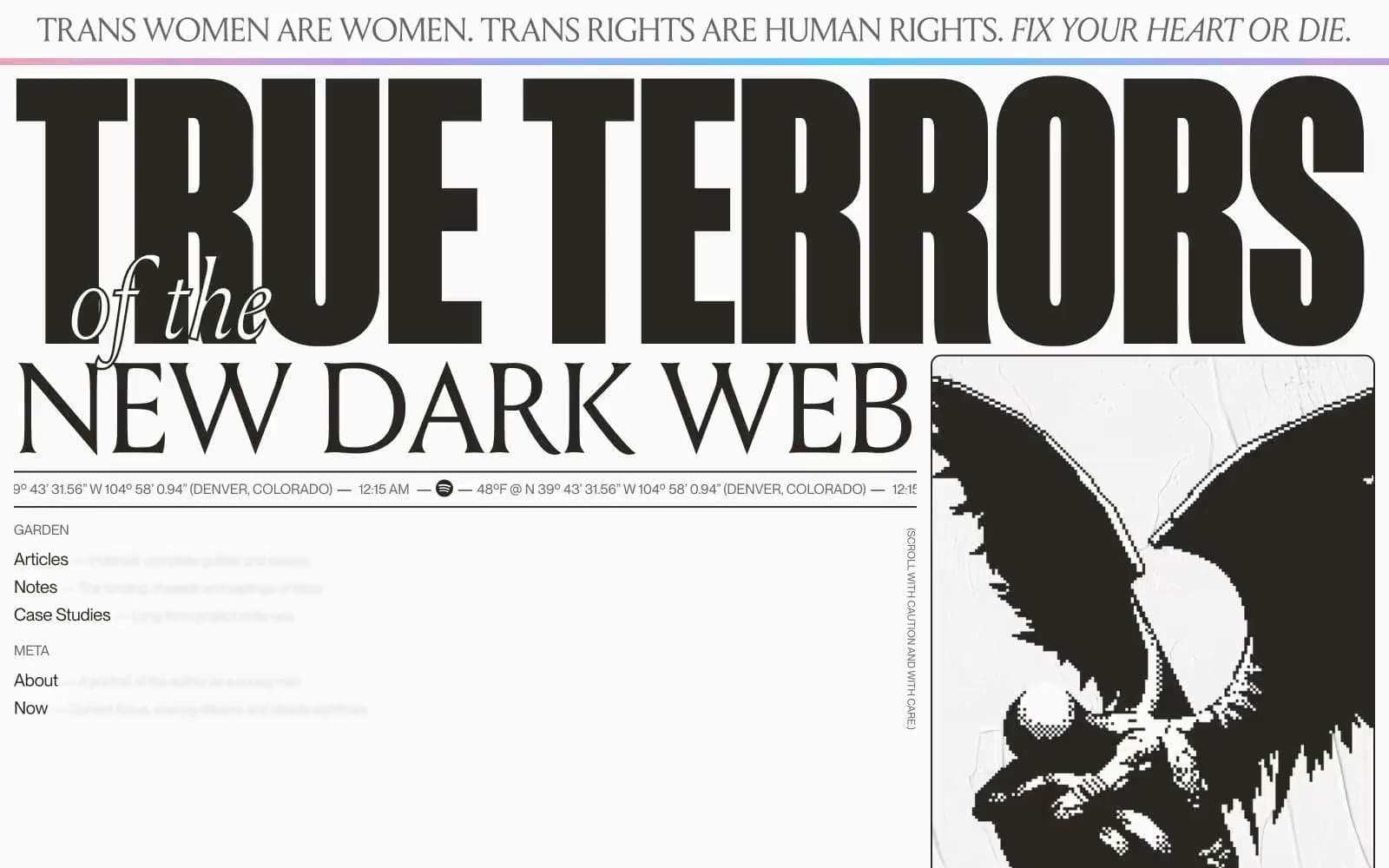
Henry design system

Neutrals7
Primary text, body ink, dominant borders, nav rules — warm near-black that carries every word on the page
Strong borders, secondary heading text — the warm-brown near-black that flanks Headline Ink
Secondary borders, muted UI text, low-emphasis dividers
Nav borders, muted borders, light decorative borders on dark sections
Inactive nav text and borders
Card and tile borders — only visible against Paper
Page background, card surfaces, inverted-section type — the cream-white ground that all dark type sits on
Try a pairing
Pick any two colors from the palette to check whether text stays readable on top.
Aa
Paper on Headline Ink
14.25 : 1 contrast
- Body textPasses AA 4.5
- Large textPasses AA 3
- StrictPasses AAA 7
More DESIGN.md files. Same web, different personalities.

Cuberto
Studio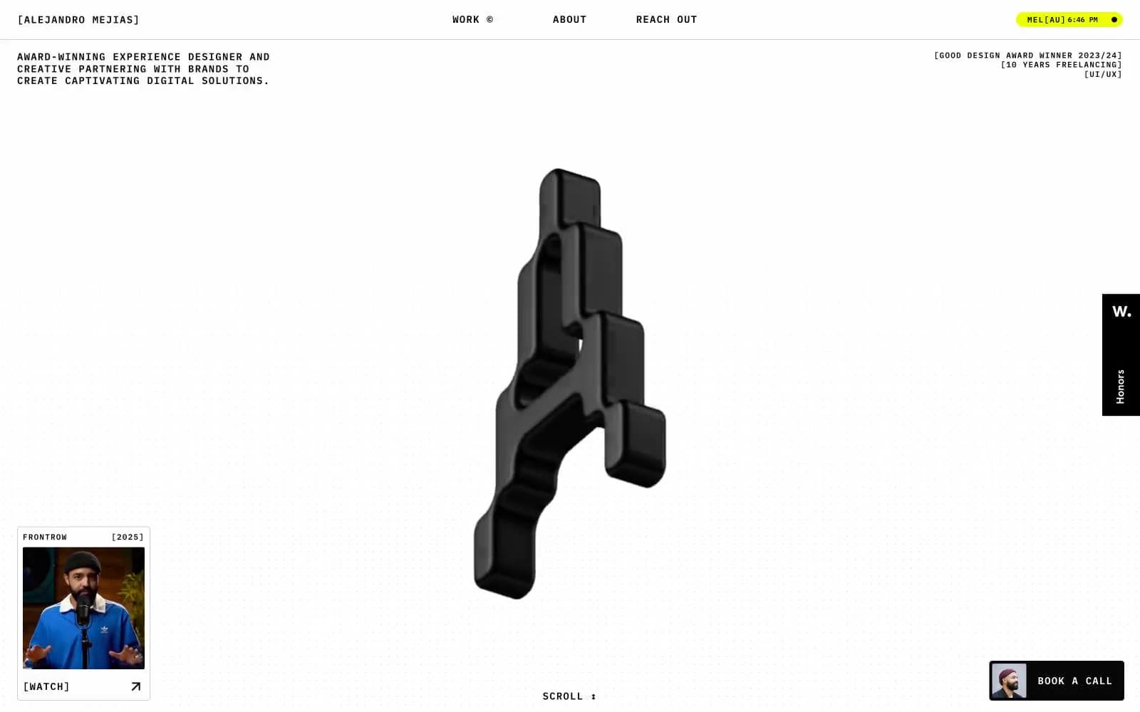
Alejandro Mejias
Studio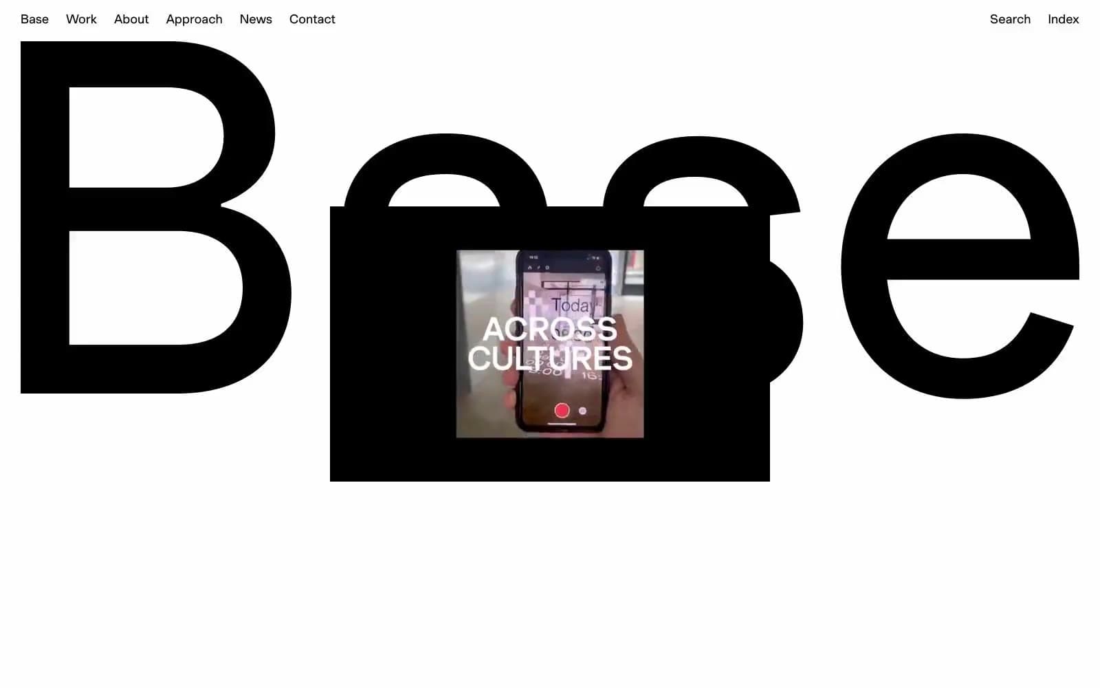
Base Design
Studio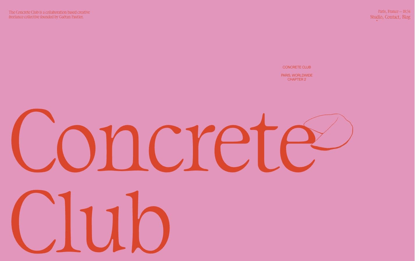
Concrete Club Studio
Studio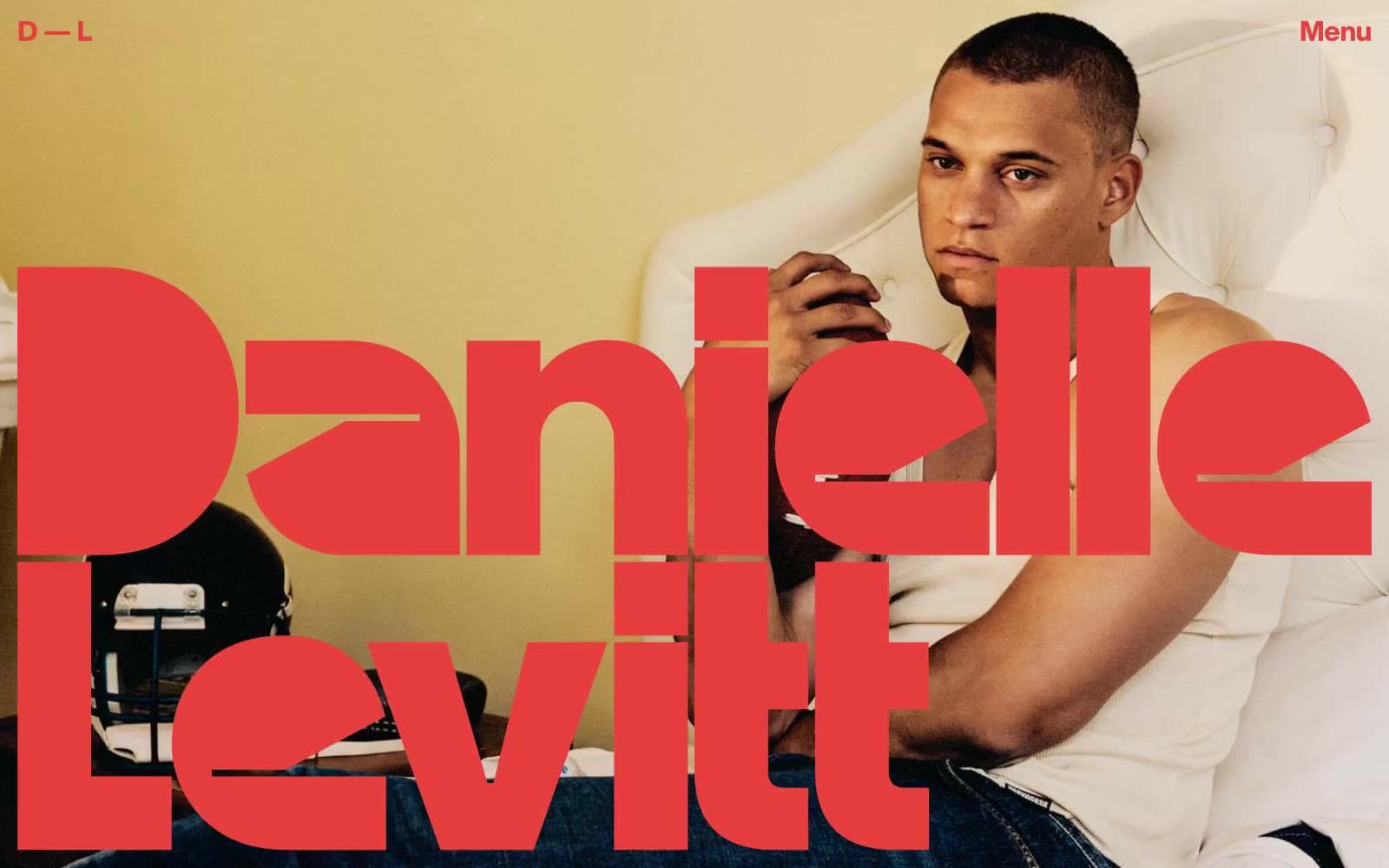
Daniellelevitt
Studio
DrawHistory
Studio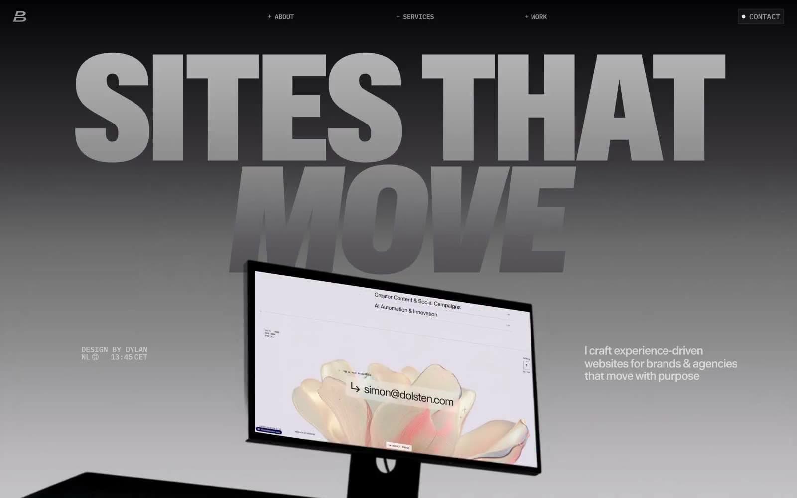
Dylanbrouwer
Studio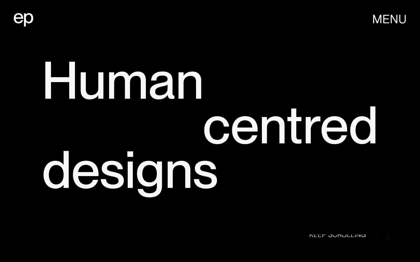
Elvina Prasad
Studio
Freytag Anderson
Studio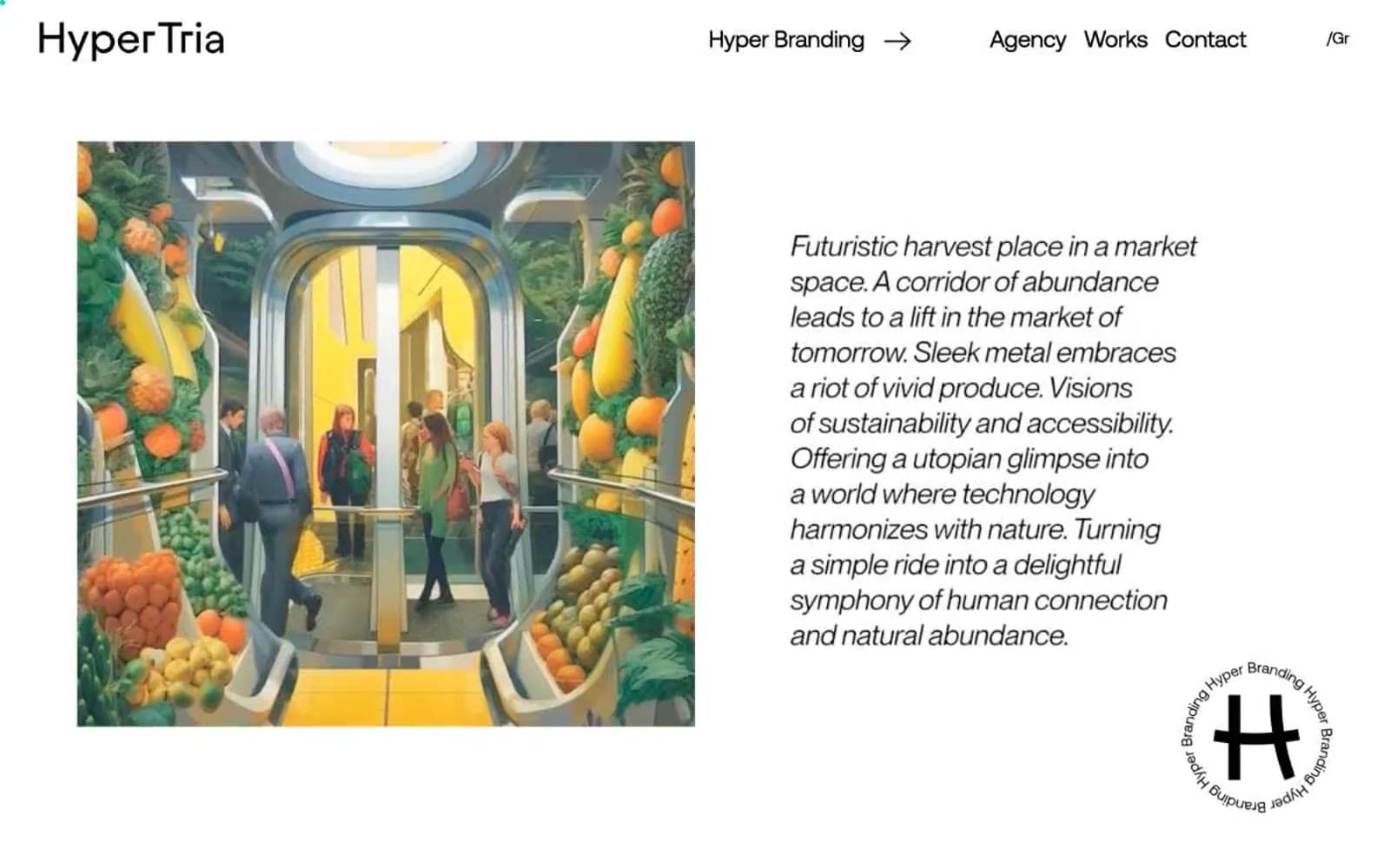
Hyper Tria
Studio
Maëlan Le Meur
Studio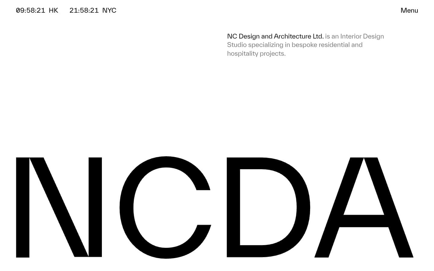
NCDA
Studio


