
Hyper Tria. Chrome monolith in a white gallery.
- Studio
- Mixed theme
- 6 colors
- 2 typefaces
Hyper Branding operates as an editorial design agency portfolio that swings between theatrical and austere: a full-bleed black hero dominated by massive chrome 3D lettering, then crisp white gallery sections where product photography and oversized Aeonik headlines do the storytelling. The system is deliberately monochrome at its bones — black, white, a single mid-gray — with a vivid red used as deliberate punctuation for navigation, kicker labels, and the agency wordmark, and a vivid green reserved for the rotating brand badge. Typography is the primary surface: a custom geometric sans rendered at whisper-light weights (300) at near-paragraph-line-heights (0.90–1.00), with aggressive negative tracking on display sizes that lets letterforms lock into sculptural compositions. Everything is sharp-edged — zero border-radius across the system — reinforcing the gallery-meets-manifesto posture rather than a soft consumer-product feel.
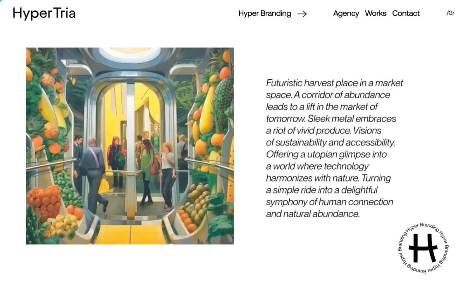
Hyper Tria design system

Brand2
Wordmark, navigation text, kicker labels, and the single chromatic accent that makes the otherwise monochrome system read as a brand. The warmth against pure black and white creates editorial urgency without tipping into alarm
Reserved for the rotating circular brand badge and high-prominence brand moments. A single saturated spot of color in an otherwise achromatic system — used sparingly so it lands as identity, not decoration
Accent1
Outlined/ghost action border, image frame accent, and link underline. Functions as the system's cool counterweight to the warm Ember Red — used for bordered interactive elements rather than filled buttons
Neutrals3
Page canvas in the hero, primary text color in light sections, and the dominant border color across all UI elements. Carries the heaviest weight in the system — defines edges, type, and spatial structure
Secondary navigation text and border color for tertiary UI elements. The middle tone that prevents the black/white binary from feeling stark in repetitive nav and list contexts
Hairline borders, dividers, input outlines, and card edges on light surfaces.
Try a pairing
Pick any two colors from the palette to check whether text stays readable on top.
Aa
Obsidian on Ember Red
5.34 : 1 contrast
- Body textPasses AA 4.5
- Large textPasses AA 3
- StrictFails AAA 7
More DESIGN.md files. Same web, different personalities.

Cuberto
Studio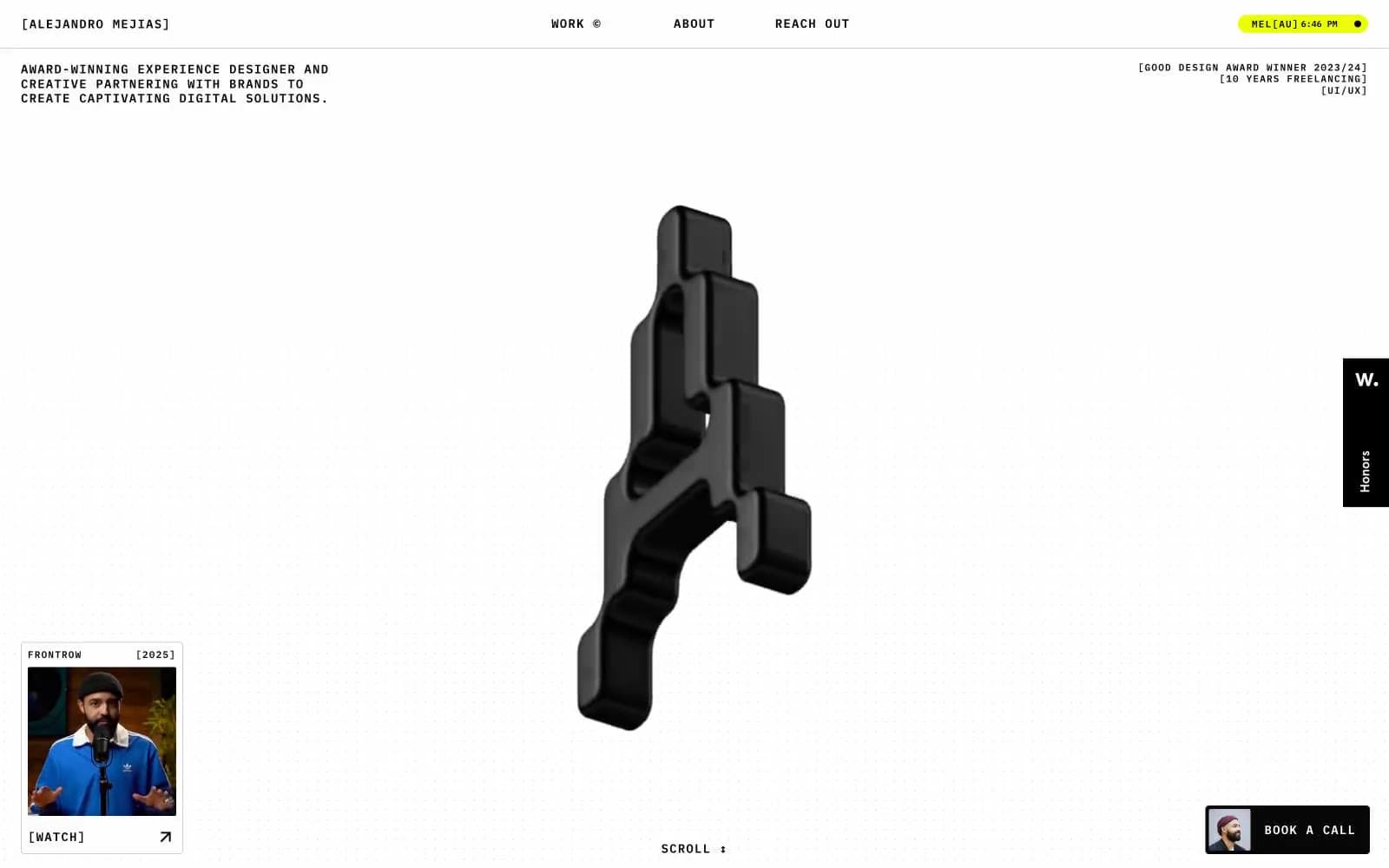
Alejandro Mejias
Studio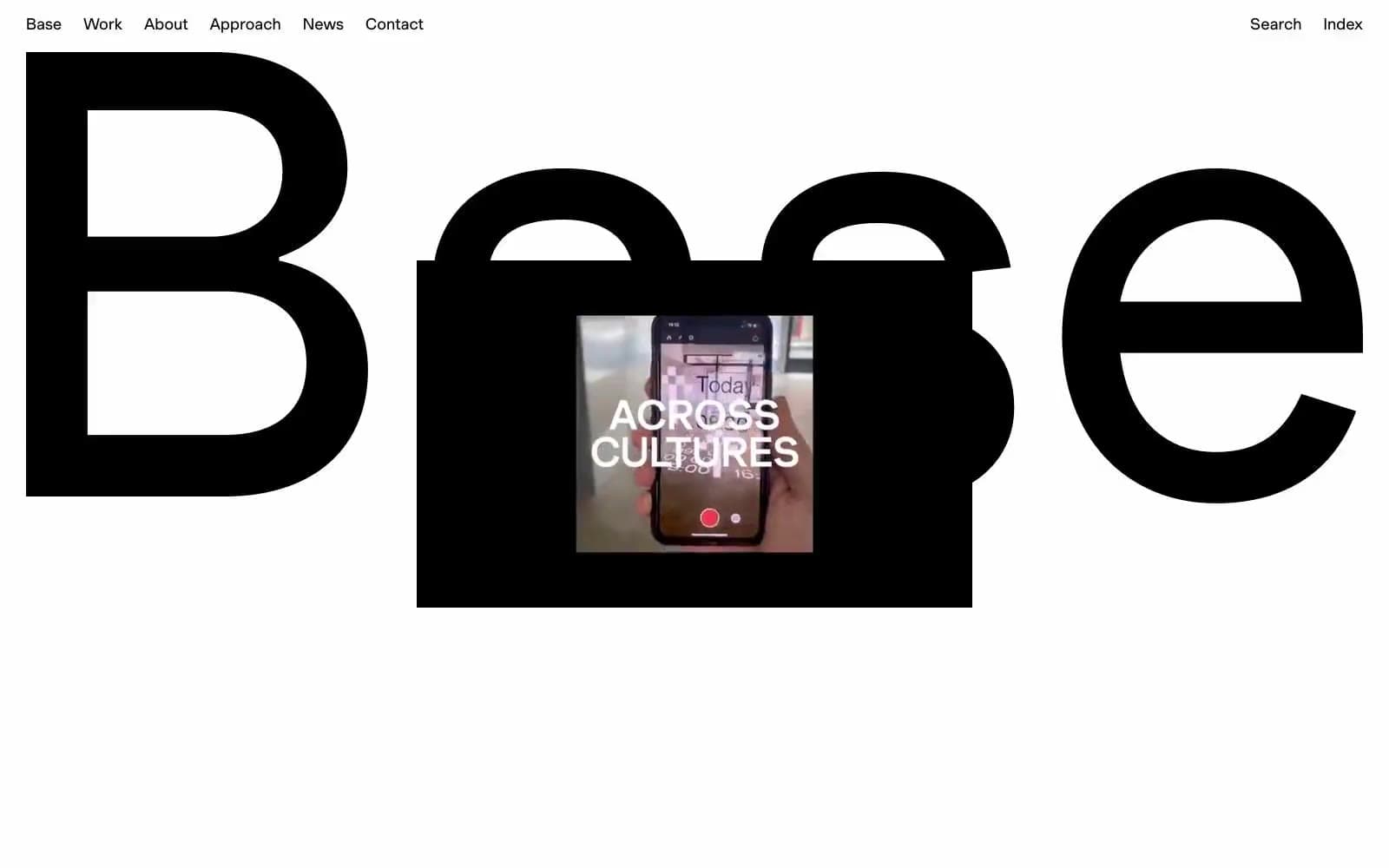
Base Design
Studio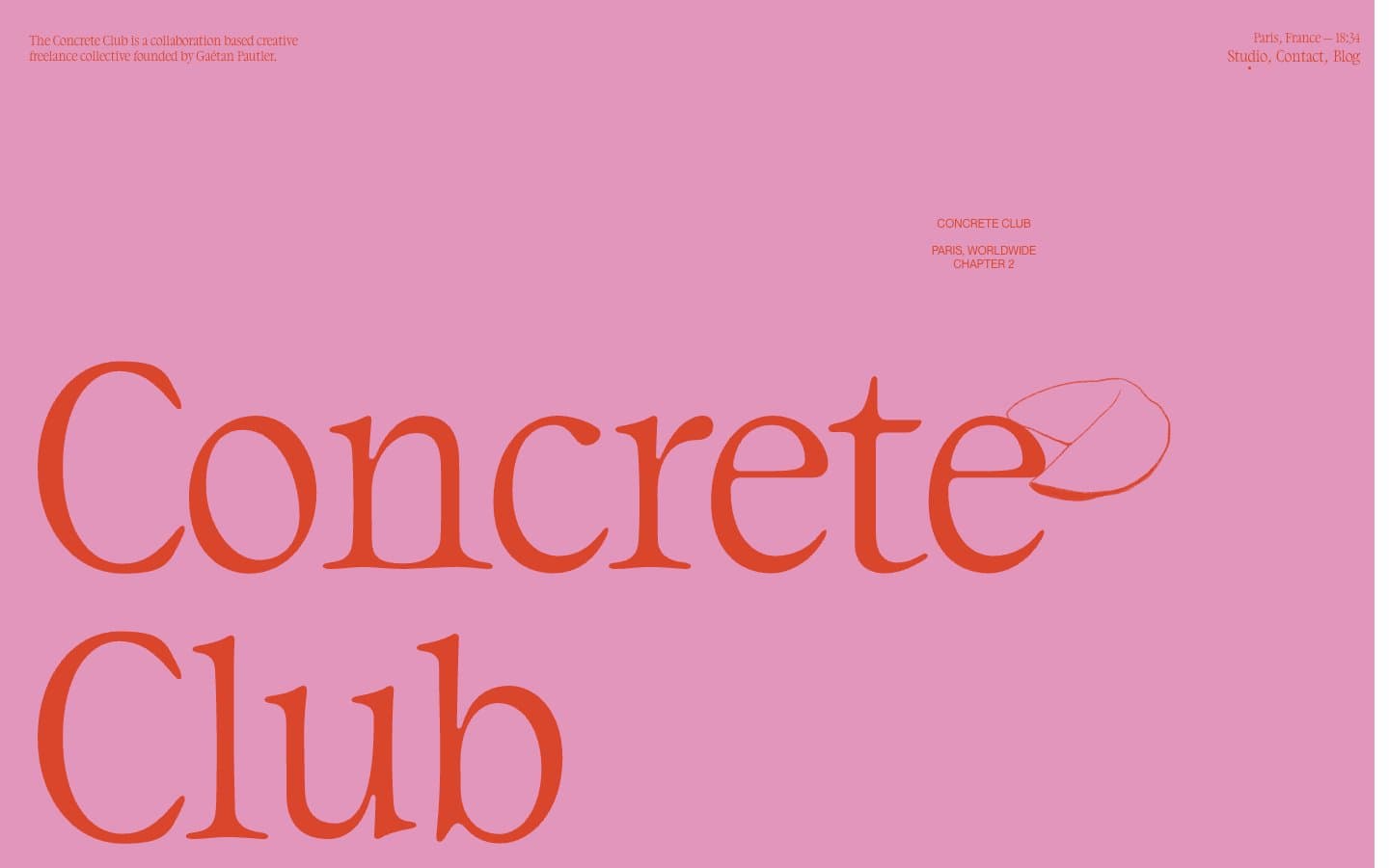
Concrete Club Studio
Studio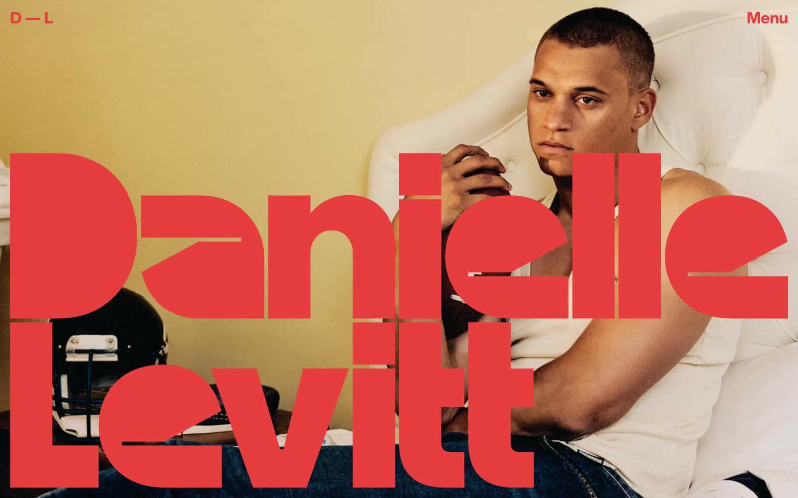
Daniellelevitt
Studio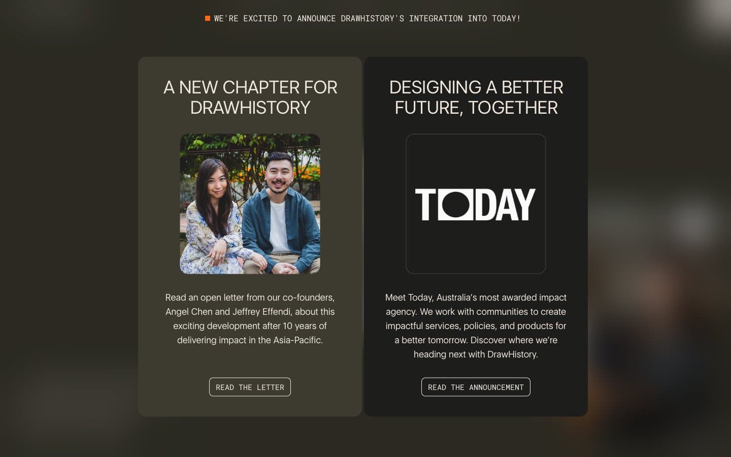
DrawHistory
Studio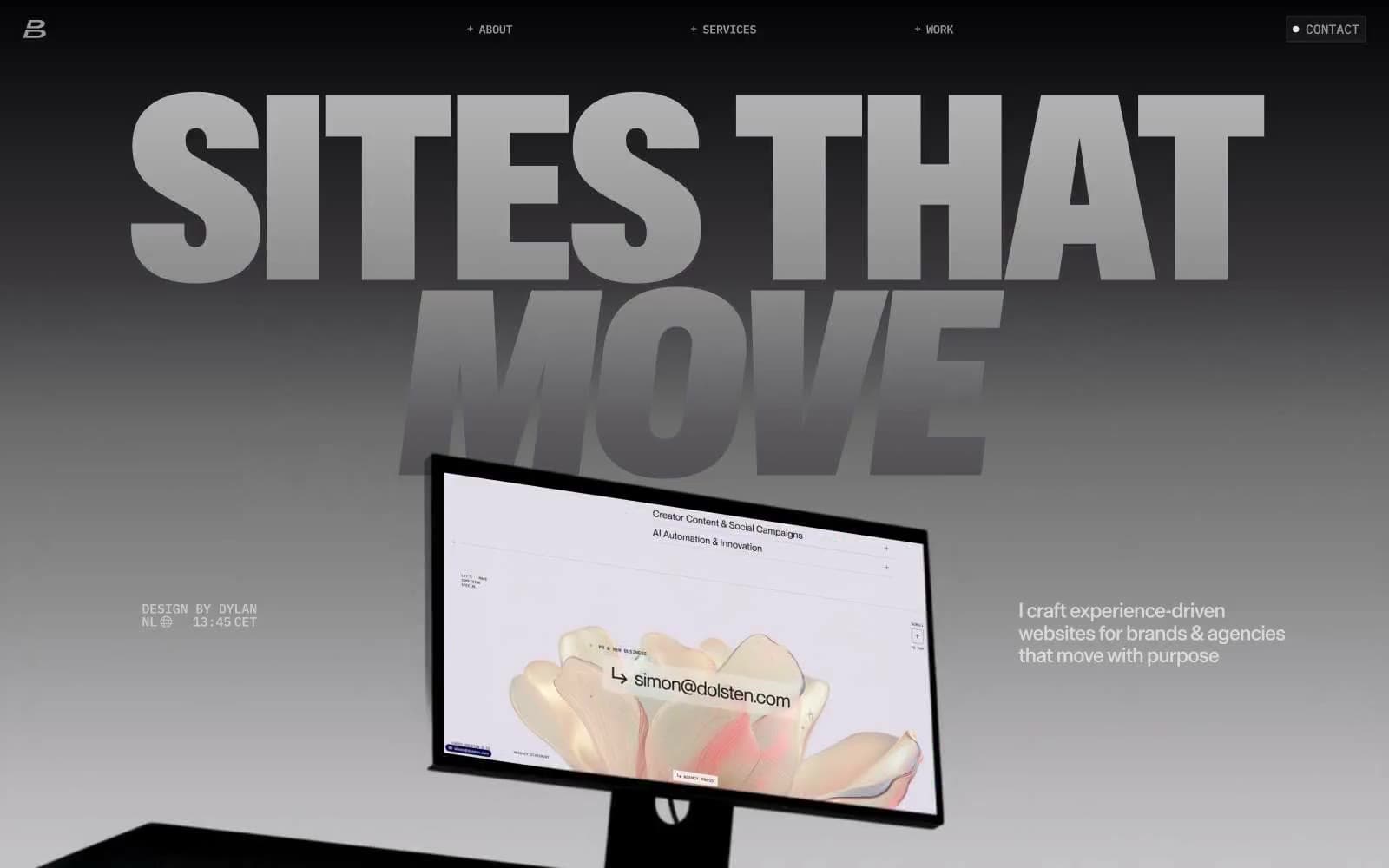
Dylanbrouwer
Studio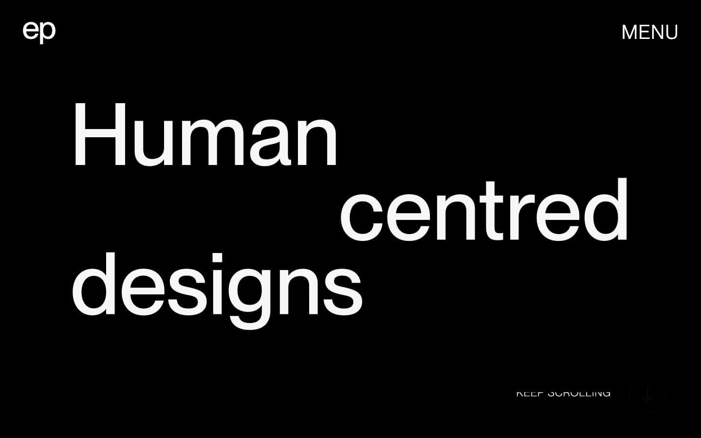
Elvina Prasad
Studio
Freytag Anderson
Studio
Henry
Studio
Maëlan Le Meur
Studio
NCDA
Studio


