
Maëlan Le Meur. A portfolio printed on bone-colored paper with ink-black display type and deep umber chapter breaks.
- Studio
- Mixed theme
- 5 colors
- 1 typeface
Maëlan Le Meur is an editorial portfolio rendered in the voice of a printed art book: a warm parchment canvas (#eee9cc) carrying the entire interface, with deep tobacco and near-black blocks used as chapter dividers rather than chrome. Typography is a single weight — PP Neue Montreal 400 — stretched across an extreme scale that goes from 15px captions to 317px display words, creating hierarchy through size and whitespace alone rather than weight shifts or color emphasis. There are no buttons, no cards with shadows, no rounded containers in the conventional sense; the only radius that exists in the system is 40px, applied to link affordances. Every surface is a full-bleed band, every section is a typographic statement, and the whole composition reads like a gallery wall — confident, quiet, and unhurried.
Maëlan Le Meur design system

Brand1
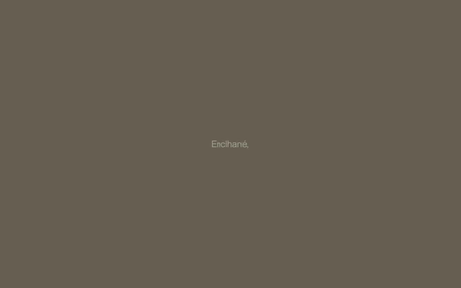
Chapter-break sections and featured band backgrounds — rich warm umber that anchors the page's heaviest typographic moments
Neutrals4
Primary text and hairline rules — the deepest tone for body copy, headings, table content, and footer dividers
Full-bleed dark sections and navigation background — the near-black that creates the page's dramatic section breaks
Secondary surface and muted text — slightly deeper parchment for sub-surfaces, helper text, and table headers
Primary canvas and card surface — the warm bone tone that carries all body content, tables, and quiet sections
Try a pairing
Pick any two colors from the palette to check whether text stays readable on top.
Aa
Parchment on Tobacco Brown
6.78 : 1 contrast
- Body textPasses AA 4.5
- Large textPasses AA 3
- StrictFails AAA 7
More DESIGN.md files. Same web, different personalities.

Cuberto
Studio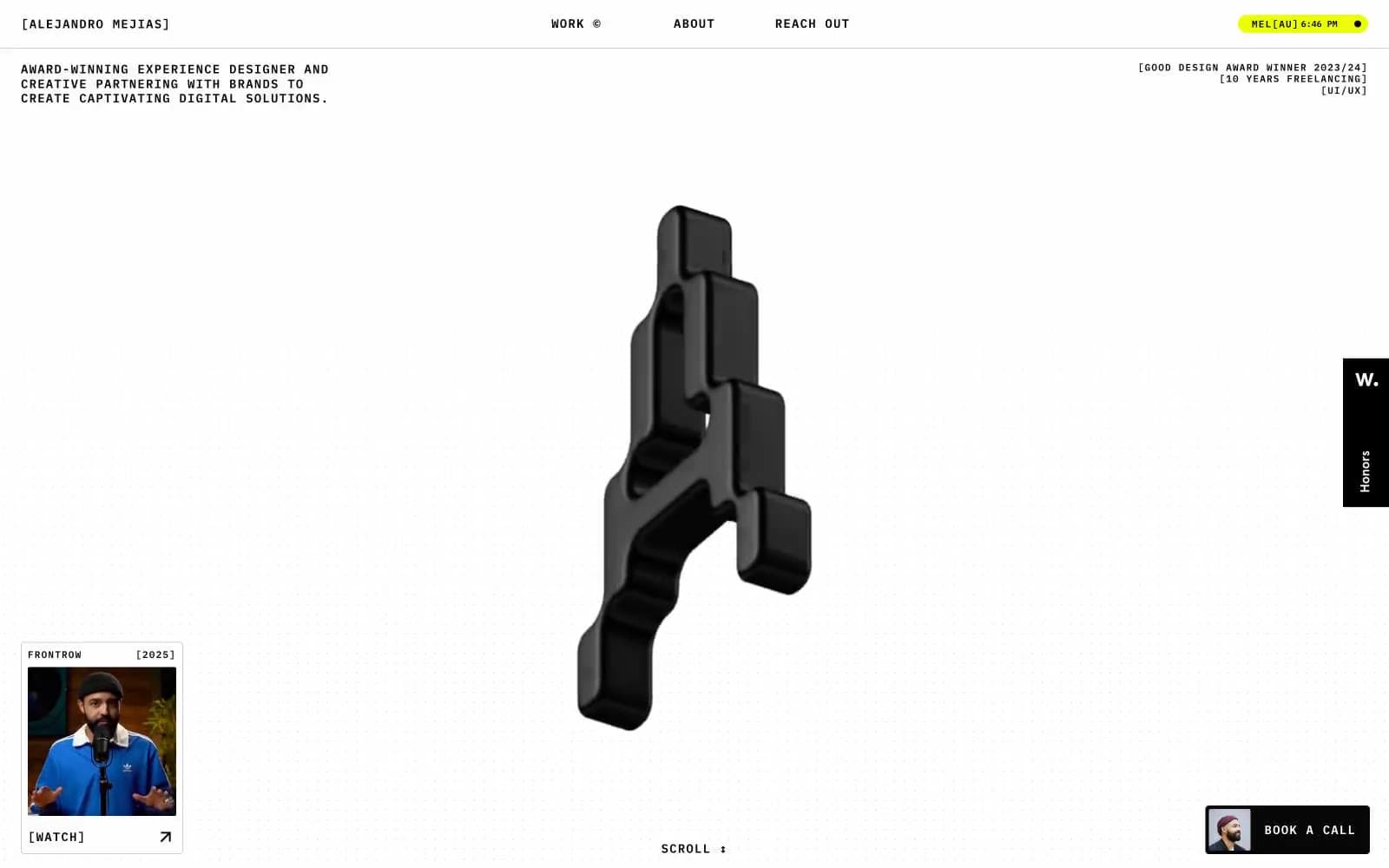
Alejandro Mejias
Studio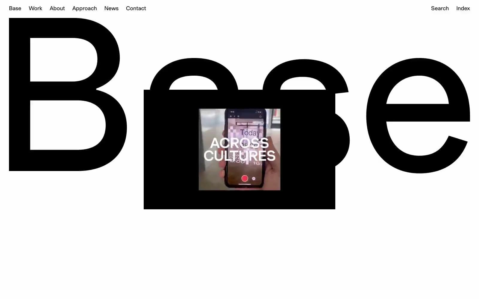
Base Design
Studio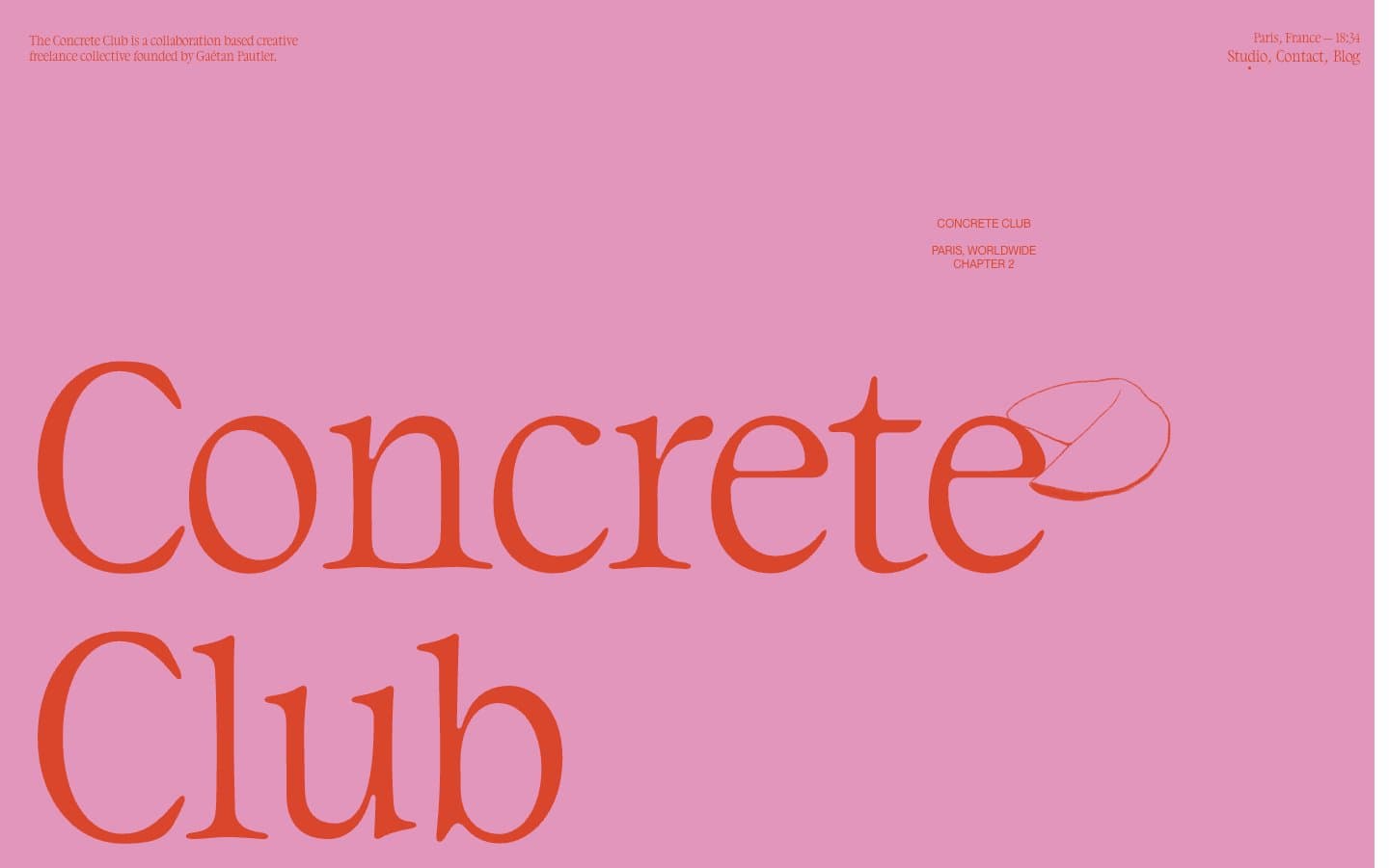
Concrete Club Studio
Studio
Daniellelevitt
Studio
DrawHistory
Studio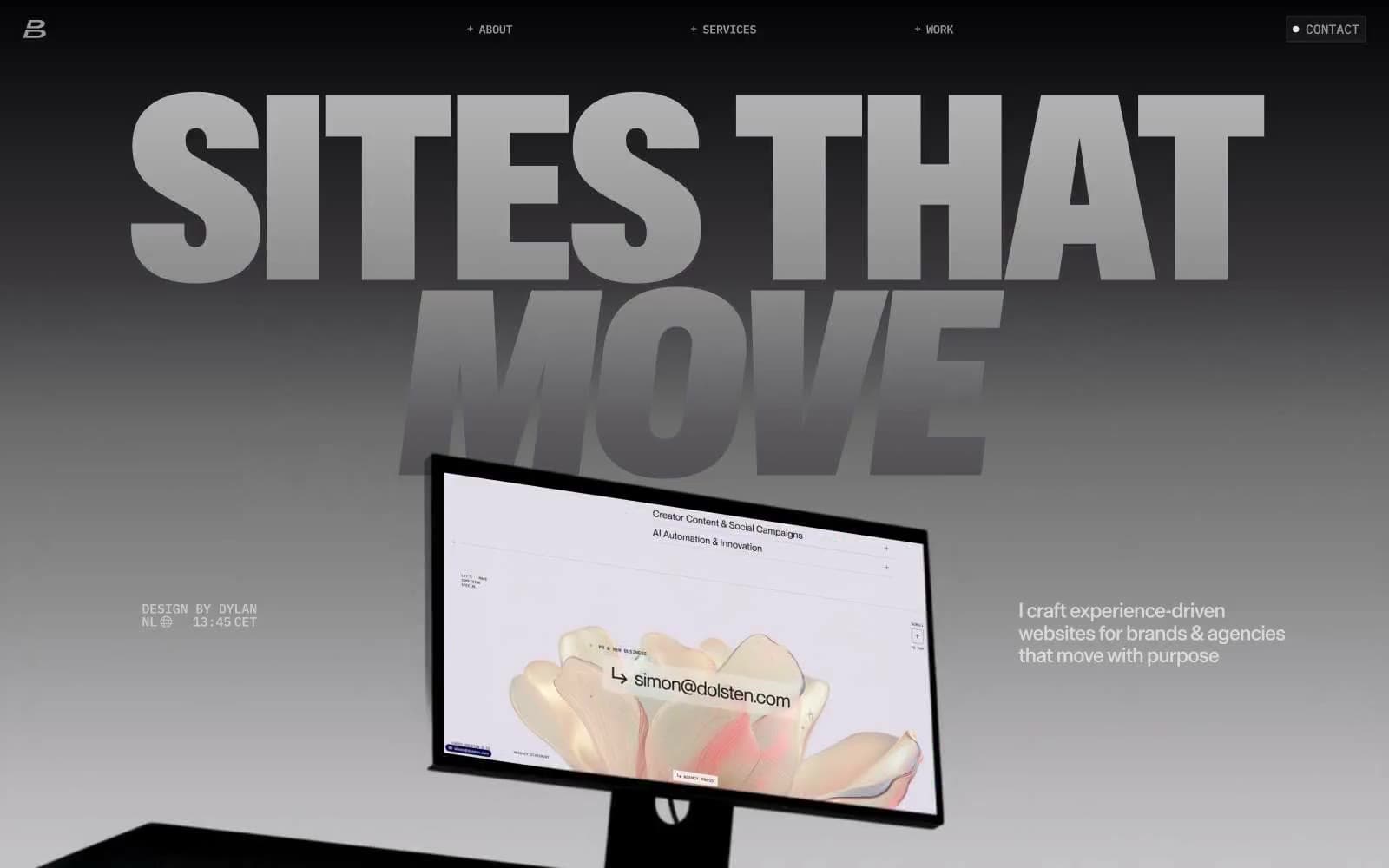
Dylanbrouwer
Studio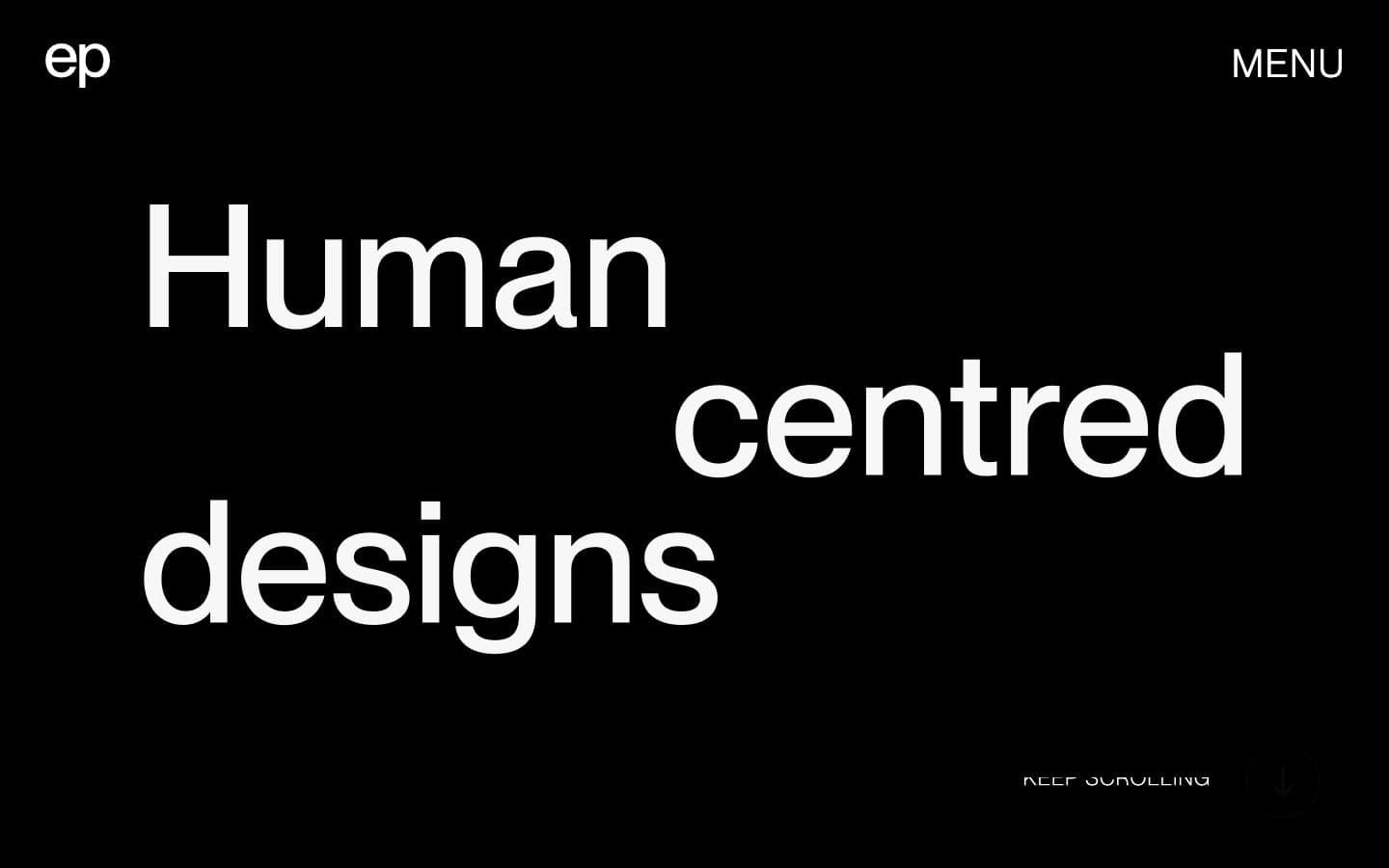
Elvina Prasad
Studio
Freytag Anderson
Studio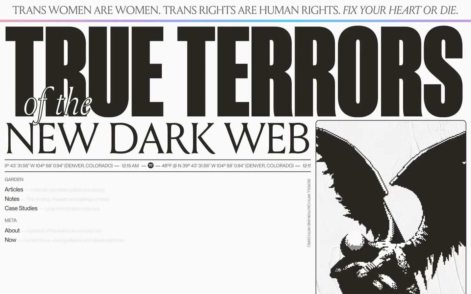
Henry
Studio
Hyper Tria
Studio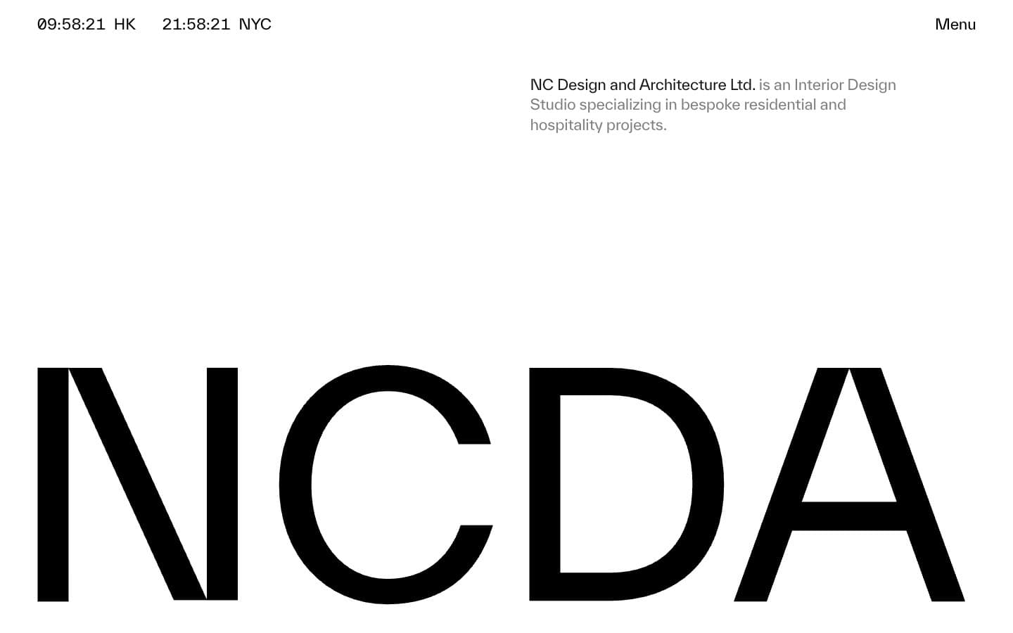
NCDA
Studio


