
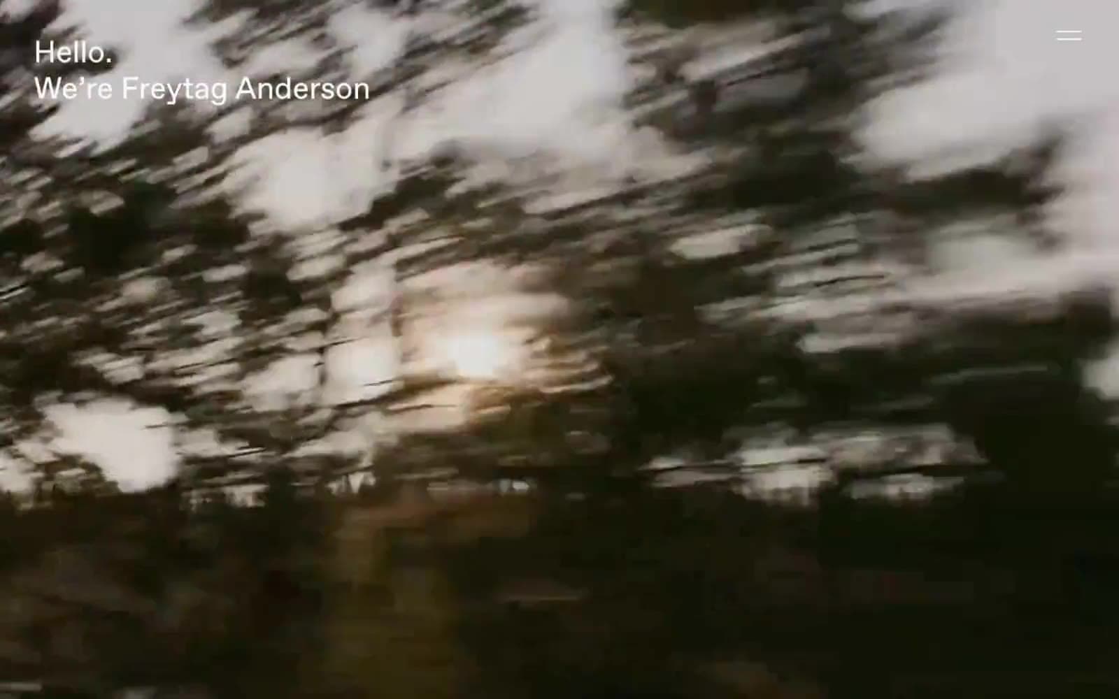
Freytag Anderson. Cinema curtain rising on a single word.
- Studio
- Mixed theme
- 6 colors
- 3 typefaces
Freytag Anderson operates as a cinematic portfolio: full-bleed atmospheric photography carries the entire visual weight while typography recedes to a whisper. The site is almost entirely achromatic — an off-white canvas (#fafafa), pure black ink, and a single warm-charcoal section that reads like a film intermission. FAVORIT, a single grotesque sans-serif, is the only voice, used identically for headlines, body, and UI; weight shifts and tracking do all the work of hierarchy. Text consistently anchors to the top-left viewport corner over imagery, and a single hamburger line replaces conventional navigation. Components are reduced to their minimum: pill-shaped ghost controls with hairline borders, no card surfaces, no shadows, no gradients. The impression is of a film opening — image, title, silence — rather than a product surface.
Freytag Anderson design system

Neutrals6
Primary text, hairline borders, link underlines — the only chromatic accent in the system is its absence of color
Deepest dark surface, used for the most recessed bands — barely distinguishable from charcoal but warmer
Dark content surface for text-only sections — warm-leaning black that softens contrast against pure ink
Warm taupe accent surface, used sparingly as a tonal break in dark sections — the only non-achromatic hint in the palette
Hairline borders, disabled borders, subtle dividers — a neutral gray that whispers structure without drawing the eye
Page canvas, base surface behind text — off-white, never pure white, to soften photographic edges
Try a pairing
Pick any two colors from the palette to check whether text stays readable on top.
Aa
Paper on Ink
20.12 : 1 contrast
- Body textPasses AA 4.5
- Large textPasses AA 3
- StrictPasses AAA 7
More DESIGN.md files. Same web, different personalities.

Cuberto
Studio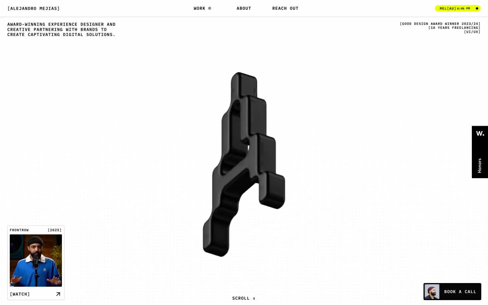
Alejandro Mejias
Studio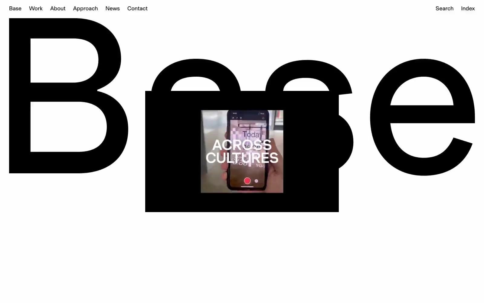
Base Design
Studio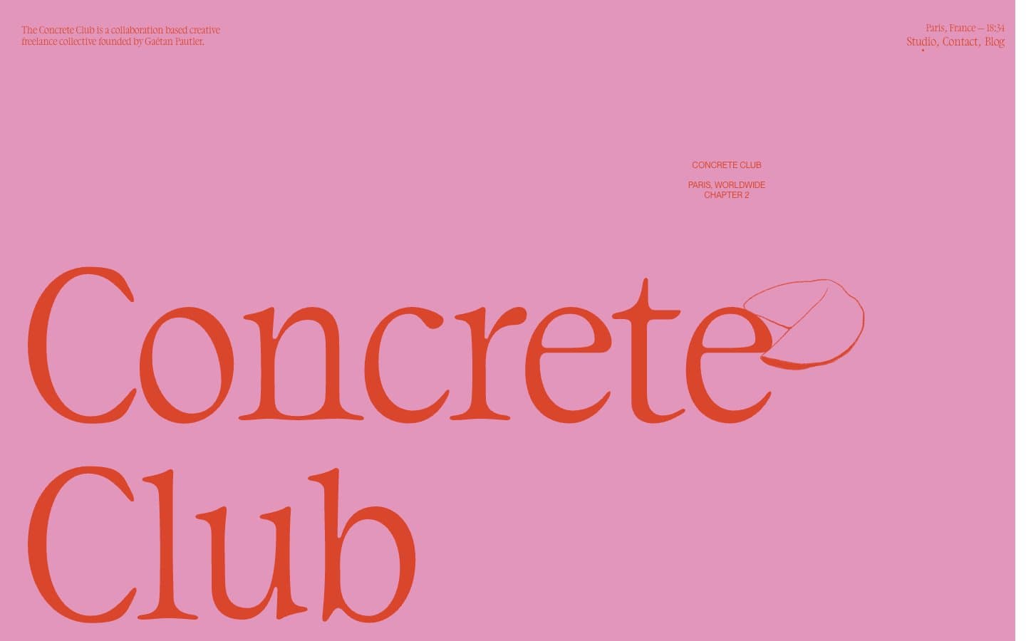
Concrete Club Studio
Studio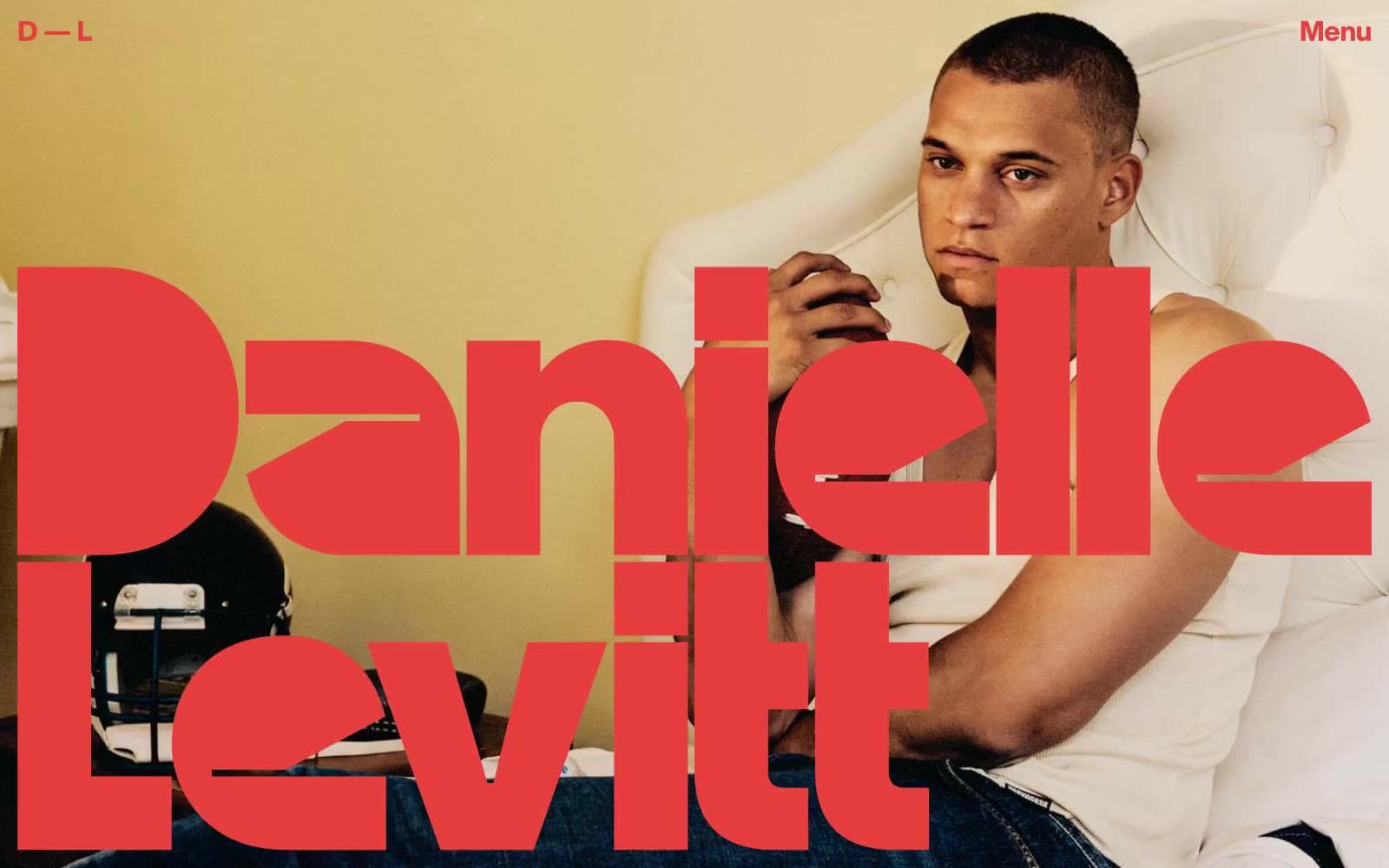
Daniellelevitt
Studio
DrawHistory
Studio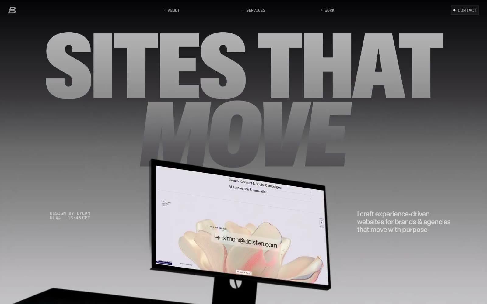
Dylanbrouwer
Studio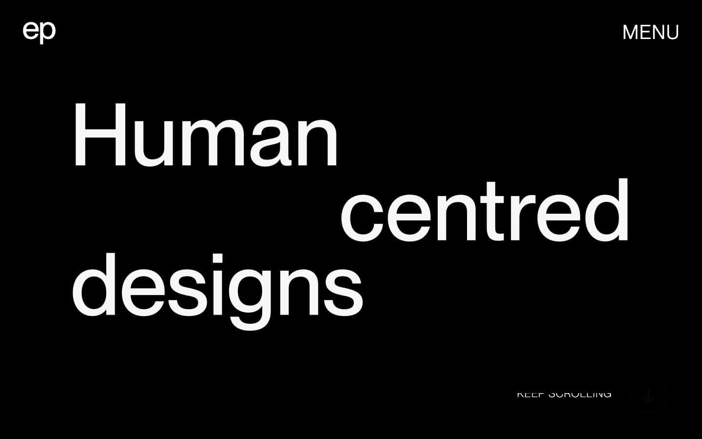
Elvina Prasad
Studio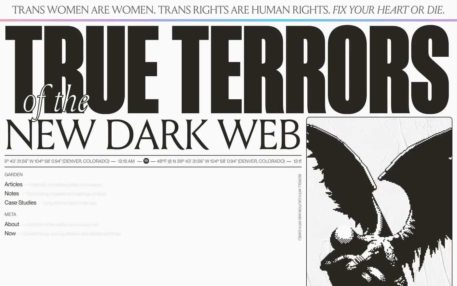
Henry
Studio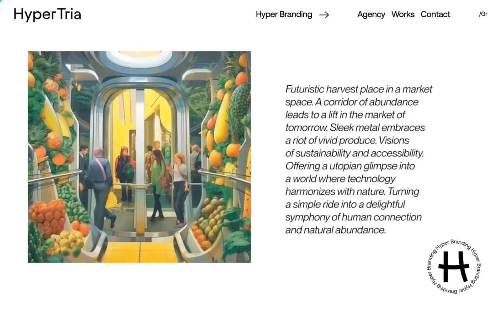
Hyper Tria
Studio
Maëlan Le Meur
Studio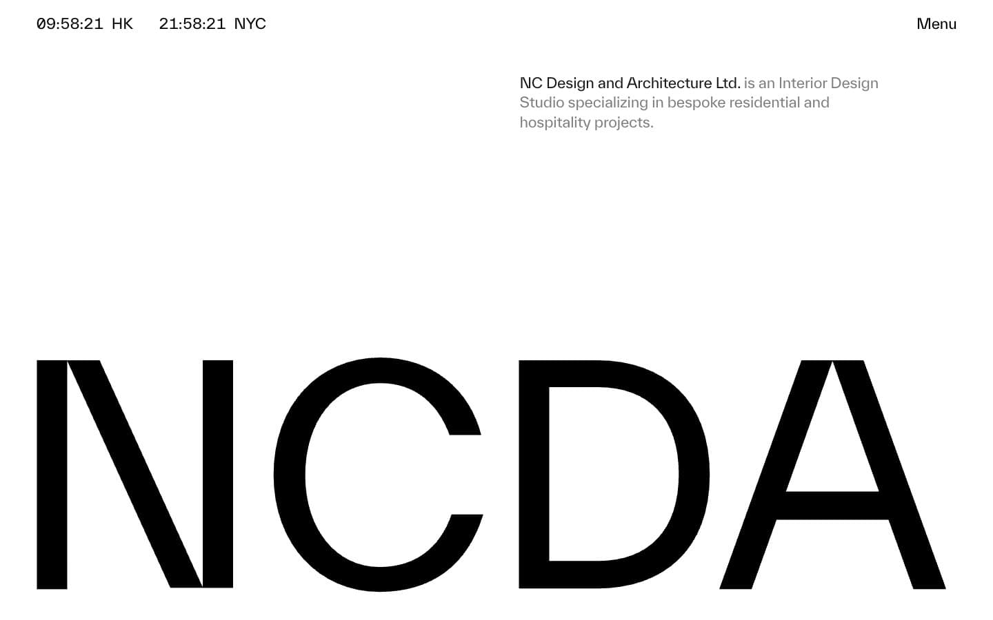
NCDA
Studio


