
Daniellelevitt. A flat acid-mint field cracked open by a slab of vermillion condensed type the size of a car door.
- Studio
- Mixed theme
- 4 colors
- 2 typefaces
Danielle Levitt's portfolio operates as an oversized editorial broadsheet: white and acid-mint canvases carry massive condensed display type in #d15022 vermillion that functions as both content and architecture. The visual system is brutally limited — burnt orange, mint green, black, and white are the only colors, and the type weights are uniformly 800, creating a single gravitational pull across every page. Photography is arranged in deliberate asymmetric collages that sit on, over, or through the type — never in uniform grids or tidy cards. The aesthetic is punk-poster meets fashion editorial: type screams, layouts breathe, and the UI chrome is reduced to two words — 'D — L' and 'Menu' — with the display lettering itself acting as the page structure.
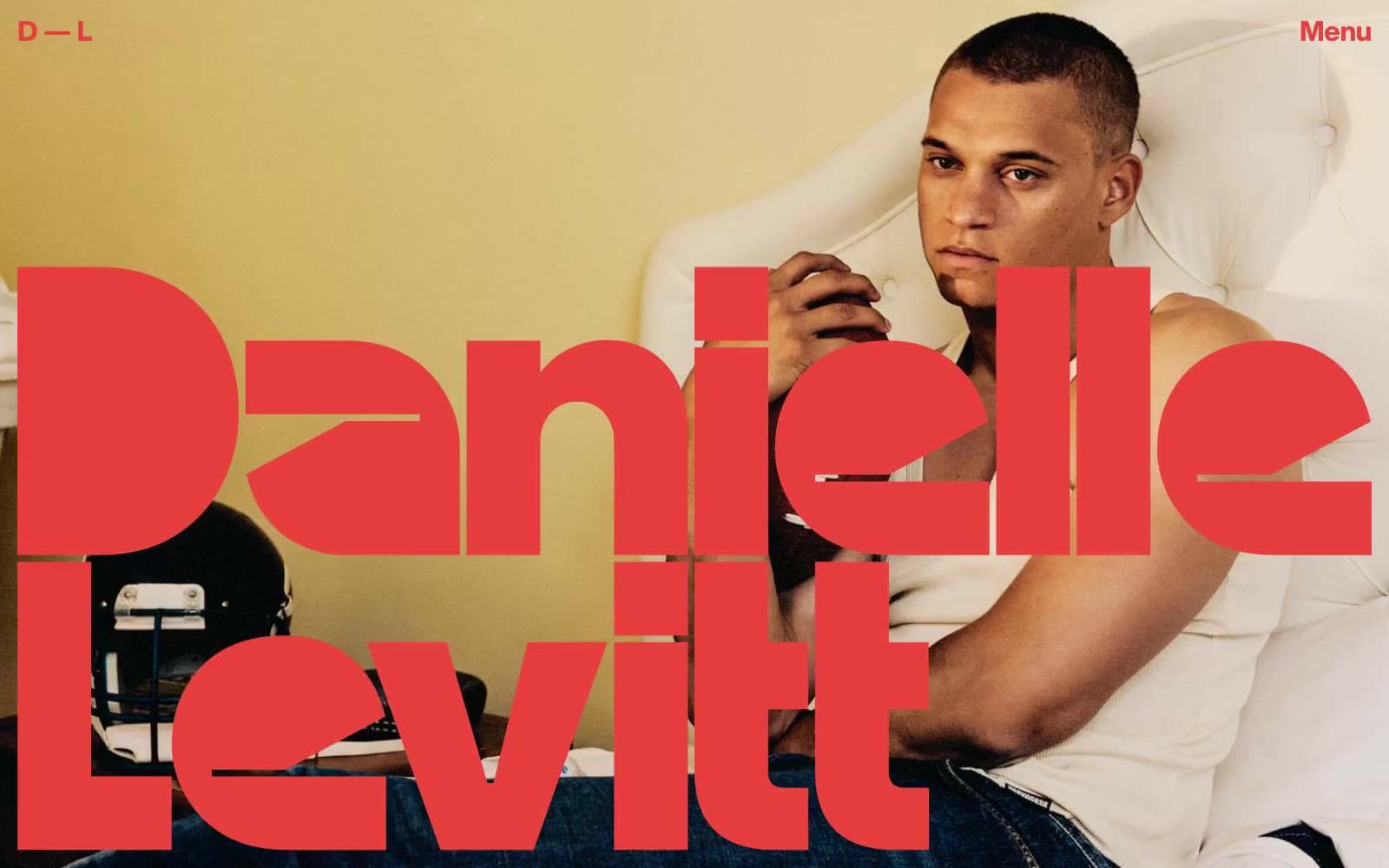
Daniellelevitt design system

Brand2
Display type, navigation, outlined action borders, section headings — burnt orange against white and mint creates the system's only chromatic voice; it carries every heading, every link, and the massive name lockup
Green action color for filled buttons, selected navigation states, and focused conversion moments
Neutrals2
Image borders, hairline dividers, secondary borders, and body-text outlines where Vermillion isn't used — the structural ink that frames every photograph
Primary canvas behind image collages and the opening viewport — flat, untextured, the gallery wall on which the photographs are pinned
Try a pairing
Pick any two colors from the palette to check whether text stays readable on top.
Aa
Pure Black on Vermillion
4.88 : 1 contrast
- Body textPasses AA 4.5
- Large textPasses AA 3
- StrictFails AAA 7
More DESIGN.md files. Same web, different personalities.

Cuberto
Studio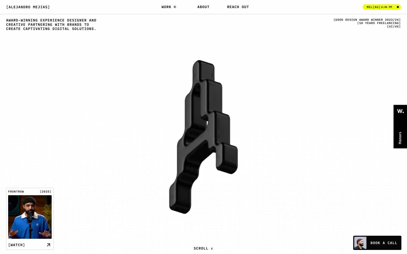
Alejandro Mejias
Studio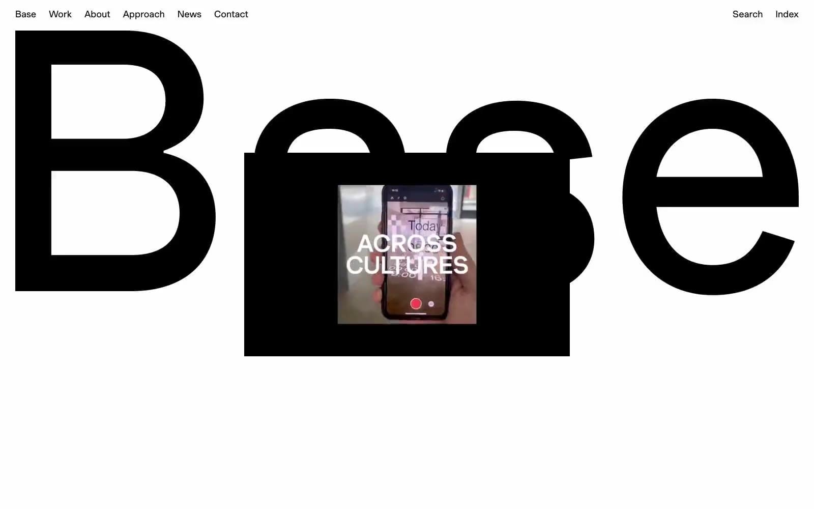
Base Design
Studio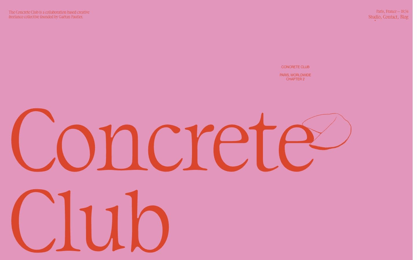
Concrete Club Studio
Studio
DrawHistory
Studio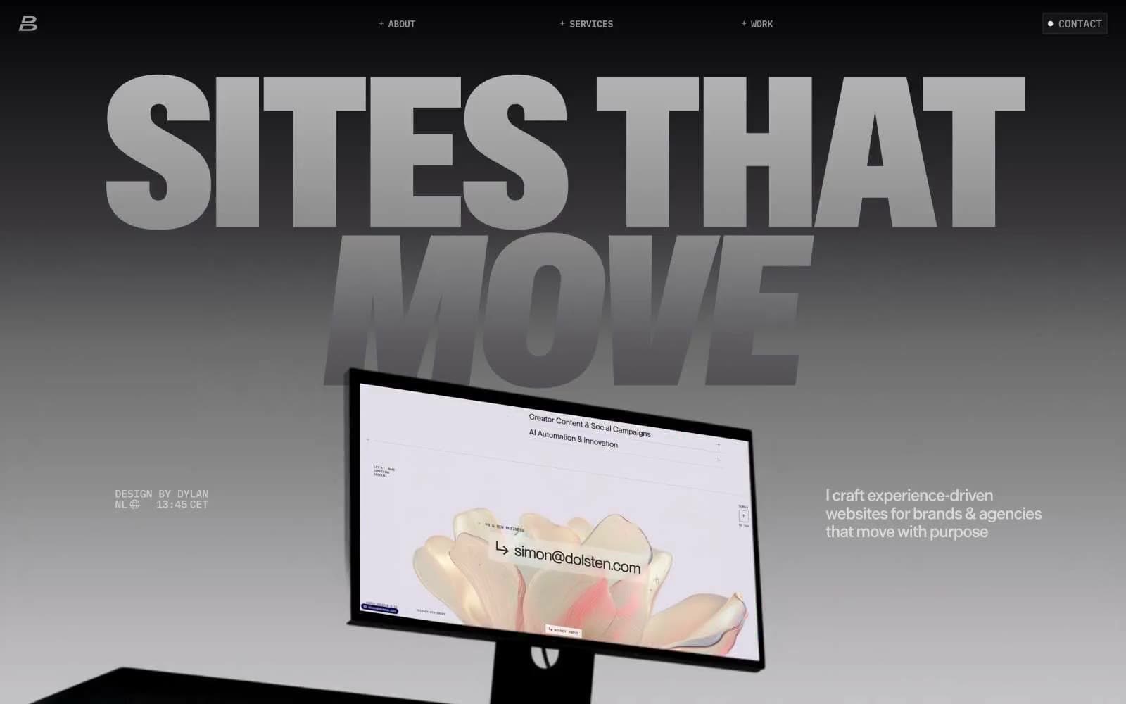
Dylanbrouwer
Studio
Elvina Prasad
Studio
Freytag Anderson
Studio
Henry
Studio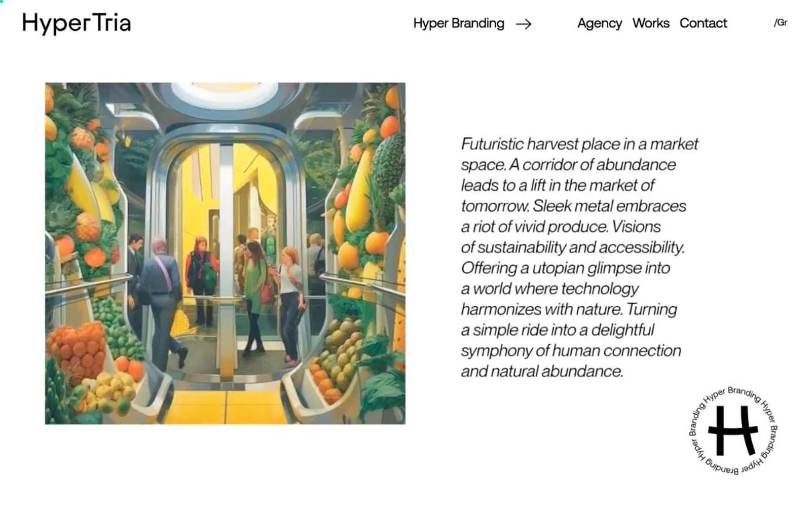
Hyper Tria
Studio
Maëlan Le Meur
Studio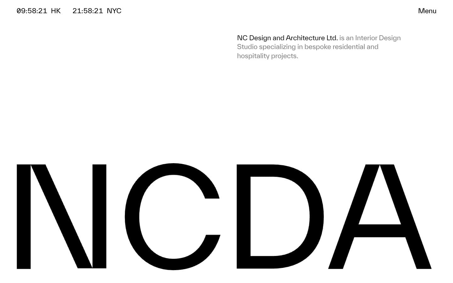
NCDA
Studio


