
DrawHistory. Warm gallery wall behind charcoal display panels.
- Studio
- Mixed theme
- 9 colors
- 2 typefaces
DrawHistory presents a muted editorial language: warm parchment canvas framed by charcoal display panels, like an exhibition catalog spread open on a gallery table. The system is overwhelmingly achromatic — near-black, warm off-white, and a dusty olive-charcoal — with a single saffron dot used as the only chromatic punctuation. Typography carries the entire personality: Eloquia Text at weight 300 in uppercase, aggressively tracked negative, creates the hushed, architectural tone of a museum wall label. Components are flat, borderless except for hairline outlines on ghost controls, and rely on surface-tone shifts rather than shadows to establish hierarchy. Density is spacious; whitespace does the structural work that borders and elevation do in more conventional systems.
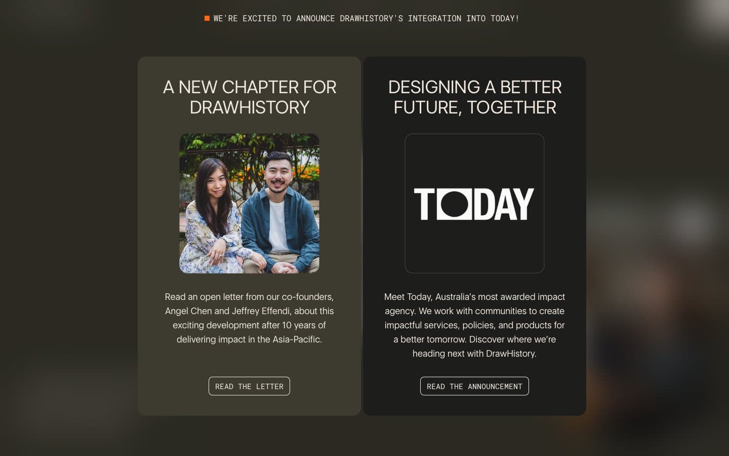
DrawHistory design system

Brand2
Warm editorial panel surface (left card) and primary action background — a dusty olive-black that distinguishes DrawHistory's signature dark from generic #111
Deep display panel surface (right card) and button background — the second editorial tone, slightly cooler and deeper than Olive Charcoal
Accent1
Sole chromatic accent — announcement indicators and small functional punctuation only. Never used for fills, buttons, or large areas
Neutrals6
Primary text, icon strokes, and the darkest borders on light surfaces
Secondary borders and muted structural lines where Ash is too present
Input borders and disabled-state surfaces
Hairline borders, dividers, subtle surface separators — the workhorse neutral that defines the 1px structural rhythm across the page
Page canvas, body text on dark panels — a warm desaturated cream that makes the dark editorial cards feel inset rather than overlaid
Reverse text on dark panels, card surfaces, and icon fills on dark backgrounds
Try a pairing
Pick any two colors from the palette to check whether text stays readable on top.
Aa
Bone on Olive Charcoal
11.26 : 1 contrast
- Body textPasses AA 4.5
- Large textPasses AA 3
- StrictPasses AAA 7
More DESIGN.md files. Same web, different personalities.

Cuberto
Studio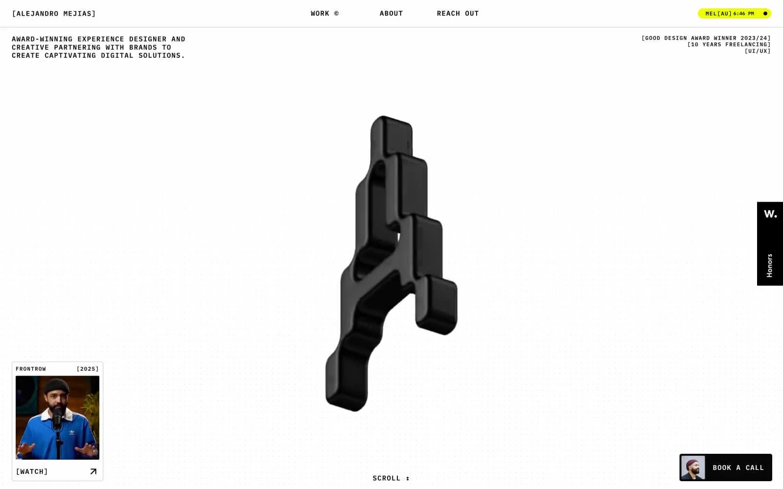
Alejandro Mejias
Studio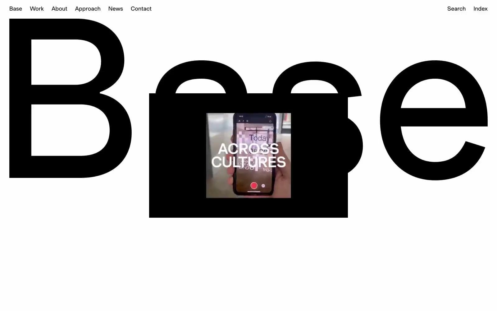
Base Design
Studio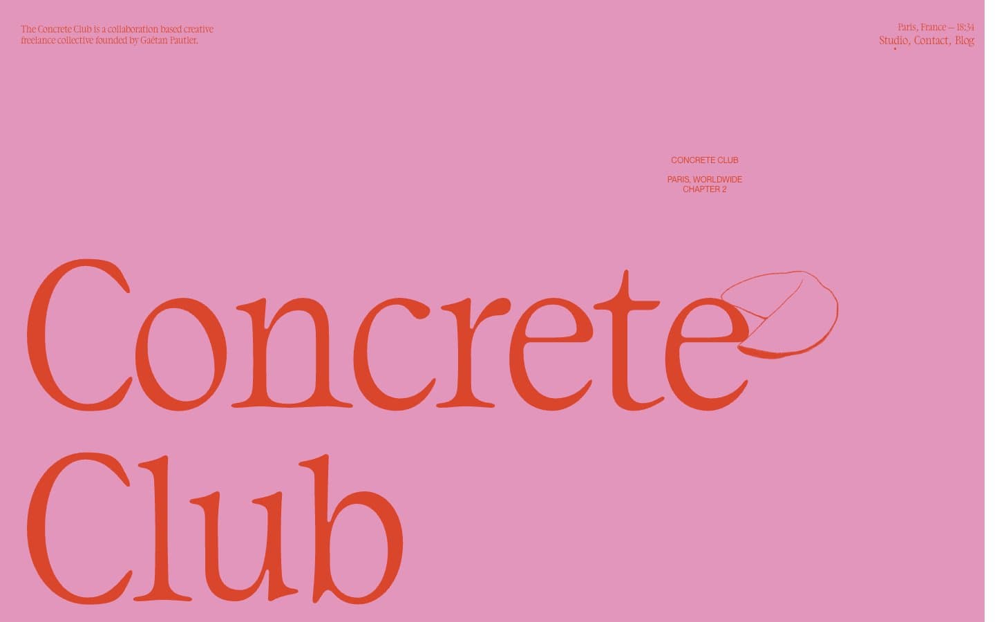
Concrete Club Studio
Studio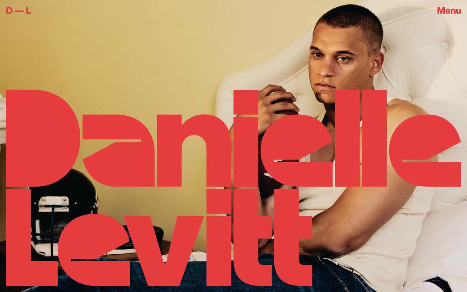
Daniellelevitt
Studio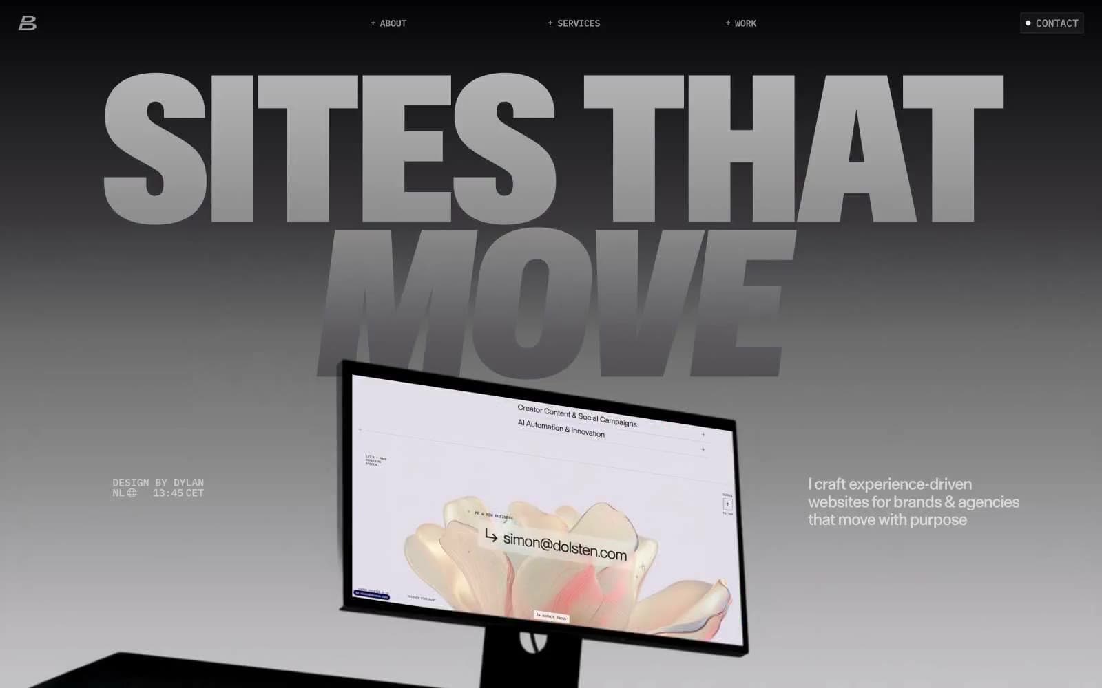
Dylanbrouwer
Studio
Elvina Prasad
Studio
Freytag Anderson
Studio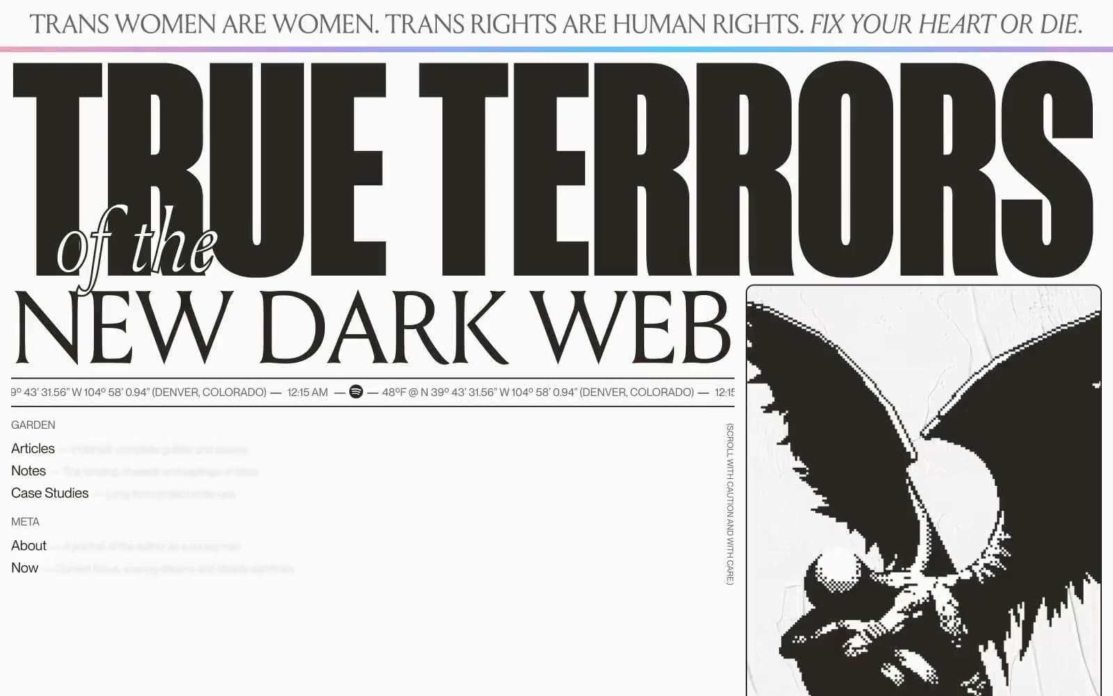
Henry
Studio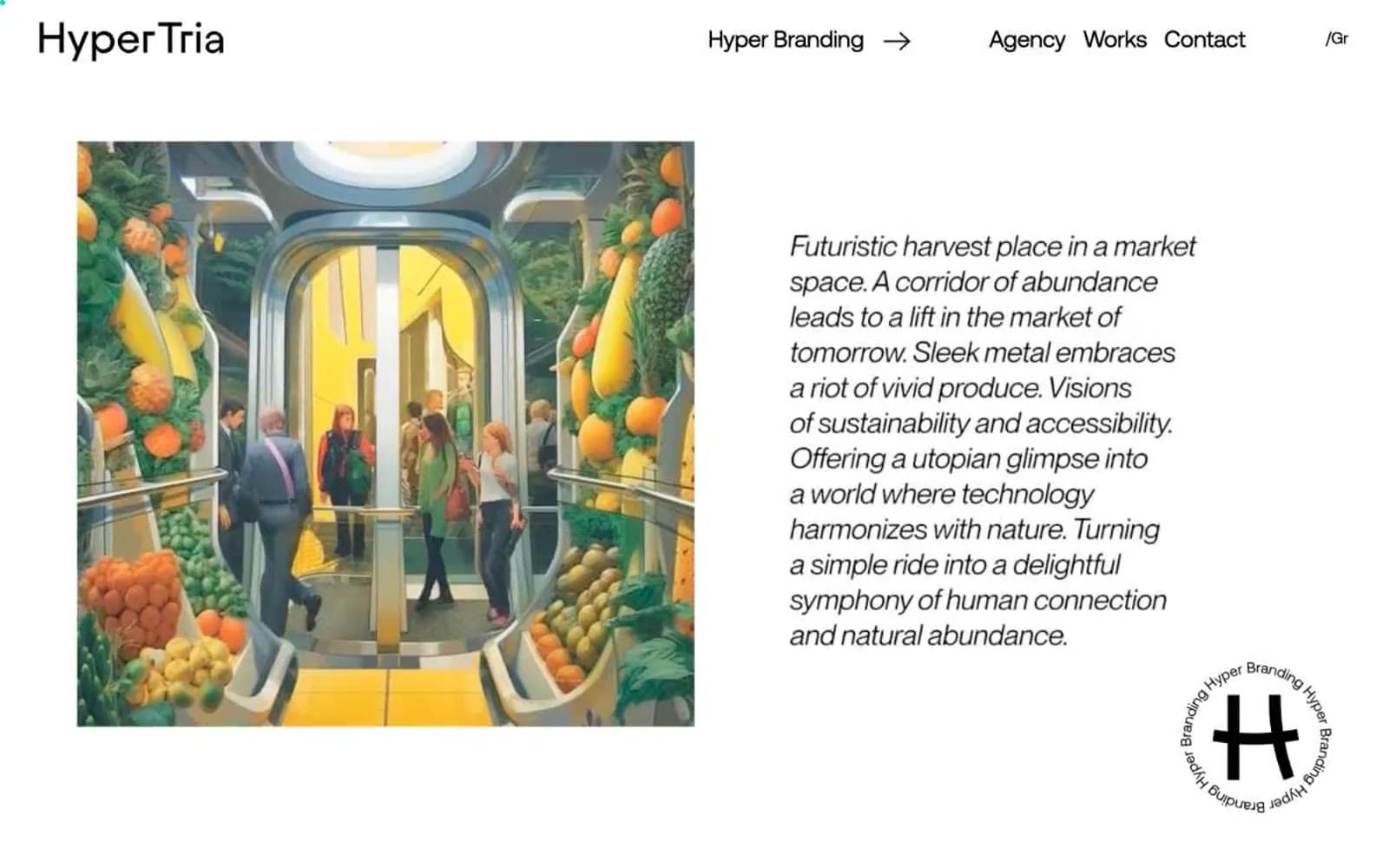
Hyper Tria
Studio
Maëlan Le Meur
Studio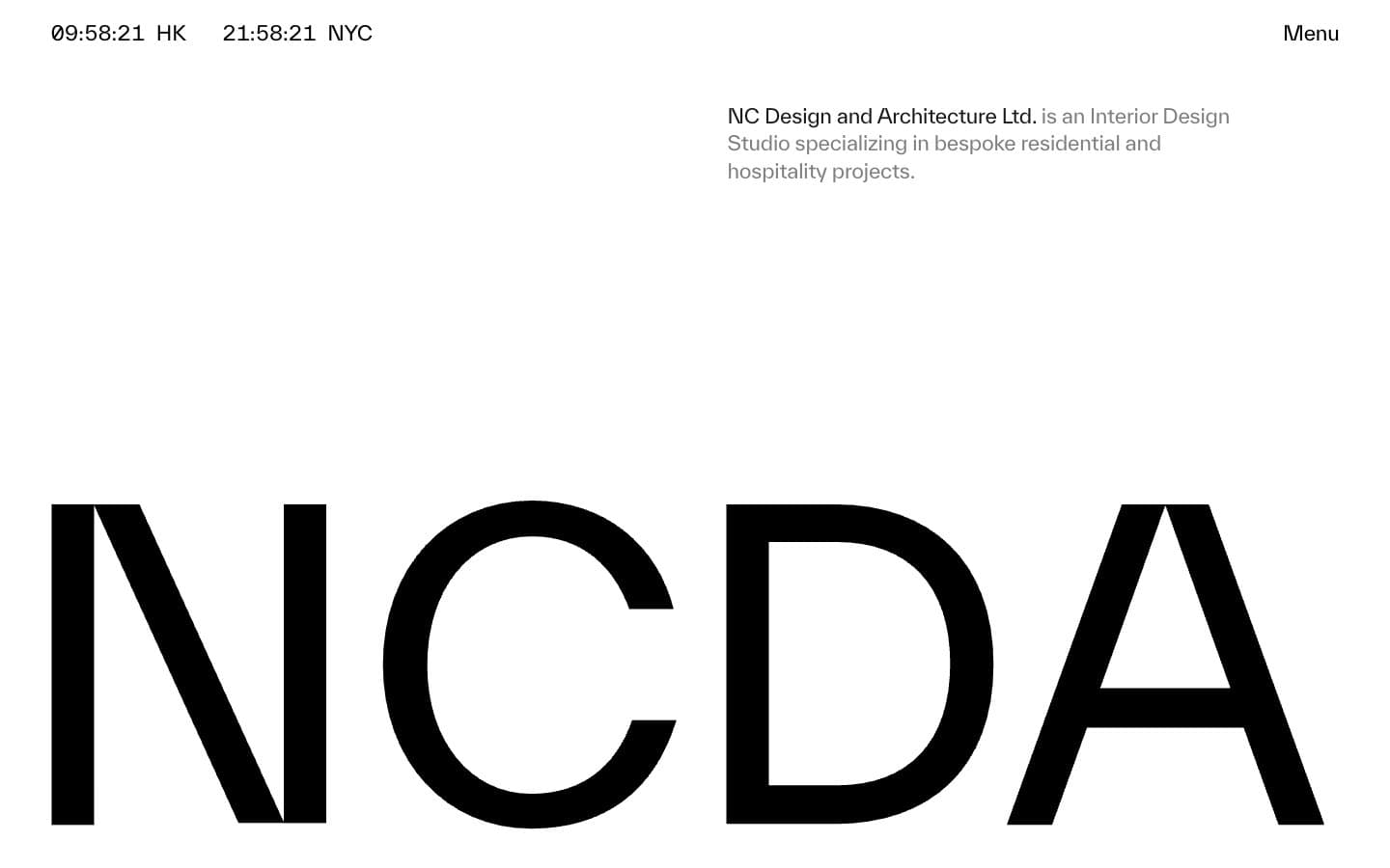
NCDA
Studio


