
Timescale. Engineering blueprint on warm graph paper.
- Developer tools
- Light theme
- 7 colors
- 3 typefaces
Timescale speaks the language of infrastructure diagrams: a warm off-white canvas with subtle grid texture, bold orange statement type that functions as a visual highlighter, and monospace numerals that feel like terminal readouts. The palette is almost entirely achromatic with exactly two chromatic punctuation marks — vivid orange for voice and chartreuse for spotlight — so color always carries intent rather than decoration. Typography is structural and dual: Geist handles interface voice while Geist Mono handles numbers, codes, and emphasis, creating a constant productive tension between the conversational and the computational. The neo-brutalist hard offset shadow (5px 5px 0px solid black) on cards and the pill-shaped CTAs give the system a tactile, blueprint-on-graph-paper quality — engineered, not decorated.
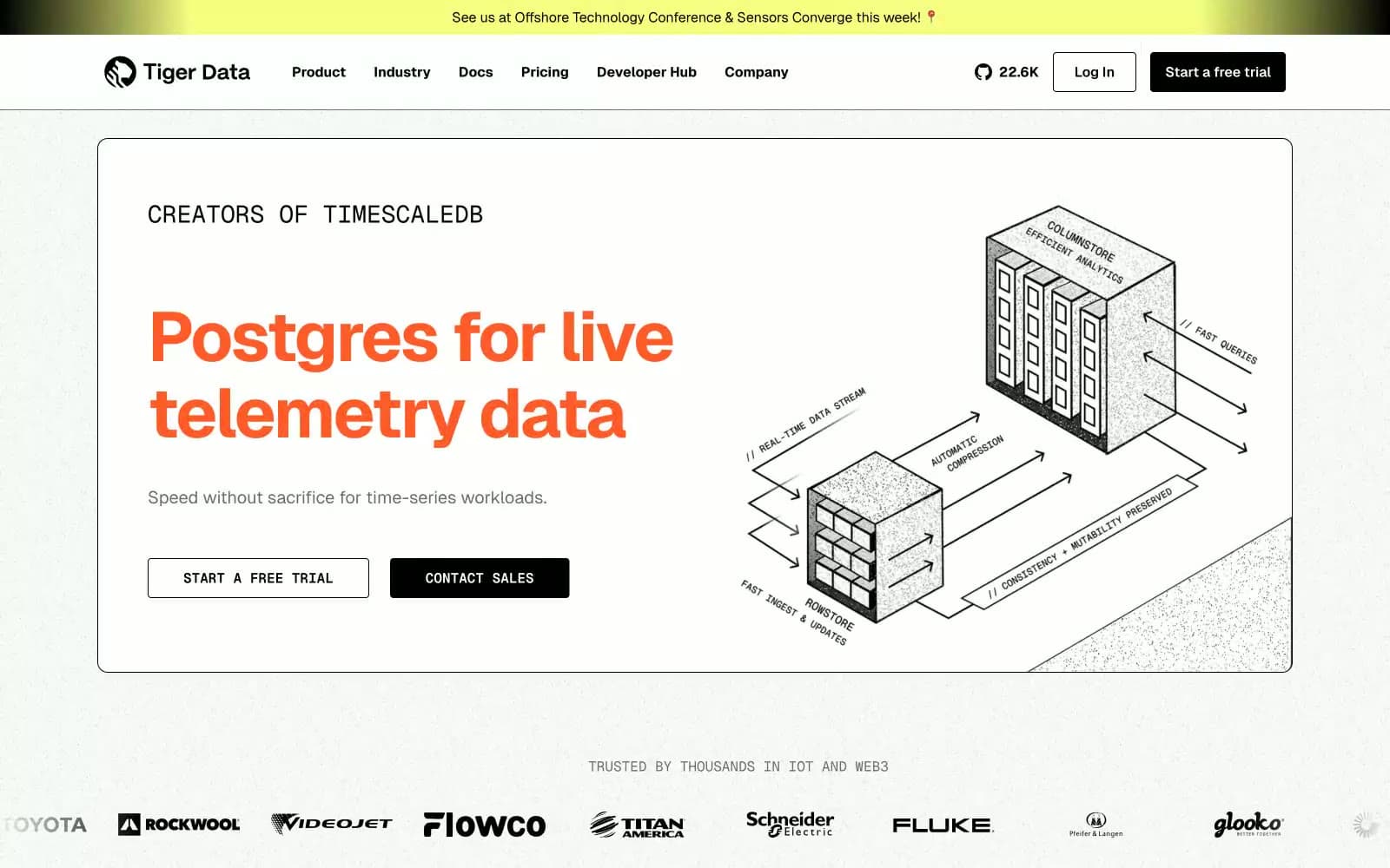
Timescale design system

Brand1
Headline accent, large stat numerals, emphasis spans, decorative borders — the only color with voice, used to make key phrases feel switched on against the monochrome canvas
Accent1
Announcement bars, highlighted callout blocks, featured chip backgrounds — acts as a spotlight wash, never a CTA fill, drawing the eye to time-sensitive or notable content
Neutrals5
Primary text, filled button backgrounds, hairline borders, hard offset shadows, icon strokes — the dominant structural color, used at scale for borders and dividers
Dark surface variant for inverted sections and elevated panels — a softer black for areas that need depth without going fully dark
Secondary text, subdued labels, muted helper copy, and shadow tints — the first step down from black when text needs to recede
Tertiary text, disabled states, placeholder copy, very light dividers — the lightest functional gray before content disappears entirely
Page canvas, card surfaces, button text on dark fills — warm off-white, never pure #fff, giving the whole system a printed-paper warmth
Try a pairing
Pick any two colors from the palette to check whether text stays readable on top.
Aa
Carbon Black on Signal Orange
6.78 : 1 contrast
- Body textPasses AA 4.5
- Large textPasses AA 3
- StrictFails AAA 7
More DESIGN.md files. Same web, different personalities.

Tailwind CSS
Developer tools
Atoms
Developer tools
Browserbase
Developer tools
Cursor
Developer tools
Deno
Developer tools
Drizzle ORM
Developer tools
Earlydog
Developer tools
Expo
Developer tools
Fingerprint
Developer tools
Flatfile
Developer tools
Flox
Developer tools
Fly.io
Developer tools


