
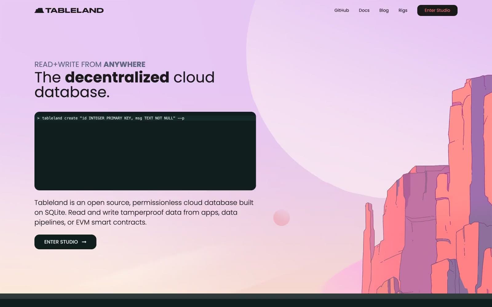
Tableland. Soft coral peaks rising over a deep green-black void with one mint-green signal light glowing on the horizon.
- Crypto
- Dark theme
- 11 colors
- 2 typefaces
Tableland operates as a dark-mode developer surface punctuated by a single painted moment: a lavender-coral hero landscape that gives way to a calm, infrastructure-feeling interior. Typography is geometric humanist (Poppins) with weight 300 doing the heavy lifting on display copy, giving headlines a quiet, engineered feel rather than a marketing punch. A muted teal (#75b6b5) carries all interactive voice — nav, icons, links, learn-more affordances — while a single vivid mint green (#0be291) is reserved exclusively for emphasized headings, creating a clear hierarchy where teal navigates and green signals the primary read. Surfaces are layered in near-black steps (page → card → elevated), with cards and buttons rounded modestly (8–16px) and never pill-shaped except for tags and icon containers. The visual signature is the contrast between the soft painterly hero and the hard-edged terminal aesthetic below it — a database that feels both approachable and uncompromising.
Tableland design system

Brand1
Teal text accent for links, tags, and emphasized short phrases. Do not promote it to the primary CTA color
Accent3
Green text accent for links, tags, and emphasized short phrases. Do not promote it to the primary CTA color
Decorative icon accent — used sparingly in nav icons and the hero illustration's mountain highlights. Warm counterpoint to the cool teal/mint palette
Hero atmosphere — the soft lavender backdrop of the hero section and mountain illustration sky. Only used in the hero band; never in component surfaces or UI chrome
Neutrals7
Page canvas and primary action background — the base layer of the dark theme and the fill of filled CTA buttons (Enter Studio, Discord). Slightly green-tinted black rather than pure neutral
Deep surface — code block backgrounds, terminal interiors, darkest elevated layers. One step below void for maximum contrast terminal aesthetic
Mid surface and hairline borders — card backgrounds, button borders, dividers. Bridges between void and the lighter elevated steps
Elevated card surface and hover-state fills — the topmost card tier, used for testimonial cards and hover backgrounds
Muted text and inactive nav icons — body helper text, inactive nav glyphs, secondary metadata. The de-emphasized reading layer
Hairline borders and dividers — the universal 1px border color used across nav, cards, icons, and structural separators. Primary border token
Primary text and icon fill — all high-emphasis body copy, headings, and filled icon shapes. The top of the text contrast scale
Try a pairing
Pick any two colors from the palette to check whether text stays readable on top.
Aa
Carbon on Abyss Teal
7.55 : 1 contrast
- Body textPasses AA 4.5
- Large textPasses AA 3
- StrictPasses AAA 7
More DESIGN.md files. Same web, different personalities.
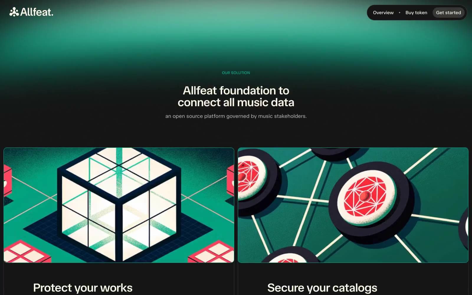
Allfeat
Crypto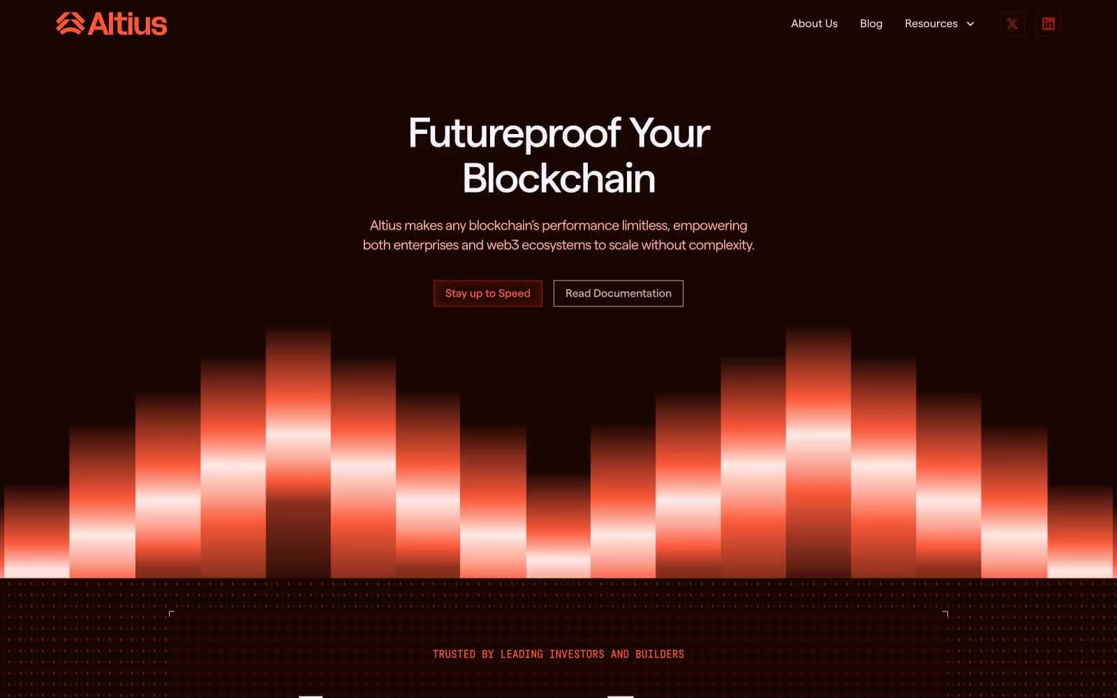
Altius
Crypto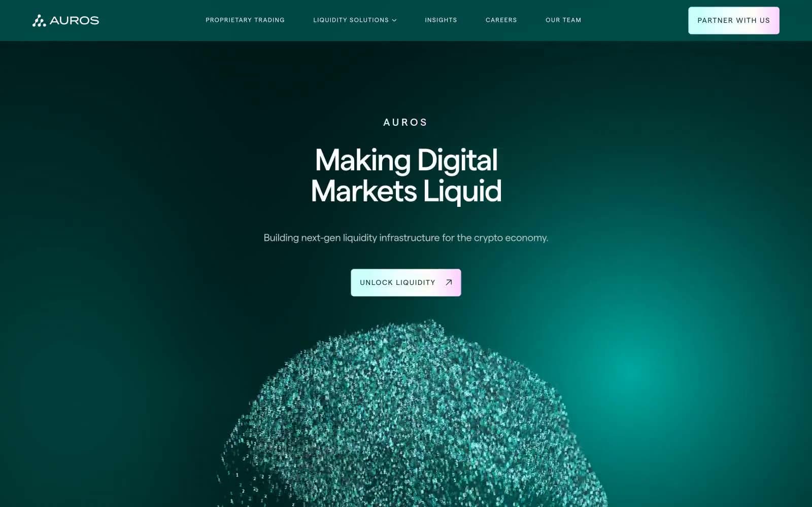
Auros
Crypto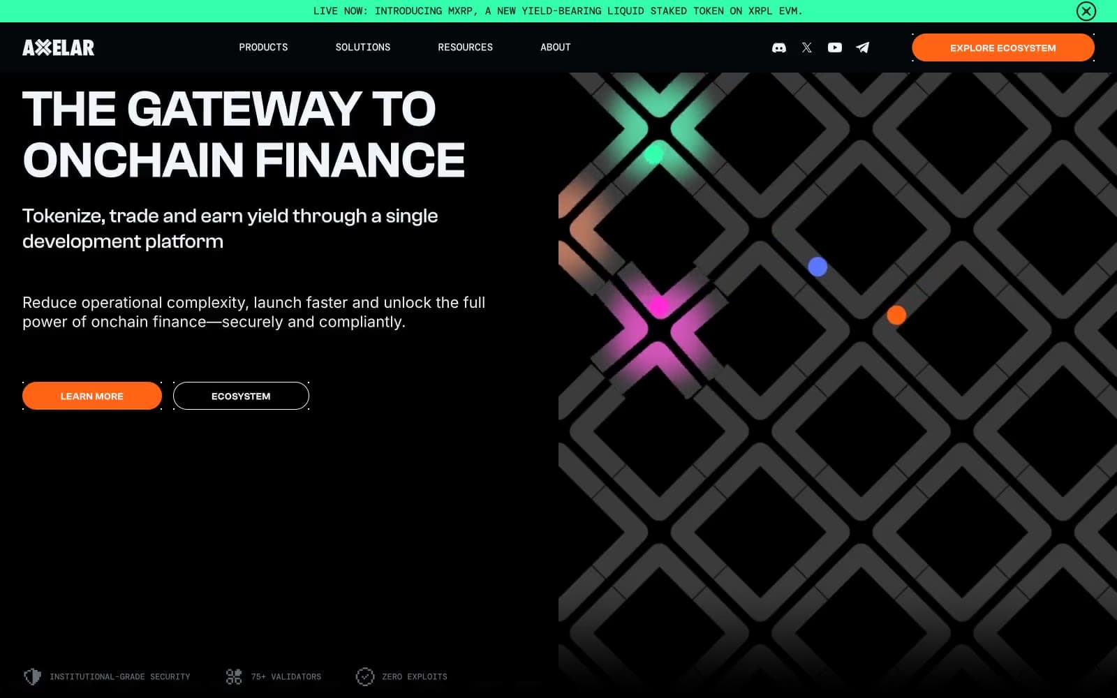
Axelar
Crypto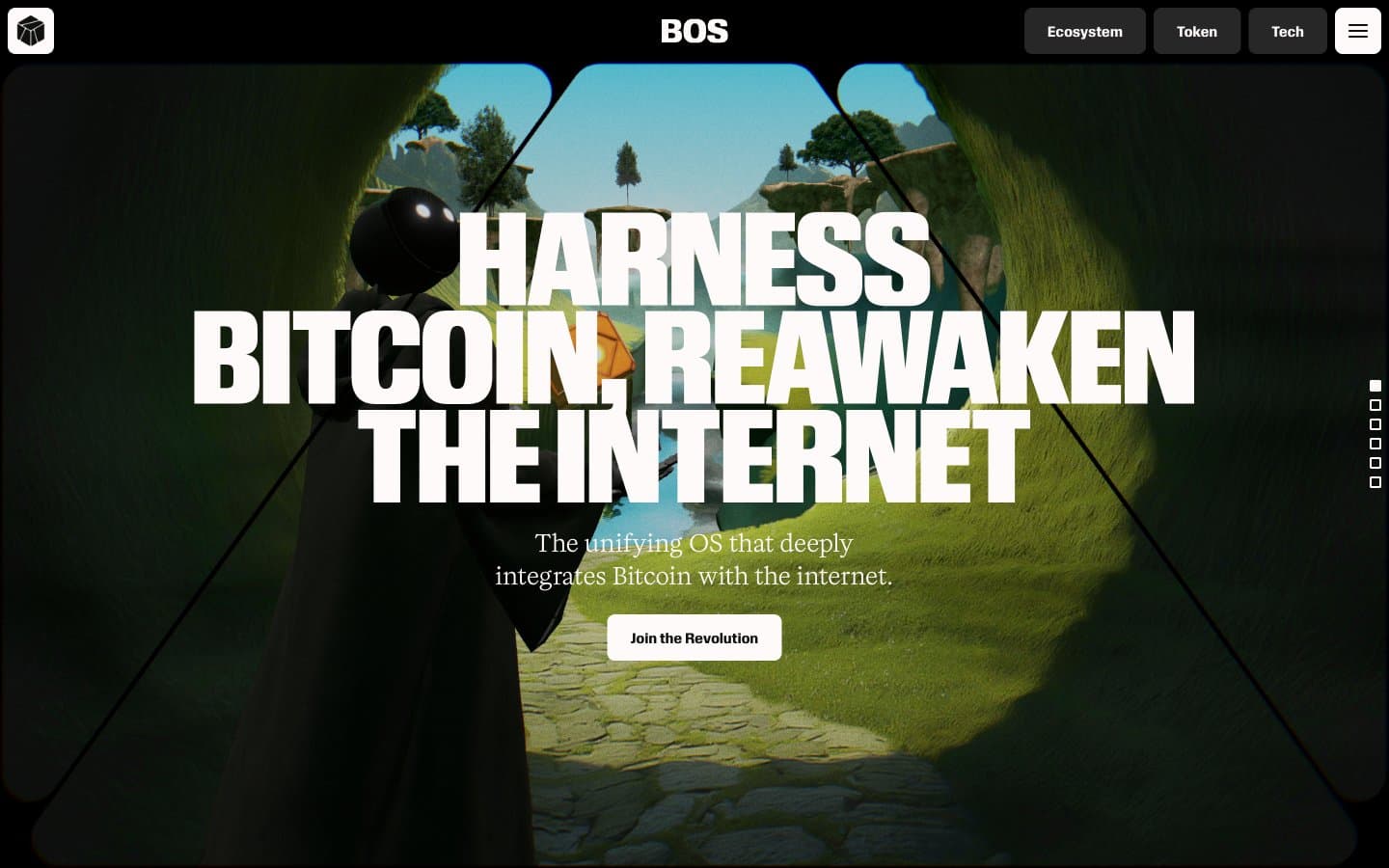
BitcoinOS
Crypto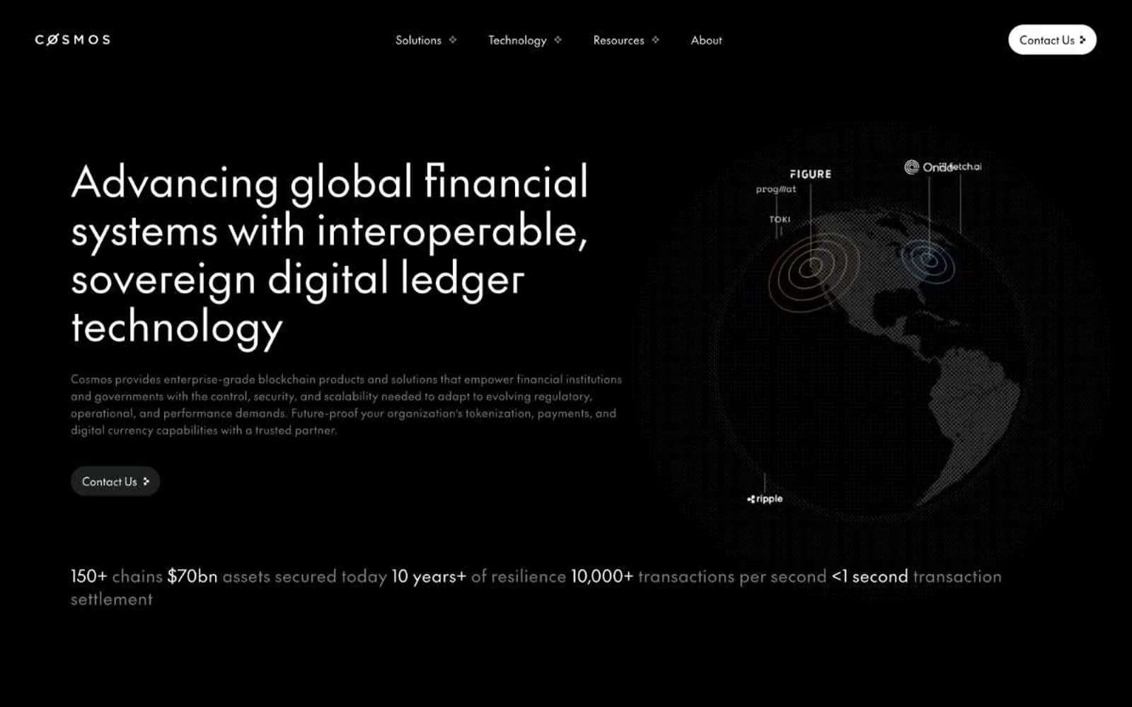
Cosmos Network
Crypto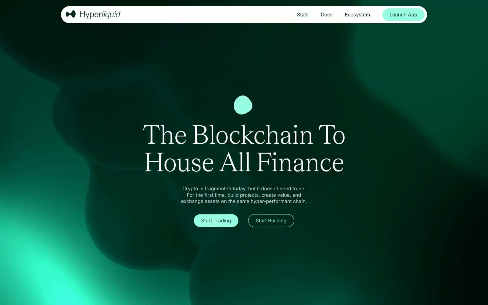
Hyper Foundation
Crypto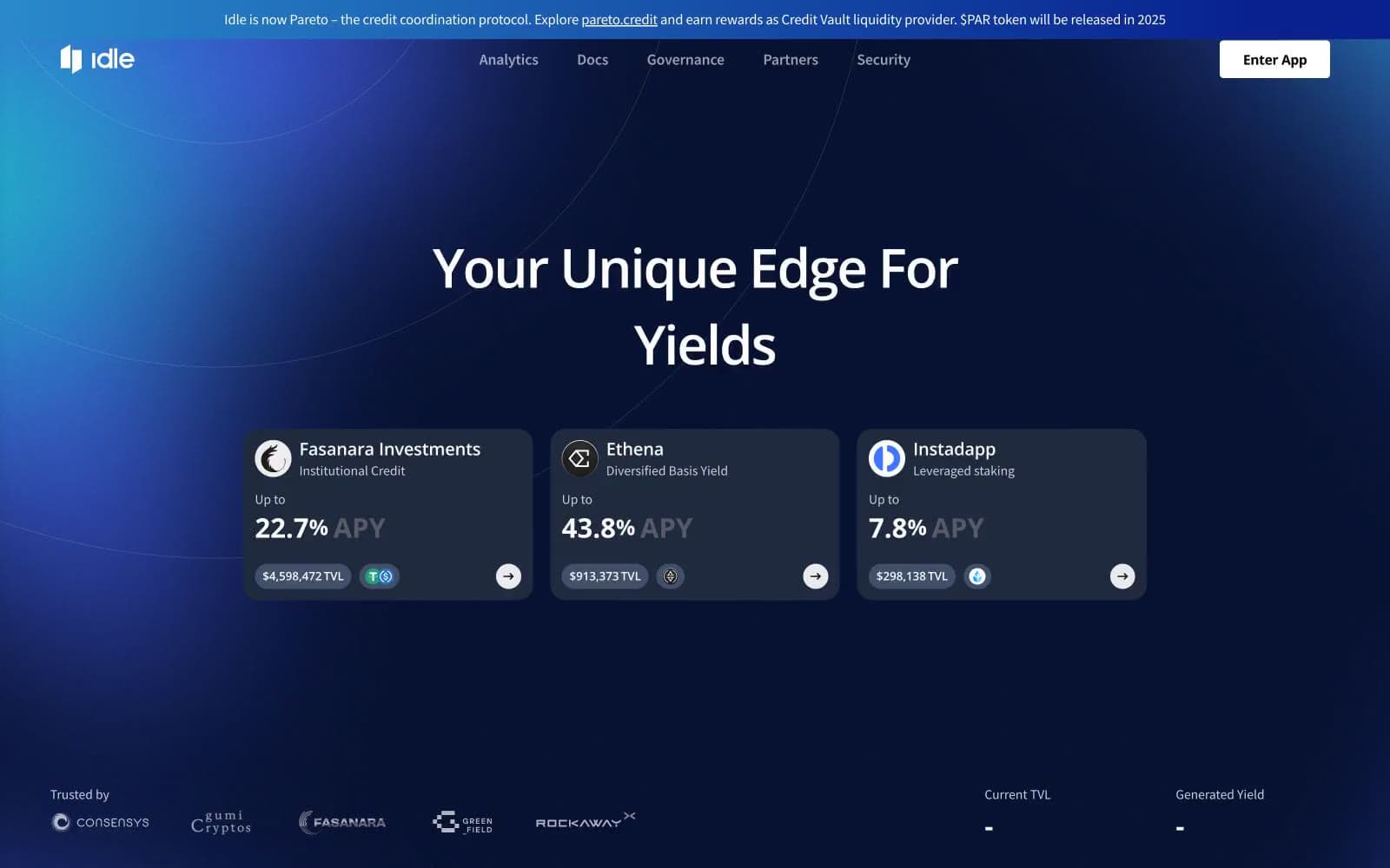
Idle Finance
Crypto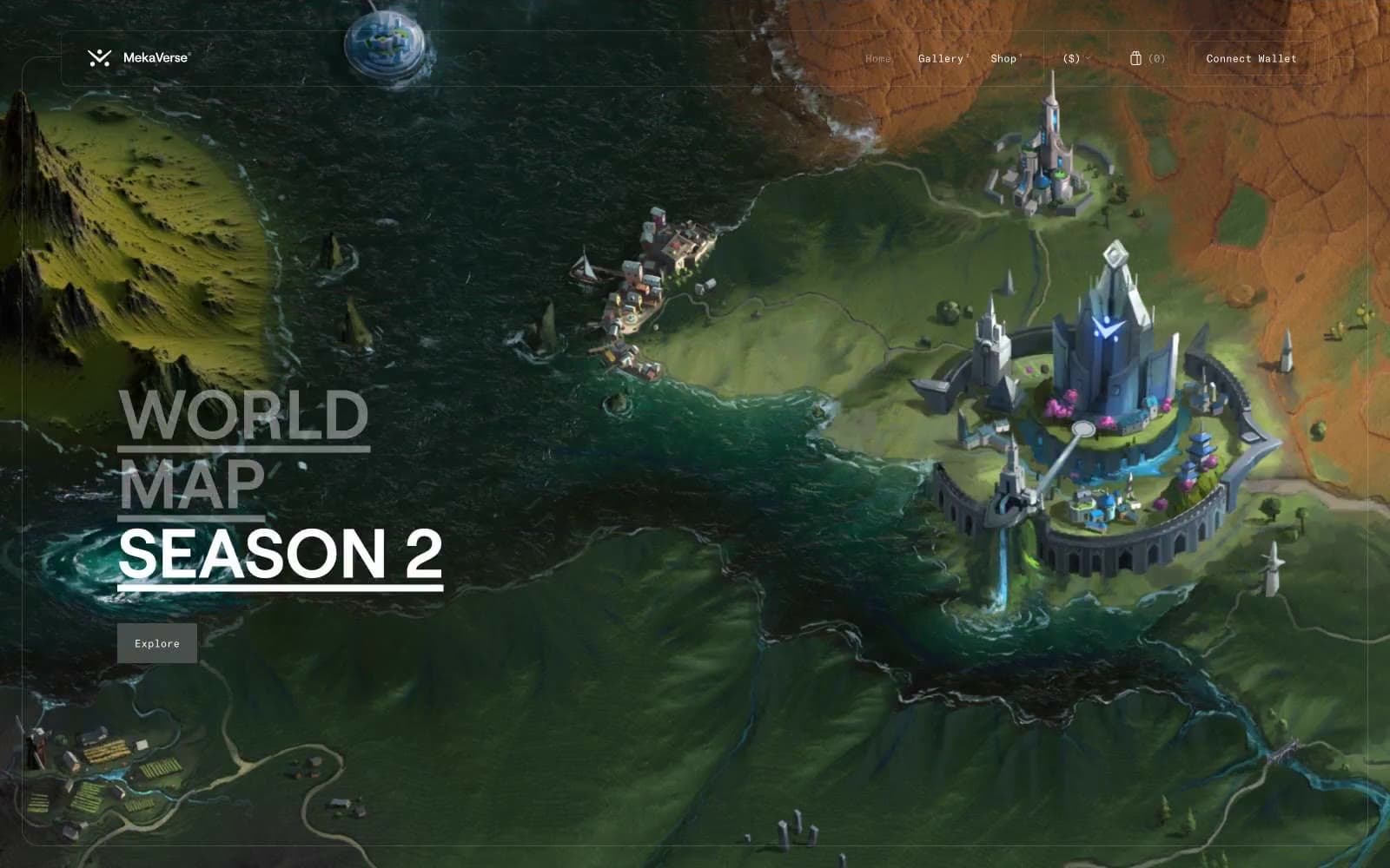
MekaVerse
Crypto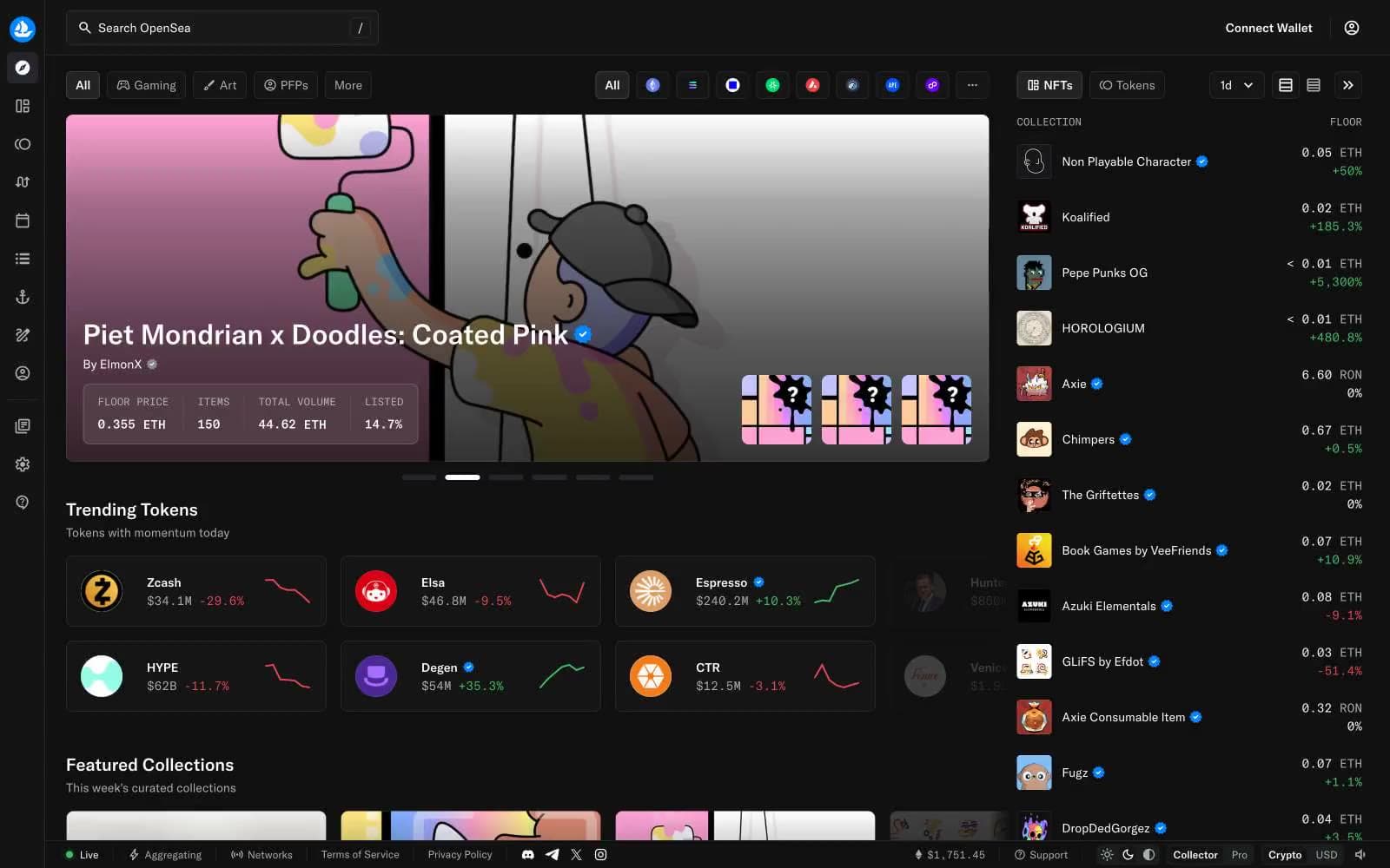
OpenSea
Crypto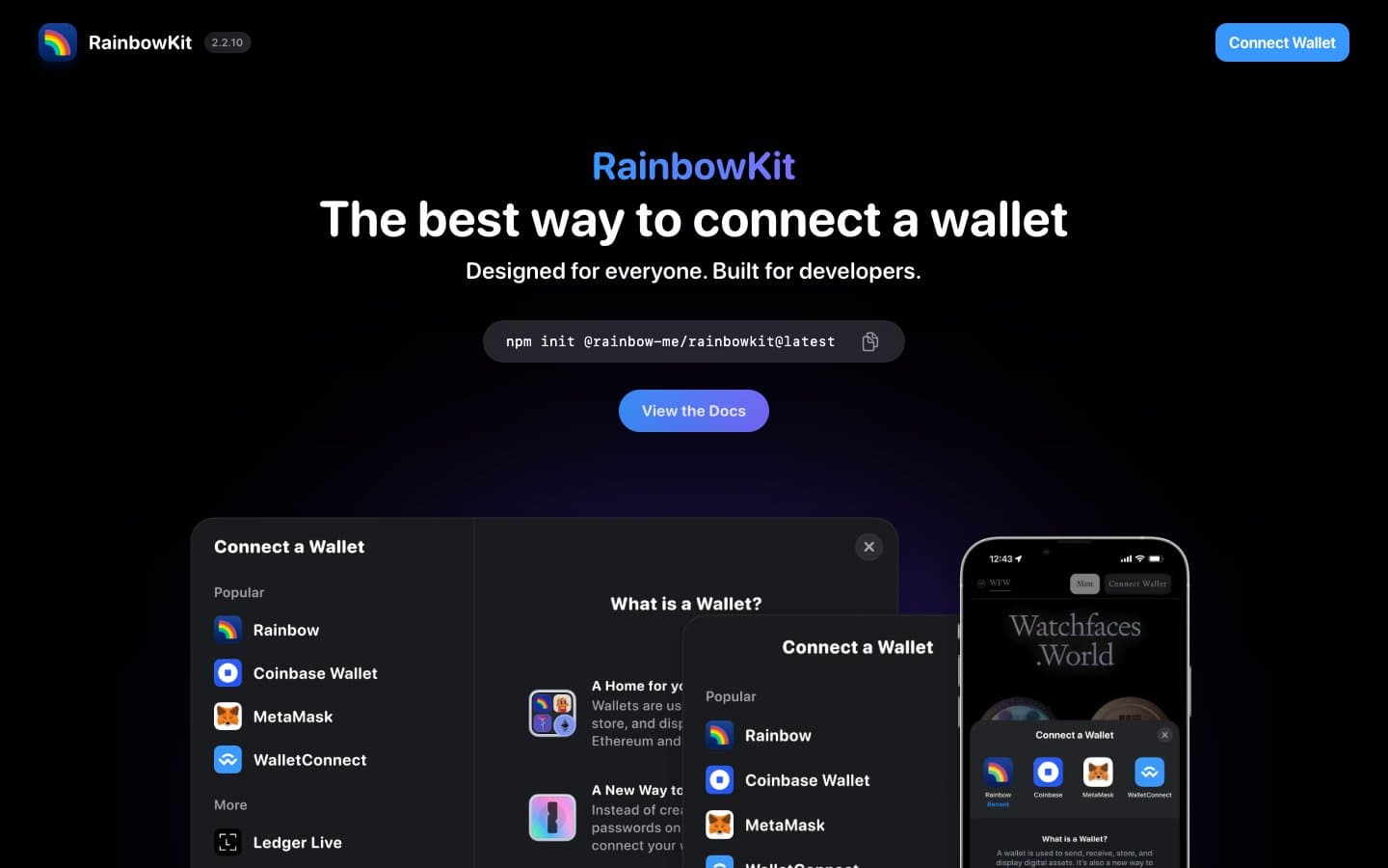
RainbowKit
Crypto
Safepal
Crypto


