
SuperHi Plus. Cobalt blueprint scattered with emoji marbles.
- Brand
- Dark theme
- 4 colors
- 1 typeface
SuperHi Plus uses a split-screen cobalt-and-ice language: one half of every section is saturated electric blue, the other is near-white, and the two panels swap roles as you scroll. Typography is a single-weight neo-grotesque display face at enormous scale (up to 85px) — the design speaks in one voice, never shouting or whispering, just stating. Decorative 3D emoji marbles anchor the light panels as visual texture while flat content lives on the blue. Components are chunky and tactile: 1px inset borders replace shadows, pill radii (50–72px) sit next to sharp 16px cards, and arrow-prefixed text labels function as navigation. The system is deliberately unornamented — no gradients, no drop shadows, no color tints — relying on the binary blue/white tension to create rhythm.
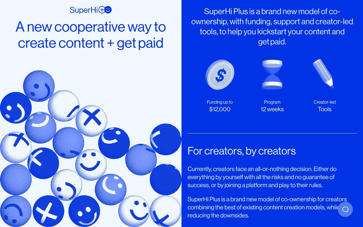
SuperHi Plus design system

Brand2
Primary surface, page background, filled action buttons, heading text, link color, and active borders. The structural anchor of the system — every dark panel lives here
Soft blue tint used sparingly for secondary button fills and tonal accents where Cobalt Voltage would be too heavy. Falls below WCAG on Ice White
Neutrals2
SVG icon fills, nav element fills, and decorative graphic anchors. Used as the dark accent inside light panels
Light surface, card backgrounds on blue sections, heading and body text on blue panels, hairline borders, ghost button outlines. Counter-surface to Cobalt Voltage
Try a pairing
Pick any two colors from the palette to check whether text stays readable on top.
Aa
Ice White on Cobalt Voltage
7.47 : 1 contrast
- Body textPasses AA 4.5
- Large textPasses AA 3
- StrictPasses AAA 7
More DESIGN.md files. Same web, different personalities.

21 TSI
Brand
Abetterlou
Brand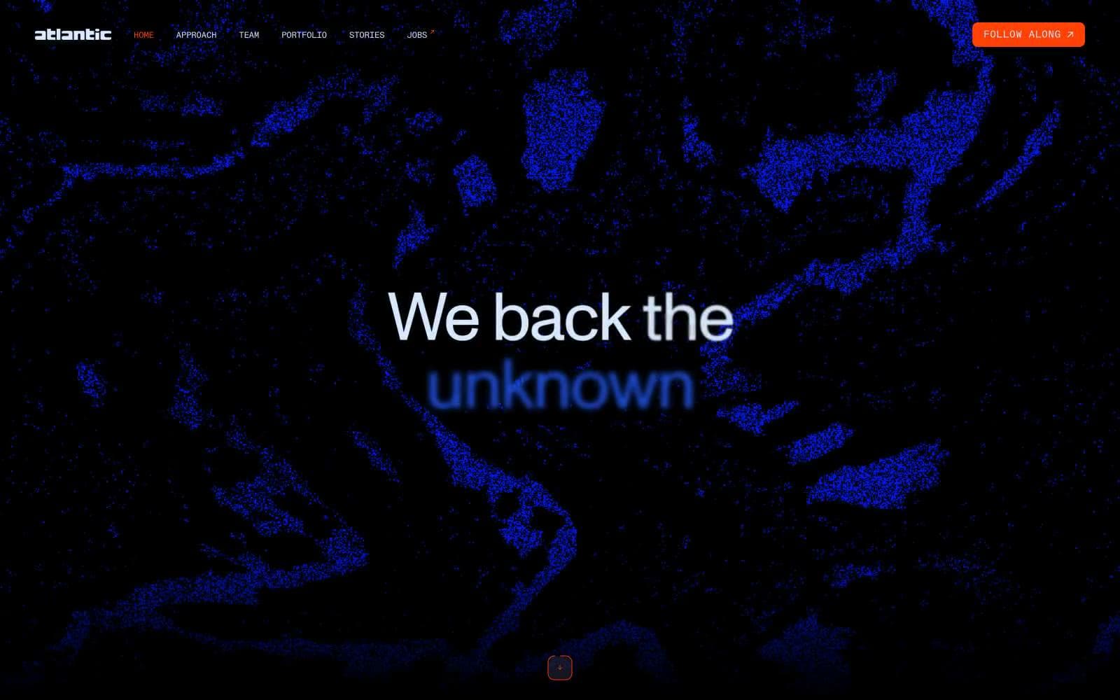
Atlantic.vc
Brand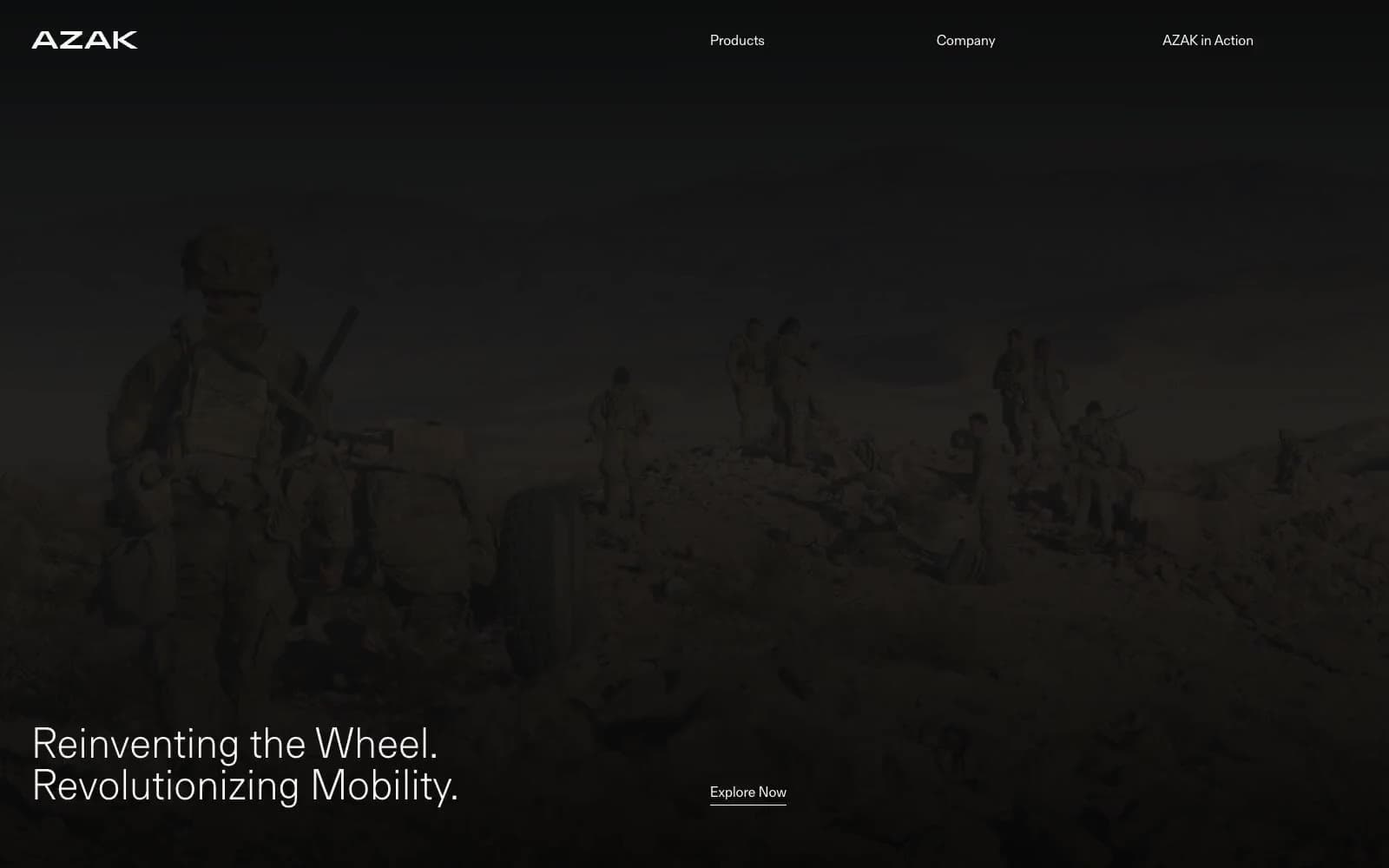
AZAK
Brand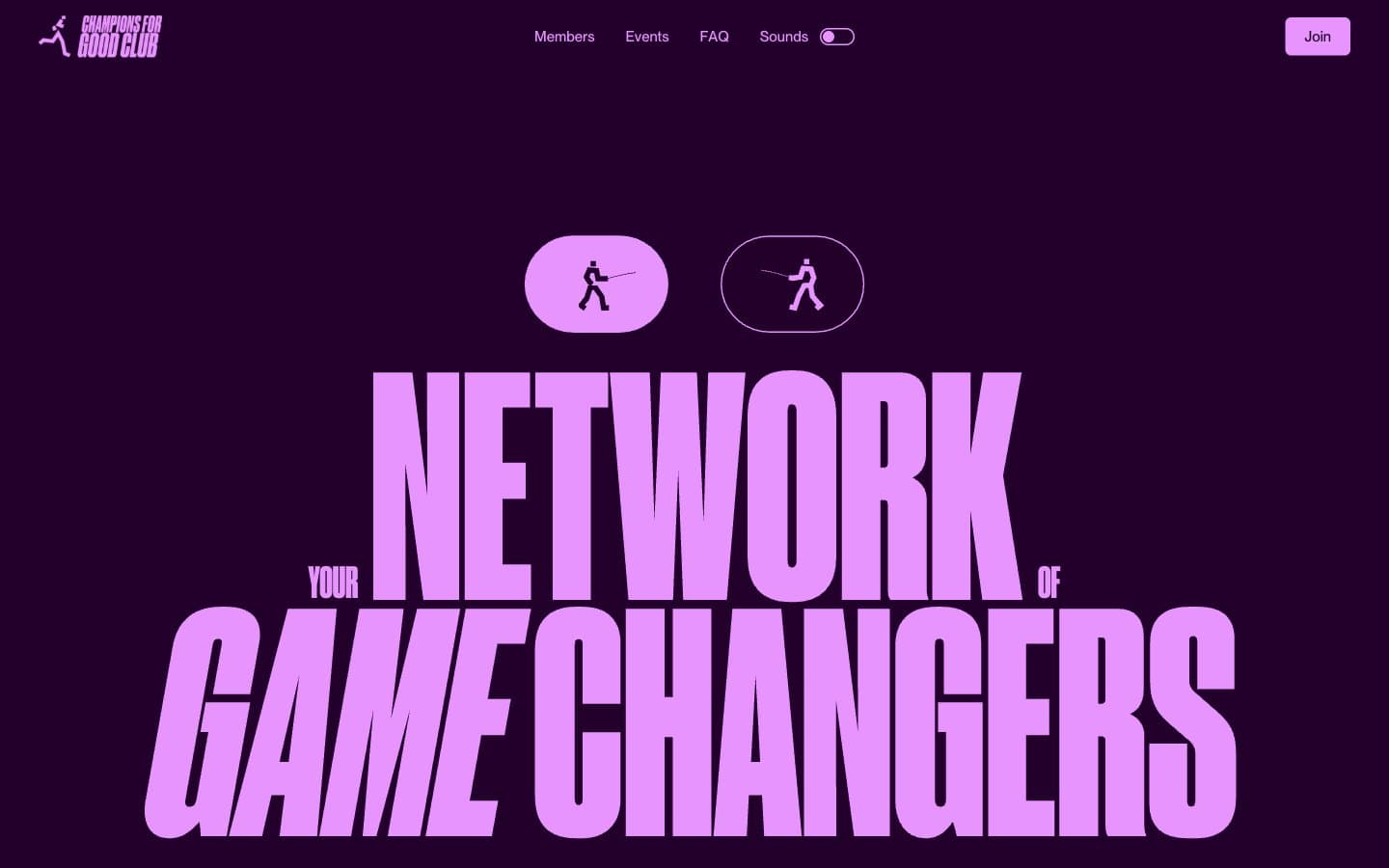
Champions4good
Brand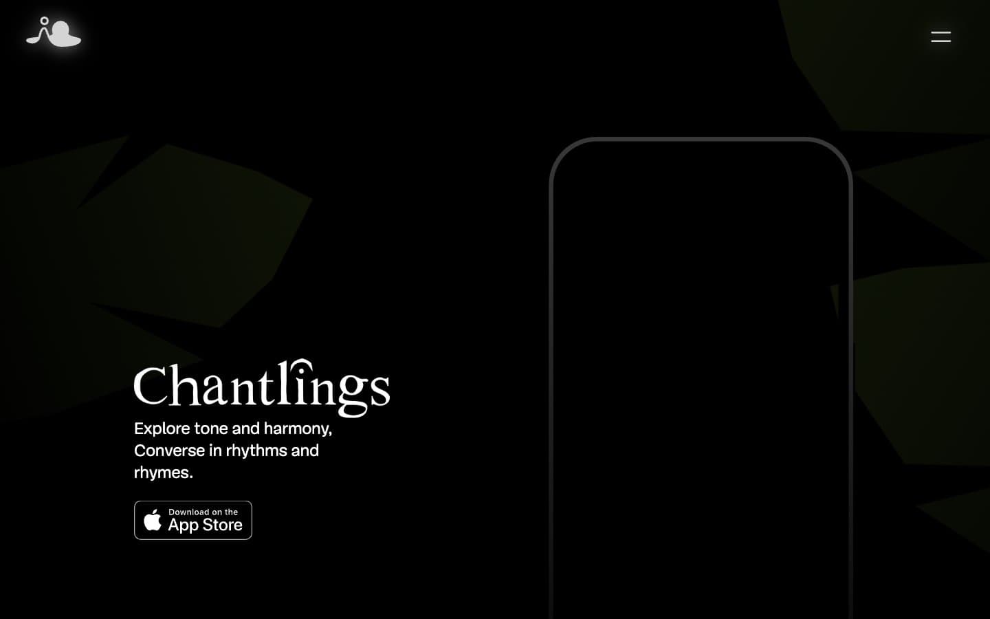
Chantlings
Brand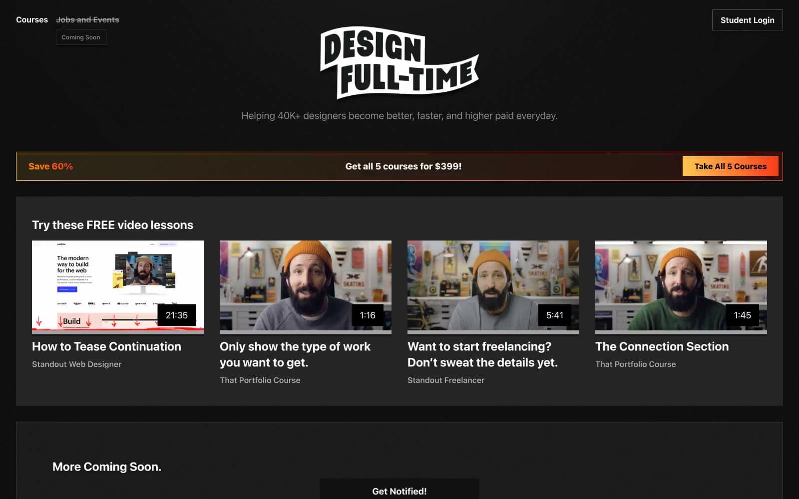
Design Full-Time
Brand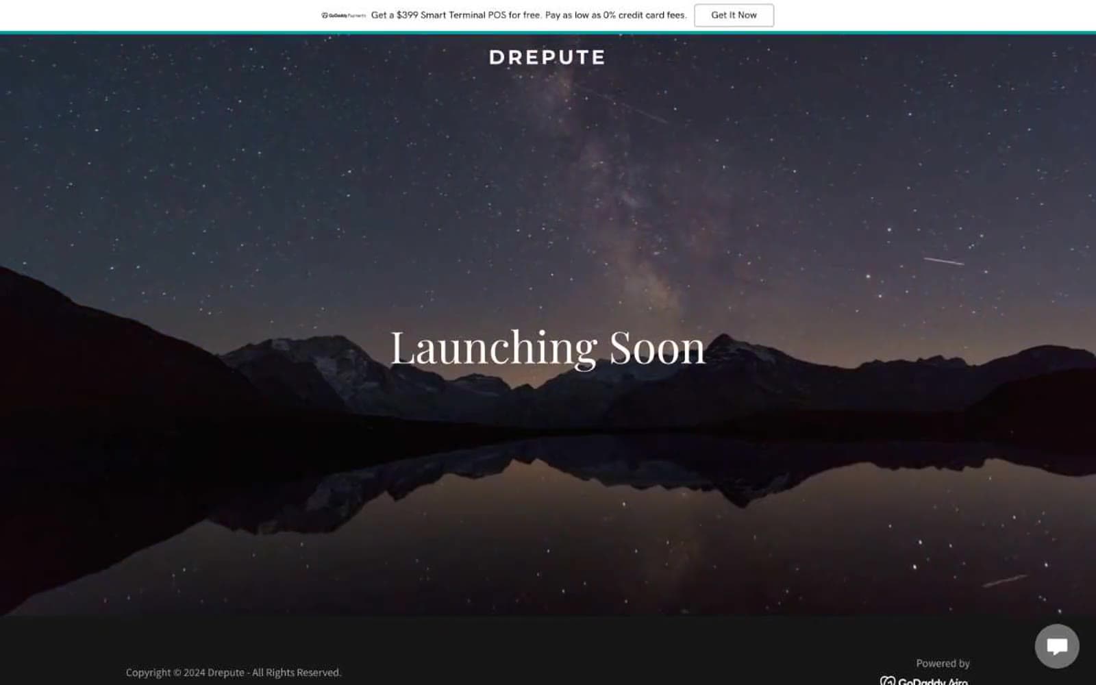
Drepute
Brand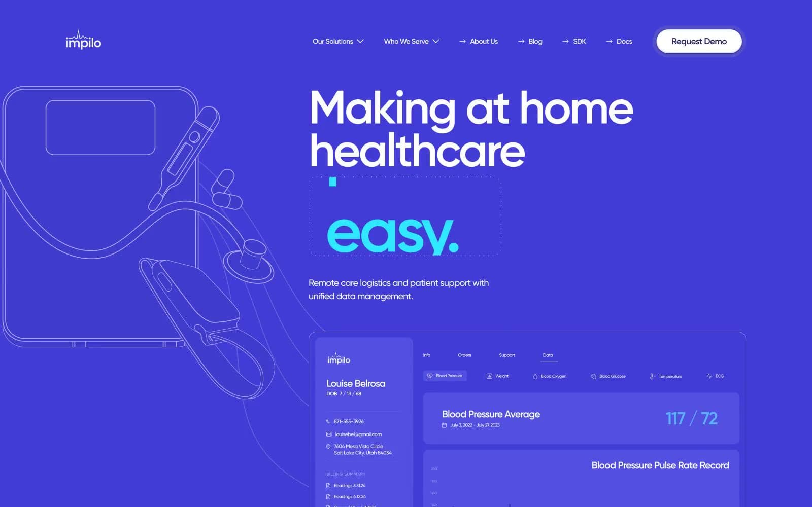
Impilo
Brand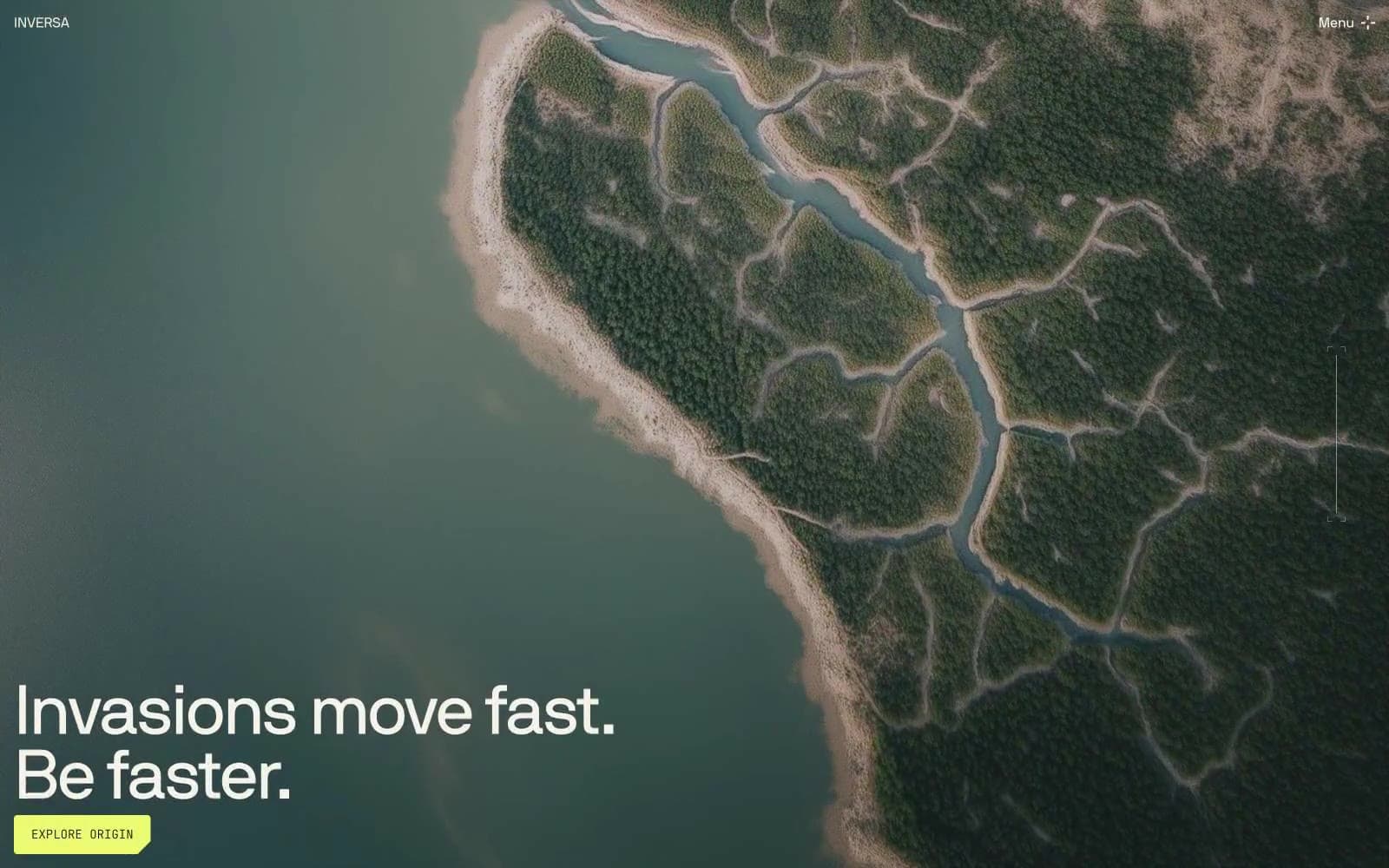
INVERSA
Brand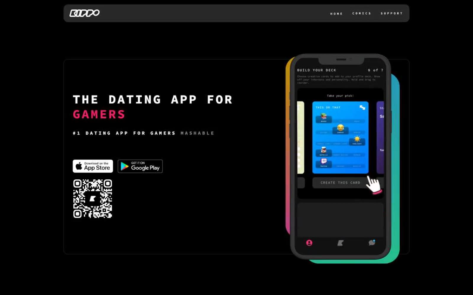
Kippo
Brand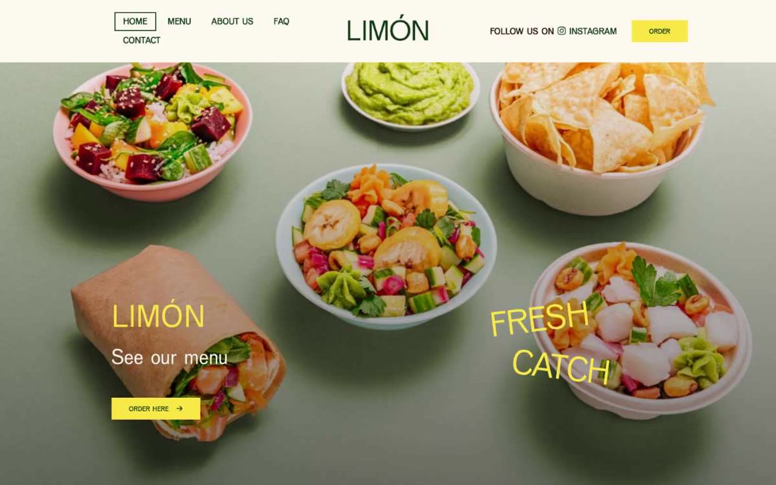
Limón
Brand


