
Chantlings. Candlelit cave, ember in the void.
- Brand
- Dark theme
- 5 colors
- 1 typeface
Chantlings lives in near-total darkness — a cinematic, candlelit void where warm amber punctuations glow against deep charcoal. The entire interface is built from three near-black neutrals and one whisper-quiet serif (Mija) used exclusively at weights 100 and 300, which gives every word the quality of breath or breath-of-sound. Color appears only as a single warm flicker: the App Store badge border, the creature's eyes, the faintest hint of a button fill — never decoration, always a tiny signal of life. Layout breathes with extreme generosity (100–196px horizontal padding, 65–100px section gaps), and surfaces are essentially flat with hairline borders, never elevated by shadow. The result is an intimate, almost ceremonial product page that treats negative space as a primary material.
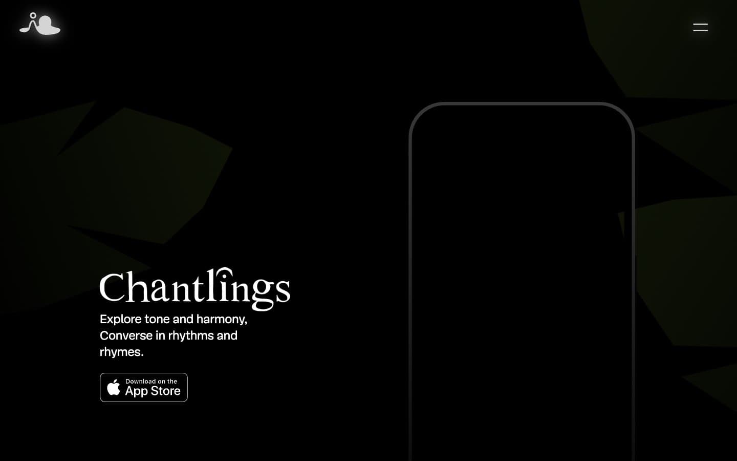
Chantlings design system

Brand1
Filled button background — the single chromatic fill in the system. Deeper, more saturated than Ember; used sparingly to mark the one real interactive surface (App Store download)
Accent1
Accent signal color — App Store badge border, link underlines, the creature's eyes and highlights. Warm amber against graphite creates a firelight-in-darkness effect, not a CTA color
Neutrals3
Page background, deep surface layer — the cavern floor of the design
Dominant structural neutral — card borders, icon strokes, dividers, link underlines. Far more present than its visual weight suggests; carries 90% of the UI scaffolding
Primary text, card border highlights, inverse surface moments — the only luminance in the system
Try a pairing
Pick any two colors from the palette to check whether text stays readable on top.
Aa
Obsidian on Amber Glow
6.65 : 1 contrast
- Body textPasses AA 4.5
- Large textPasses AA 3
- StrictFails AAA 7
More DESIGN.md files. Same web, different personalities.

21 TSI
Brand
Abetterlou
Brand
Atlantic.vc
Brand
AZAK
Brand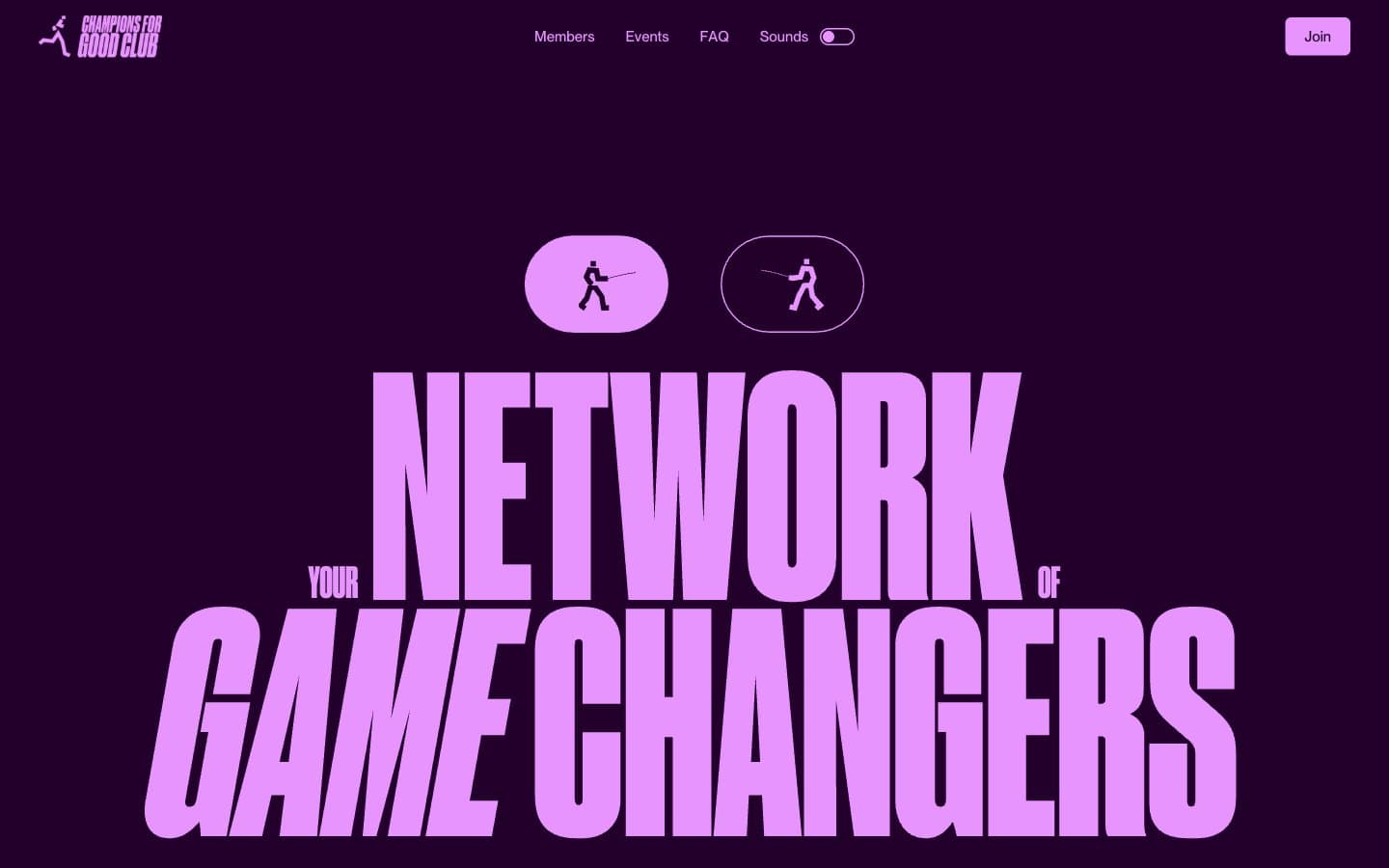
Champions4good
Brand
Design Full-Time
Brand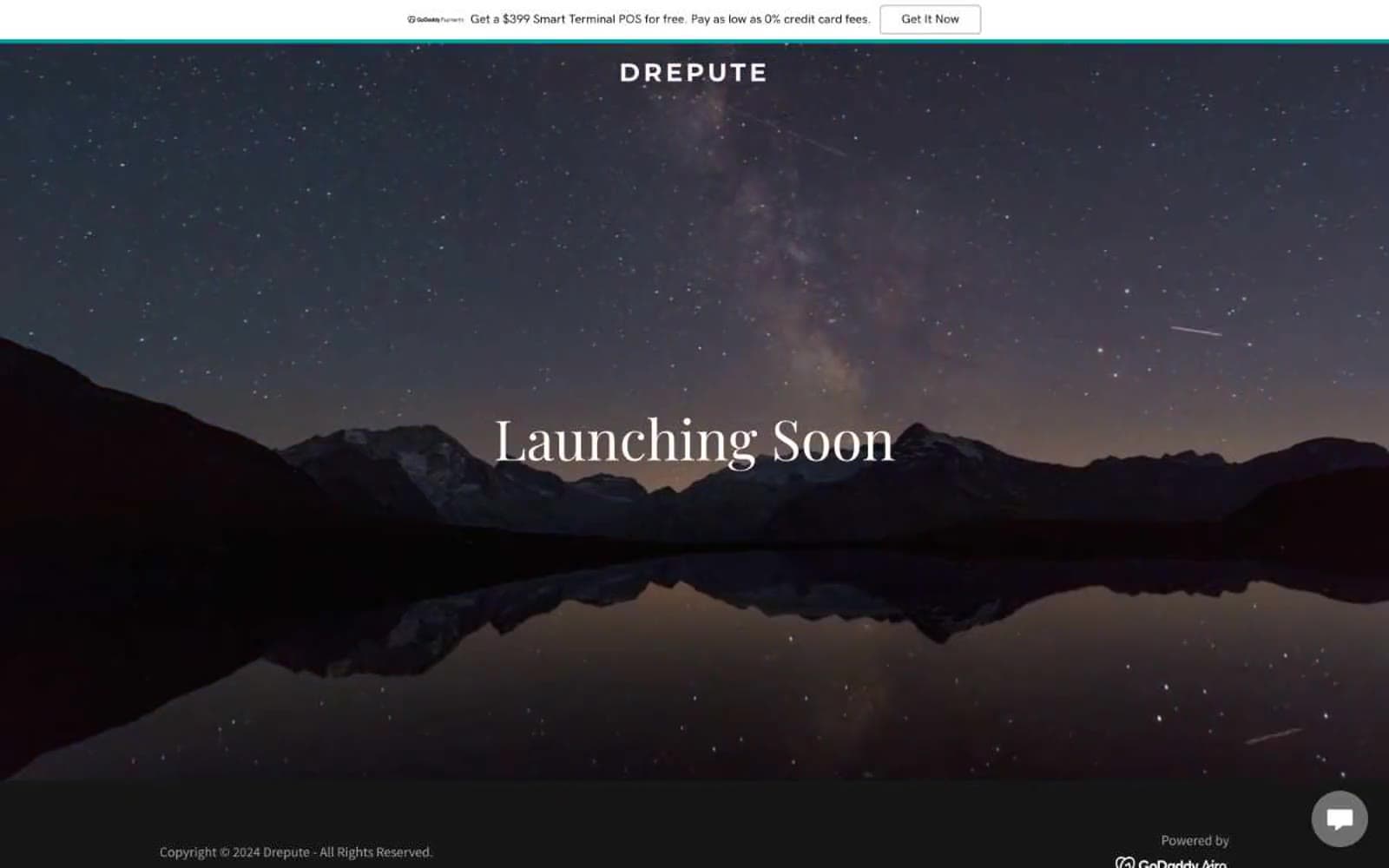
Drepute
Brand
Impilo
Brand
INVERSA
Brand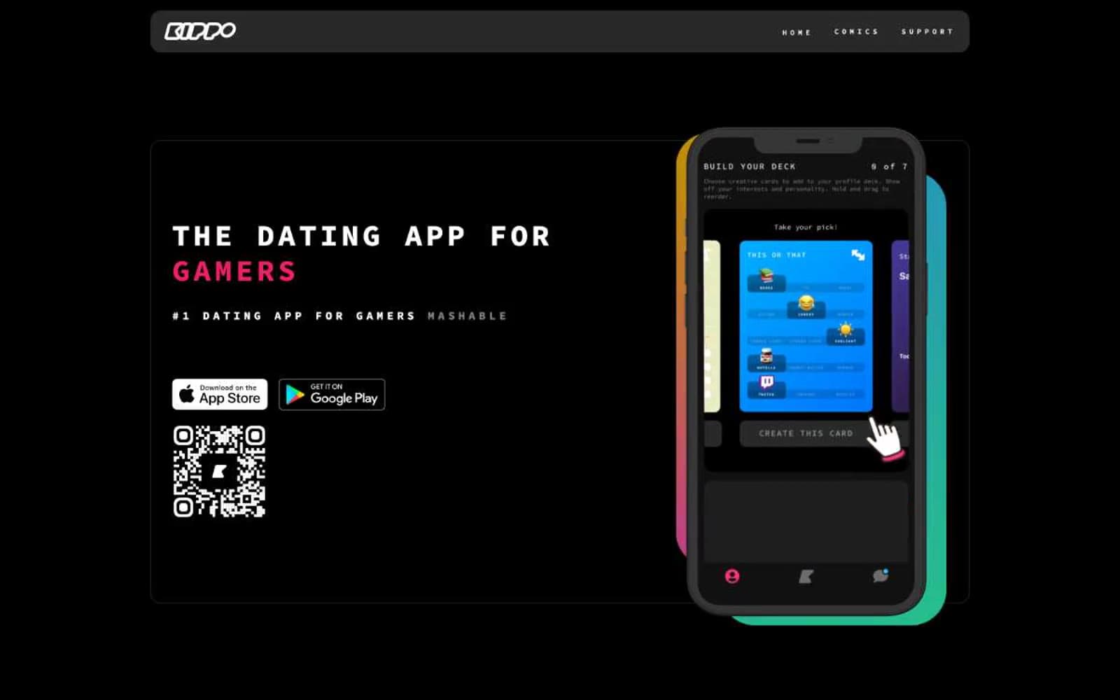
Kippo
Brand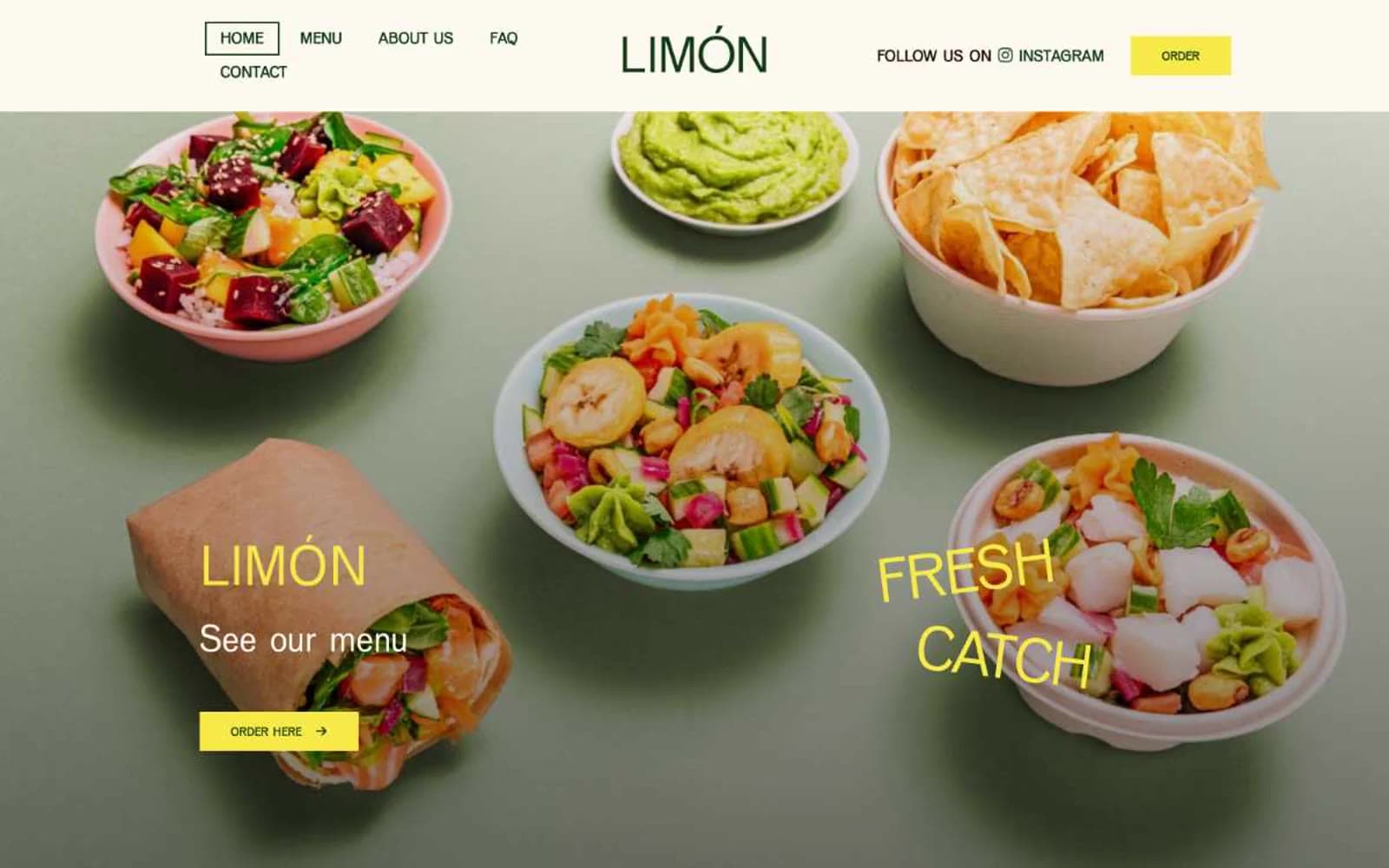
Limón
Brand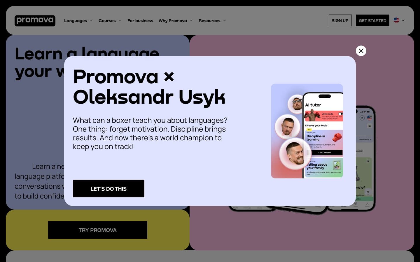
Promova
Brand


