
Abetterlou. Warm cream typography glowing against deep coffee-black, with amber-gold buttons that feel pressed into the page like heated metalwork.
- Brand
- Dark theme
- 9 colors
- 1 typeface
A warm dark 'private clinic at dusk' system: coffee-black canvas (#140b00), cream typography (#fff1e0), and a single amber accent (#ffb442) that fires only on action. PP Neue Montreal carries the entire voice at weights 400 and 500 — geometric and clinical, but the cream ink and tight negative tracking on the 43–81px range give it editorial weight rather than generic SaaS feel. The defining rhythm is a shape contrast: full-pill controls (buttons, inputs, links at ~1296px radius) sit on gently squared 6px surfaces, so action elements feel pressed-in and tactile while content cards stay quiet. Restraint is the system: one chromatic accent, two font weights, compact 12px gaps, and 52px section breath that reads premium without becoming airy.

Abetterlou design system

Brand1
Primary action fill, accent highlights, and the system signal color — the only chromatic accent; appears on filled CTAs, icon hover states, and section dividers. Pairs against Espresso for a heated-metal contrast that feels pressed-in and intentional
Neutrals8
Deepest surface for footers and recessed bands — almost-black brown for slight layering below Espresso
Page canvas and primary surface — warm coffee-black rather than pure black, the entire site sits on this
Faint internal border on cards and panels — barely-visible depth line on the dark canvas
Subtle hairline borders on dark surfaces — warm taupe that holds edges without competing with content
Neutral form states, badge text, and quiet UI feedback where color should stay understated. Do not promote it to the primary CTA color
Muted helper text and secondary labels — warm gray that recedes against Espresso without disappearing
Occasional light surface tint where near-white is needed (rare, secondary to Warm Cream)
Primary text and icon strokes — the only ink color across the system, reads as off-white parchment in dark contexts
Try a pairing
Pick any two colors from the palette to check whether text stays readable on top.
Aa
Midnight Cocoa on Amber Forge
11.40 : 1 contrast
- Body textPasses AA 4.5
- Large textPasses AA 3
- StrictPasses AAA 7
More DESIGN.md files. Same web, different personalities.
21 TSI
Brand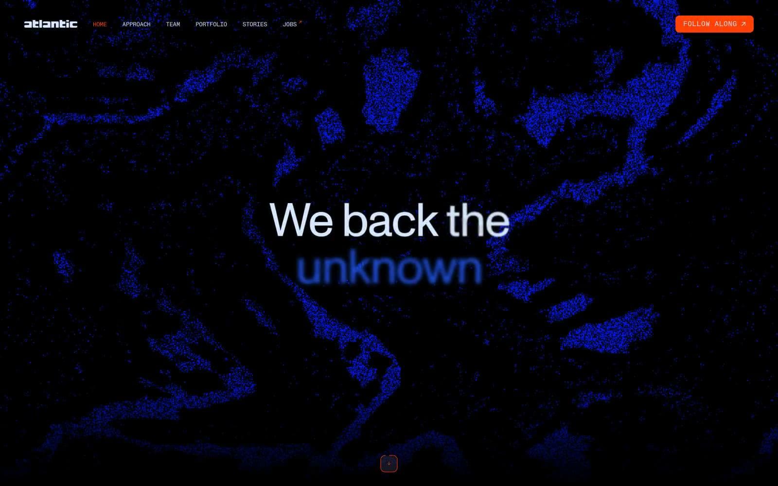
Atlantic.vc
Brand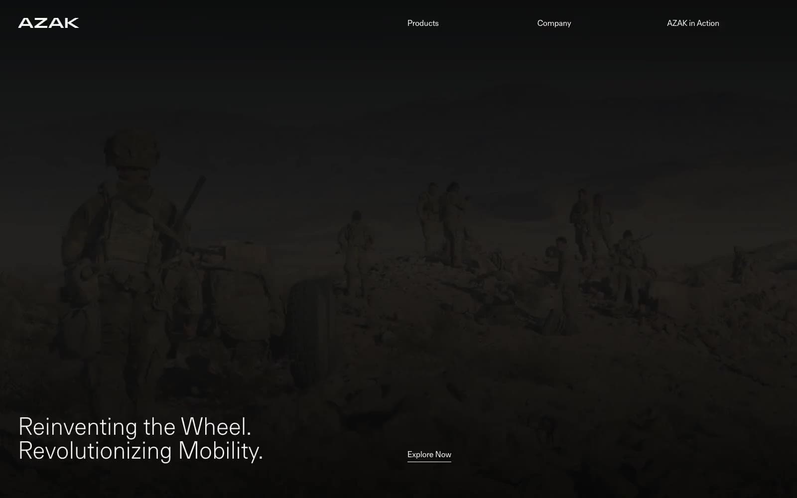
AZAK
Brand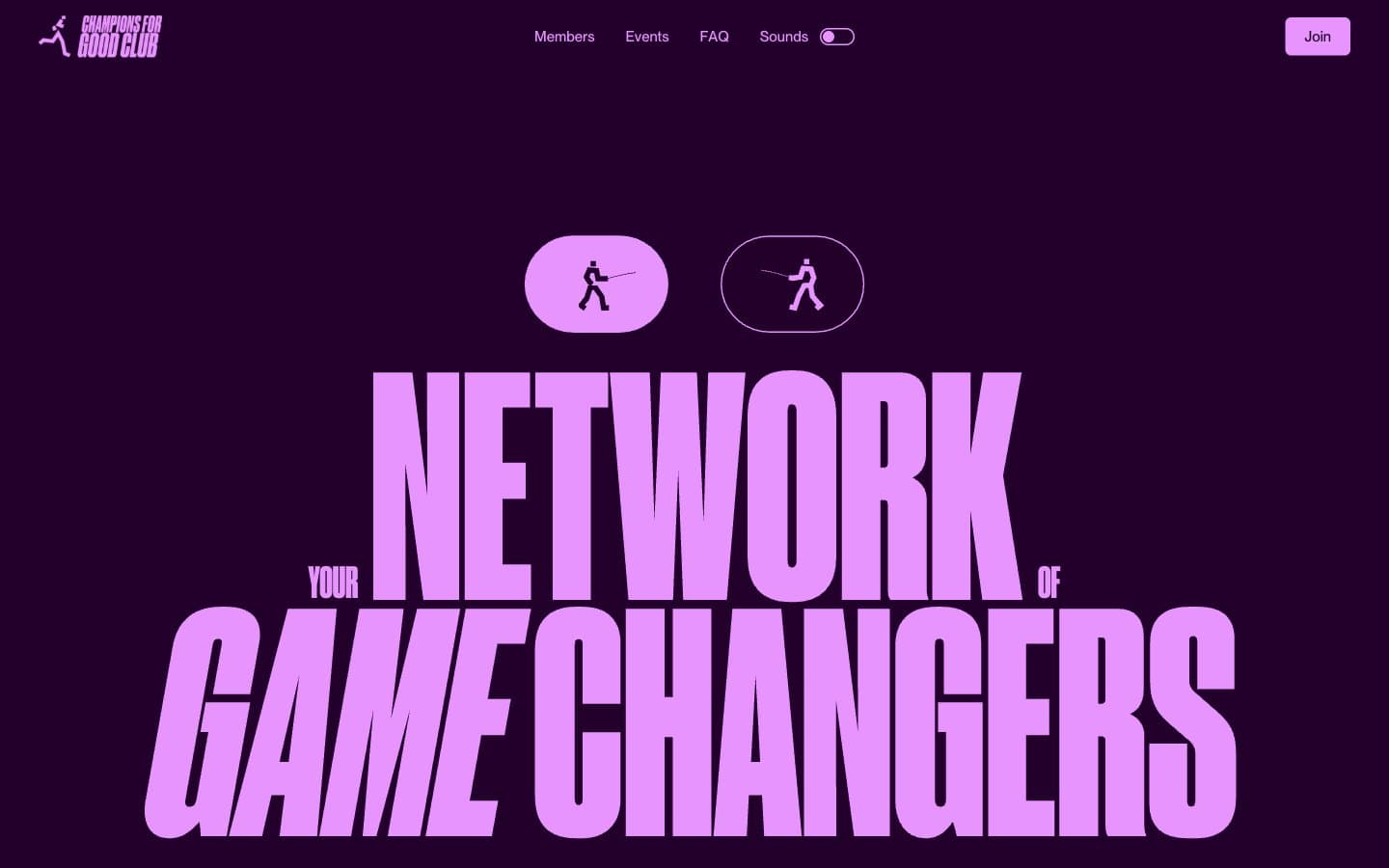
Champions4good
Brand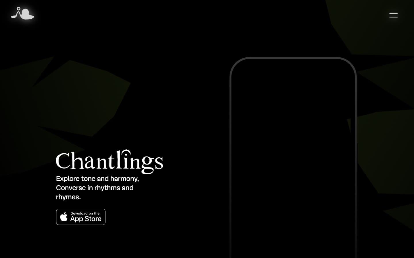
Chantlings
Brand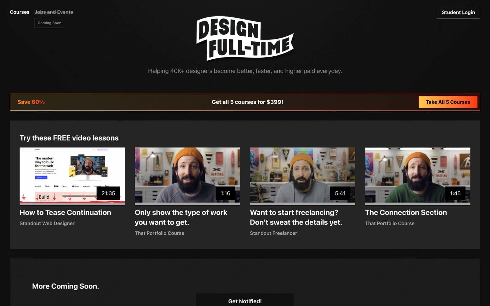
Design Full-Time
Brand
Drepute
Brand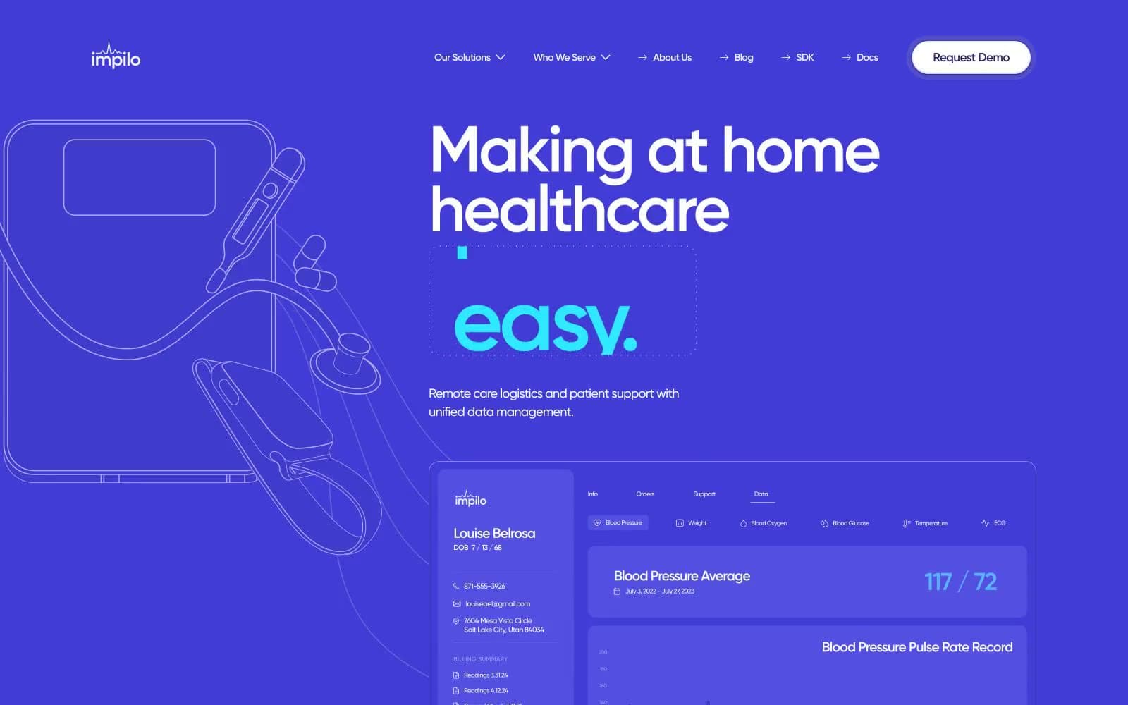
Impilo
Brand
INVERSA
Brand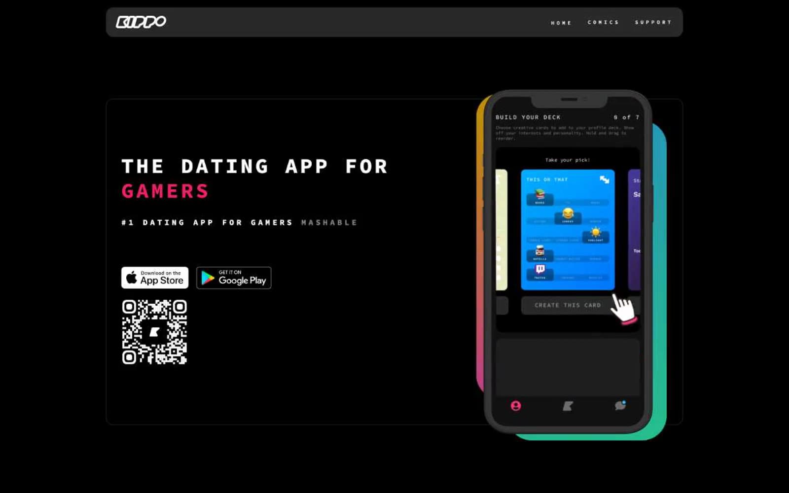
Kippo
Brand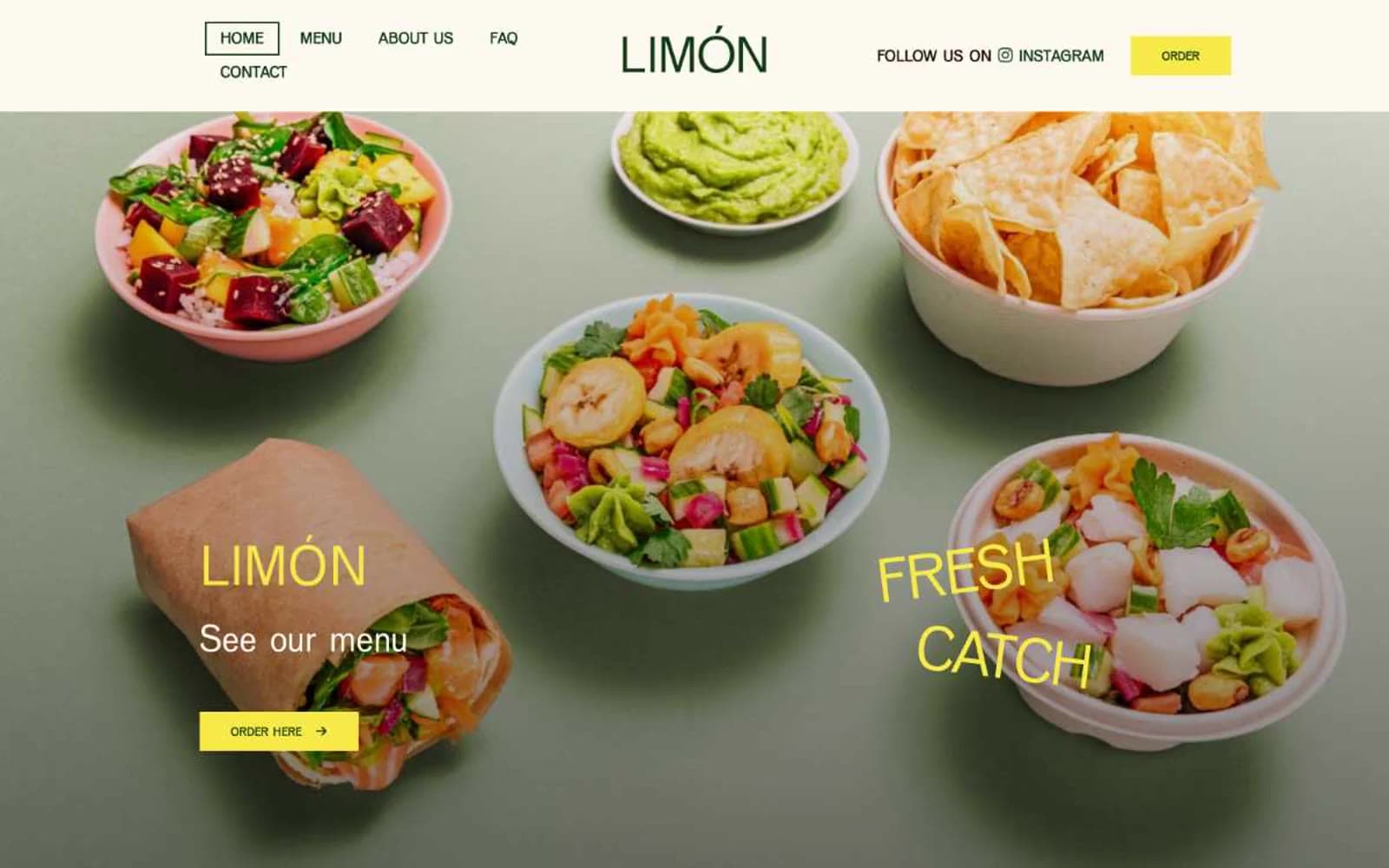
Limón
Brand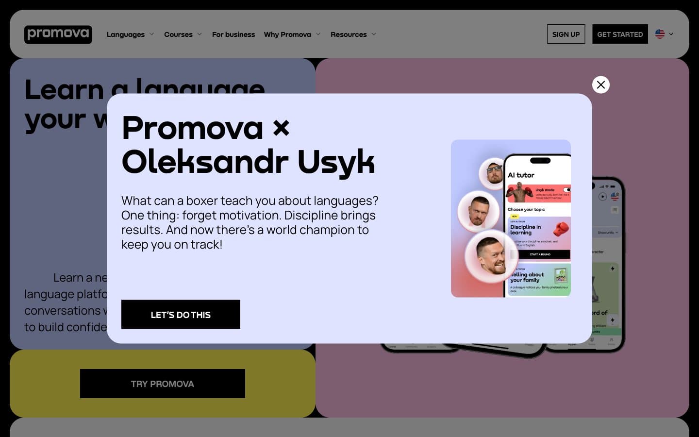
Promova
Brand


