
INVERSA. Topographic field terminal at midnight.
- Brand
- Dark theme
- 6 colors
- 2 typefaces
Inversa operates as a dark conservation-tech command console: a near-black canvas saturated with aerial earth imagery, where massive editorial type and a single electric lime accent function like tactical highlights on a topo map. The visual language is sparse and deliberate — generous negative space, no shadows, near-zero radius — letting one vivid chromatic note (electric lime) cut through the otherwise binary warm-cream-on-near-black system. Typography does the heavy lifting: a humanist sans at near-architectural sizes (58–72px) speaks the narrative voice, while JetBrains Mono handles every data label, tag, and interface annotation as if reading coordinates. Components are utilitarian and unadorned — sharp 3.6px corners, no elevation, no decorative chrome — creating the feel of a field instrument rather than a marketing site.
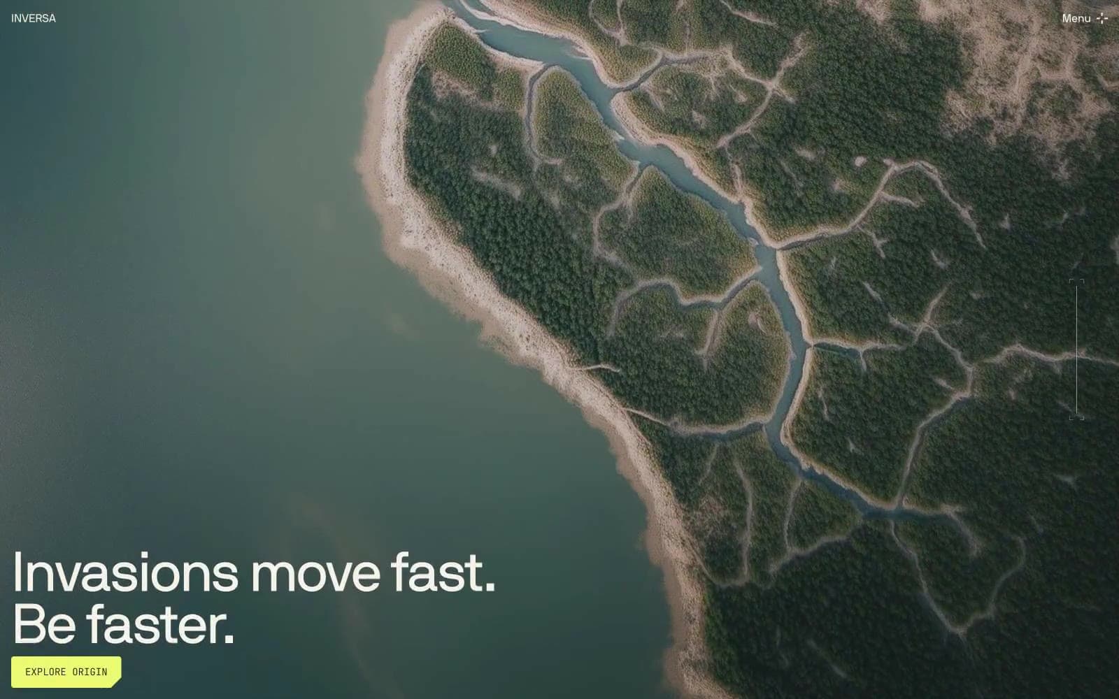
INVERSA design system

Brand1
Green supporting accent for decorative details and low-frequency emphasis. Do not promote it to the primary CTA color
Accent1
Gradient transition shade for the lime accent — deeper stop used in horizontal lime fades
Neutrals4
Page canvas, hero background, card surfaces — the near-black base with a faint olive cast that keeps the dark from feeling synthetic
Hairline borders, footer dividers, low-emphasis rules
Muted secondary text, placeholder input state, low-contrast labels on light surfaces
Primary text, body copy, headings, icon strokes, border color on dark — warm off-white that reads as paper, not LCD white
Try a pairing
Pick any two colors from the palette to check whether text stays readable on top.
Aa
Obsidian Loam on Lime Surveyor
16.49 : 1 contrast
- Body textPasses AA 4.5
- Large textPasses AA 3
- StrictPasses AAA 7
More DESIGN.md files. Same web, different personalities.

21 TSI
Brand
Abetterlou
Brand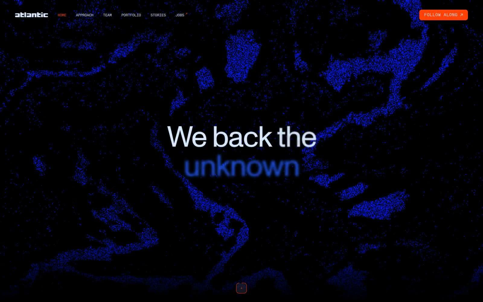
Atlantic.vc
Brand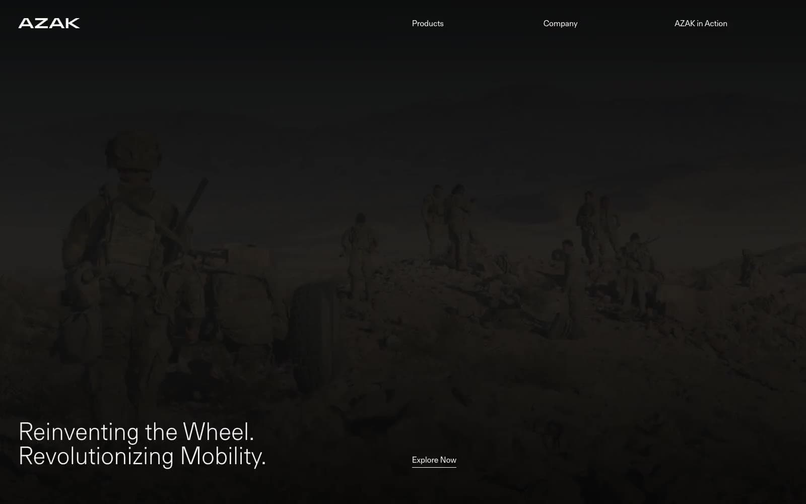
AZAK
Brand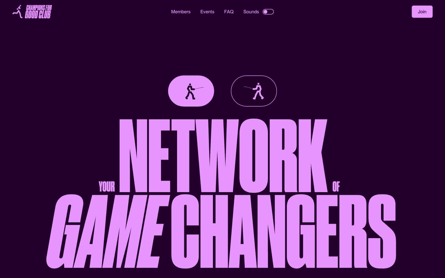
Champions4good
Brand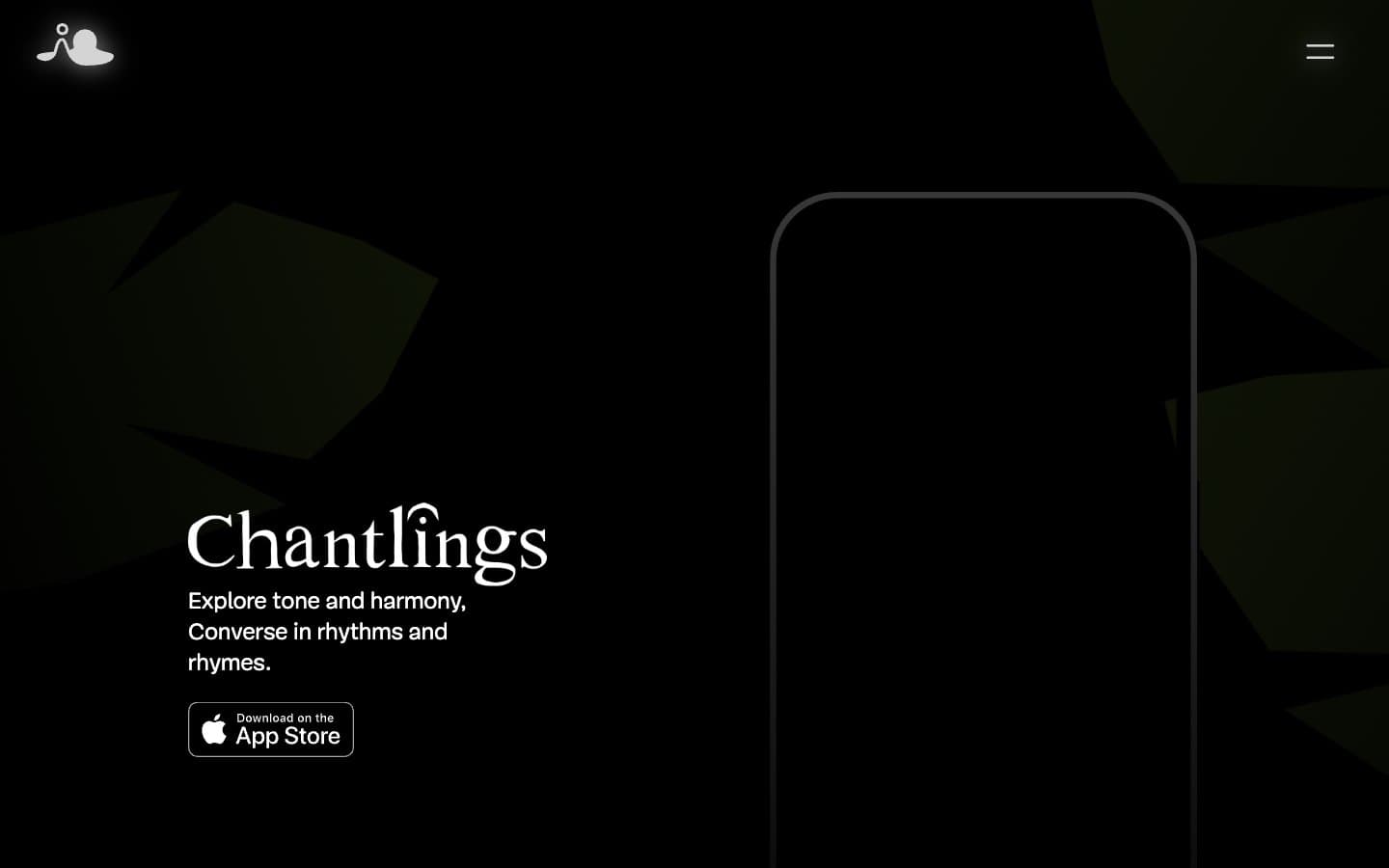
Chantlings
Brand
Design Full-Time
Brand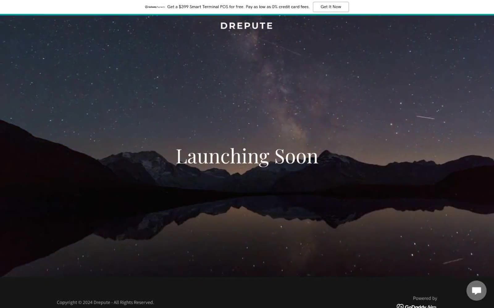
Drepute
Brand
Impilo
Brand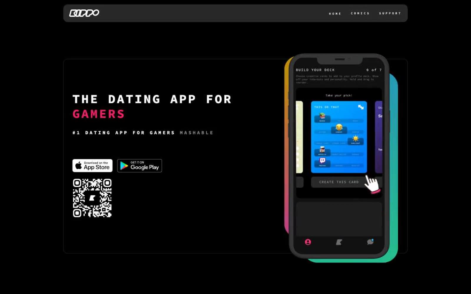
Kippo
Brand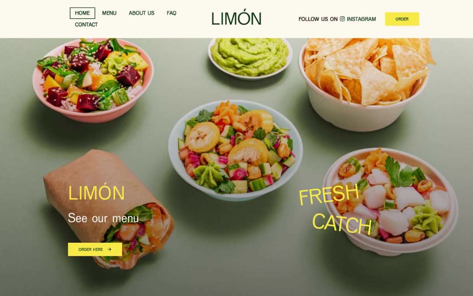
Limón
Brand
Promova
Brand


