
Impilo. A violet command console where health data glows in cyan.
- Brand
- Dark theme
- 15 colors
- 1 typeface
Impilo operates in a deep midnight-violet universe where the canvas itself (#16165c) carries the brand — there is no white default, only progressively lighter violet surfaces stacking toward #f4f4f6 for inverted sections. A single typeface (Gilroy) speaks in two voices: weight 500 for running text and weight 600 for display, with aggressive negative tracking at large sizes that makes headlines feel engineered rather than written. The accent system is a clinical triad — cyan #00b1ff for data and links, mint #00ffaa for positive states, and a lighter violet #b1a6f6 for line-art illustration — so color never decorates, it always means something. Surfaces are pill-soft (1425px buttons, 24-32px cards) and float on ambient violet shadows rather than neutral grays, keeping every elevation on-brand.
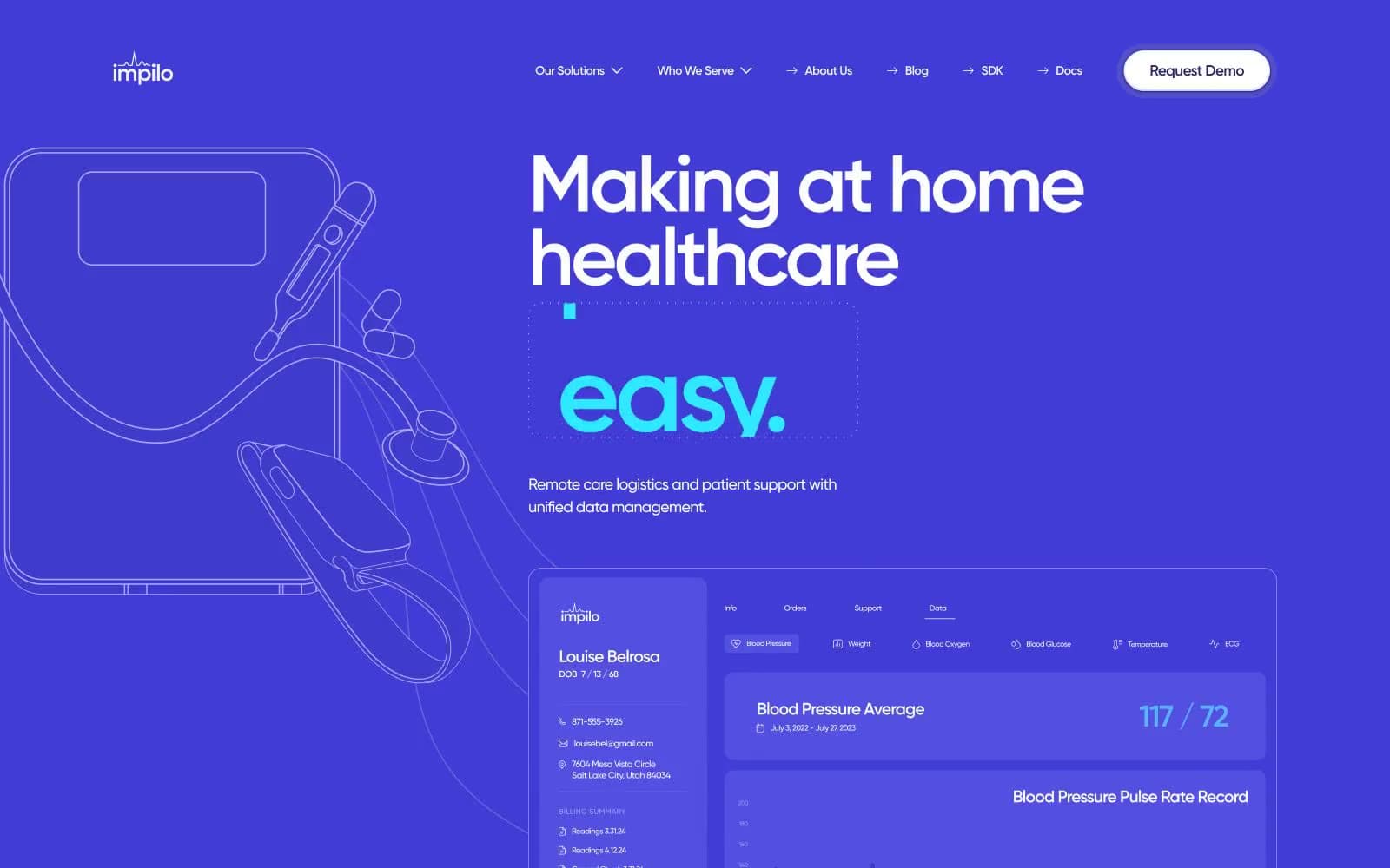
Impilo design system

Brand5
Page canvas, hero background, primary surface — the brand-defining midnight violet that sets the entire dark mode identity
Mid-tone accent surface, footer background, highlighted metric blocks — mid-violet for tertiary elevation and accent fills
Violet action color for filled buttons, selected navigation states, and focused conversion moments.
Card border outlines, subtle surface edges on dark mode — keeps card perimeters defined without breaking the violet mood
Body and card border accent, secondary surface outline — lighter violet for hairline separators on dark surfaces
Accent5
Line-art illustration stroke, decorative SVG fills, wireframe graphics — soft violet for technical/medical illustration overlay
Data highlights, chart strokes, icon accents, inline links, interactive borders — the primary data-viz and link color across the UI
Secondary cyan accent, softer data labels, gradient endpoints paired with Clinical Cyan
Green outline accent for tags, dividers, and focused UI edges. Use as a supporting accent, not as a status color
Highlight accent for key data callouts and chart emphasis — brighter teal-cyan for moments that need to pop
Neutrals5
Elevated card surfaces on dark canvas, secondary card backgrounds — one step lighter than canvas for depth without breaking the violet atmosphere
Hairline dividers, disabled borders, low-contrast separators
Muted text on light sections, secondary borders, low-emphasis labels
Soft icon strokes, subtle dividers, and low-emphasis decorative details. Do not promote it to the primary CTA color
Primary text, button text on dark, button backgrounds in light section, high-contrast headings
Try a pairing
Pick any two colors from the palette to check whether text stays readable on top.
Aa
Cloud White on Deep Iris
16.11 : 1 contrast
- Body textPasses AA 4.5
- Large textPasses AA 3
- StrictPasses AAA 7
More DESIGN.md files. Same web, different personalities.

21 TSI
Brand
Abetterlou
Brand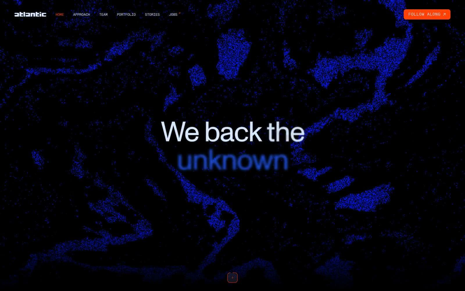
Atlantic.vc
Brand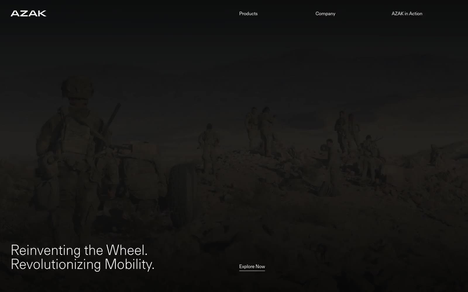
AZAK
Brand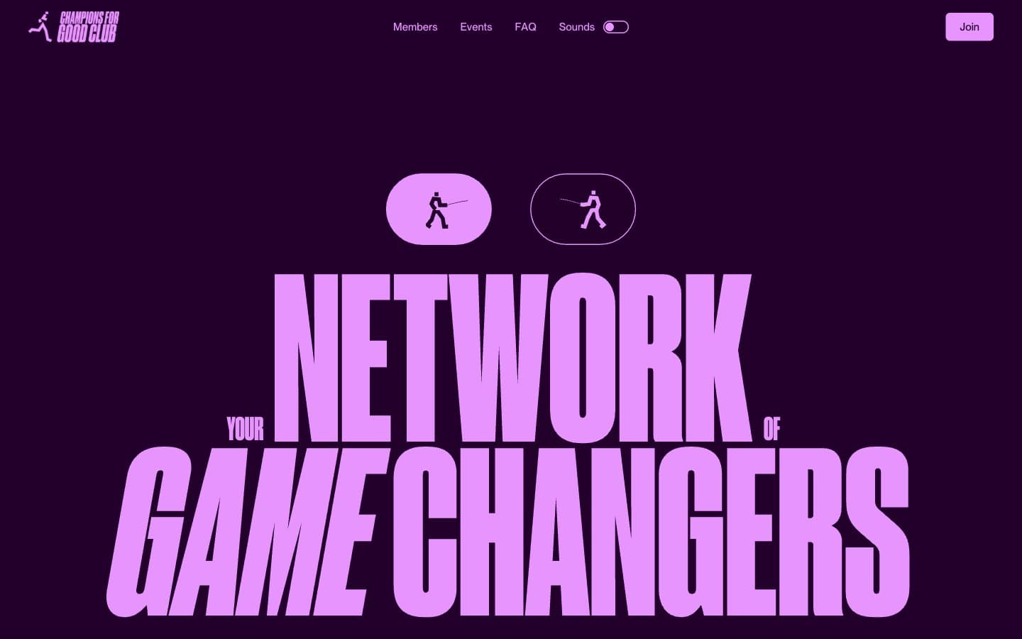
Champions4good
Brand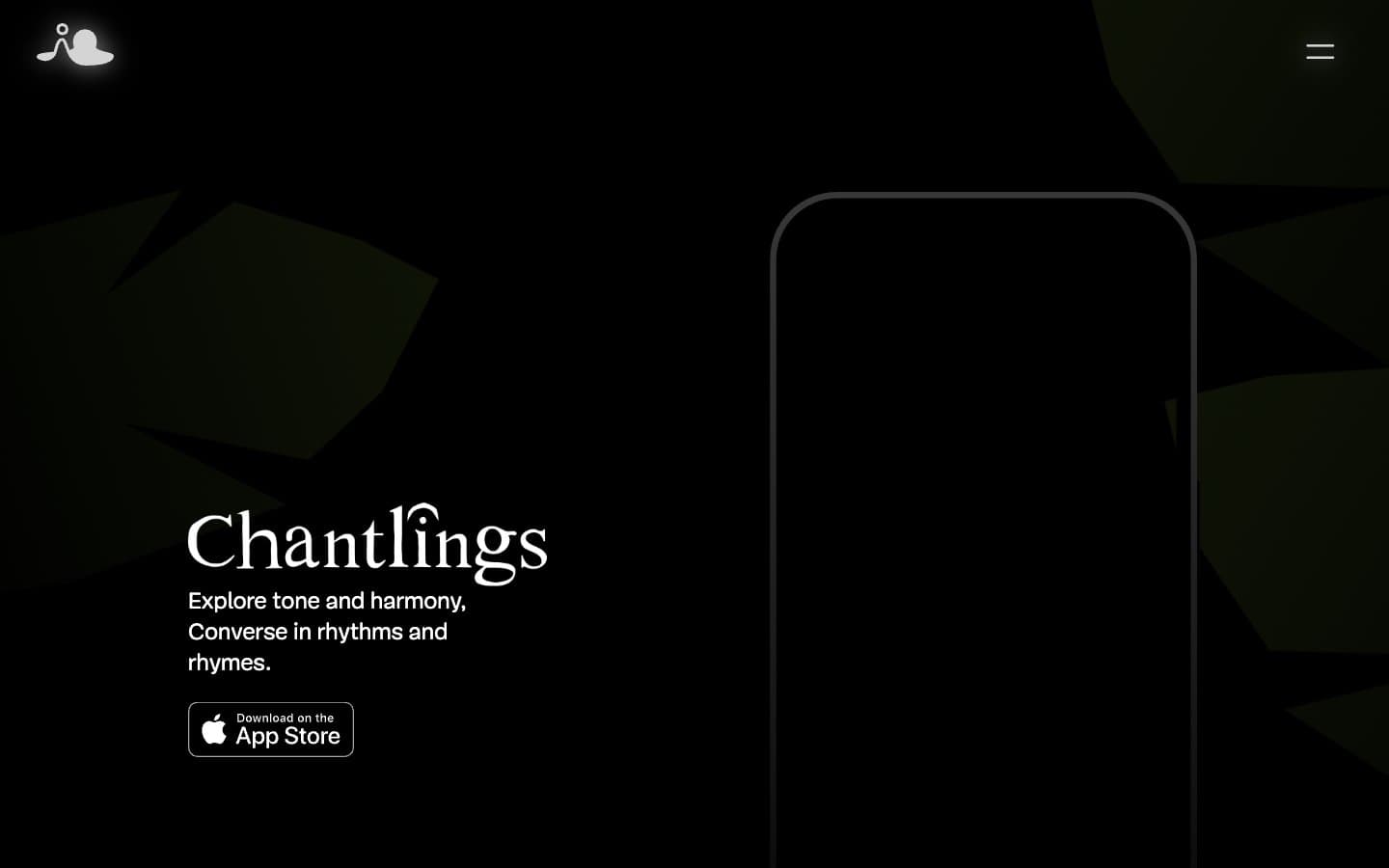
Chantlings
Brand
Design Full-Time
Brand
Drepute
Brand
INVERSA
Brand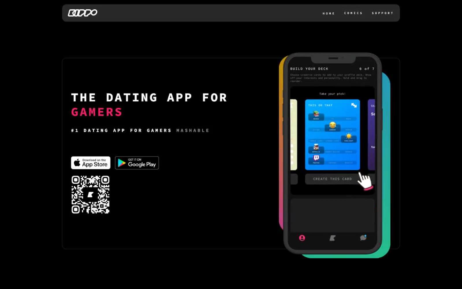
Kippo
Brand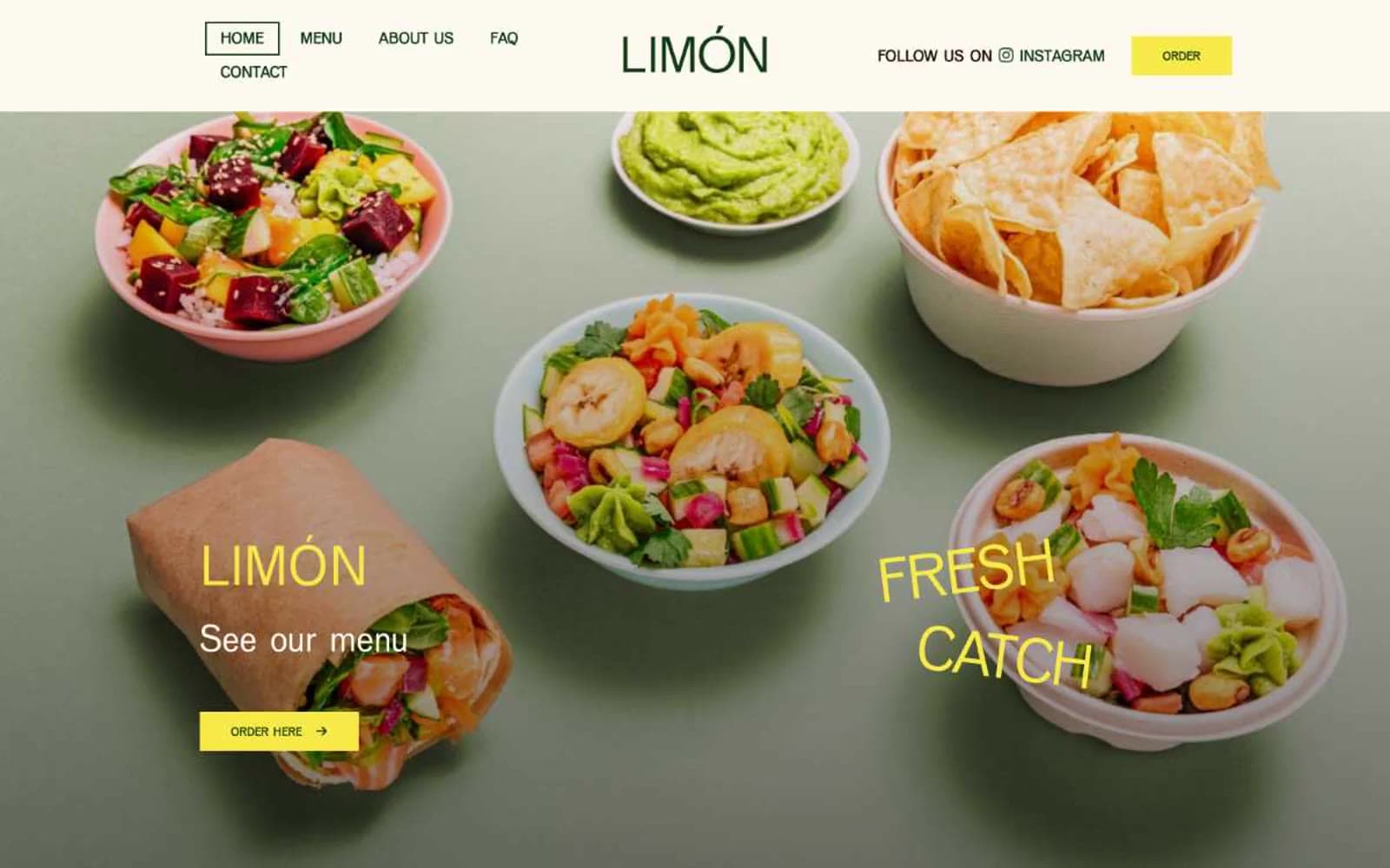
Limón
Brand
Promova
Brand


