
21 TSI. A high-fashion editorial spread where the UI dissolves into atmosphere.
- Brand
- Dark theme
- 4 colors
- 1 typeface
21 TSI operates in the grammar of luxury fashion editorial: the interface itself is austere monochrome — white type, black canvas, hairline rules — while full-bleed crimson photography carries the entire emotional register. UI chrome is deliberately reduced to a single thin top divider, small uppercase wordmarks, and pill-bordered controls; nothing competes with the image. Typography is the structural skeleton: Saans at 12px for nav, then jumping to 106–245px for display — a near-vertical scale that makes individual headlines feel like runway installations rather than page headers. The system prefers silence over information density; every interactive element is a ghost, every frame is a photograph, and the only color that matters is whatever the lens captures.

21 TSI design system

Brand1
Dominant brand atmosphere from full-bleed editorial photography — the only chromatic note in the system, always carried by the image rather than applied to UI chrome
Neutrals3
Page canvas behind full-bleed imagery, button borders on inverted elements, deepest surface layer
Muted secondary borders and dividers used when full white feels too hot against the photographic background
Primary text, navigation labels, ghost-button borders, hairline rules, every UI stroke above imagery
Try a pairing
Pick any two colors from the palette to check whether text stays readable on top.
Aa
Paper White on Crimson Heat
6.27 : 1 contrast
- Body textPasses AA 4.5
- Large textPasses AA 3
- StrictFails AAA 7
More DESIGN.md files. Same web, different personalities.

Abetterlou
Brand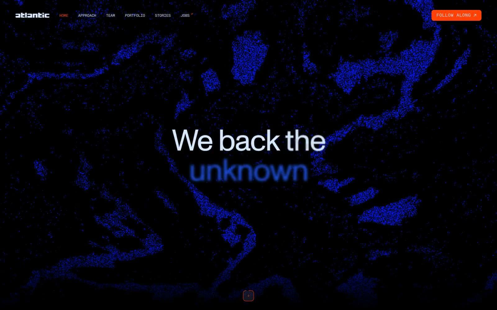
Atlantic.vc
Brand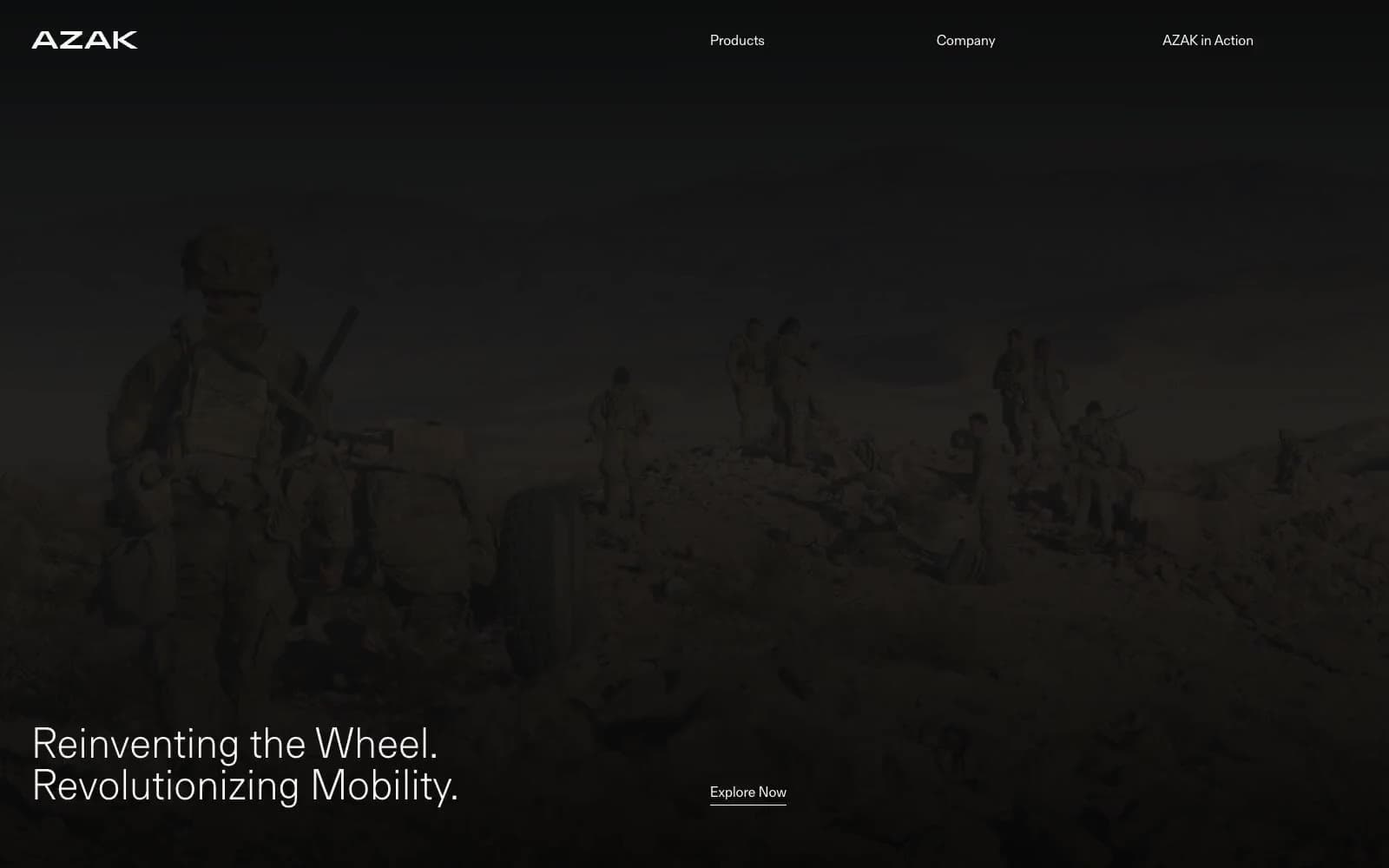
AZAK
Brand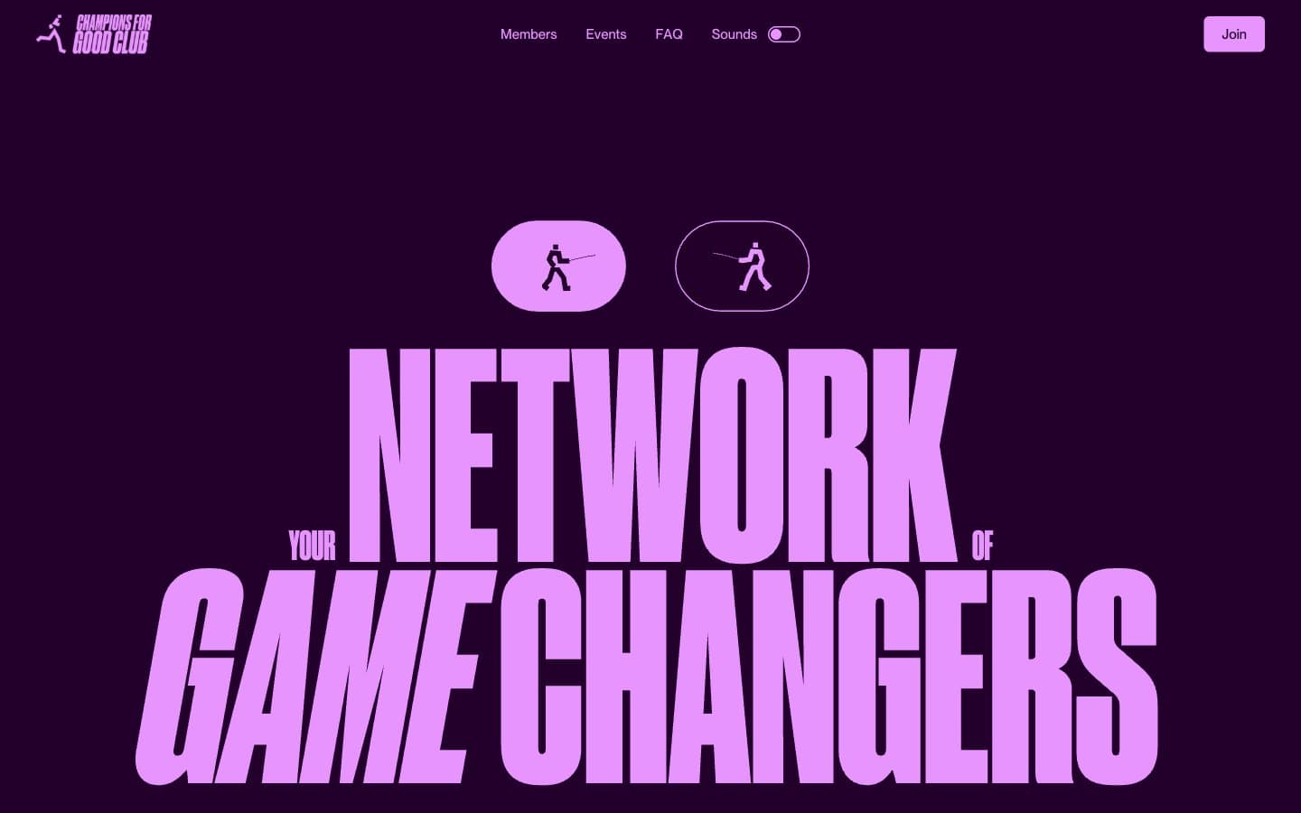
Champions4good
Brand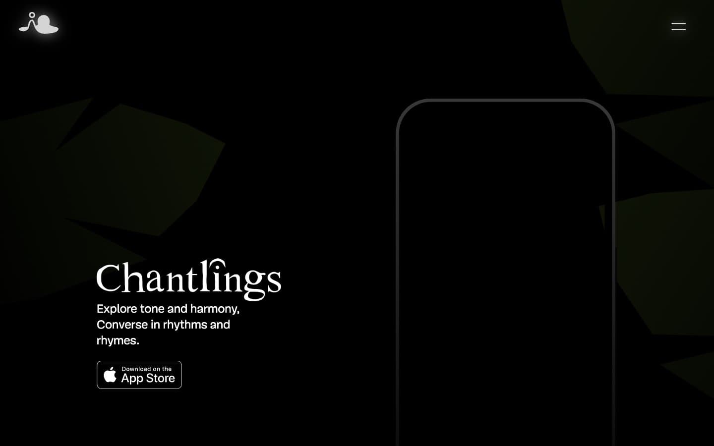
Chantlings
Brand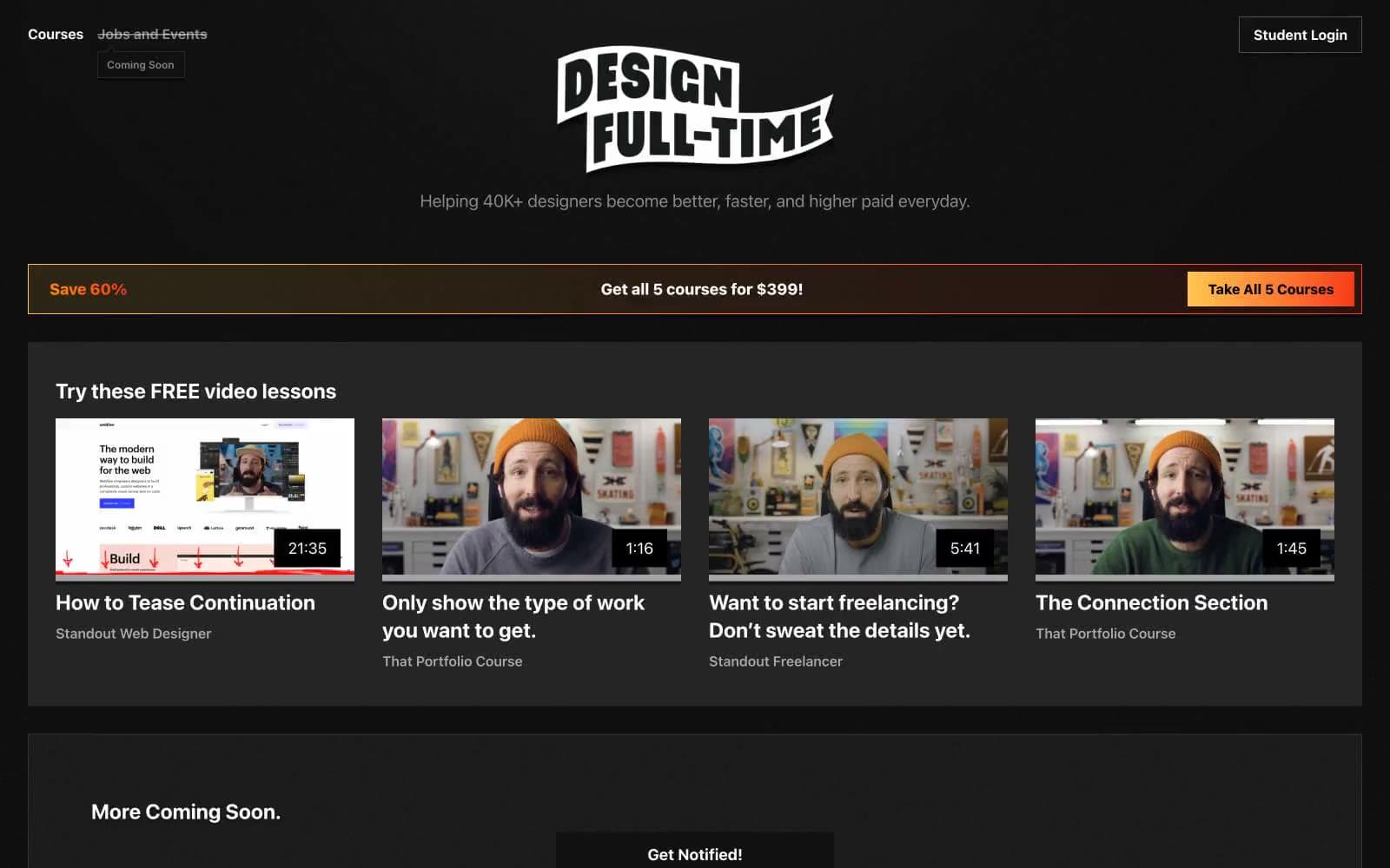
Design Full-Time
Brand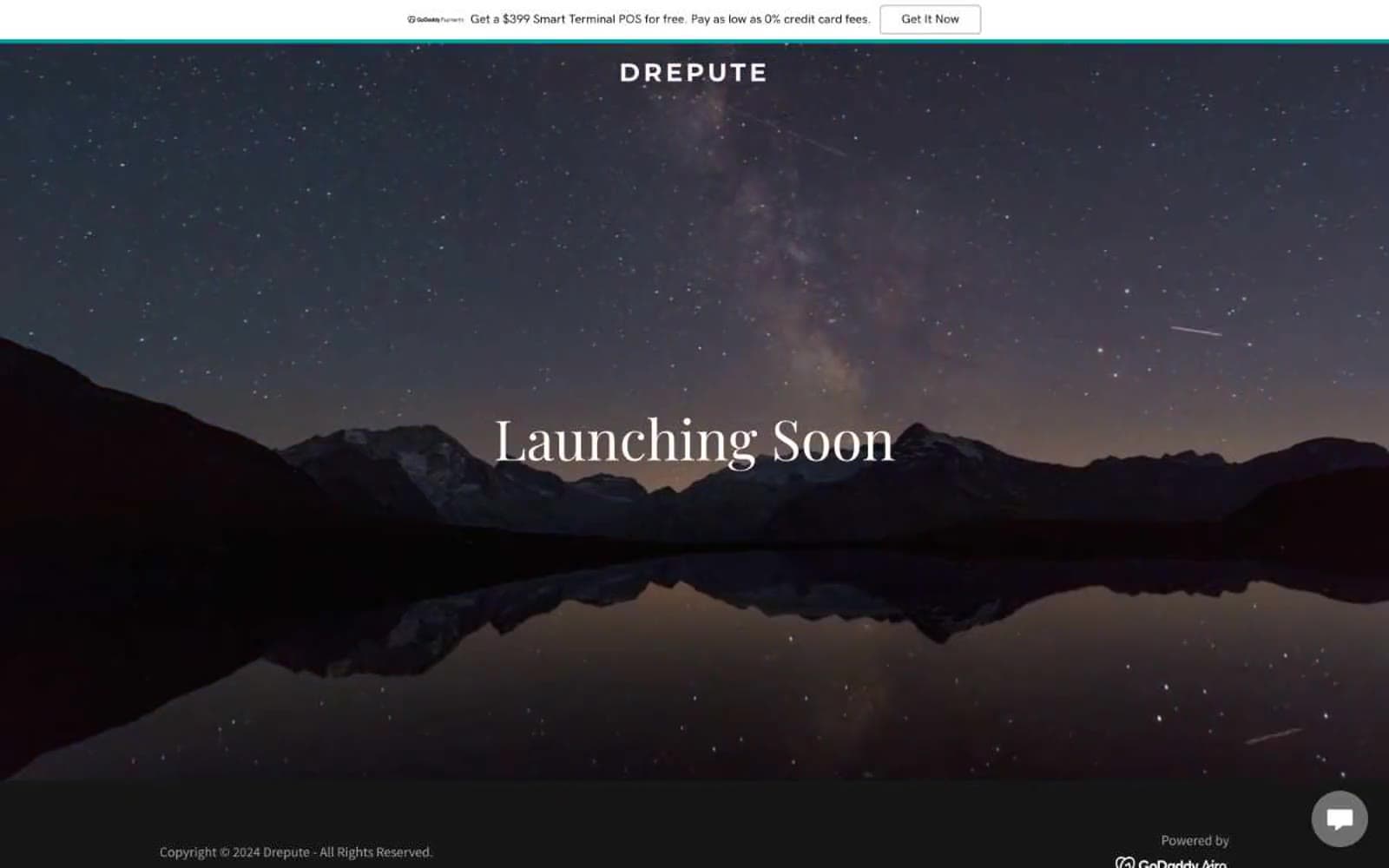
Drepute
Brand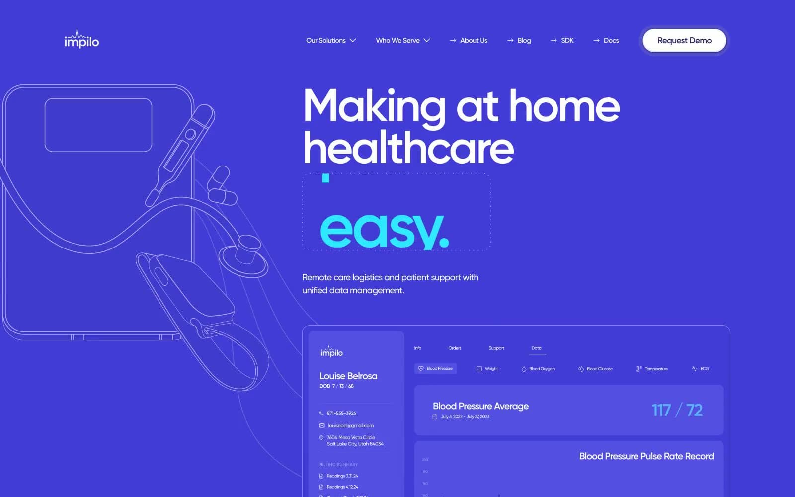
Impilo
Brand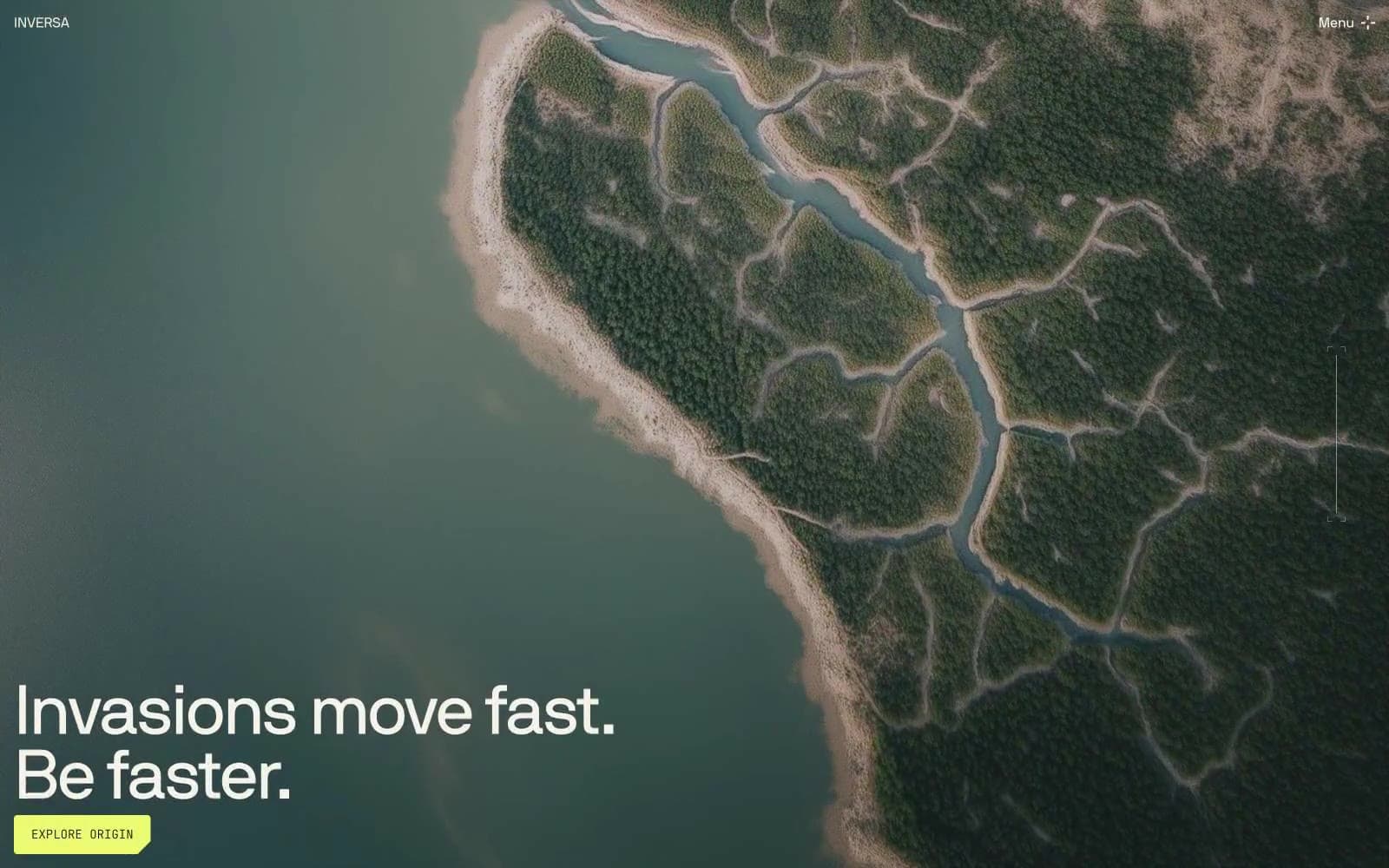
INVERSA
Brand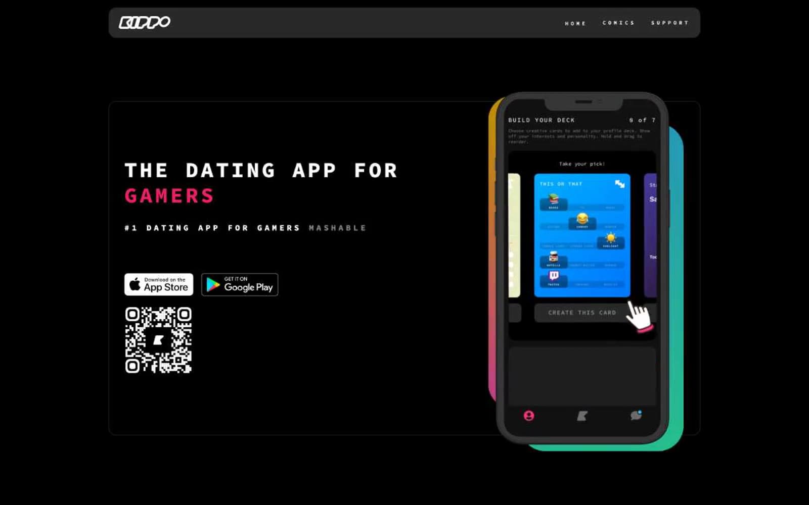
Kippo
Brand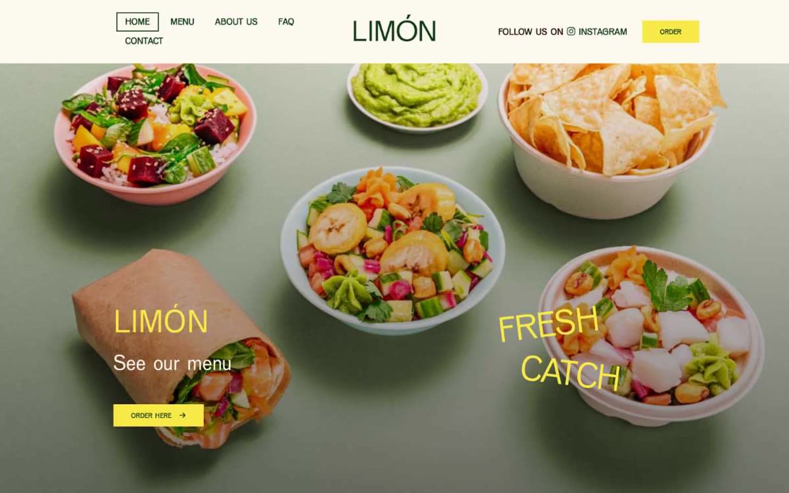
Limón
Brand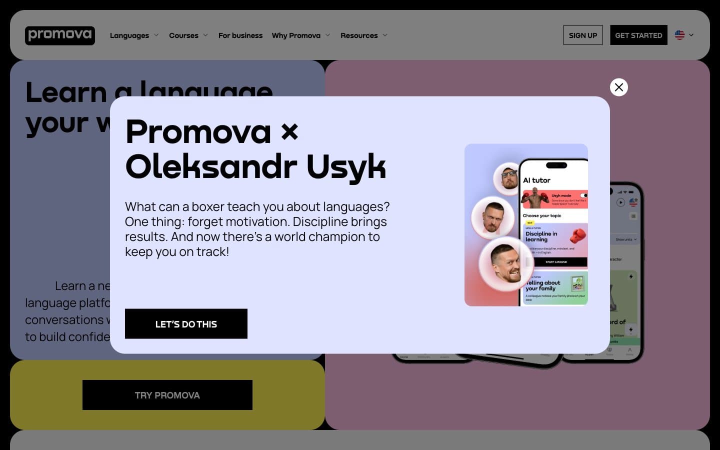
Promova
Brand


