
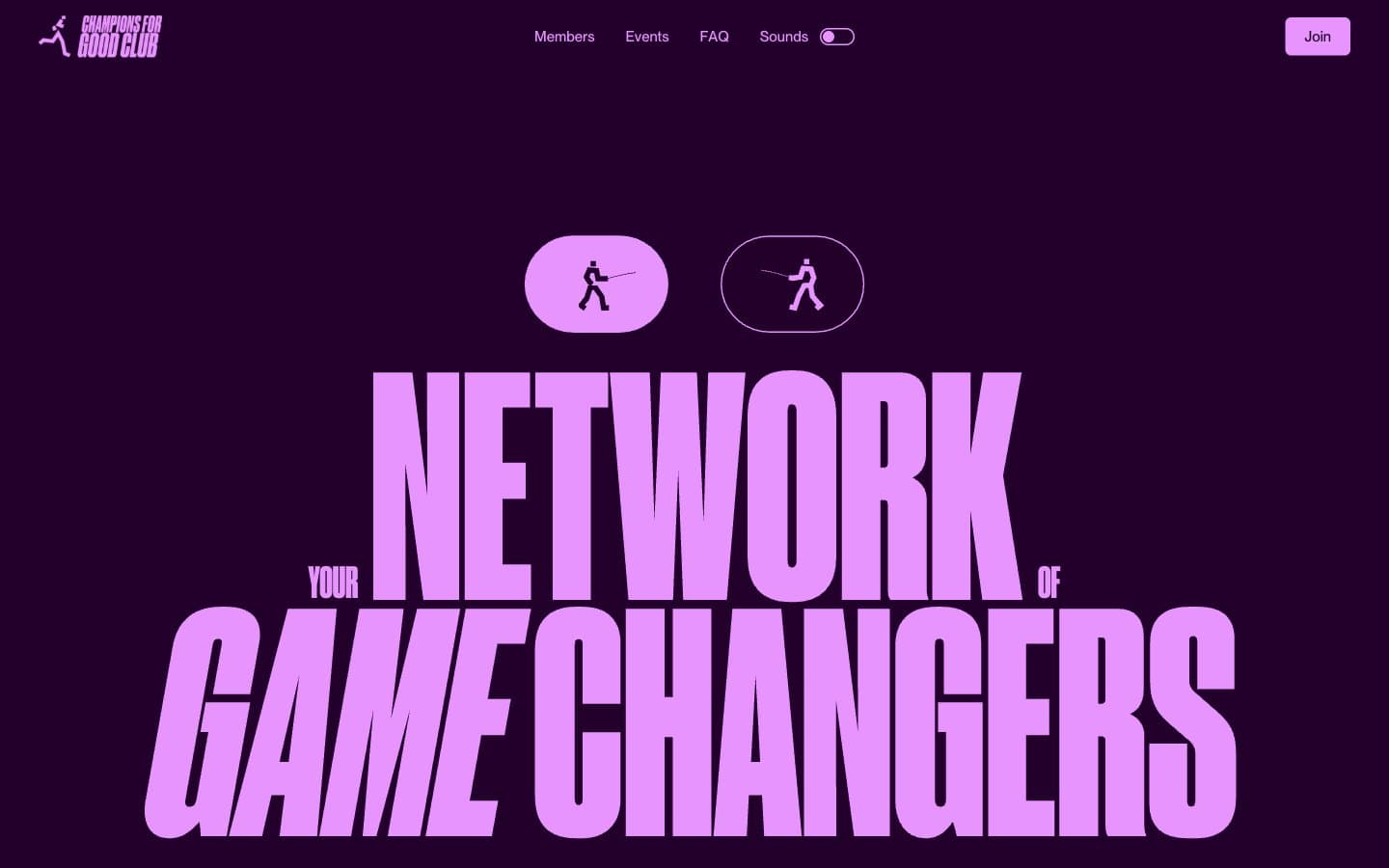
Champions4good. A vintage club poster screaming from a plum-dark wall.
- Brand
- Dark theme
- 10 colors
- 3 typefaces
Champions4good is a dark-first club poster: deep plum canvas, one screaming lavender accent, and ultra-condensed display type that fills the screen like a vintage sports broadside. The visual hierarchy is brutally simple — everything chromatic is lavender-pink (#e894ff) against the plum ground, and supporting accents (mint, amber) appear as small functional punctuation rather than competing for attention. Body sections break to white canvas with the same condensed display type rendered in dense black, creating a high-contrast section rhythm. The type attitude is anti-restraint: Druk Condensed at 200-300px with tight tracking and tight line-height pushes the display copy to the edges of its container, while Neue Montreal handles UI chrome at human sizes. Components are minimal — pill toggles, a single filled lavender button, sparse navigation — letting the typography and the plum-to-white contrast do the work.
Champions4good design system

Brand2
Hero canvas, dark section backgrounds, page-level ground — sets the exclusive nighttime club mood
Pink supporting accent for decorative details and low-frequency emphasis. Do not promote it to the primary CTA color
Accent2
Accent punctuation: highlight washes, badge backgrounds, small functional moments — cool contrast against lavender
Accent punctuation: warm highlight moments, secondary badges, energy markers — warm contrast against the cool palette
Neutrals6
Maximum-contrast text on white sections, solid fills for condensed display type in light zones
Headlines on light sections, heavy text blocks, near-black emphasis
Warm near-black for card backgrounds, dark UI surfaces, warm-tinted borders — adds subtle warmth to the otherwise cool palette
Cool near-black for body text, deep card surfaces, cool borders — the teal undertone distinguishes dark text from the plum background
Primary body text on light sections, icon strokes, dense UI text
Light section canvas, reverse text on dark plum, card surfaces in light zones
Try a pairing
Pick any two colors from the palette to check whether text stays readable on top.
Aa
Paper White on Deep Plum
18.98 : 1 contrast
- Body textPasses AA 4.5
- Large textPasses AA 3
- StrictPasses AAA 7
More DESIGN.md files. Same web, different personalities.

21 TSI
Brand
Abetterlou
Brand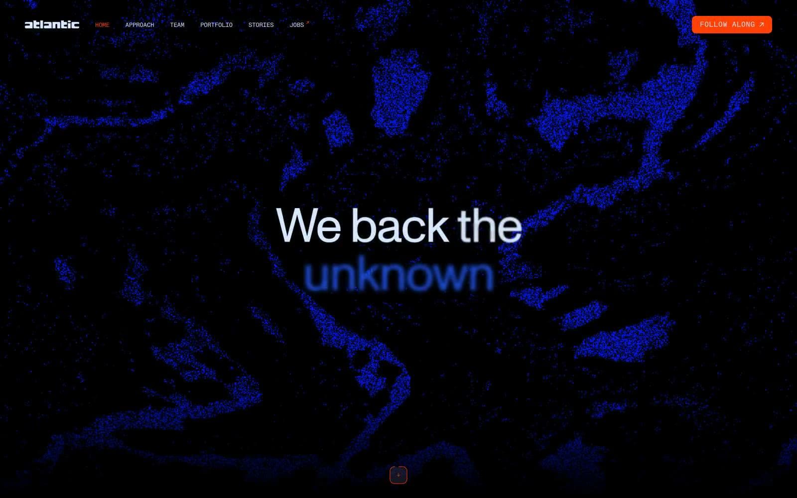
Atlantic.vc
Brand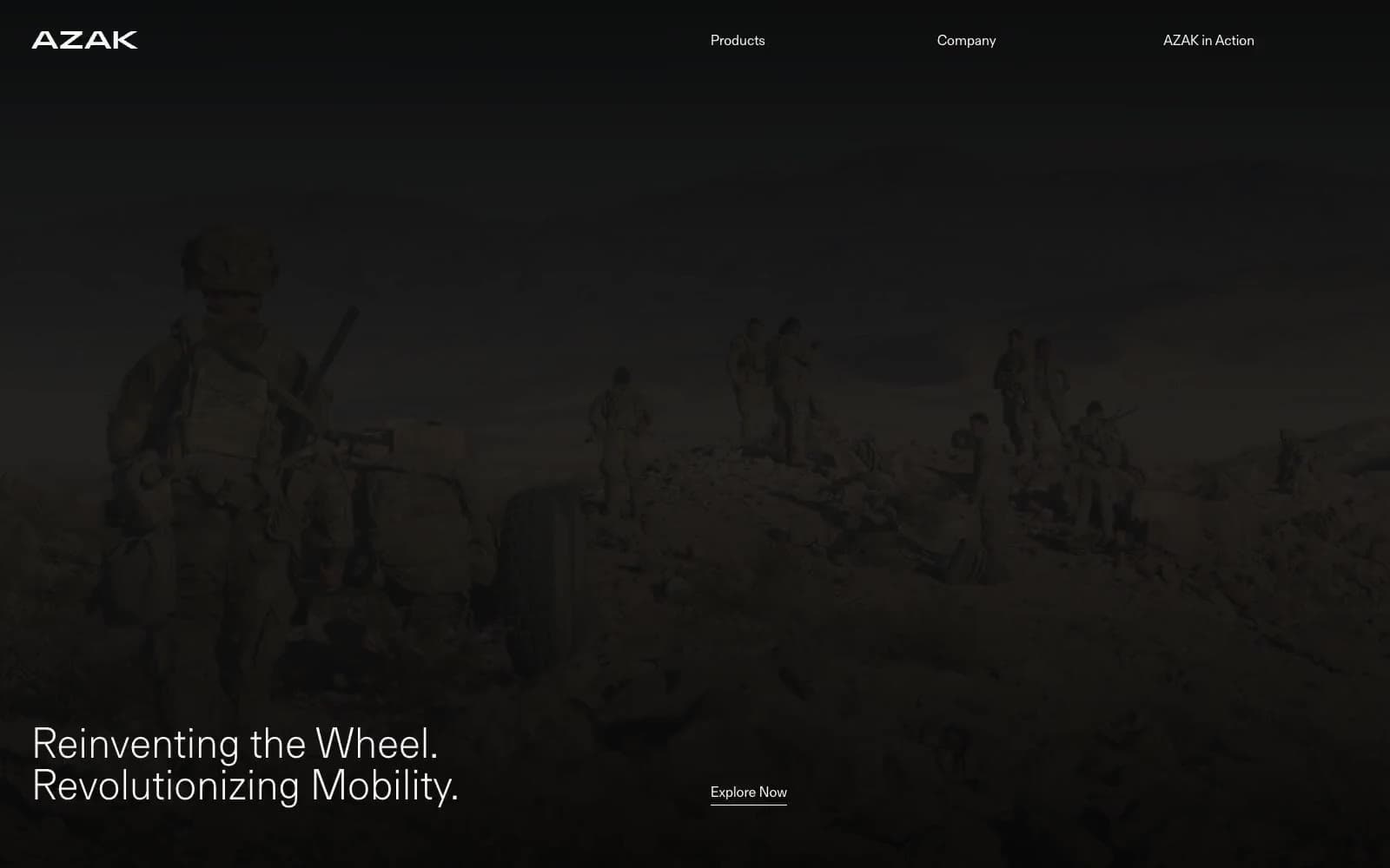
AZAK
Brand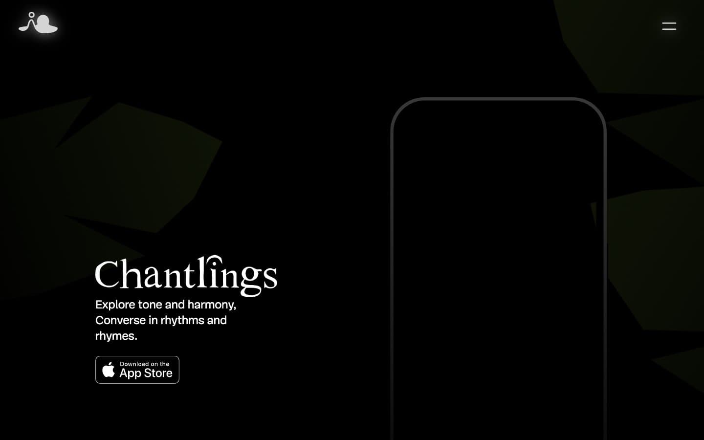
Chantlings
Brand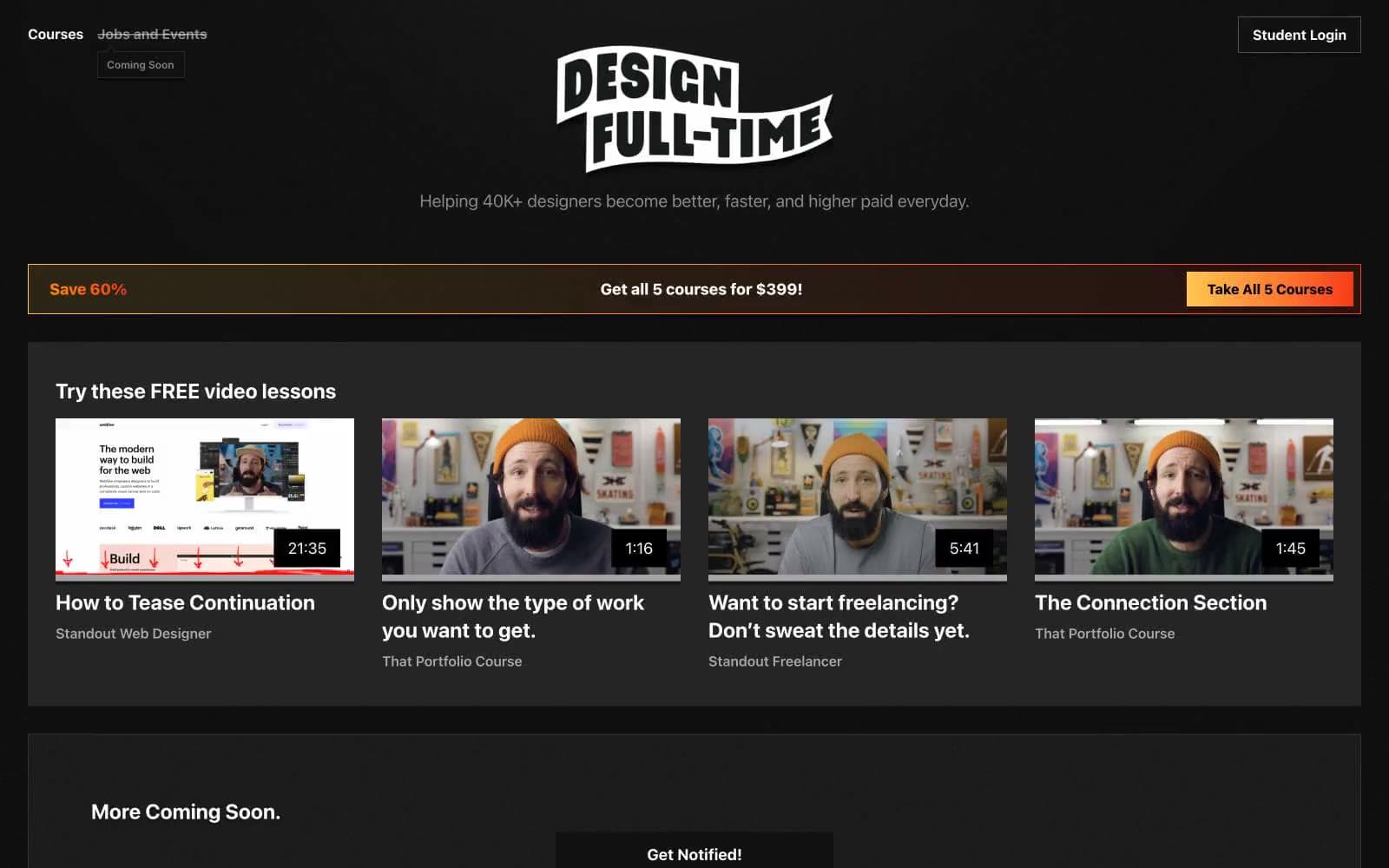
Design Full-Time
Brand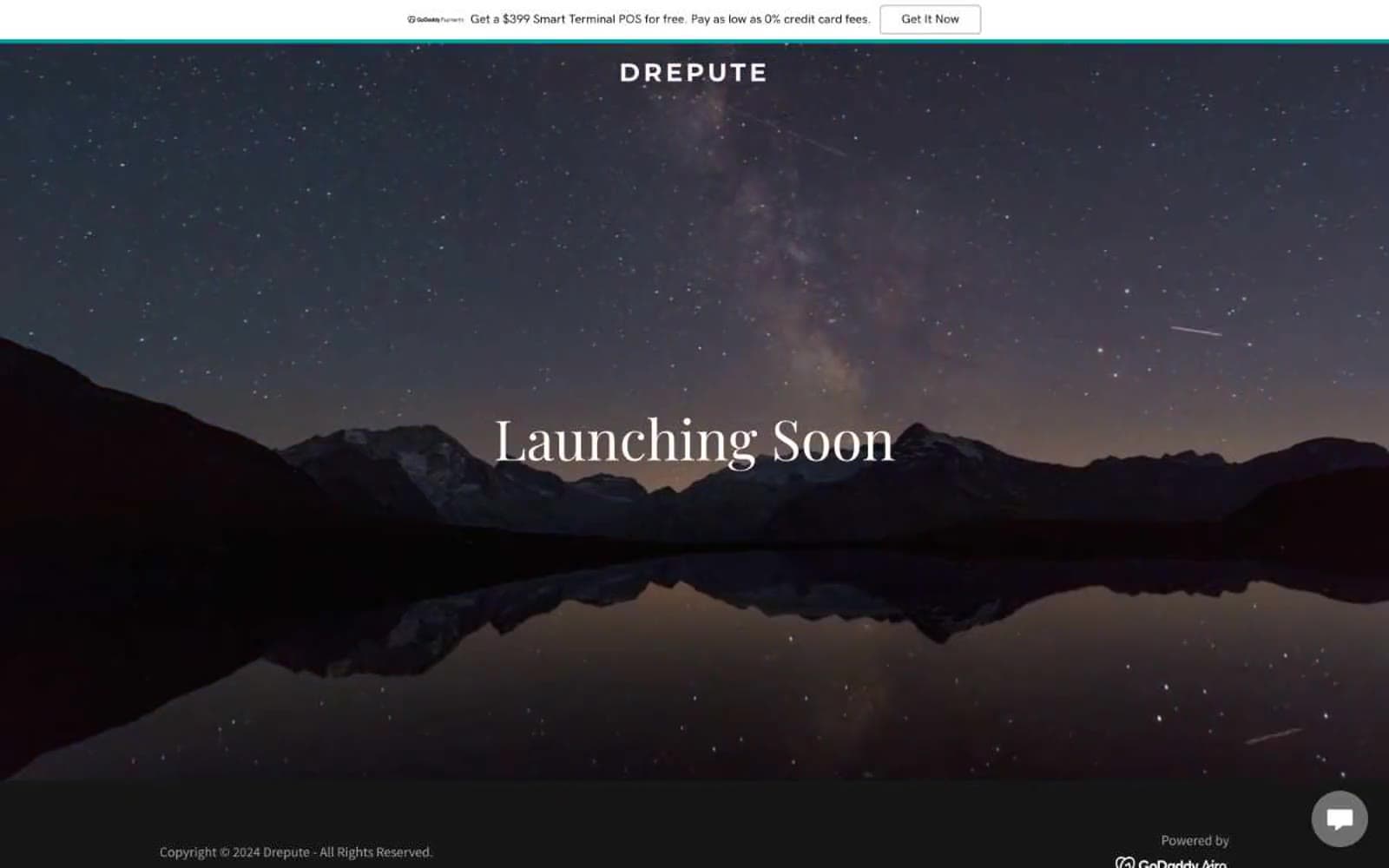
Drepute
Brand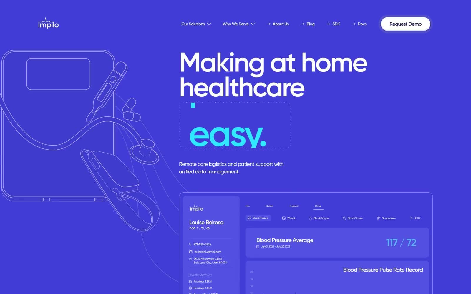
Impilo
Brand
INVERSA
Brand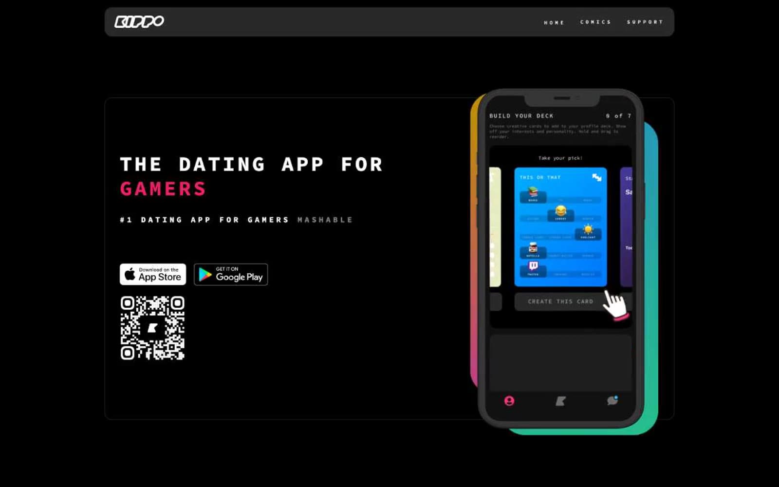
Kippo
Brand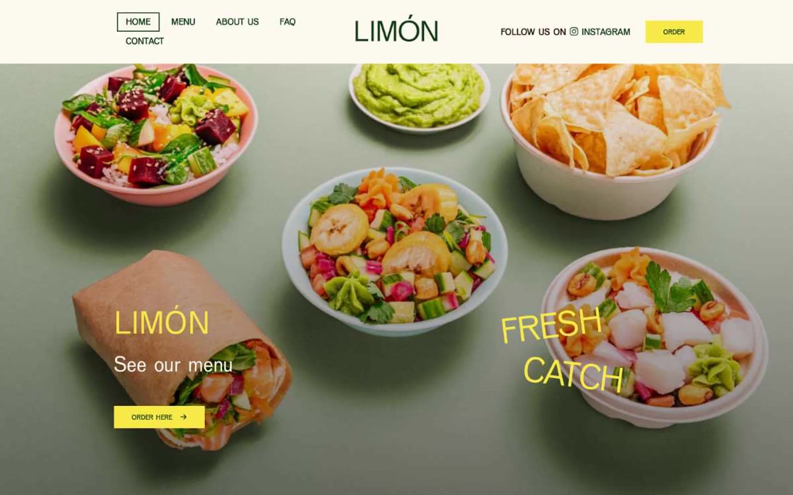
Limón
Brand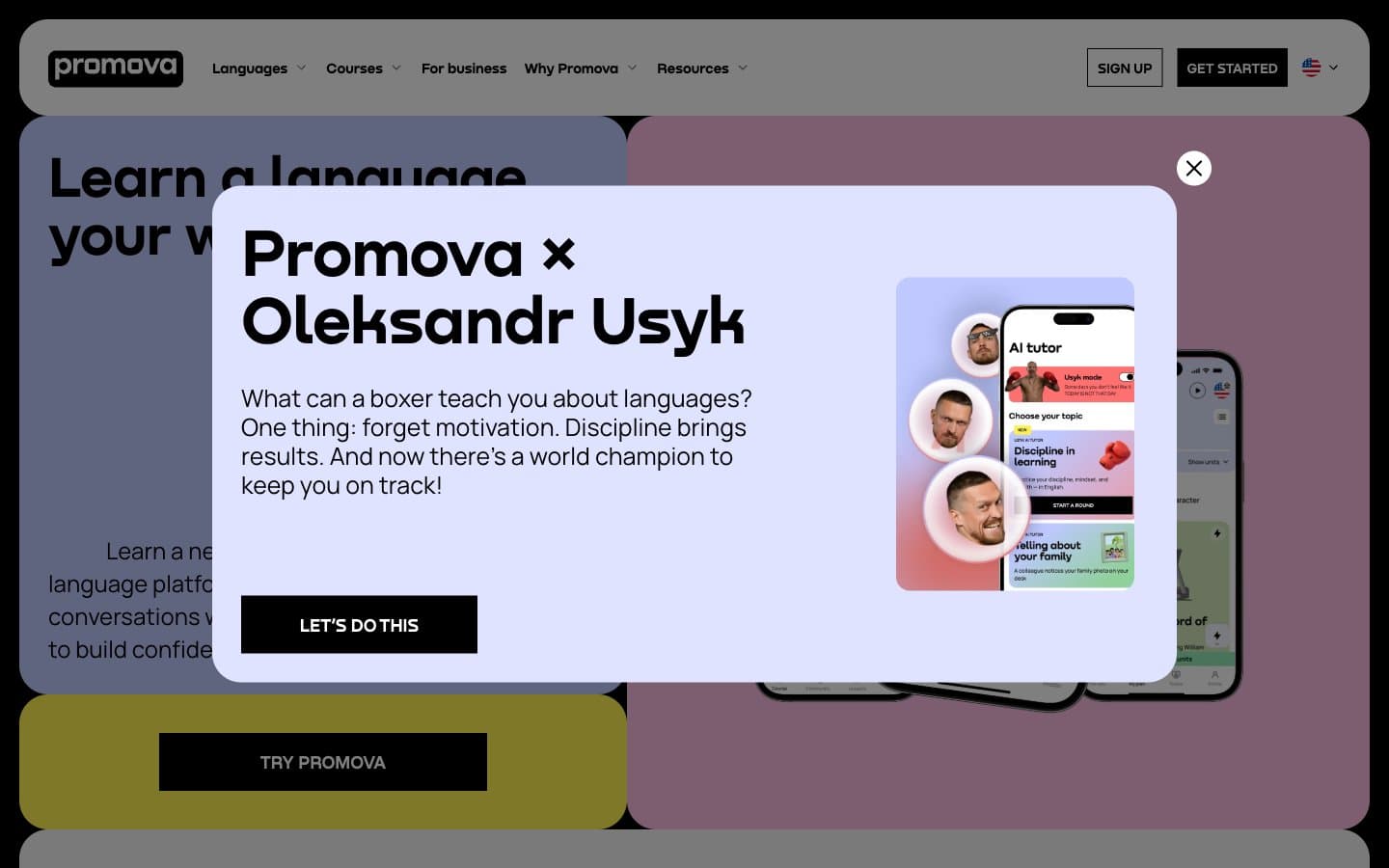
Promova
Brand


