
Limón. Moody brasserie under candlelight.
- Brand
- Dark theme
- 6 colors
- 6 typefaces
Limón runs on the visual grammar of an evening brasserie: deep olive-black canvases under warm overhead light, food photographed as editorial still-life, and a single flash of saturated lemon yellow that reads as accent illumination rather than decoration. Typography carries unusually wide positive tracking — almost hand-stenciled — which makes the brand name and display lines feel pressed onto glass or neon. The palette is deliberately minimal: one near-black, one forest-deep green, one electric yellow, and one warm cream for the breathing sections. Cards and images are heavy; chrome (buttons, borders, dividers) is feather-light with essentially zero corner radius, giving the whole site a confident, unsoftened edge.
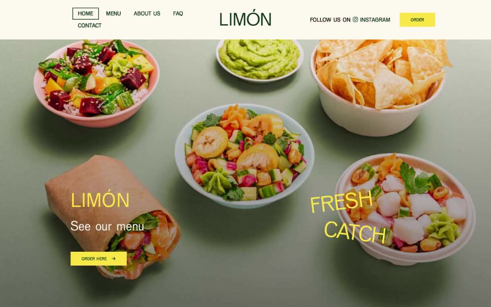
Limón design system

Brand2
Headings, body text, list dividers, link color — the deep green gives the dark-mode typography a botanical, not corporate, character
Filled CTA buttons, large display headlines, accent links, highlight washes — the only chromatic note in the system, used sparingly to ignite dark sections
Neutrals4
Page background, hero canvas, primary text on light sections — the dominant surface that makes the yellow accent feel like lit signage
Hairline dividers, subtle borders, muted accents — a desaturated green-gray that holds the system together without competing with the two brand greens
Light section backgrounds, card surfaces, off-white content panels — a paper-stock warmth that softens the dark hero without going clinical
Icon strokes, button borders, negative-space punctuation inside the dark canvas
Try a pairing
Pick any two colors from the palette to check whether text stays readable on top.
Aa
Pure White on Forest Ink
12.66 : 1 contrast
- Body textPasses AA 4.5
- Large textPasses AA 3
- StrictPasses AAA 7
More DESIGN.md files. Same web, different personalities.

21 TSI
Brand
Abetterlou
Brand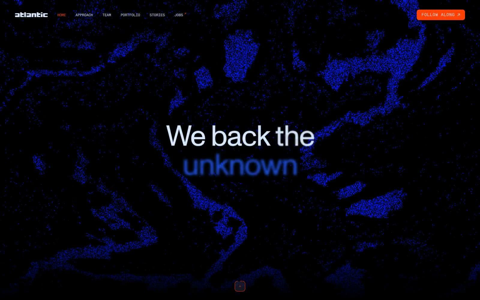
Atlantic.vc
Brand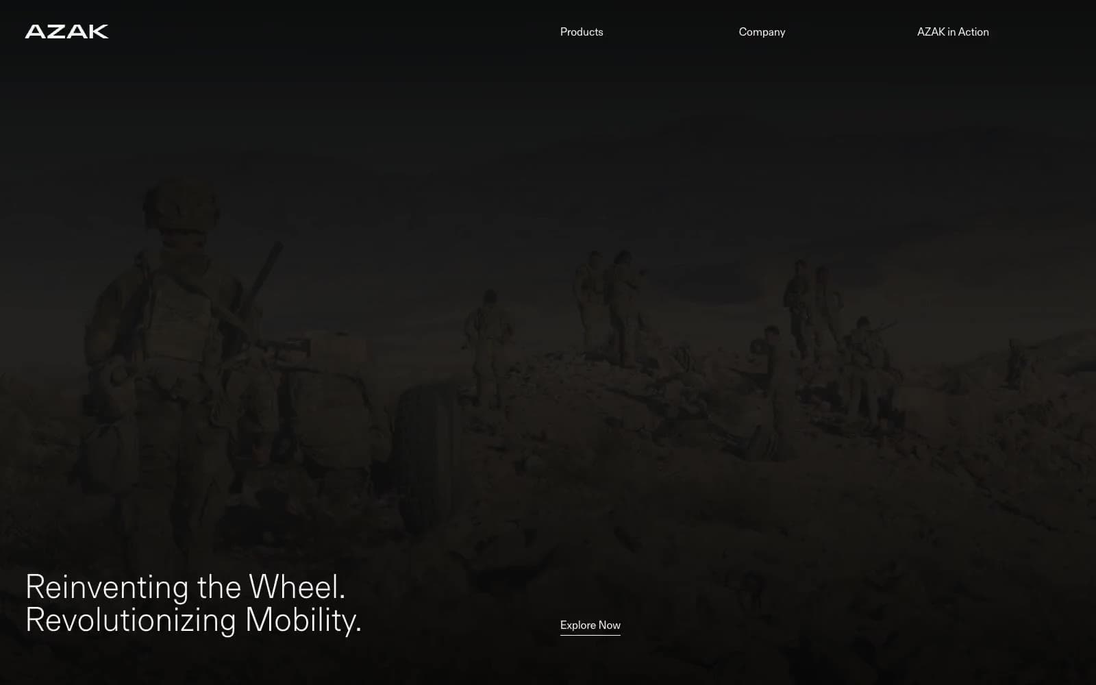
AZAK
Brand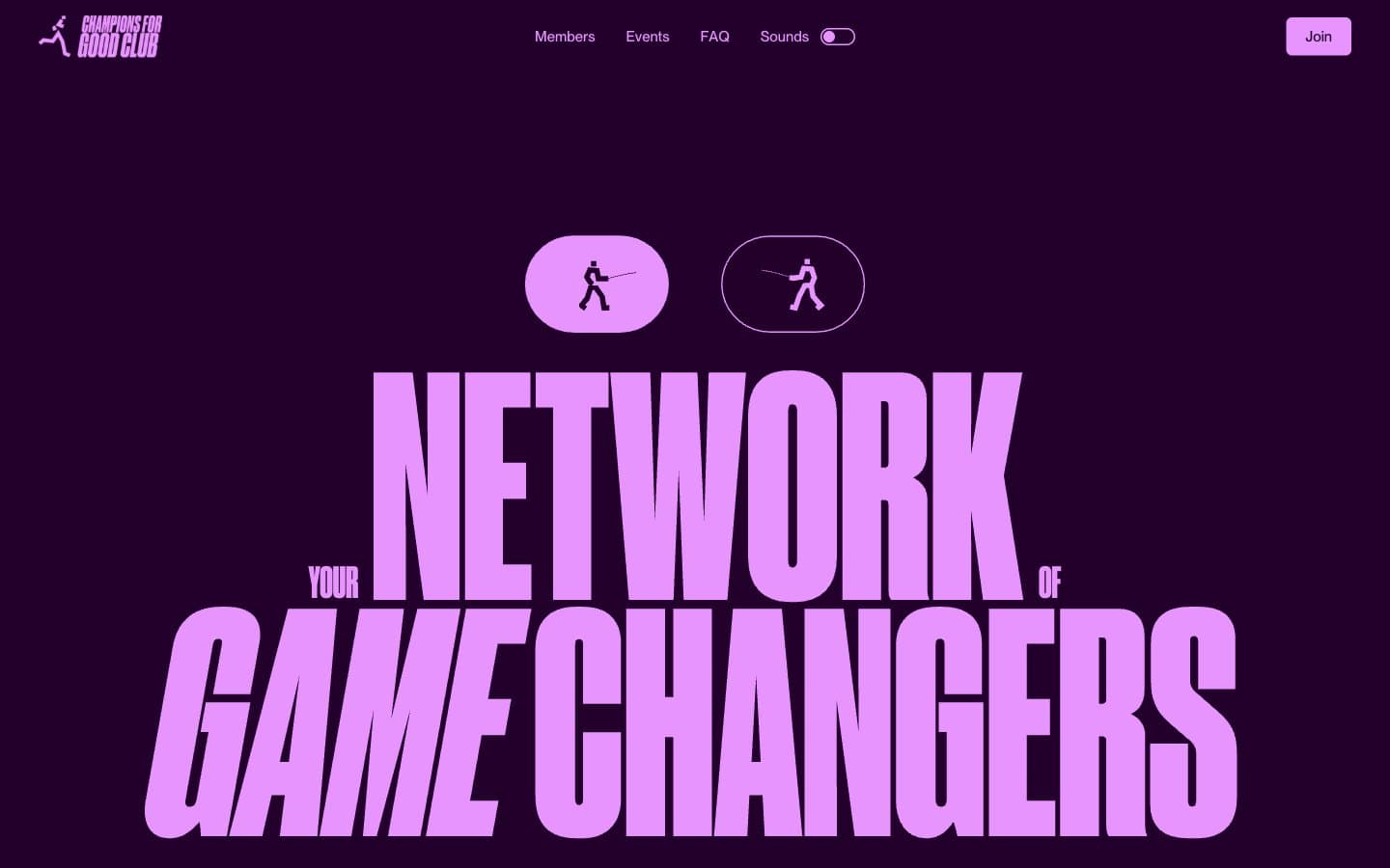
Champions4good
Brand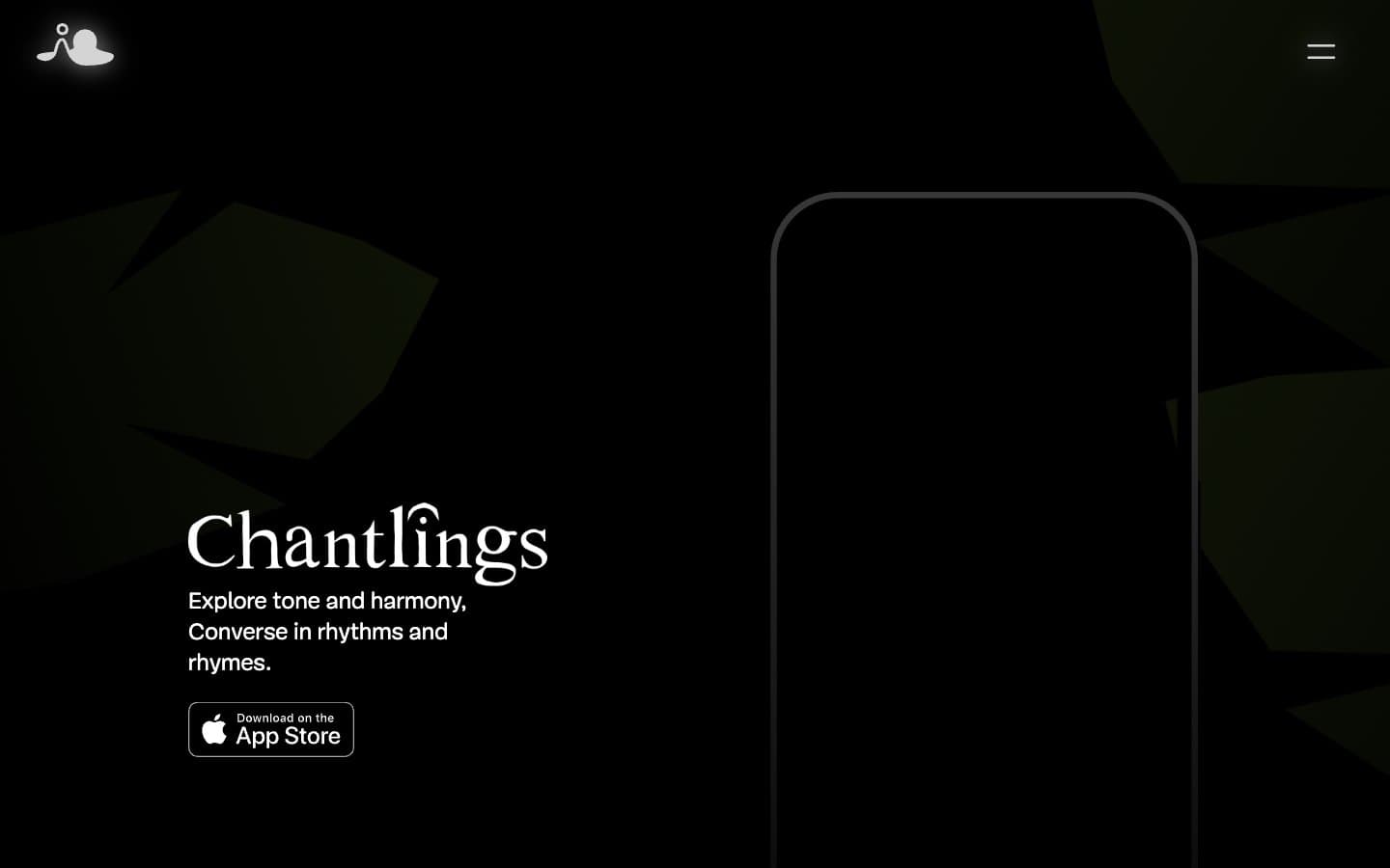
Chantlings
Brand
Design Full-Time
Brand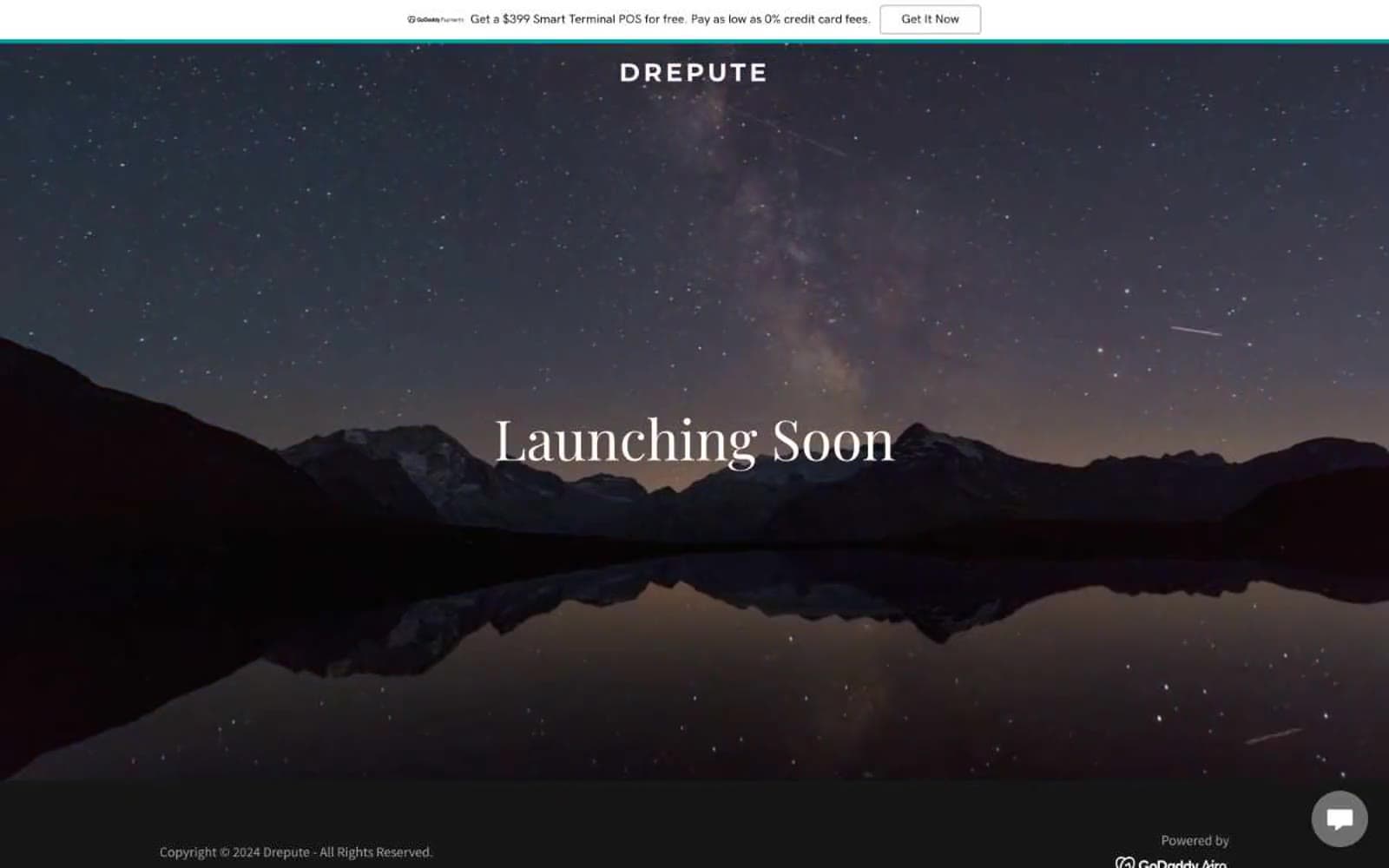
Drepute
Brand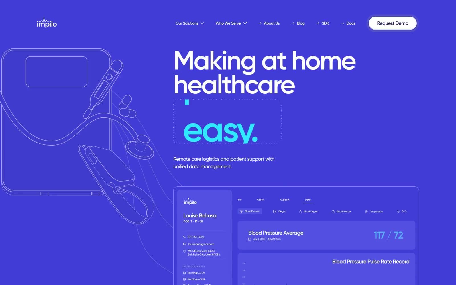
Impilo
Brand
INVERSA
Brand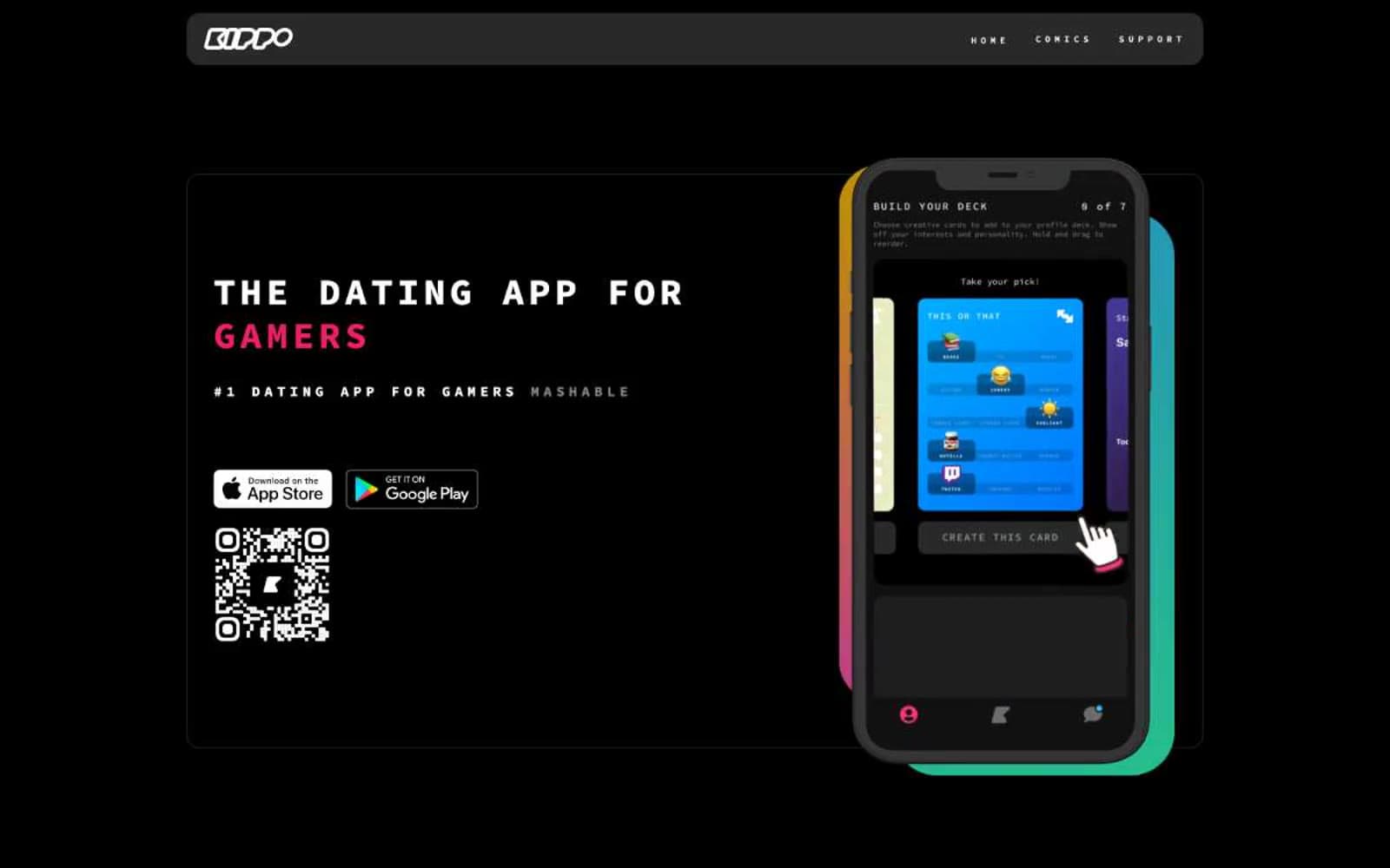
Kippo
Brand
Promova
Brand


