
Status. A dark security console where the only color is a single violet signal lamp.
- Crypto
- Dark theme
- 13 colors
- 1 typeface
Status presents an encrypted-vault aesthetic: a near-black canvas (#09101c) with steel-toned borders and elevated slate surfaces that read as private infrastructure rather than consumer app. Color is rationed tightly — Status Violet (#7140fd) owns brand identity moments while Signal Blue (#2a4af5) carries the only filled action, and everything else stays in an achromatic 95% palette. Inter handles every typographic role, with display 88px headlines tracking at -0.021em that feel engineered rather than set. Comfortable 4px-based rhythm, 20-24px card radii, and 12px pill-shaped controls create a deliberate, security-first surface language. Product mockups (wallet, messenger) are the primary visual content — the device IS the hero, not lifestyle photography.
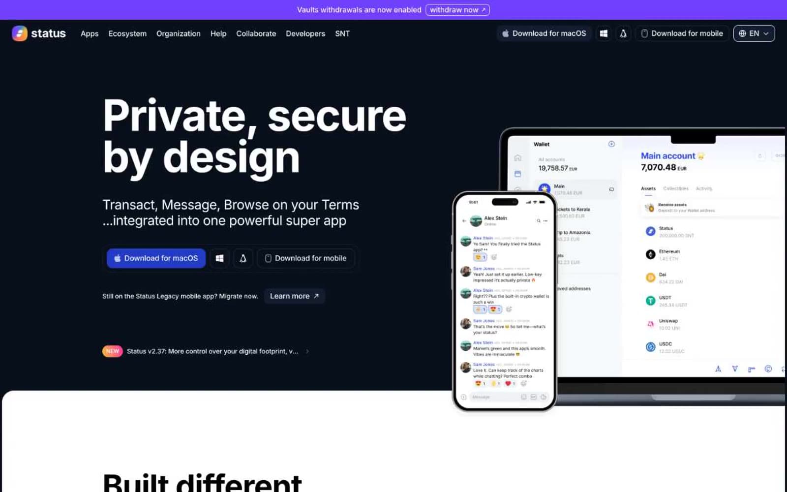
Status design system

Brand2
Primary action fill, brand-action emphasis — the only saturated button color, single violet-blue signal against the dark canvas
Violet text accent for links, tags, and emphasized short phrases
Accent2
Accent hue in gradient washes, illustrative moments, secondary brand color in art; Brand gradient wash for decorative sections, hero accents, and section backgrounds
Warm accent in gradient compositions and illustrative highlights — the yellow stop in tri-color gradients
Neutrals9
Page canvas, card backgrounds, primary surface — the near-black base that absorbs everything else
Elevated surface for buttons and interactive containers, one step above the canvas
Primary border color, link underlines, nav separators — defines structural edges at very high frequency
Secondary card surface, subtle elevation tier above Midnight Ink
Muted body text, helper copy, secondary labels — readable but recessive
Icon fills, tertiary text, nav inactive states — the lightest non-white neutral
Light-section borders, hairline dividers, outlines on light backgrounds
Lightest neutral border, soft dividers in light sections
Light-section canvas, primary text on dark, inverted surface — dual-role neutral
Try a pairing
Pick any two colors from the palette to check whether text stays readable on top.
Aa
Paper on Signal Blue
6.18 : 1 contrast
- Body textPasses AA 4.5
- Large textPasses AA 3
- StrictFails AAA 7
More DESIGN.md files. Same web, different personalities.
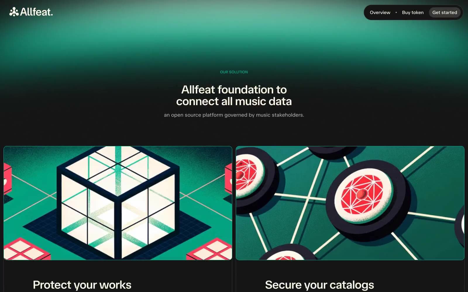
Allfeat
Crypto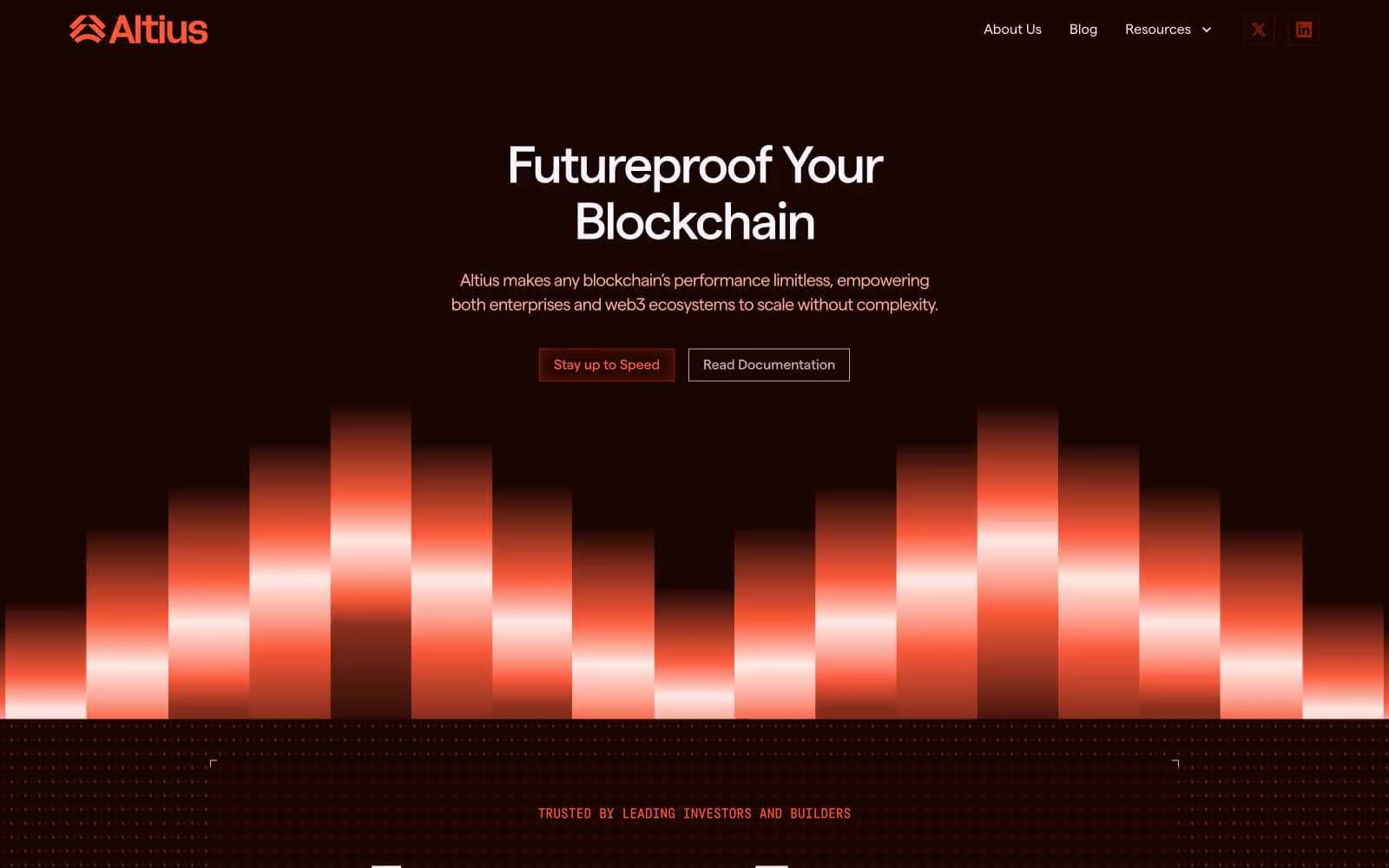
Altius
Crypto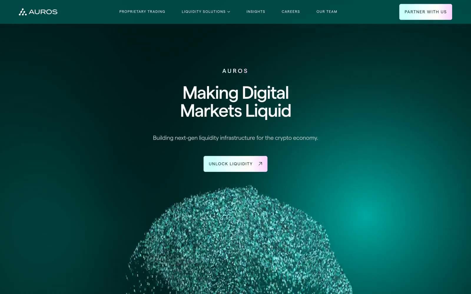
Auros
Crypto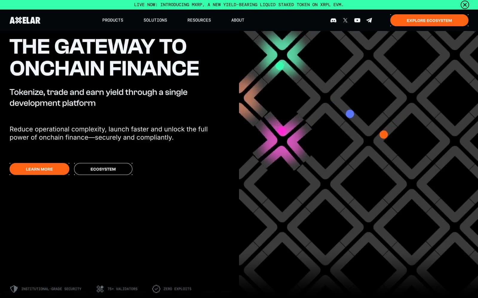
Axelar
Crypto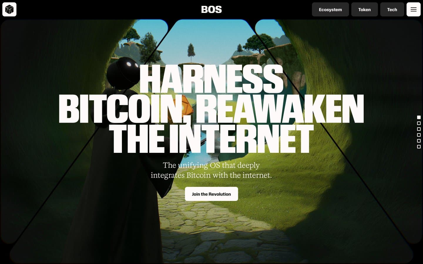
BitcoinOS
Crypto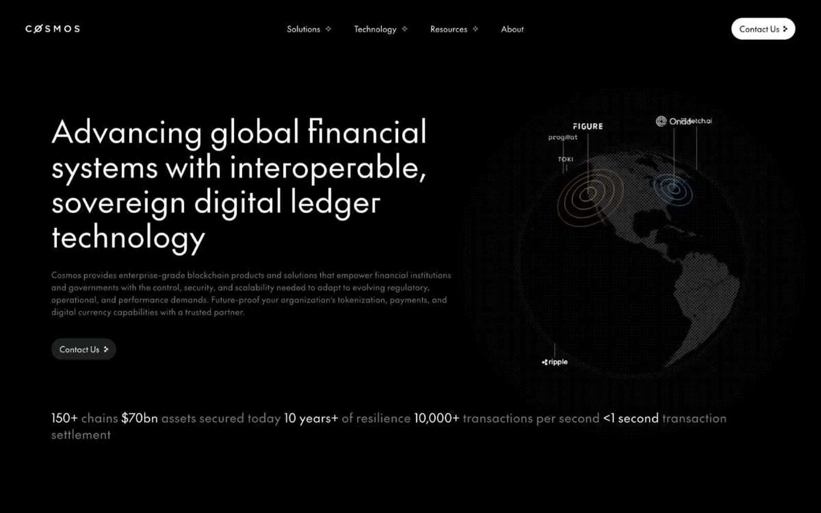
Cosmos Network
Crypto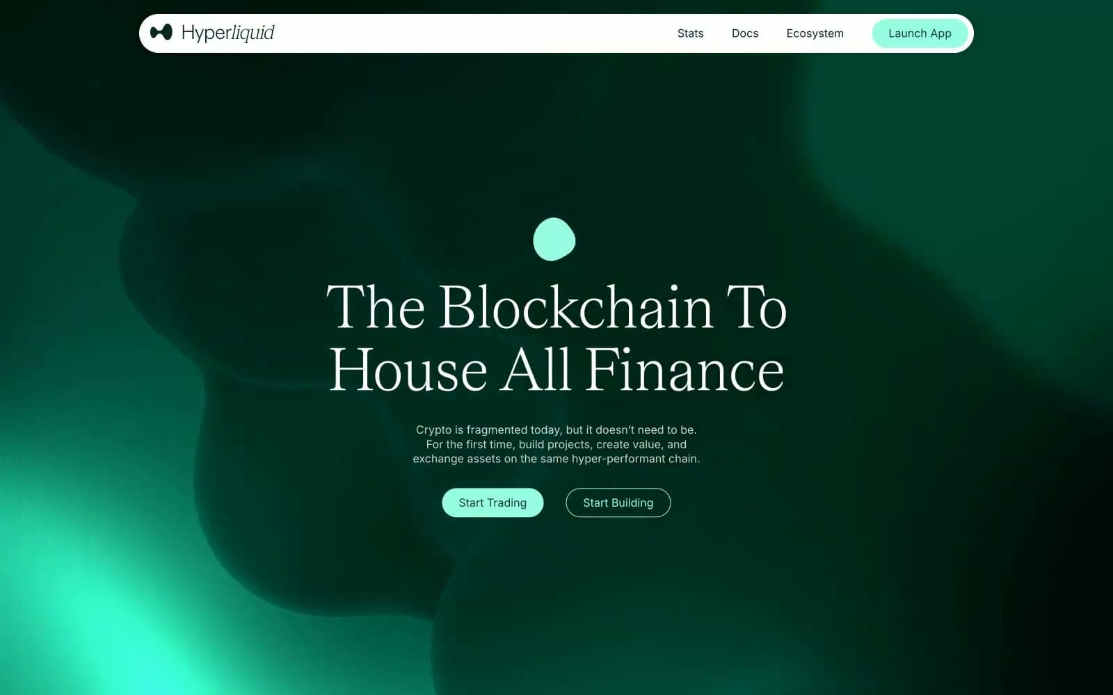
Hyper Foundation
Crypto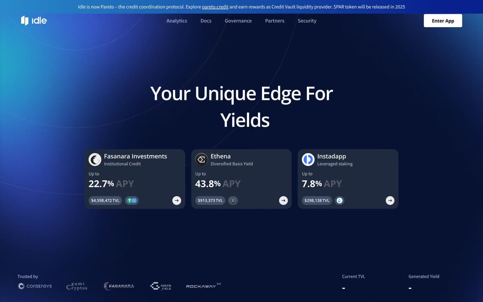
Idle Finance
Crypto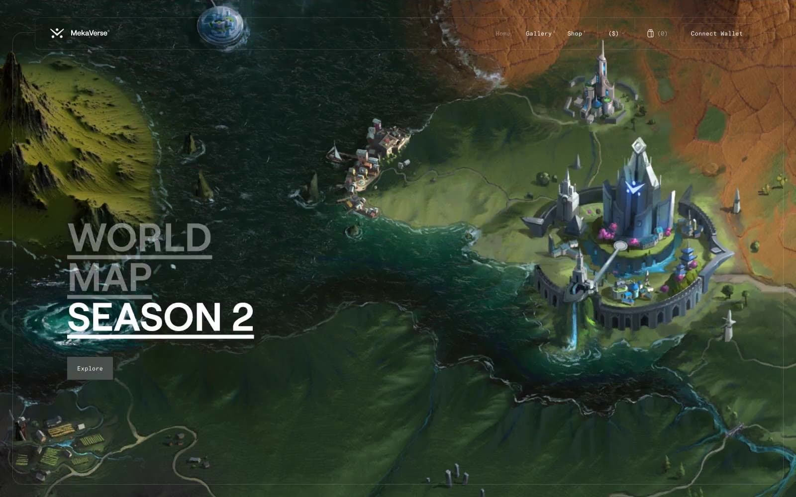
MekaVerse
Crypto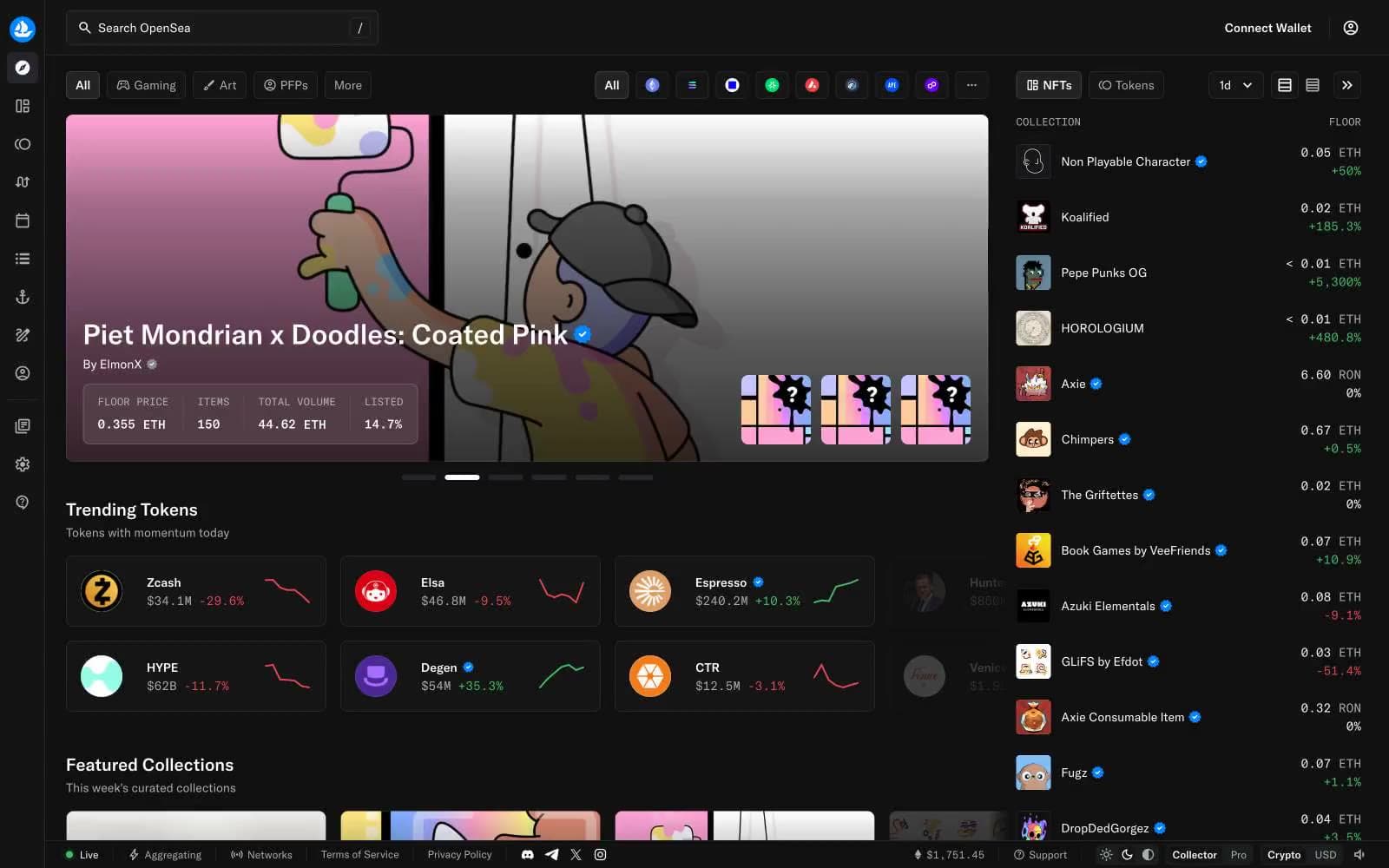
OpenSea
Crypto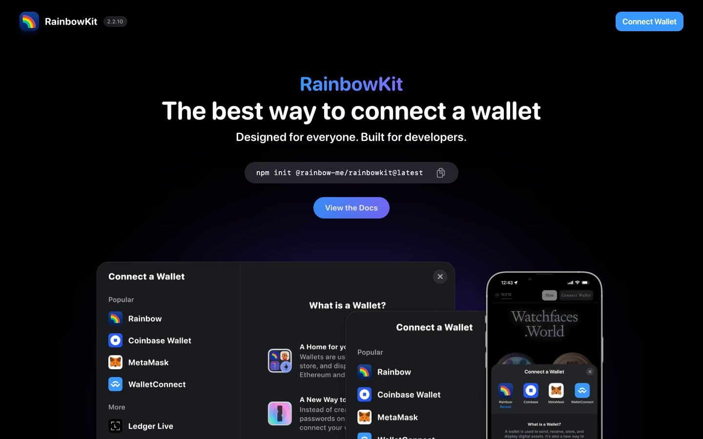
RainbowKit
Crypto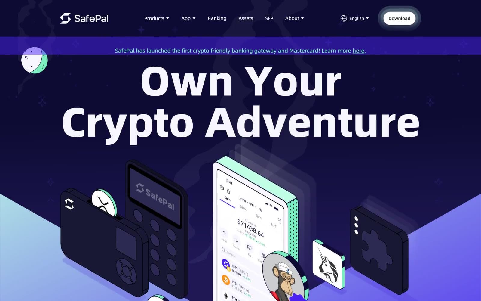
Safepal
Crypto


