
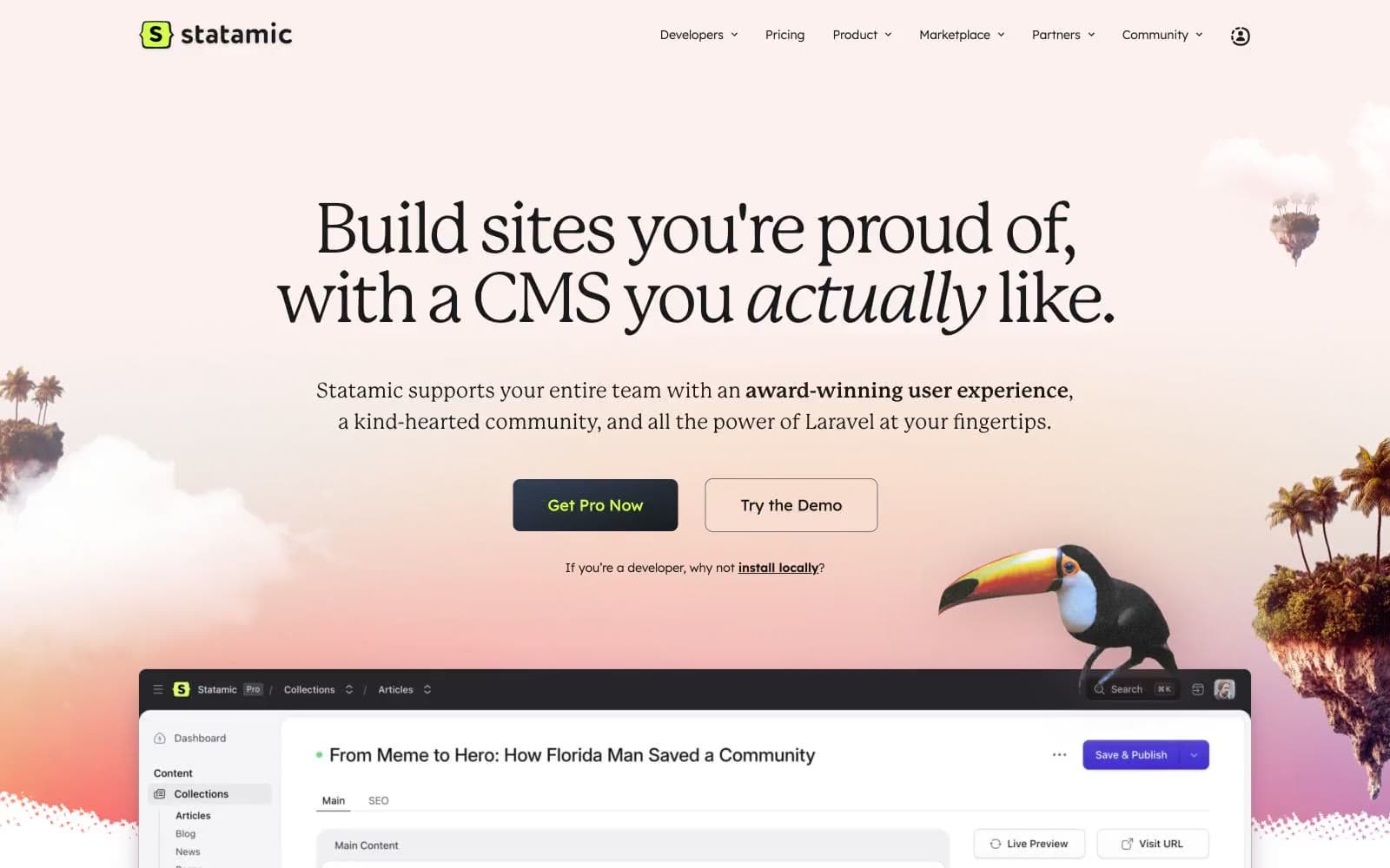
Statamic. Warm editorial sunset over floating islands.
- Developer tools
- Light theme
- 15 colors
- 4 typefaces
Statamic pairs a warm, editorial display serif with a clean geometric sans for a CMS that feels like a publication rather than a dashboard. The visual system lives in a sunlit peach-to-pink gradient world decorated with floating tropical islands — the brand leans into warmth, softness, and a slightly handcrafted sensibility. Color is used sparingly against an off-white canvas: olive-green electric lime as the brand spark, muted lavender for outlined actions, and near-black for the filled primary button. Surfaces are soft with minimal elevation, radii stay modest (8px dominates), and shadows whisper rather than shout. Typography carries most of the personality — a thin serif at 60-96px for headlines with tight tracking, and Lexend in its lighter weights for body and UI text.
Statamic design system

Brand1
Green accent for outlined action borders, linked labels, and lightweight interactive emphasis. Do not promote it to the primary CTA color
Accent6
Outlined action borders, ghost button strokes, soft decorative accents — a desaturated violet that signals interactivity without shouting
Decorative pastel wash, soft card accents, illustration tints
Decorative pastel wash, hero gradient highlight, soft illustration tint
Deep accent in image shadows and illustration depth — gives floating islands their grounded dimensionality
Gradient endpoint for dark image overlays
Subtle multi-hue gradient wash on feature sections — used at 0.08 opacity for atmospheric backgrounds
Neutrals8
Dark borders and separators for elevated surfaces and inverted UI. Do not promote it to the primary CTA color
Deeper secondary text, fine separator borders
Body text at reduced contrast, fine borders in content blocks
Nav text, icon strokes, list borders, secondary text
Muted body text, subtle borders, image shadows — warm gray that harmonizes with the peach canvas
Hairline borders, light dividers between sections and cards
Hero gradient base, secondary surfaces — the warm cream that gives the whole site its sunset atmosphere
Page canvas, card surfaces, button text on dark fills, list backgrounds
Try a pairing
Pick any two colors from the palette to check whether text stays readable on top.
Aa
Ink on Electric Lime
15.11 : 1 contrast
- Body textPasses AA 4.5
- Large textPasses AA 3
- StrictPasses AAA 7
More DESIGN.md files. Same web, different personalities.

Tailwind CSS
Developer tools
Atoms
Developer tools
Browserbase
Developer tools
Cursor
Developer tools
Deno
Developer tools
Drizzle ORM
Developer tools
Earlydog
Developer tools
Expo
Developer tools
Fingerprint
Developer tools
Flatfile
Developer tools
Flox
Developer tools
Fly.io
Developer tools


