
SST. Code terminal in a gallery.
- Developer tools
- Light theme
- 11 colors
- 2 typefaces
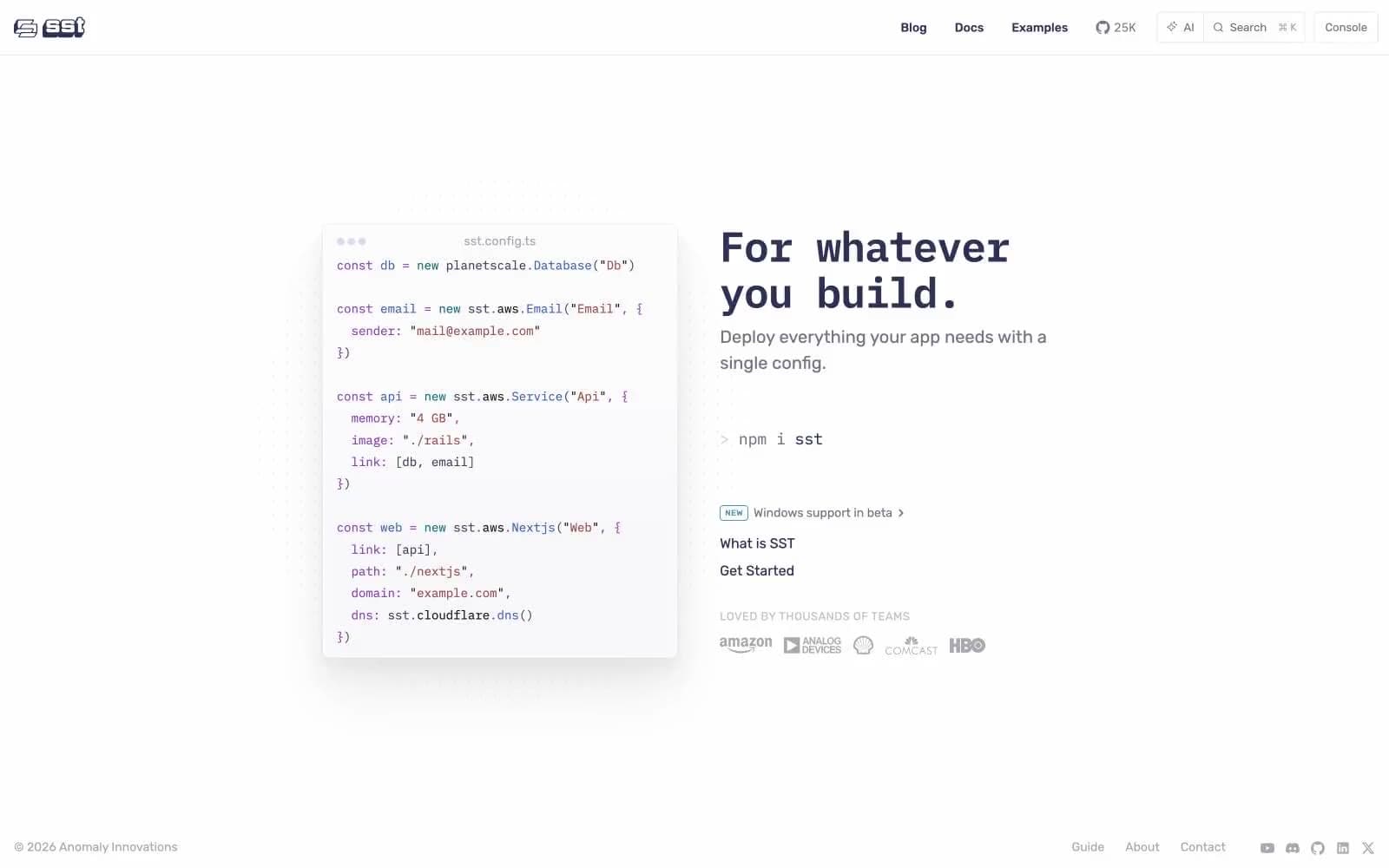
SST's design language reads like a developer's terminal wrapped in a polished product page. A monospaced code block anchors the hero — the syntax-highlighted config is the visual hero, not a decorative illustration. Typography is strictly two-family: IBM Plex Mono carries every code surface, technical label, and inline command, while Rubik Variable handles all prose, navigation, and UI chrome. The palette is austere and off-black: a signature dark indigo-violet (#303055) drives headings, body, and links, sitting on a pure white canvas with a barely-tinted lavender-gray (#e8e8f2) as the only soft surface accent. Code syntax uses four muted-but-distinct hues (purple, blue, teal, red-brown) that never bleed into the surrounding UI. Components are minimal and flat: 4px-rounded ghost buttons, pill-shaped nav controls, hairline borders, zero decorative shadows.
SST design system

Brand1
Headings, body text, links, primary text color — dark indigo-violet replaces the conventional near-black, giving every word a faint cool cast that signals developer-tool seriousness without feeling heavy
Accent4
Code syntax highlighting for strings, property names, and keywords — the most vivid color in the system, reserved exclusively for inside code blocks
Code syntax for method names, object keys, and function calls — paired with Code Plum to create the two-color syntax core
Code syntax for type annotations, decorators, and select tokens — deeper teal that reads as technical rather than decorative
Red supporting accent for decorative details and low-frequency emphasis
Neutrals6
Occasional maximum-contrast text and borders where absolute black is required
Secondary body text, descriptions, paragraph copy — sits one step lighter than SST Ink for prose that shouldn't compete with headings
Muted helper text, icon fills, secondary button text, navigation metadata — the mid-gray that makes UI chrome recede
Lightest text, disabled states, subtle icon outlines, and hairlines — the floor of the gray scale
Subtle surface tint for code-block backgrounds, tag pills, and soft card fills — a whisper of violet that ties back to SST Ink
Light supporting surface for subtle backgrounds and section separation. Do not promote it to the primary CTA color
Try a pairing
Pick any two colors from the palette to check whether text stays readable on top.
Aa
Paper on SST Ink
12.50 : 1 contrast
- Body textPasses AA 4.5
- Large textPasses AA 3
- StrictPasses AAA 7
More DESIGN.md files. Same web, different personalities.

Tailwind CSS
Developer tools
Atoms
Developer tools
Browserbase
Developer tools
Cursor
Developer tools
Deno
Developer tools
Drizzle ORM
Developer tools
Earlydog
Developer tools
Expo
Developer tools
Fingerprint
Developer tools
Flatfile
Developer tools
Flox
Developer tools
Fly.io
Developer tools


