
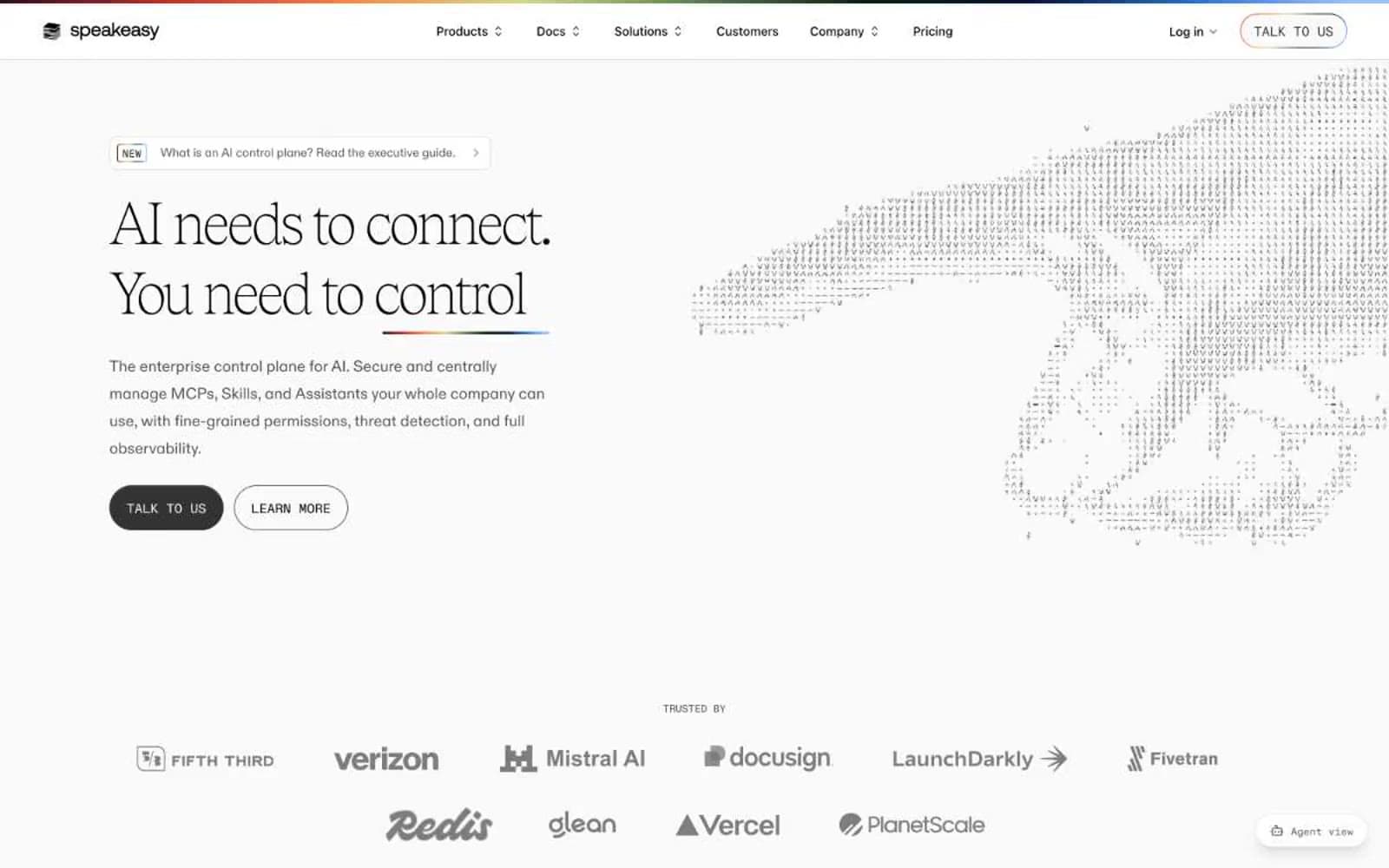
Speakeasy. Editorial broadsheet on a white field with a rainbow ribbon.
- Developer tools
- Light theme
- 20 colors
- 4 typefaces
Speakeasy is a near-monochromatic editorial system built on a vast white canvas, with one extraordinary move: a custom serif (Tobias) rendered at weight 100, stretched to 140px headlines that whisper rather than announce. The interface feels like a high-end print magazine that accidentally became a product page — generous breathing room, hairline dividers, flat surfaces, and a single vibrant gradient hairline at the page's top edge that acts as a signature ribbon. Color is rationed like ink: black and a warm gray scale do nearly all the work, while small chromatic accents (green, orange, yellow, violet, red) appear as functional punctuation inside icons, badges, and feature illustrations. Components are deliberately flat — borders over shadows, small radii, compact spacing — letting the type and the top rainbow gradient do the brand-building.
Speakeasy design system

Brand1
Link and icon accent — the only saturated blue, used sparingly for emphasis strokes
Accent7
Green outline accent for tags, dividers, and focused UI edges
Green wash for highlight backgrounds, decorative bands, and soft emphasis behind content
Soft badge backgrounds, callout fills, gradient end-stop
Icon strokes and feature-card illustrations — the warmest functional accent in iconography
Vivid icon fills, alert-tinged highlights, gradient mid-stop; The signature top-of-page gradient hairline — 9-stop spectrum from maroon through amber, green, indigo, to sky
Tag/badge backgrounds, warm highlight washes, featured callout fills
Red outline accent for tags, dividers, and focused UI edges. Use as a supporting accent, not as a status color
Neutrals12
Dark borders and separators for elevated surfaces and inverted UI. Do not promote it to the primary CTA color
Deepest text and badge backgrounds, near-black accent
Navigation borders, deep surface tone, alt black for softer contrast
Filled button background — the system’s only CTA fill, paired with white text
Icon strokes, dark borders, button shadows, dense text
Body text, icon strokes, secondary text, muted UI labels
Muted helper text, subtle borders, supporting metadata
Tertiary text, placeholder labels, disabled icon outlines, decorative dot fields
Default hairline borders, dividers between sections, the most-used neutral border
Light borders, subtle surface separators, ghost button outlines
Subtle elevated surfaces, off-white section bands, card hover wash
Page and card surfaces, button text on dark fills, inverse text on black
Try a pairing
Pick any two colors from the palette to check whether text stays readable on top.
Aa
Paper White on Iris Blue
5.25 : 1 contrast
- Body textPasses AA 4.5
- Large textPasses AA 3
- StrictFails AAA 7
More DESIGN.md files. Same web, different personalities.

Tailwind CSS
Developer tools
Atoms
Developer tools
Browserbase
Developer tools
Cursor
Developer tools
Deno
Developer tools
Drizzle ORM
Developer tools
Earlydog
Developer tools
Expo
Developer tools
Fingerprint
Developer tools
Flatfile
Developer tools
Flox
Developer tools
Fly.io
Developer tools


