
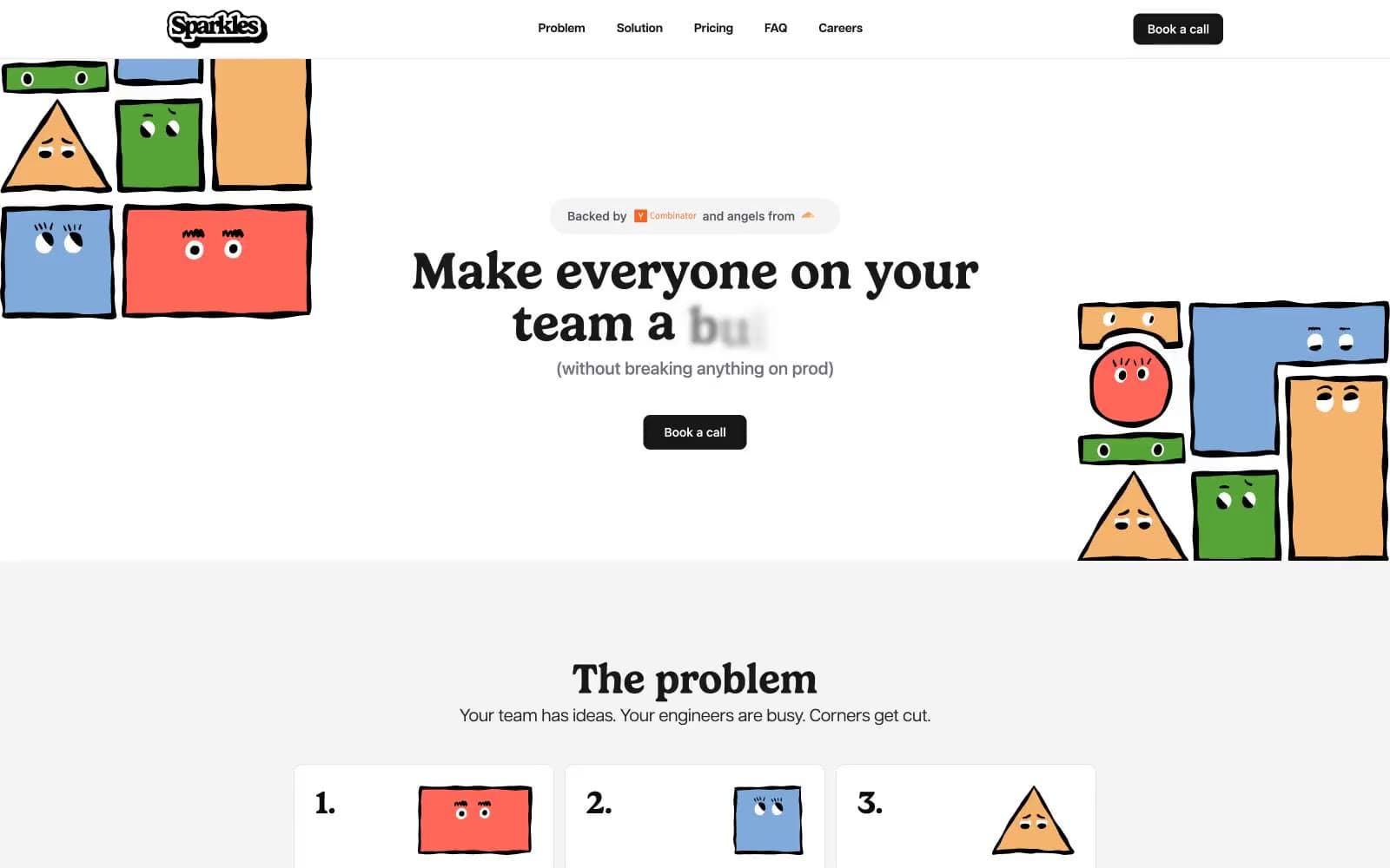
Sparkles. Ink-on-paper broadsheet guarded by crayon mascots.
- Developer tools
- Light theme
- 12 colors
- 2 typefaces
Sparkles runs on a near-total monochrome palette interrupted only by a single block of footer green — a deliberate, almost editorial restraint that makes the playful hand-drawn character illustrations do all the chromatic heavy lifting. Gelica (a chunky display serif) carries every headline at weight 600 with near-zero line-height, creating tight, assertive editorial moments that contrast with Articulat CF's wide-tracked sans-serif body and UI text. The interface is flat, border-driven, and uses #18181b as the universal 'ink' — for headings, nav text, icons, and the only filled button — so the eye reads the page like a printed broadsheet. Cards and inputs sit on white (#ffffff) with #e5e5e5 hairlines and 10px corners; elevation is essentially absent. The visual signature is the collision of austere typesetting with crayon-colored cartoon mascots tucked into the margins.
Sparkles design system

Brand1
Footer band background — the only chromatic UI color, a friendly grass green that punctuates the monochrome page
Neutrals11
Primary text, deepest foreground — the absolute ink for body copy and legal/footer type
Headlines, nav text, icons, filled button background — the universal interactive ink
Body text emphasis, input fill backgrounds for dark/inverted inputs
Secondary body text, input borders, subtle button borders
Muted helper text, link text, icon details
Icon strokes (the dominant icon color), secondary UI lines
Card borders when slightly more definition is needed than the default hairline
Universal hairline border — by far the most-used color in the system at 360+ border applications
Card surfaces, hero background tint, subtle section backgrounds
Page-tinted background variant, near-white surfaces for cards that need separation from pure white
Primary canvas and card surface — the page sits on white
Try a pairing
Pick any two colors from the palette to check whether text stays readable on top.
Aa
Ink Black on Footer Green
7.43 : 1 contrast
- Body textPasses AA 4.5
- Large textPasses AA 3
- StrictPasses AAA 7
More DESIGN.md files. Same web, different personalities.

Tailwind CSS
Developer tools
Atoms
Developer tools
Browserbase
Developer tools
Cursor
Developer tools
Deno
Developer tools
Drizzle ORM
Developer tools
Earlydog
Developer tools
Expo
Developer tools
Fingerprint
Developer tools
Flatfile
Developer tools
Flox
Developer tools
Fly.io
Developer tools


