
SpaceX. Mission control viewport into deep space.
- Brand
- Dark theme
- 4 colors
- 2 typefaces
SpaceX operates in cinematic darkness. The entire interface is a single voice — off-white technical typography on absolute black — with no decorative color to compete with the full-bleed photography of spacecraft and celestial bodies. D-DIN, a geometric industrial sans, gives every label the feel of an instrument panel readout; uppercase tracking at 0.09-0.10em turns navigation into mission-control abbreviations. The page surrenders its visual real estate to imagery: text floats over rockets and planets rather than sitting in contained cards. Buttons are hairline outlines, never filled. Color appears only as a function of light — the page has no accent, no warm, no soft.
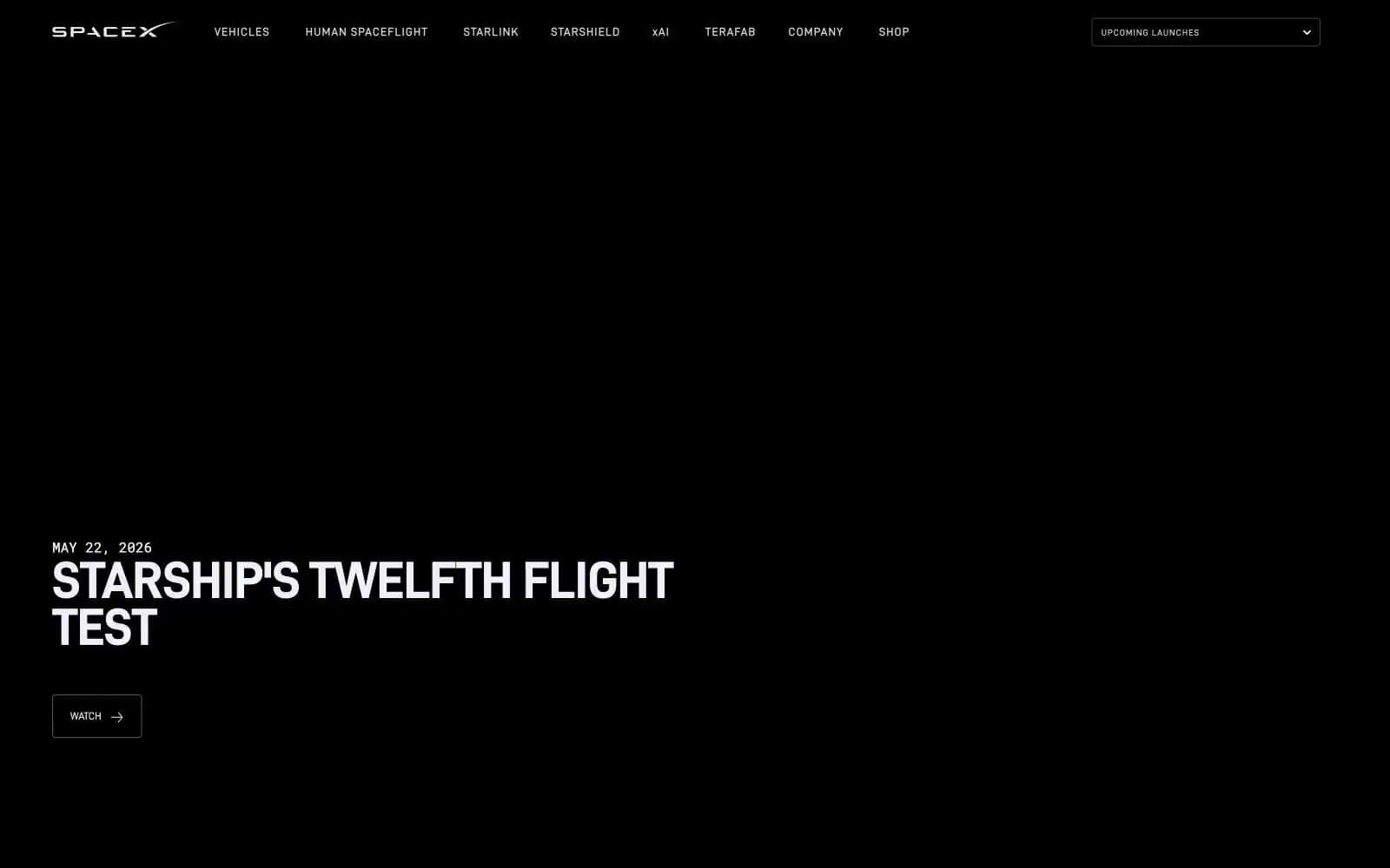
SpaceX design system

Neutrals4
Page canvas, all section backgrounds — the unbroken dark that makes the photography luminous
Subtle nav separators and low-emphasis dividers — barely visible against black, used only when structural separation is needed
Supporting neutral for secondary UI, dividers, and muted labels. Do not promote it to the primary CTA color
All body text, headings, icons, nav labels, button text, button borders — the sole foreground color; the cool tint reads as artificial light against black, not paper
Try a pairing
Pick any two colors from the palette to check whether text stays readable on top.
Aa
Star White on Void Black
18.55 : 1 contrast
- Body textPasses AA 4.5
- Large textPasses AA 3
- StrictPasses AAA 7
More DESIGN.md files. Same web, different personalities.

21 TSI
Brand
Abetterlou
Brand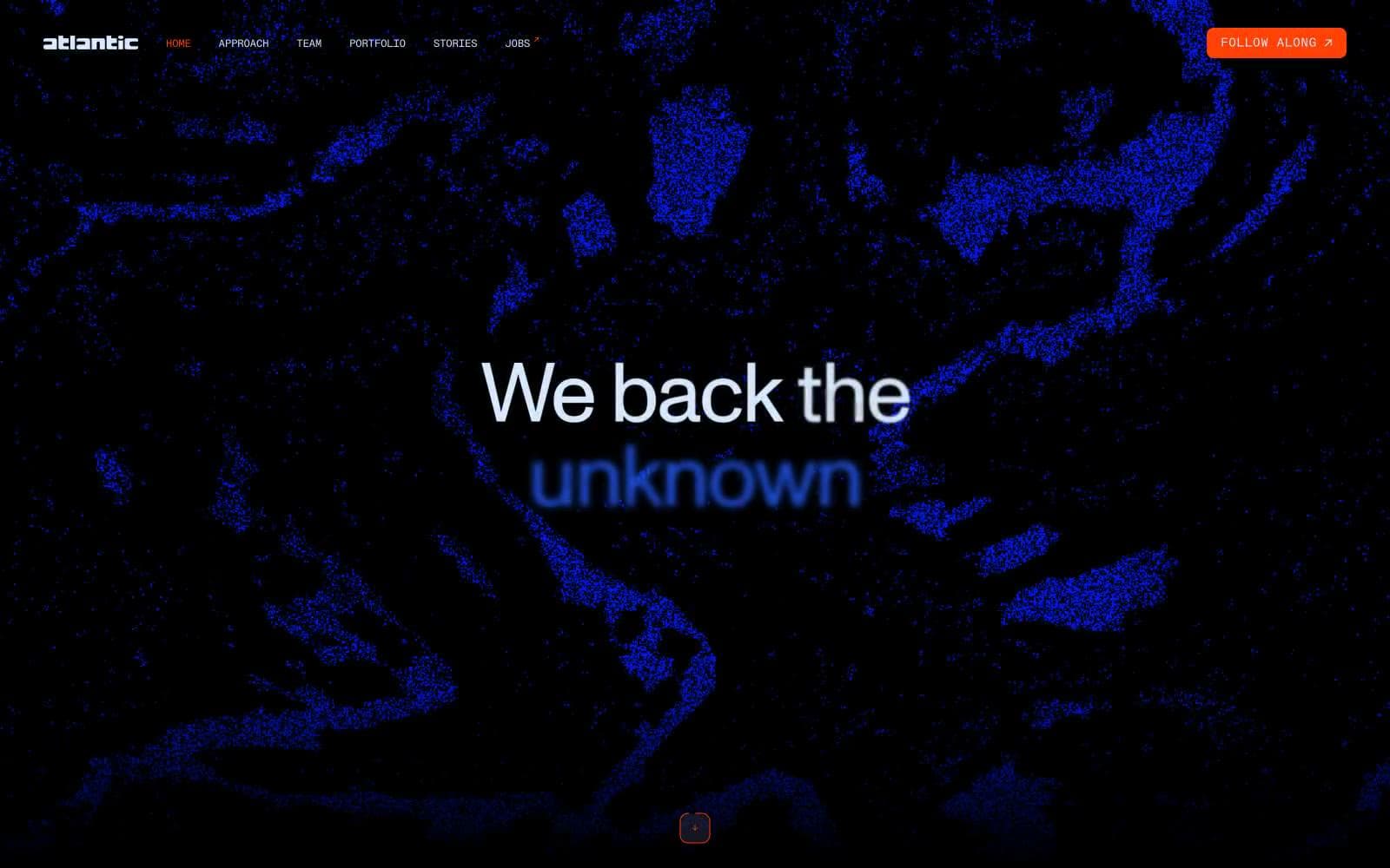
Atlantic.vc
Brand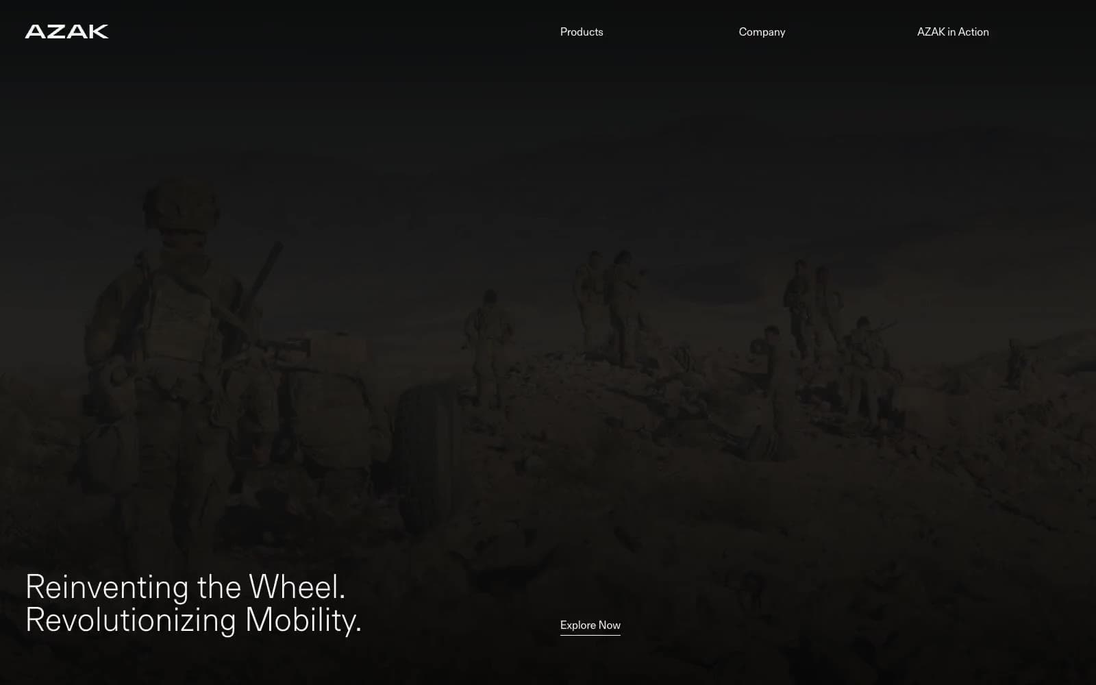
AZAK
Brand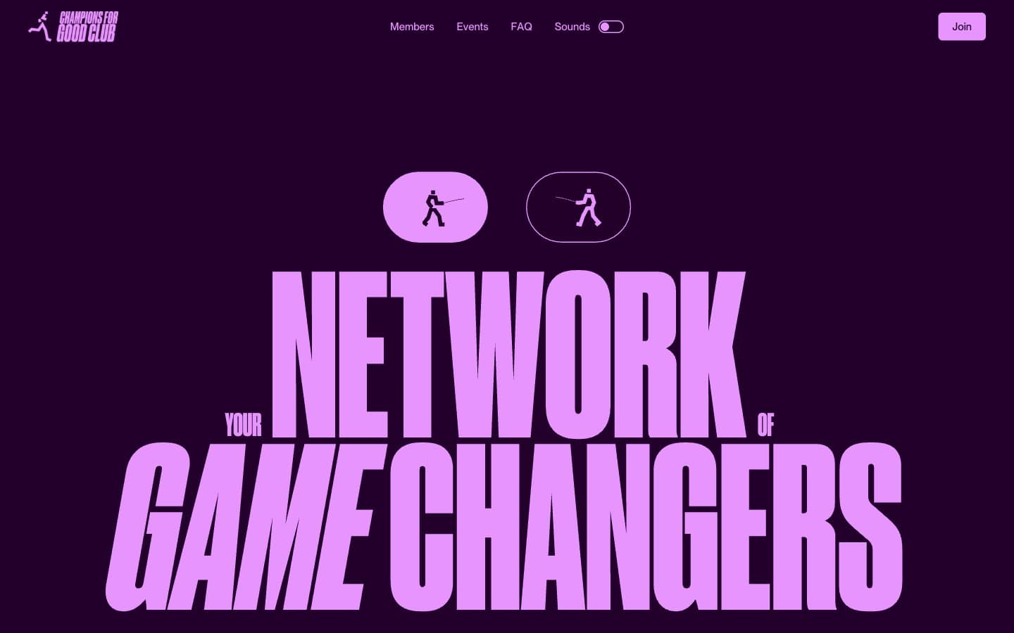
Champions4good
Brand
Chantlings
Brand
Design Full-Time
Brand
Drepute
Brand
Impilo
Brand
INVERSA
Brand
Kippo
Brand
Limón
Brand


