
Smiling Wolf. Print magazine in monochrome.
- Studio
- Mixed theme
- 5 colors
- 2 typefaces
Smiling Wolf uses an editorial Swiss-minimalist language: a warm off-white canvas (#f7f3f0) and near-black surfaces (#131713) alternate to create a strict two-tone rhythm, with no chromatic accent, no gradients, and no shadows anywhere. Typography carries the entire brand voice — a custom display serif/sans hybrid (Bagoss Standard) speaks at large sizes with tight negative tracking and near-unity line-heights, while a wide-tracked monospace (General Grotesque Mono) stamps every label, tag, and metadata line in uppercase 9-10px. All corners are 4px sharp. The result reads like a print magazine spread — high-contrast blocks, generous negative space, hairline dividers, and a refusal of decoration.
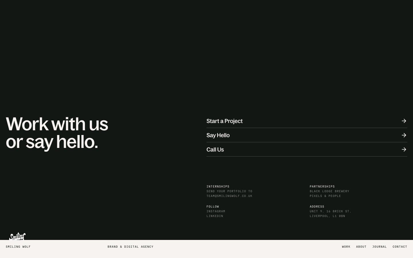
Smiling Wolf design system

Neutrals5
Hairline borders, dividers, link strokes — the structural outline color; appears 1340× as border, defining every panel edge
Primary text on light canvas, dark-section backgrounds, inverse-surface text — near-black with a barely-perceptible green undertone
Muted helper text, secondary metadata, label text — sits at AA on dark and fails on light, so it belongs in the dark sections and monospace stamps
Secondary borders, inactive dividers — a step lighter than Carbon for de-emphasized edges
Page canvas, card surfaces, dark-section text — warm off-white that keeps the page from feeling clinical
Try a pairing
Pick any two colors from the palette to check whether text stays readable on top.
Aa
Bone on Carbon
19.03 : 1 contrast
- Body textPasses AA 4.5
- Large textPasses AA 3
- StrictPasses AAA 7
More DESIGN.md files. Same web, different personalities.

Cuberto
Studio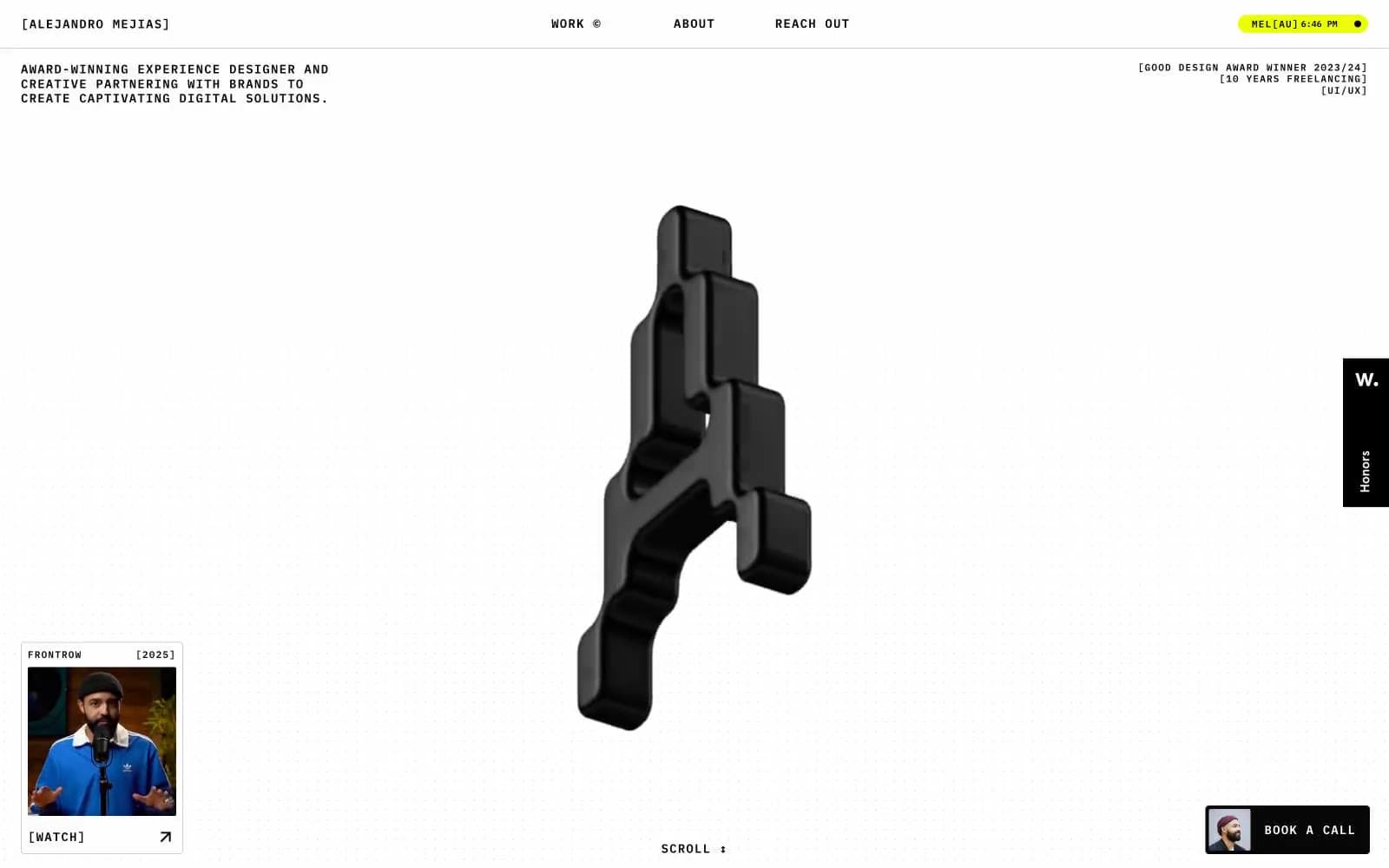
Alejandro Mejias
Studio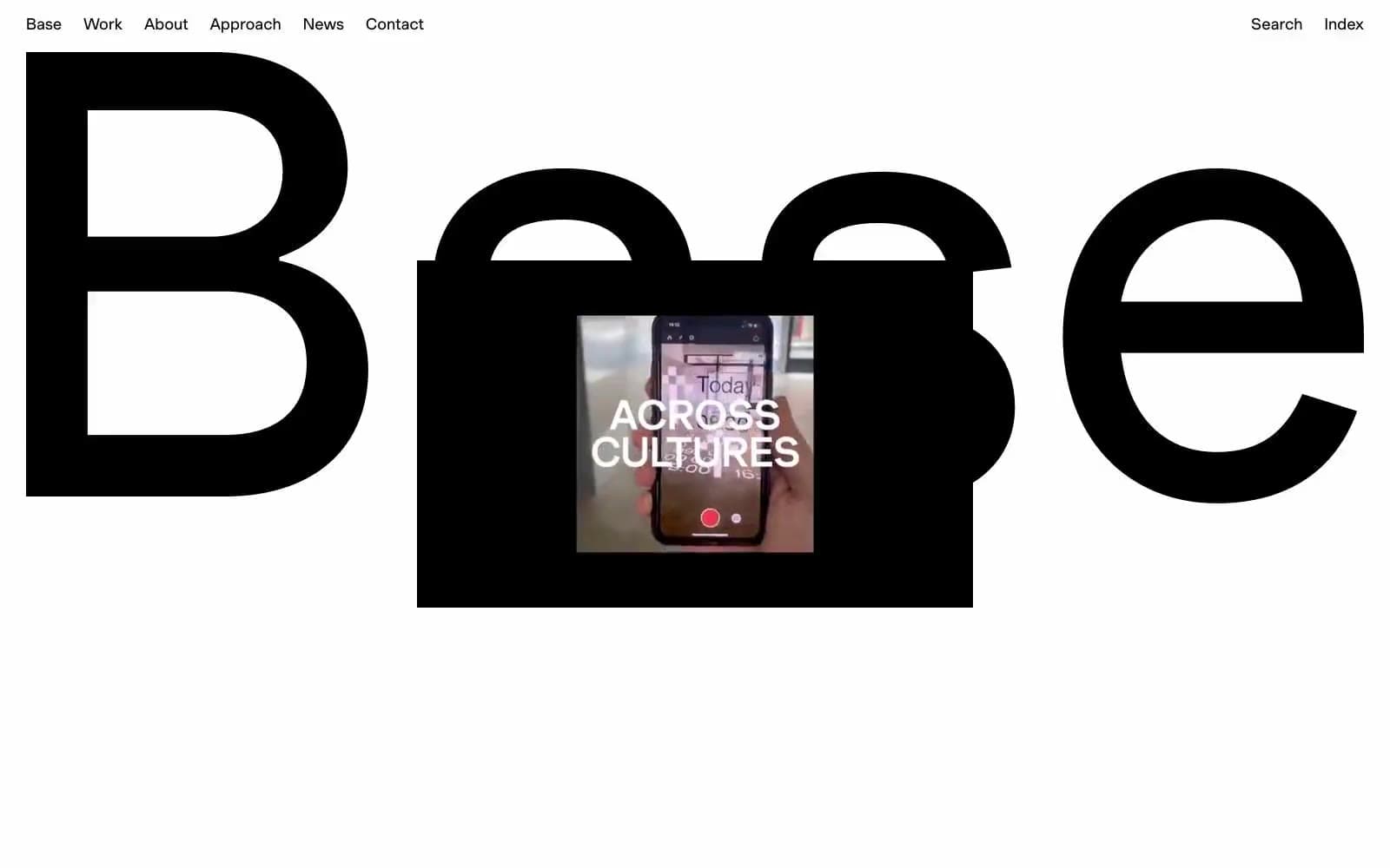
Base Design
Studio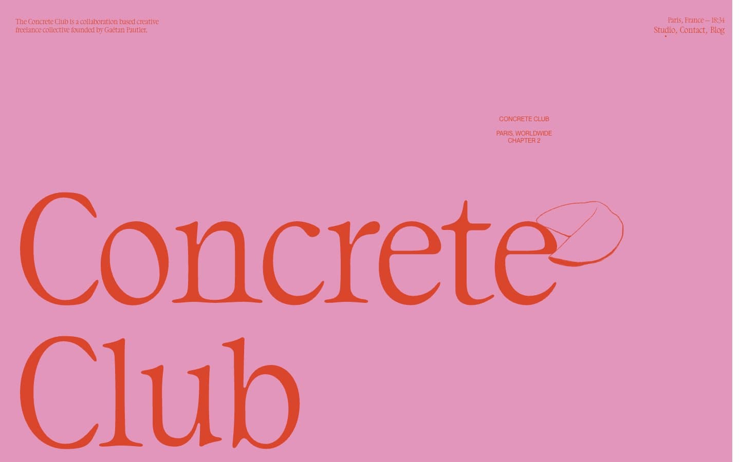
Concrete Club Studio
Studio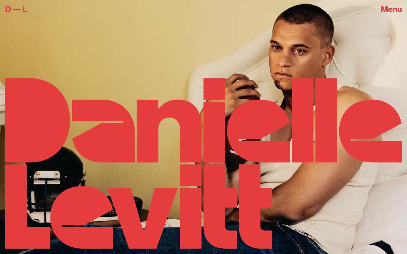
Daniellelevitt
Studio
DrawHistory
Studio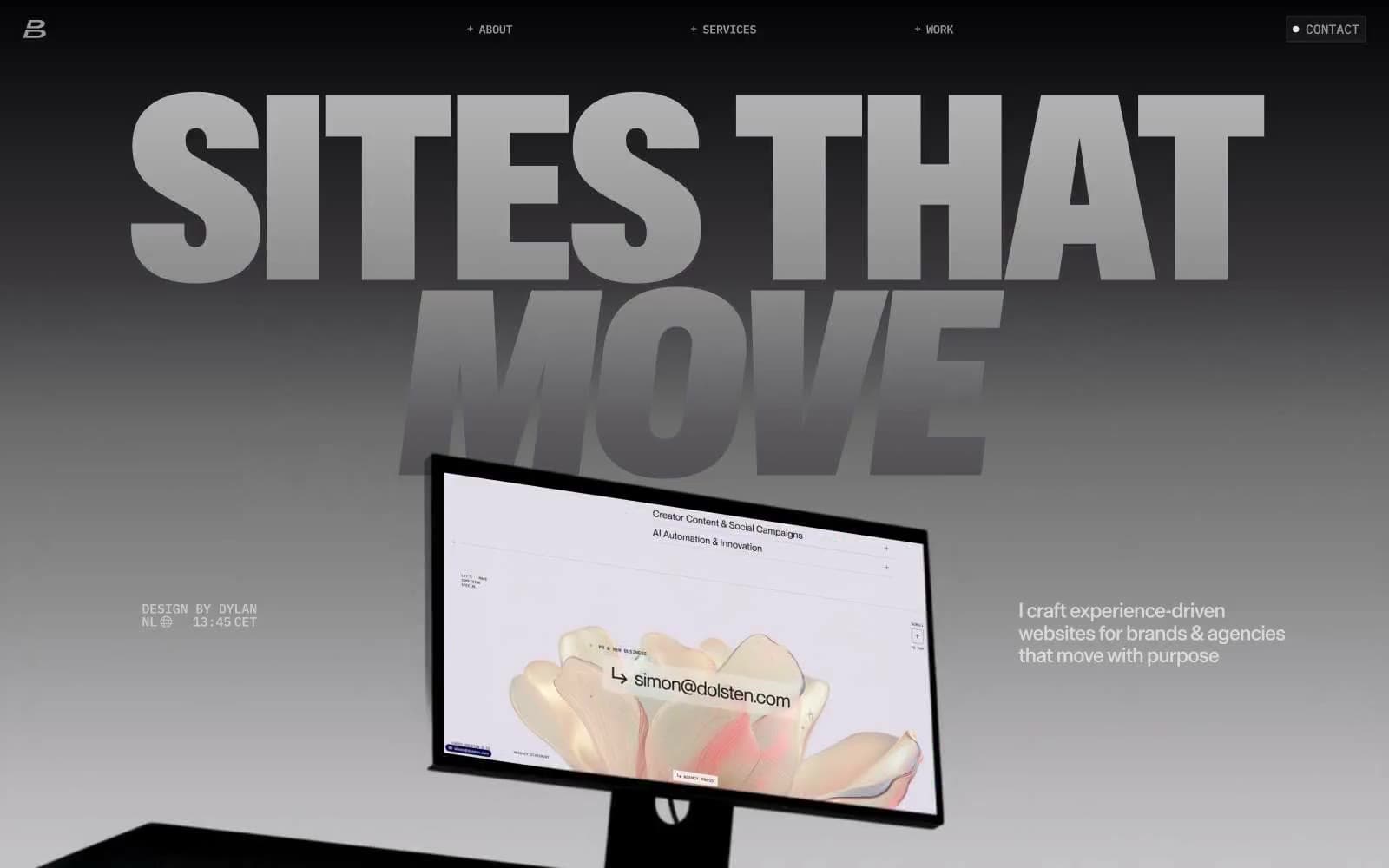
Dylanbrouwer
Studio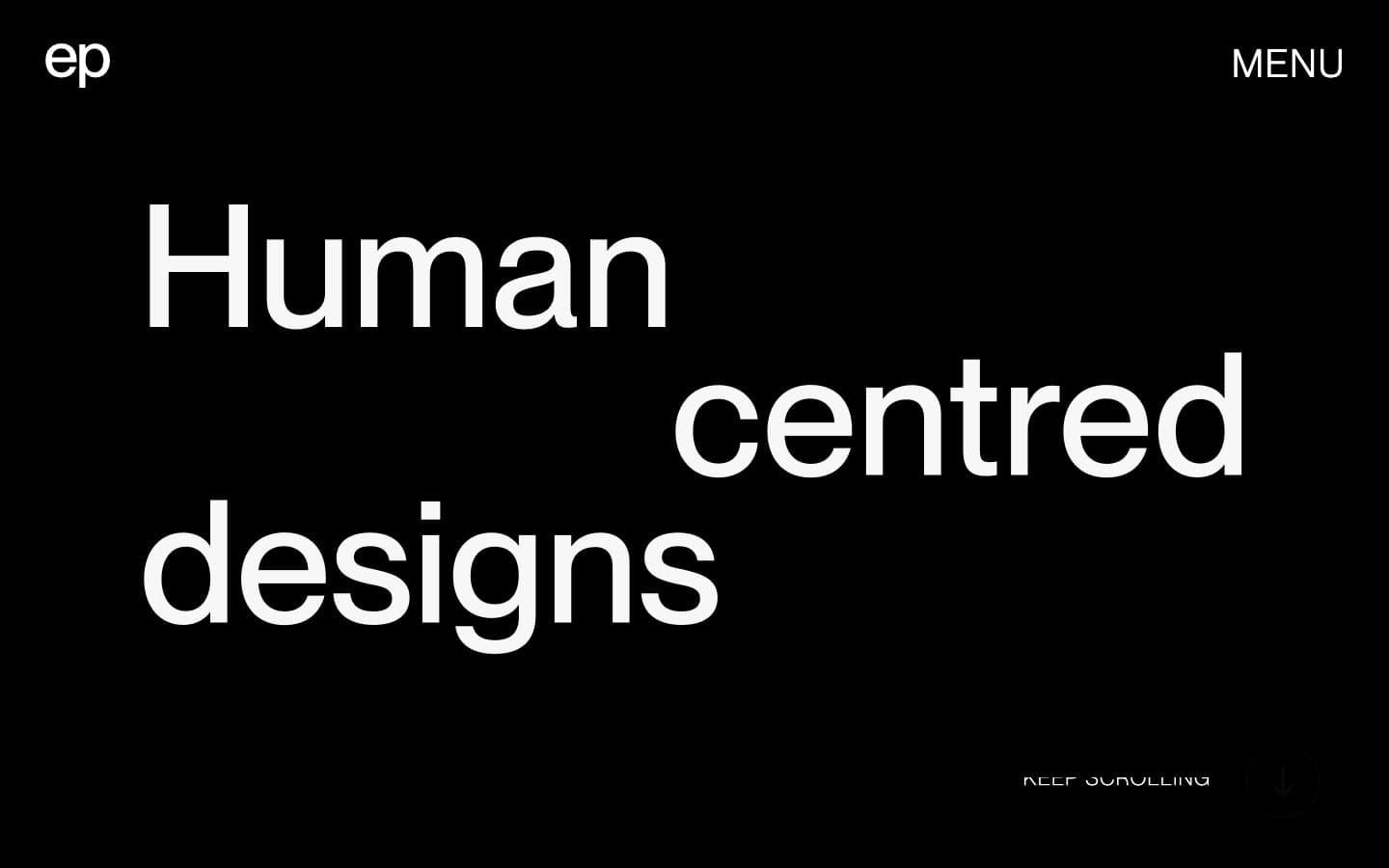
Elvina Prasad
Studio
Freytag Anderson
Studio
Henry
Studio
Hyper Tria
Studio
Maëlan Le Meur
Studio


