
Slash. Midnight vault with gilded ledger lines.
- Finance
- Dark theme
- 15 colors
- 2 typefaces
Slash operates in a midnight gallery mode: an almost-black canvas, white type, and a single warm copper accent that functions as editorial punctuation. Display headings are set in Ivy Presto, a high-contrast didone serif used at extreme sizes (up to 88px) — this serif-versus-sans collision is the system's signature, lending financial seriousness without the stockbroker gravitas of traditional banking. The rest of the UI is deliberately quiet: thin borders, pill-shaped controls, compact 16px body text, and barely-there elevation that lets the serif breathe. A single golden gradient (chart line, micro-accents) injects warmth into an otherwise monochrome system, evoking the warm glow of a Bloomberg terminal rendered for a design audience.
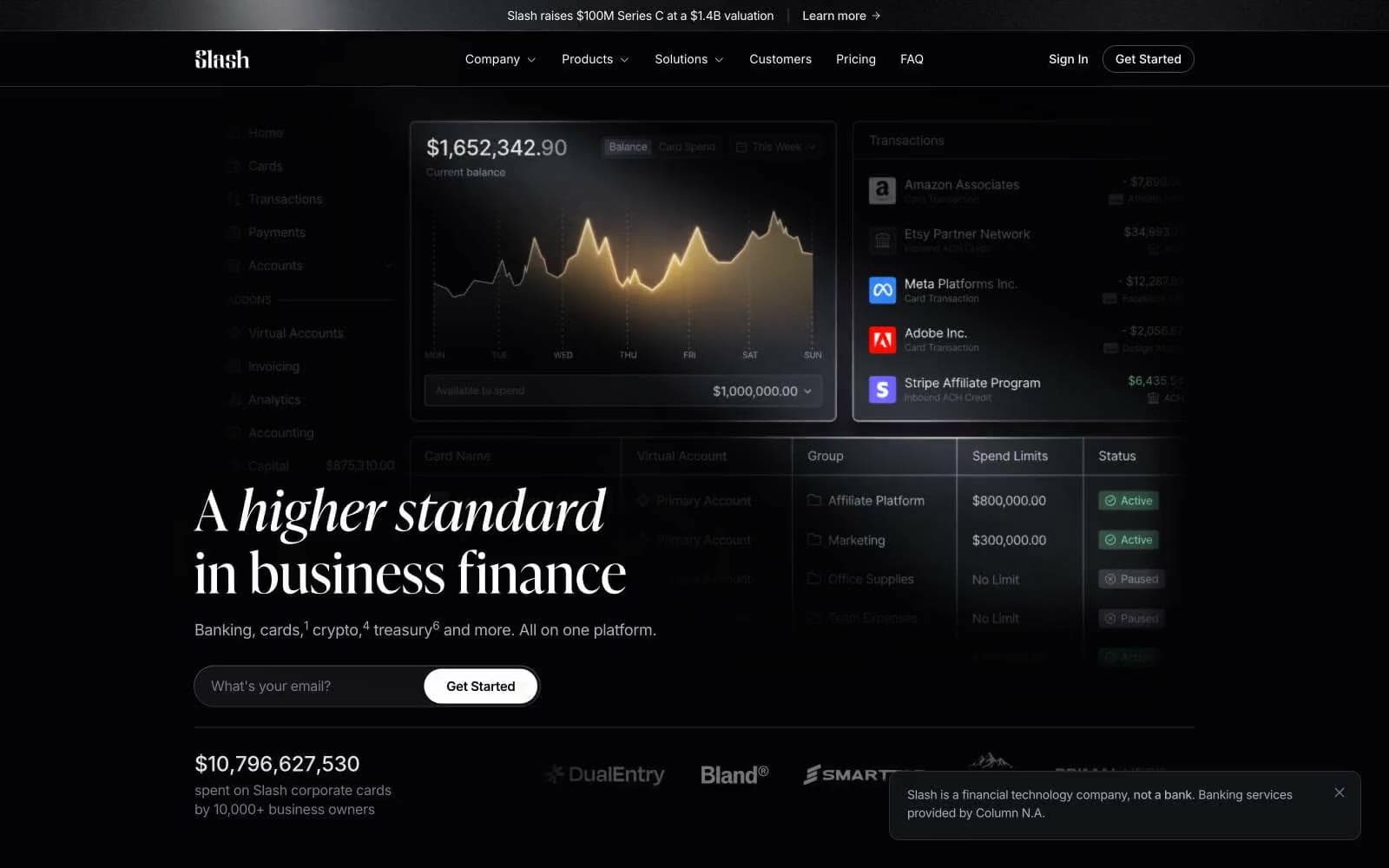
Slash design system

Accent2
Category labels, editorial links, warm accent punctuation — the only chromatic color, used sparingly to mark curated content and category tags
Chart line stroke, financial data visualization accent — a warm gold-to-cream gradient that brings the only color energy to data displays
Neutrals13
Card surface, secondary backdrop — one step deeper than the page for visual weight
Page canvas, footer background, deepest surface — near-black with the faintest blue undertone
Elevated panels, subtle UI fills — the first clearly lighter step in the surface stack
Borders, dividers, icon containers, slider controls — the hairline color that defines structure
Secondary borders, muted icon strokes, subtle dividers between content blocks
Tertiary borders, inactive nav items — barely visible structural lines
Muted body text, placeholder content, secondary metadata
Button borders, icon strokes, secondary text, ghost button outlines
Nav text, body descriptions, helper text — the workhorse readable gray
Subdued body copy, supplementary text, less-emphasized paragraphs
Light body text, medium-emphasis paragraphs, secondary headings
High-emphasis body text, dense data labels, the default text tone across most UI
Primary action button fill, headings, nav active state — the highest contrast color, reserved for elements that must command attention
Try a pairing
Pick any two colors from the palette to check whether text stays readable on top.
Aa
Onyx on Copper
7.62 : 1 contrast
- Body textPasses AA 4.5
- Large textPasses AA 3
- StrictPasses AAA 7
More DESIGN.md files. Same web, different personalities.
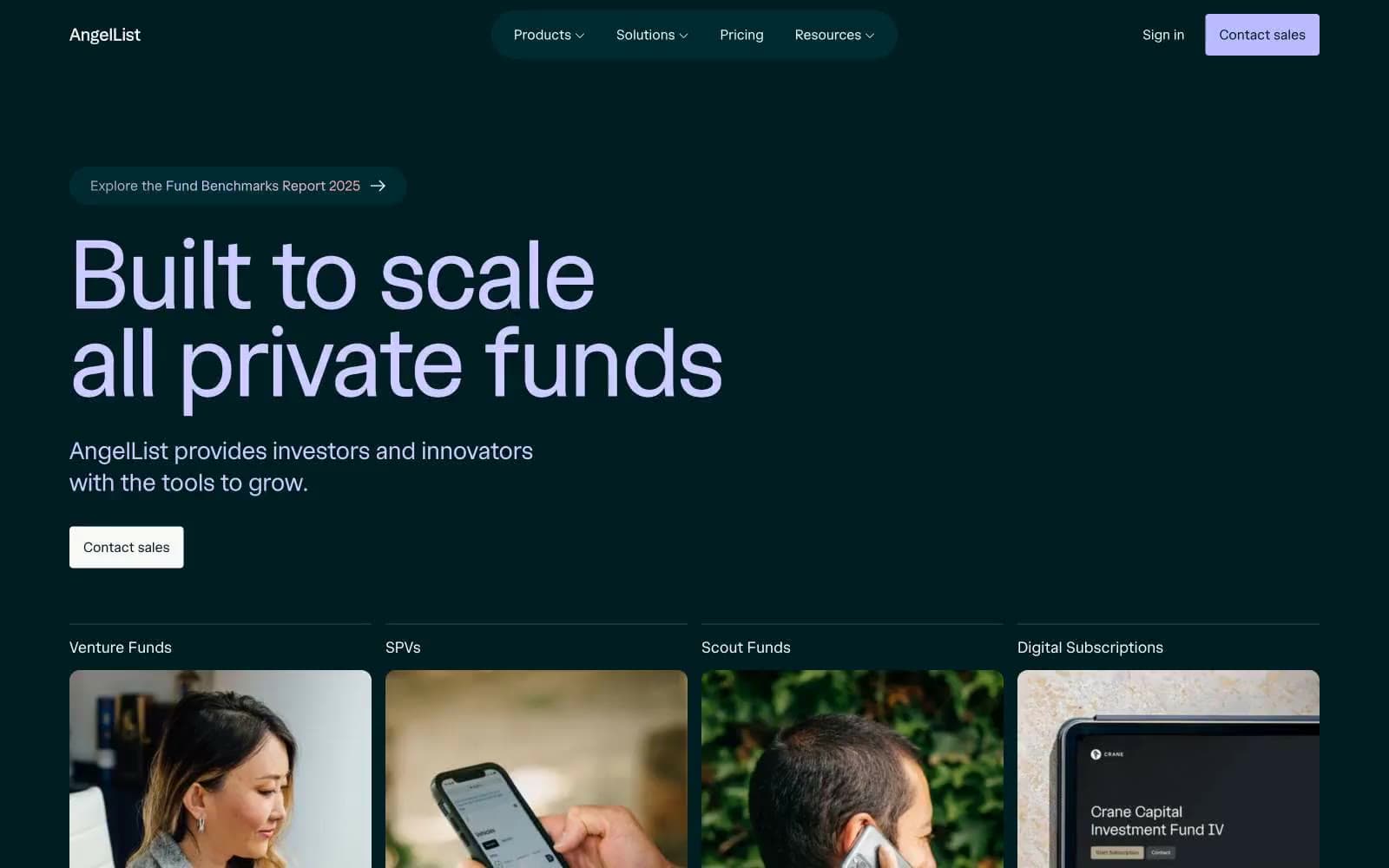
AngelList
Finance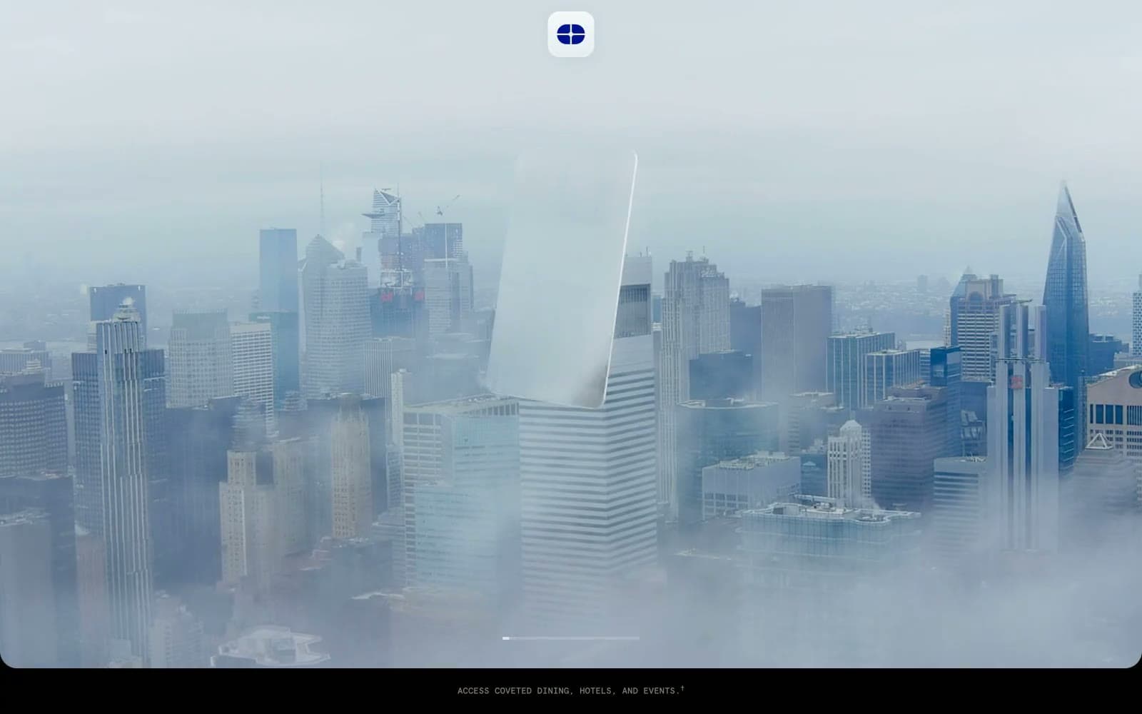
Atlas Card
Finance
Boostinsurance
Finance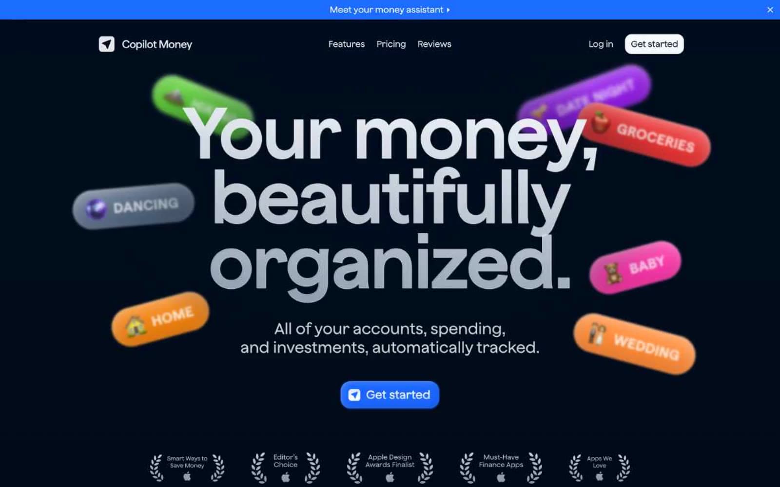
Copilot Money
Finance
Design
Finance
DNA
Finance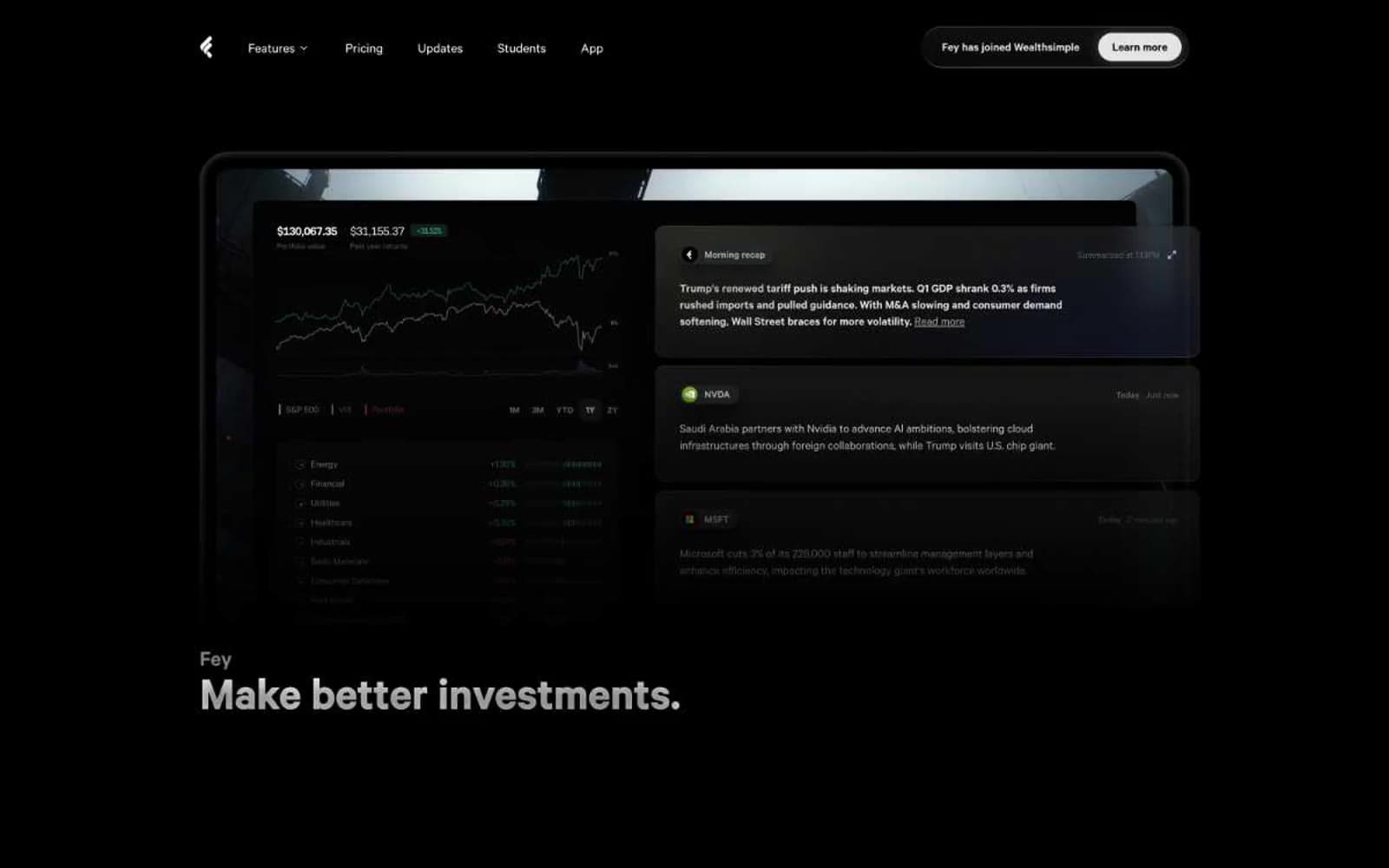
Fey
Finance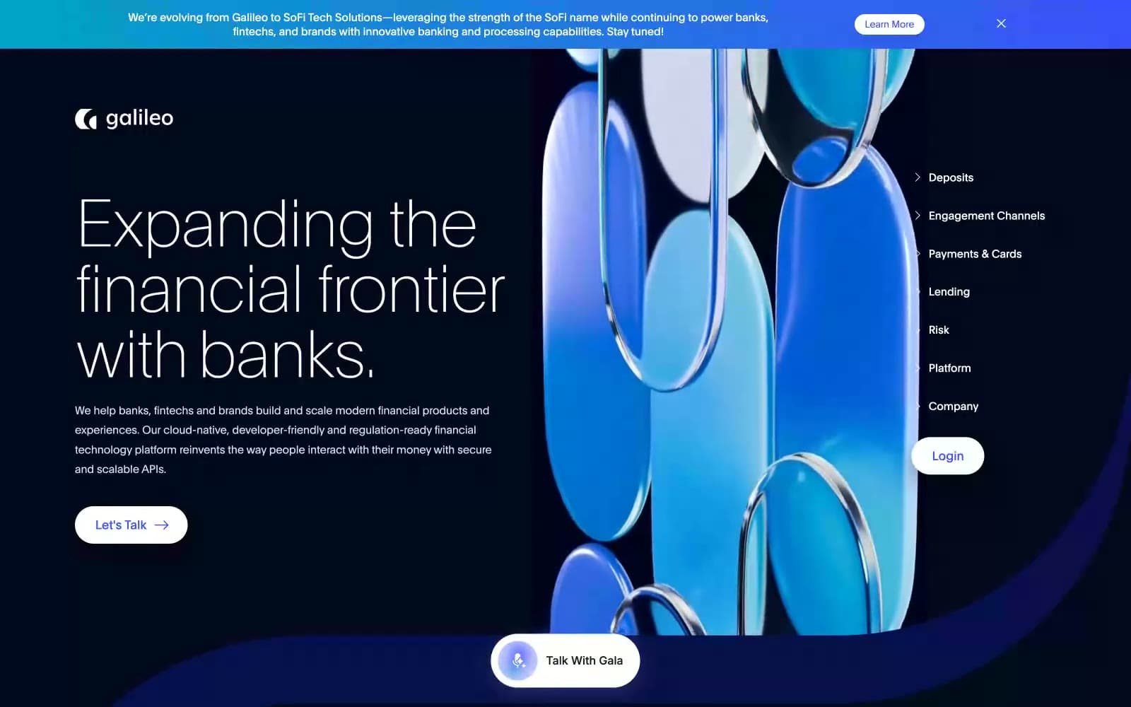
Galileo-ft
Finance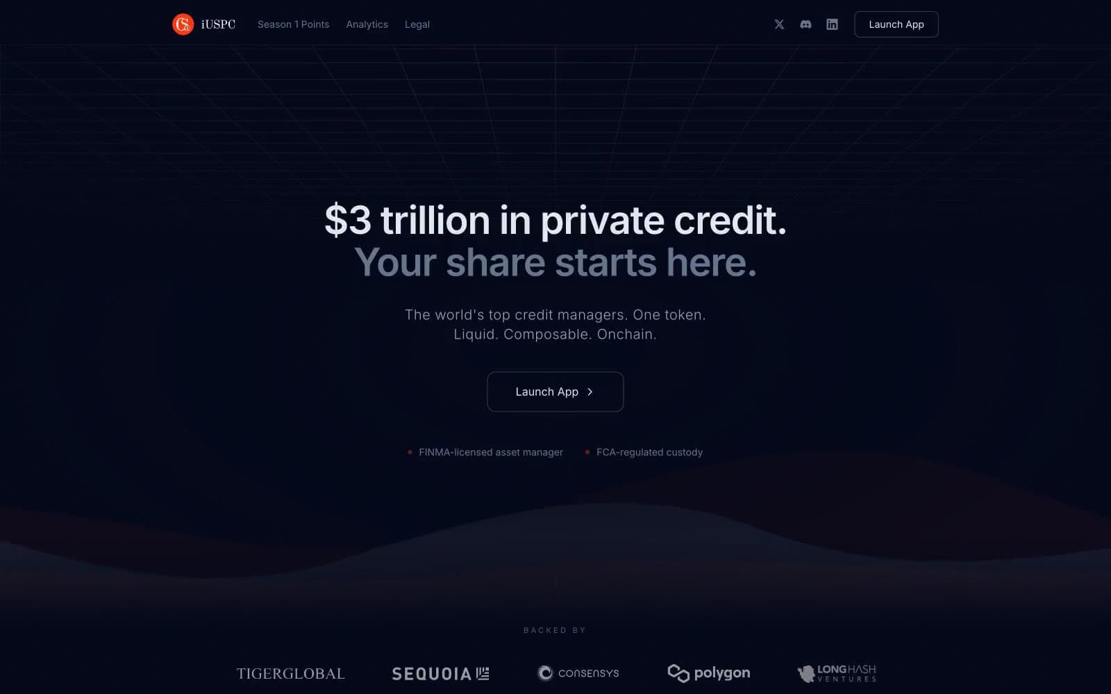
iUSPC by Coinshift
Finance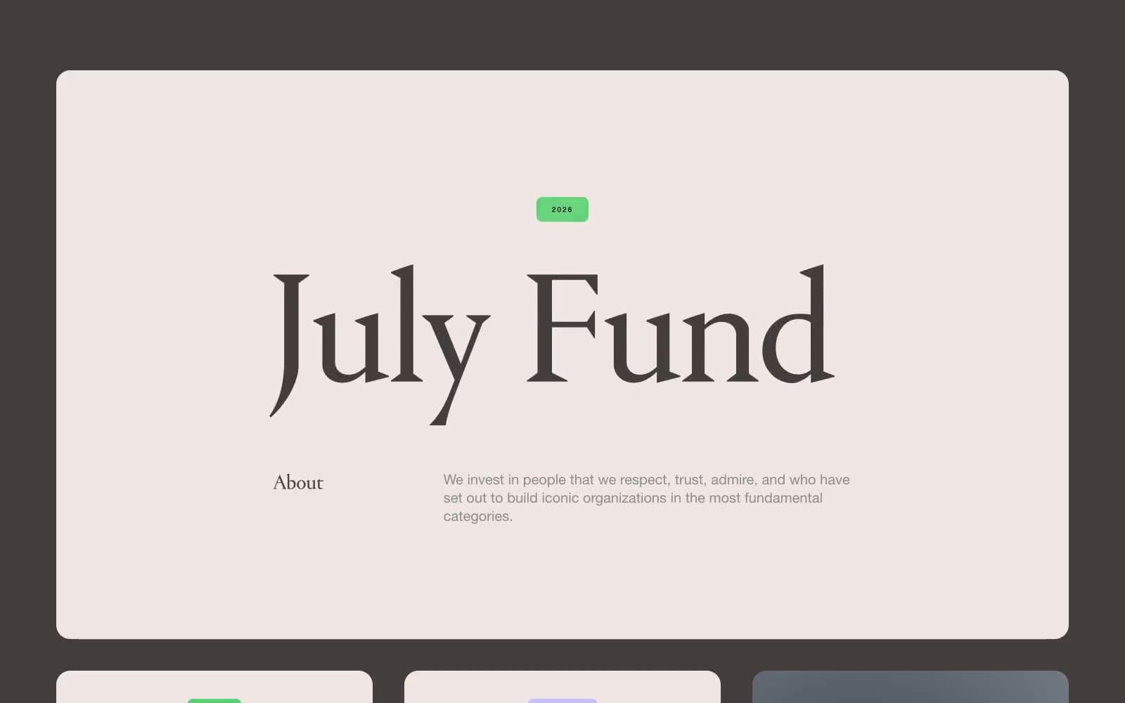
July Fund
Finance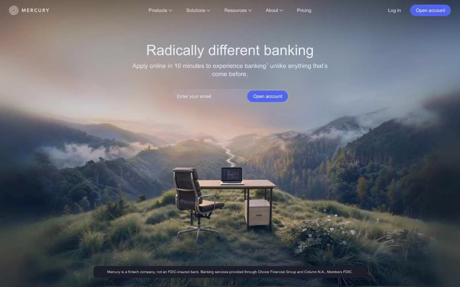
Mercury
Finance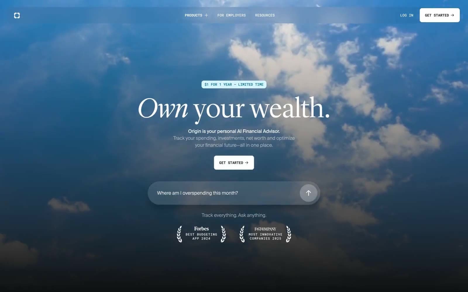
Origin Financial
Finance


