
July Fund. Dark gallery monograph with chromatic chapter cards.
- Finance
- Dark theme
- 14 colors
- 2 typefaces
July Fund is an editorial venture-capital mosaic rendered in a dark, museum-like gallery space. The base is near-black (#000000 and #433e3c warm charcoals), and content is built from individual themed cards — each one a saturated color field acting as a chapter in a visual index. Typography is deliberately split: a high-contrast custom serif (Portrait) sets headlines that feel like gallery wall text, while compact Helvetica Neue runs the labels, metadata, and body copy underneath in a quiet, typewriter-precise voice. The system reads as a printed monograph made interactive — generous padding inside cards, pill-shaped controls, uppercase letter-spaced badges, and zero decorative shadow. Color is not decoration here; it is categorization. Each chromatic card (forest green, twilight violet, olive, solar yellow, ember red) signals a different fund vertical or post type, so the grid itself becomes a navigation system.
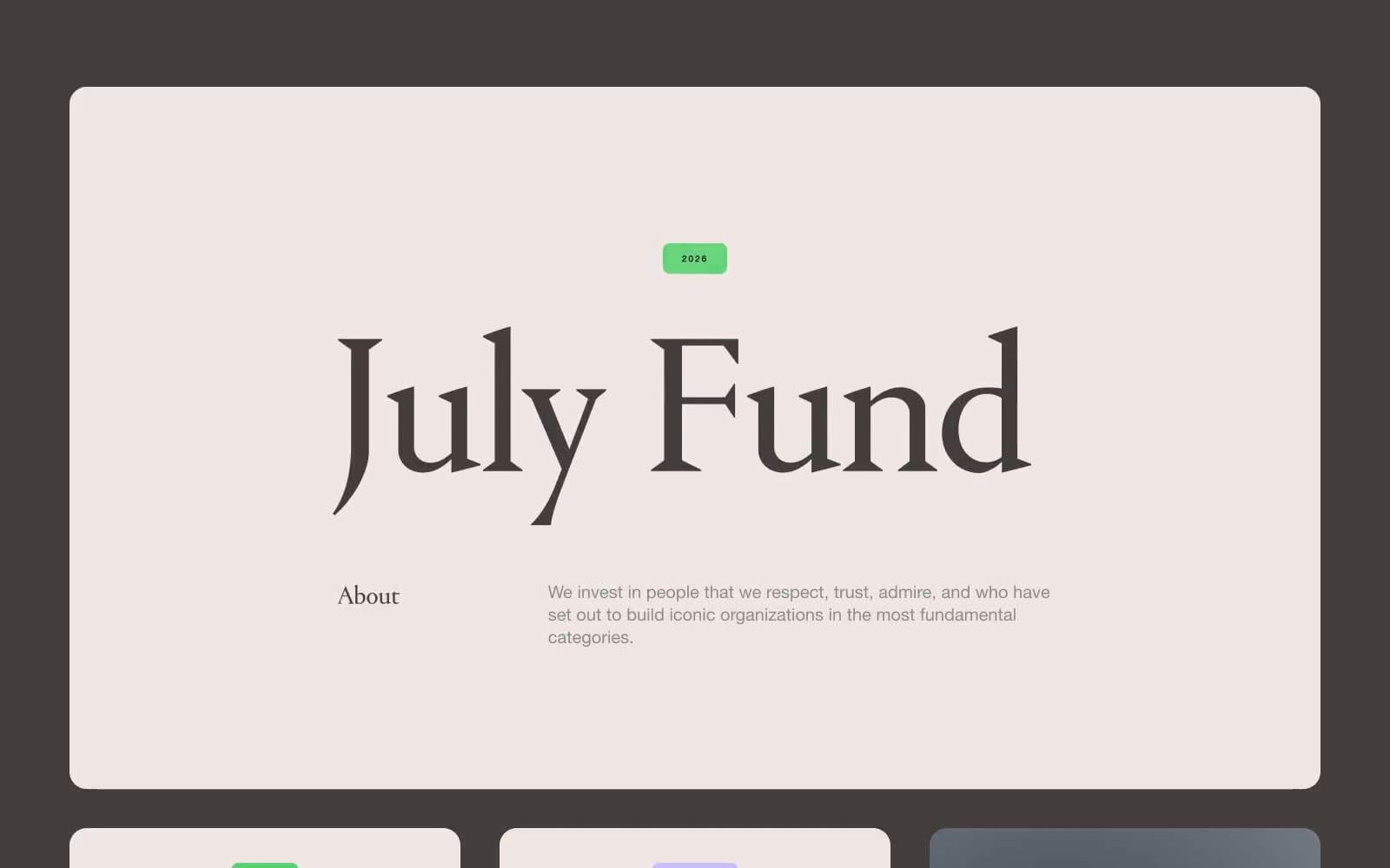
July Fund design system

Brand4
Themed card surface for nature/climate/sustainability chapters — the deepest chromatic field, reads as moss or deep canopy
Themed card surface for space, frontier, and science verticals — saturated enough to dominate a grid cell, dark enough to hold white type
Themed card surface for energy and industry chapters — a near-black ochre that glows against the canvas
High-impact accent card fill for transformation and thesis verticals — the loudest single block in the system, used sparingly to punctuate the grid
Accent2
Small uppercase tag/badge fill for news and announcement labels — the only saturated green used at small scale
Soft accent for secondary badges and highlight borders on the violet card family
Neutrals7
Page canvas, deepest card base, and the void between sections — the room the cards hang in
Button background for primary text controls on dark surfaces — one shade deeper than the card it sits in
Secondary surface and elevated card base for monochrome content blocks
Dominant border color across cards, badges, and dividers — the hairline that frames every chromatic block
Muted body copy, list markers, and supporting metadata — the whisper tier below primary text
Light card surface for the hero/about panel and inverted buttons — a warm off-white that reads as printed paper on the dark canvas
Headline color on dark cards, badge text on chromatic fills, and link highlights
semantic1
Reserved research and analytical-content badge fill — used almost never; its rarity makes it register as a category marker
Try a pairing
Pick any two colors from the palette to check whether text stays readable on top.
Aa
Paper White on Forest Floor
13.41 : 1 contrast
- Body textPasses AA 4.5
- Large textPasses AA 3
- StrictPasses AAA 7
More DESIGN.md files. Same web, different personalities.
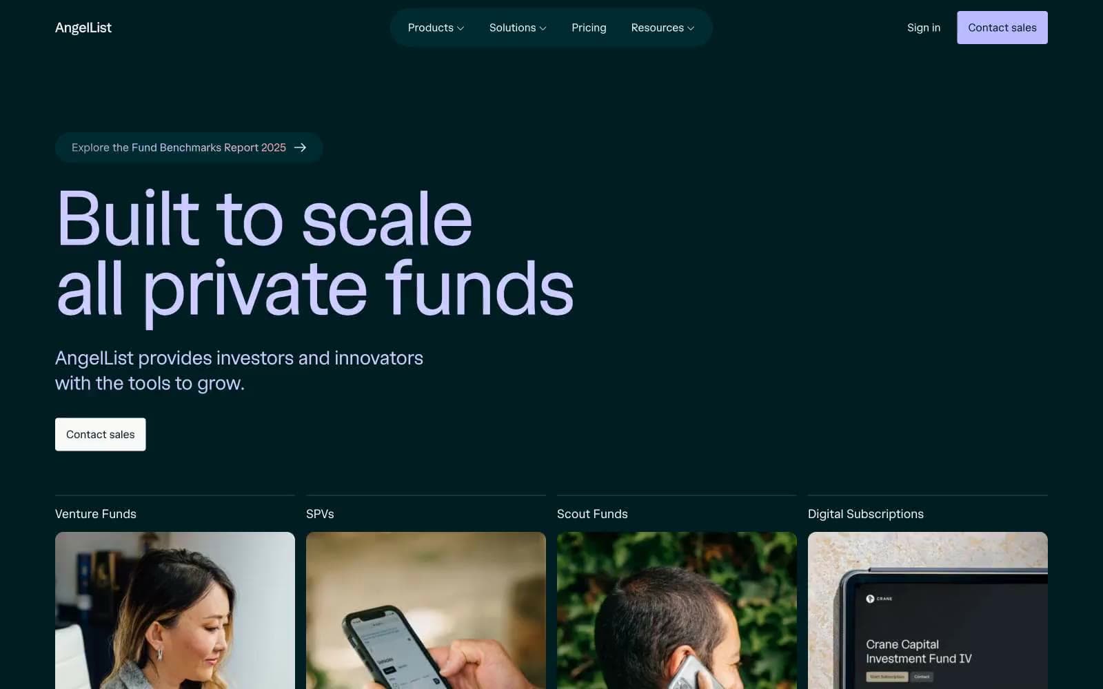
AngelList
Finance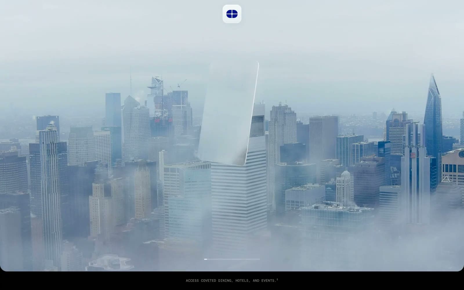
Atlas Card
Finance
Boostinsurance
Finance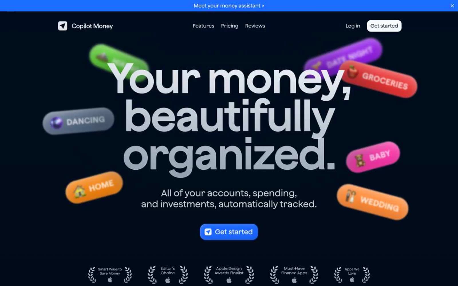
Copilot Money
Finance
Design
Finance
DNA
Finance
Fey
Finance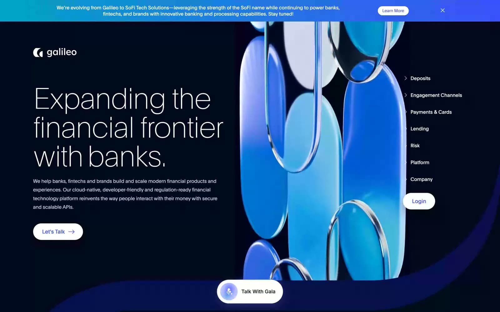
Galileo-ft
Finance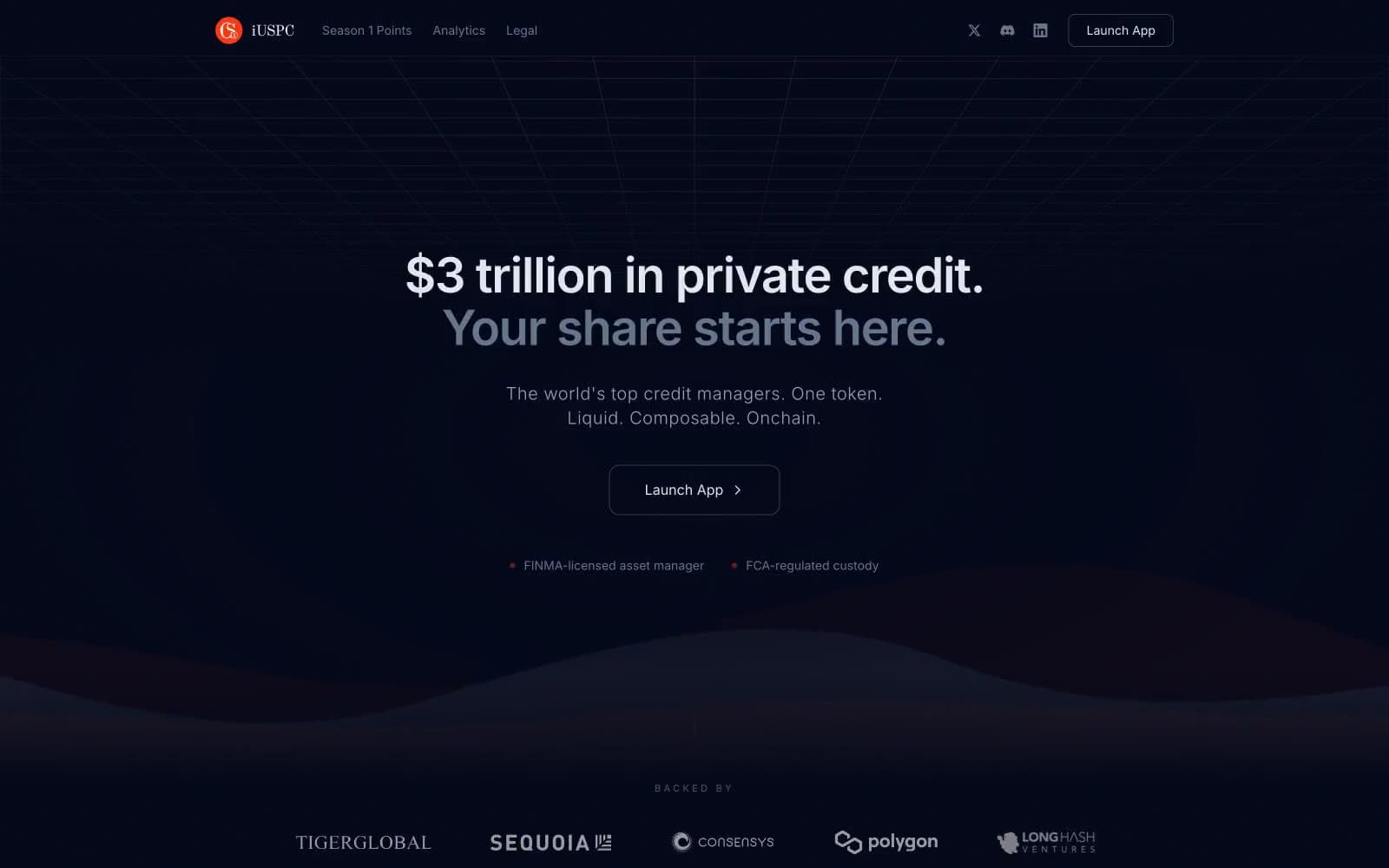
iUSPC by Coinshift
Finance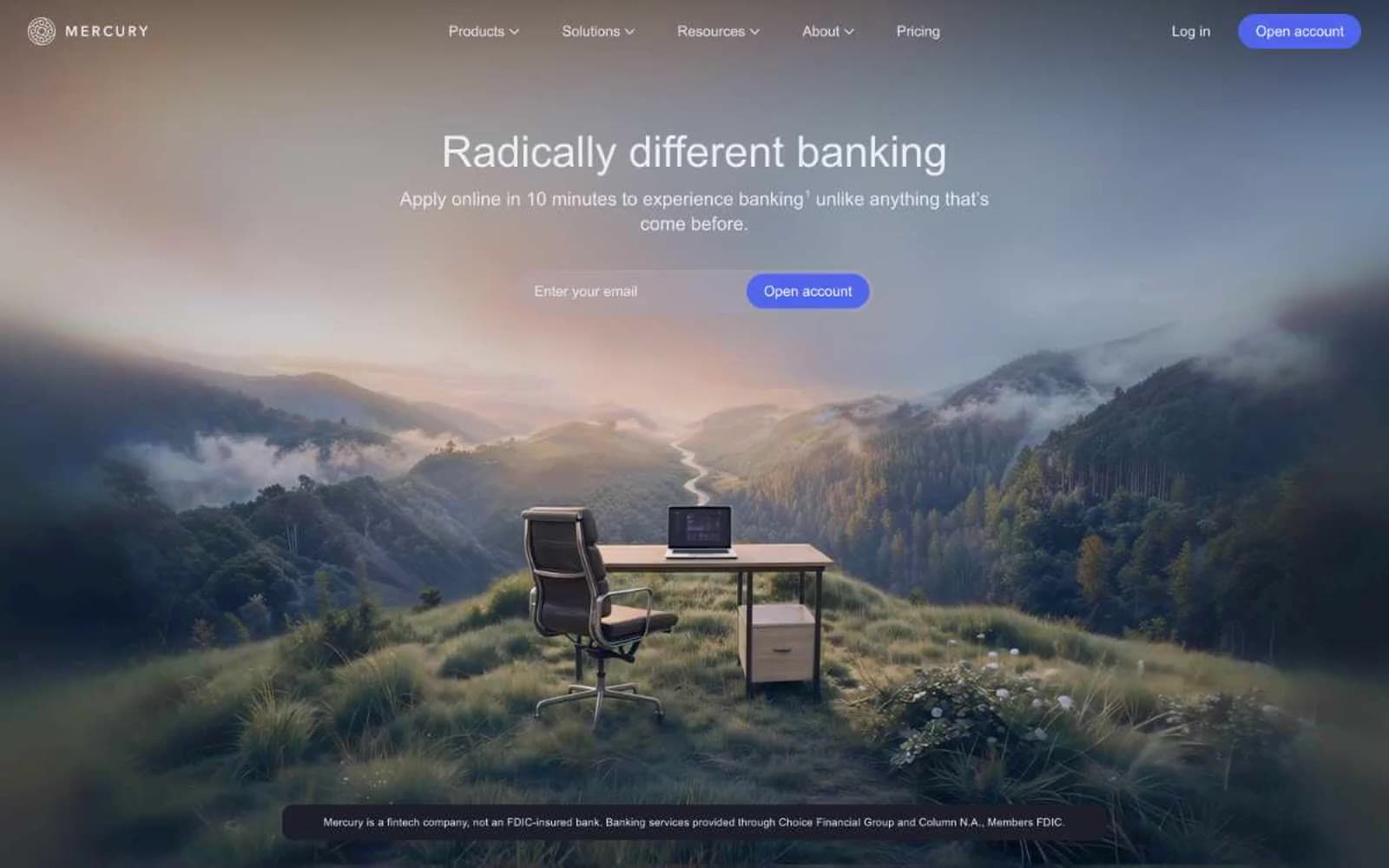
Mercury
Finance
Origin Financial
Finance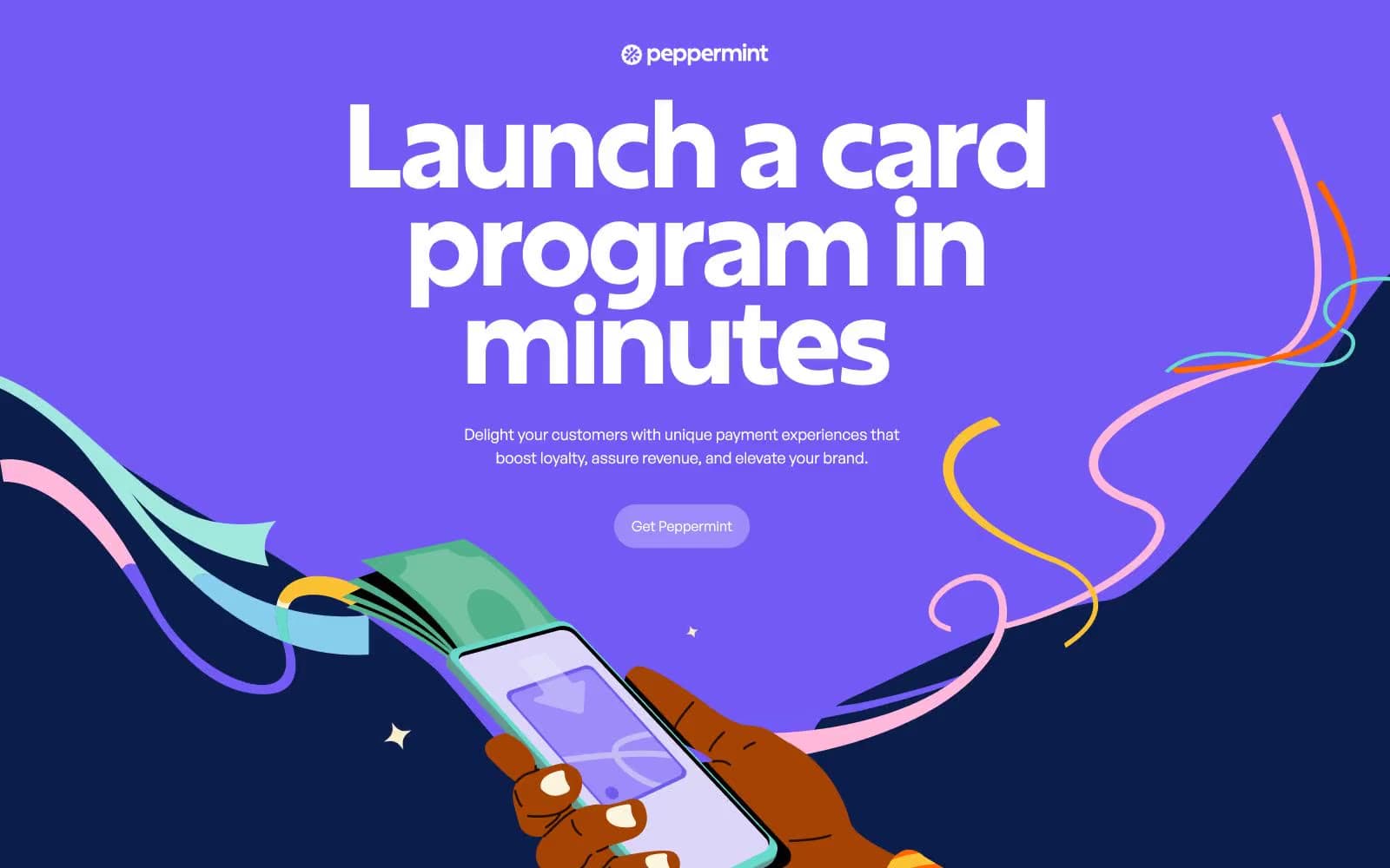
Peppermint
Finance


