
Boostinsurance. Abyssal mission control.
- Finance
- Dark theme
- 14 colors
- 2 typefaces
Boost Insurance inhabits an abyssal command center: deep teal canvas, faint topographic grid lines, and bioluminescent lime-green accents that feel switched-on against the matte dark surface. The platform is rendered as floating glass UI cards — slightly translucent, subtly bordered, rounded generously — floating over the dark ocean of the page, suggesting infrastructure and scale rather than personality. Typography does most of the talking: an enormous light-weight display cut (Gellix at 90–120px) with tight negative tracking, paired against a quiet, readable body. Color is rationed — a single signature cyan-to-lime gradient powers the primary action and a few under-line flourishes, while the rest of the surface stays deep teal, off-white text, and barely-visible hairline borders. The overall density is spacious and confident, with breathing room between every section and section transitions that feel like descending deeper into a system rather than scrolling a brochure.

Boostinsurance design system

Brand3
Primary brand accent — underline flourishes under display keywords, eyebrow labels in uppercase, decorative SVG fills, product-category icon glows, and the terminal stop of the signature gradient
Lighter lime used for subdued accent text and outlined-link borders where a softer hit of brand color is needed
Dark green surface — for solid-fill lime-tinted backgrounds and badge containers where the lime accent needs a darker anchor
Accent2
Supporting palette color for small decorative accents when the core palette needs contrast. Do not promote it to the primary CTA color
Secondary gradient stop — the warm tail of the tri-stop accent gradient used sparingly on decorative flows and a few product-card highlights
Neutrals9
Page canvas and dominant surface — the deep-ocean background that carries every section; large bordered card fills also read as this token because the surface stack collapses into a single dark plane
Lowest-elevation surface behind content inside dark cards — used for card padding interior fills where the outer card is lighter
Mid-tier surface and dividers — floating card fills slightly lighter than the canvas, section dividers, hairline borders around hero card and feature blocks
Elevated surface and heavier borders — used for raised card surfaces and stroke weights where more separation from the canvas is needed
Muted surface accent and softer card borders — for secondary container backgrounds and quieter stroke treatments
Muted body text and secondary borders — helper text, captions, inactive icon strokes, and quiet UI labels
Tertiary text and border — for less-emphasized copy and fine dividers that should recede further than Storm Glass
Lightest neutral — icon outlines on dark surfaces and thin card borders where higher contrast is needed without using full white
Primary text and high-contrast iconography — headlines, body copy, button text, and reverse-mode icon fills; a warm off-white that softens against the teal canvas
Try a pairing
Pick any two colors from the palette to check whether text stays readable on top.
Aa
Abyss Teal on Lime Voltage
12.64 : 1 contrast
- Body textPasses AA 4.5
- Large textPasses AA 3
- StrictPasses AAA 7
More DESIGN.md files. Same web, different personalities.
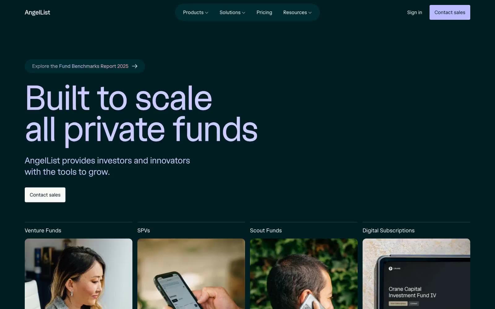
AngelList
Finance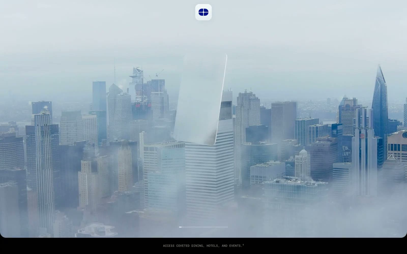
Atlas Card
Finance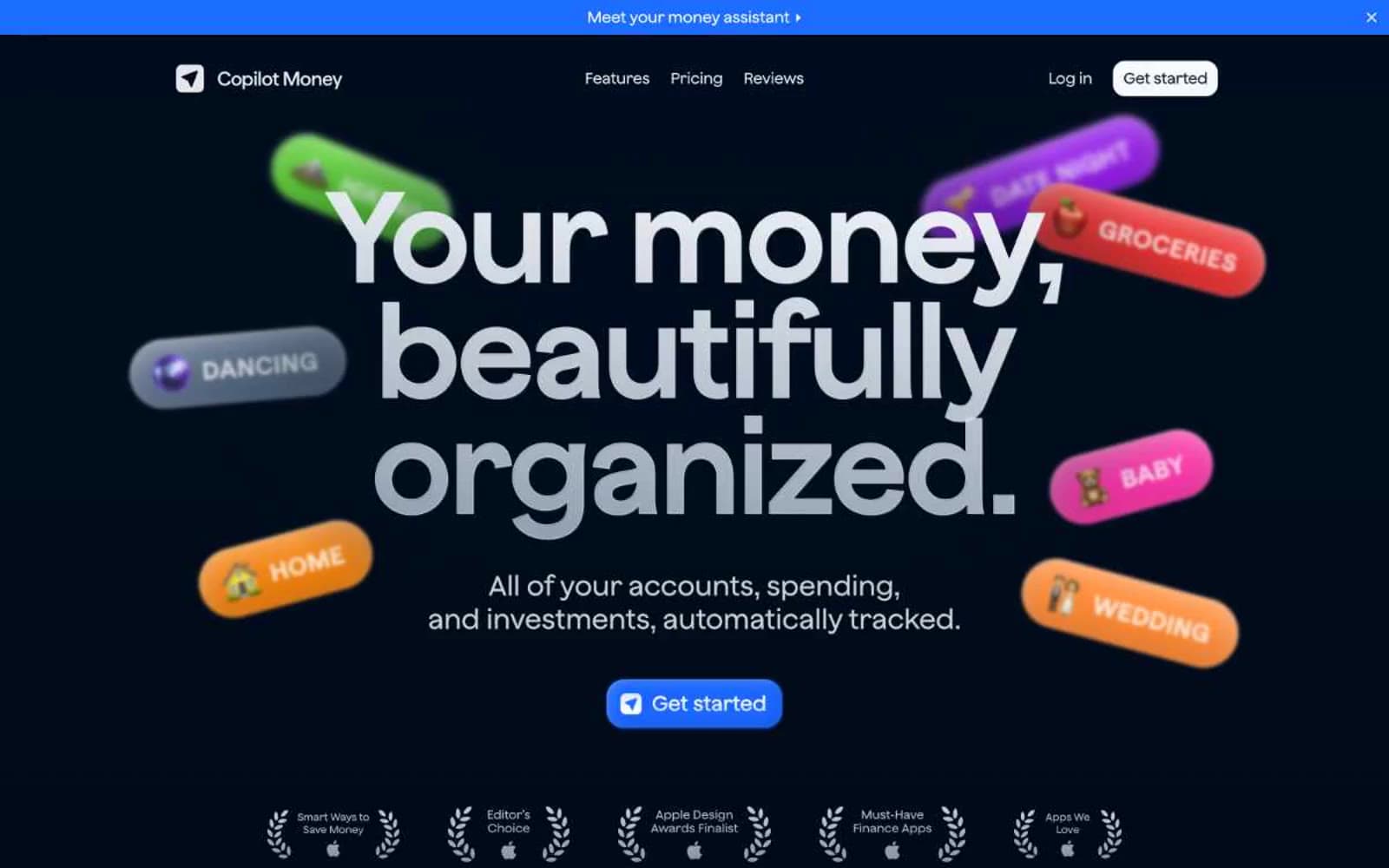
Copilot Money
Finance
Design
Finance
DNA
Finance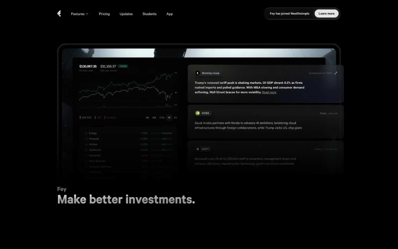
Fey
Finance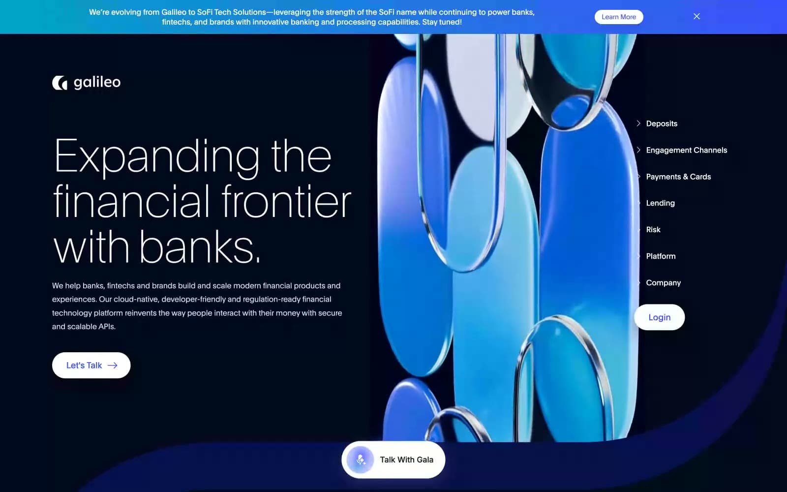
Galileo-ft
Finance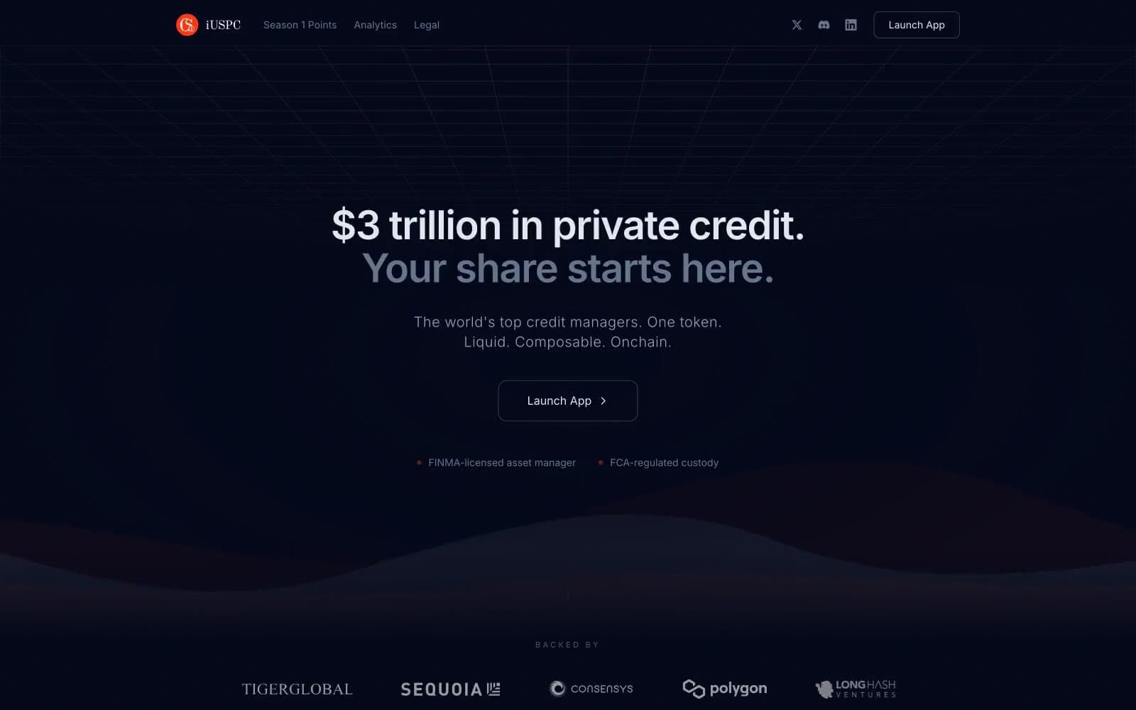
iUSPC by Coinshift
Finance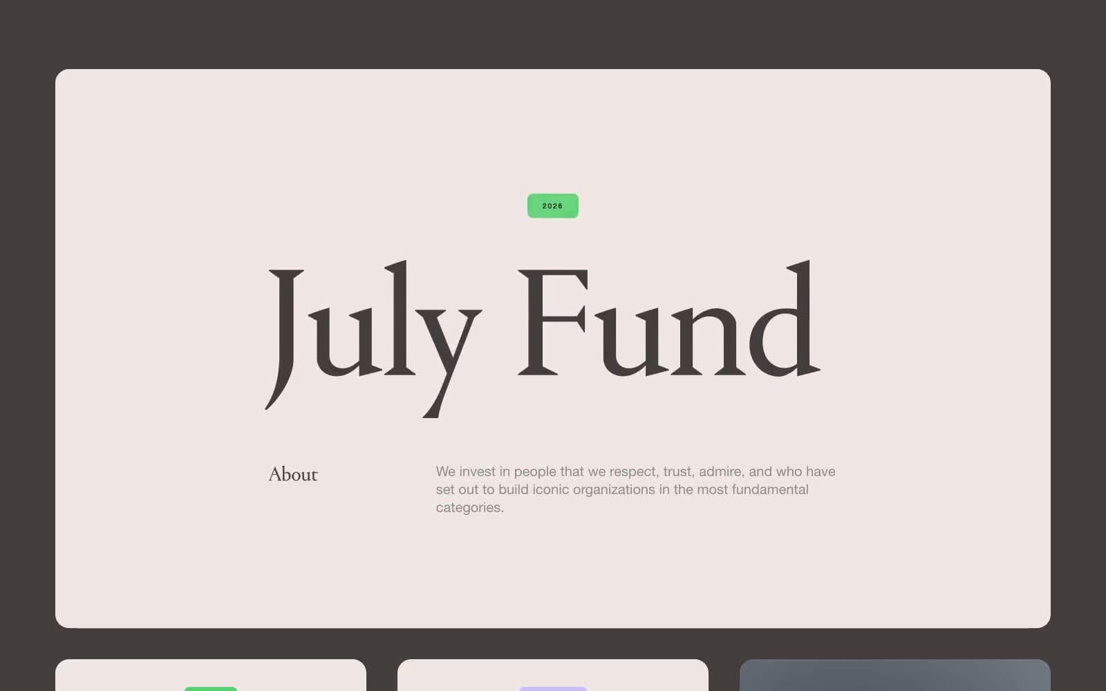
July Fund
Finance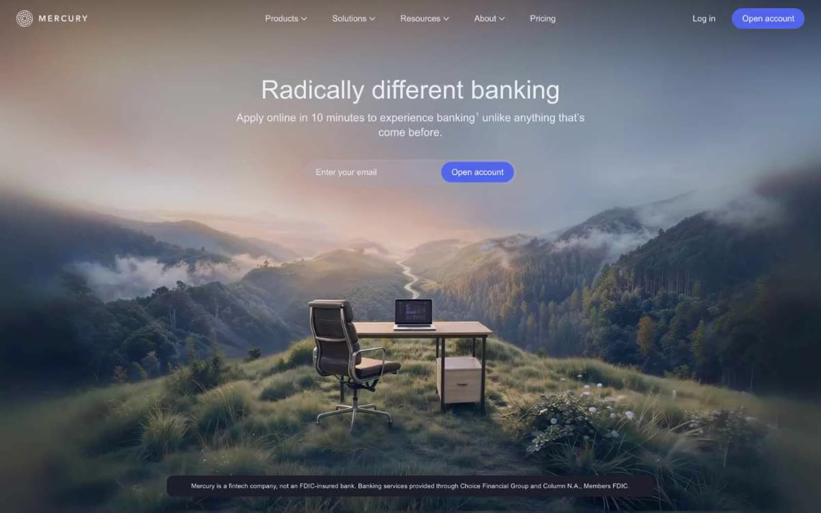
Mercury
Finance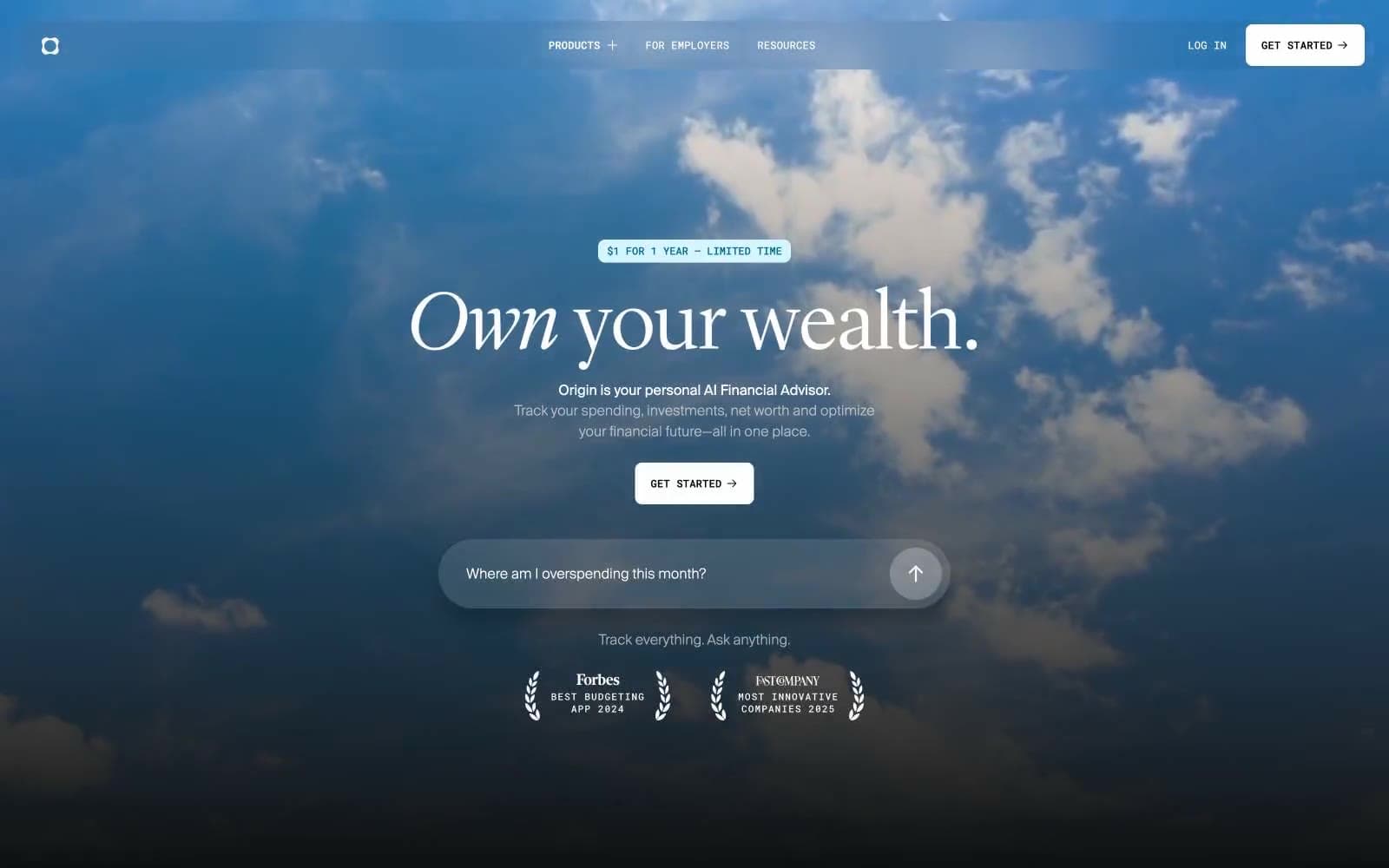
Origin Financial
Finance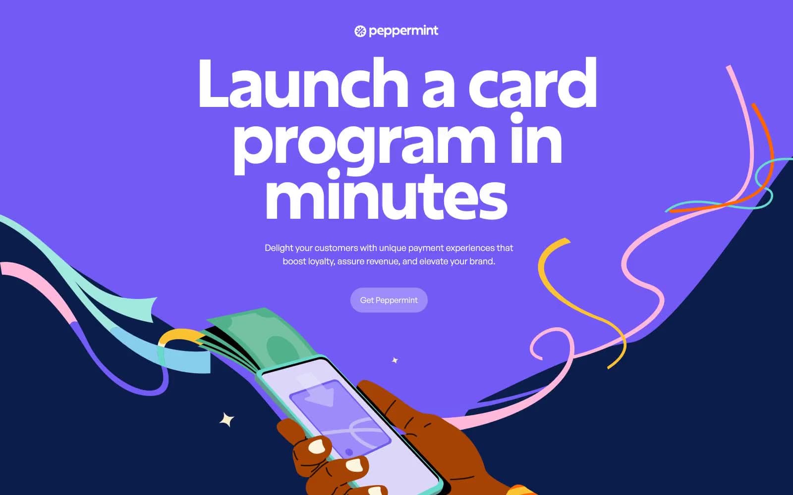
Peppermint
Finance


