
Atlas Card. Pure black space where one deep electric blue is the only thing that matters.
- Finance
- Dark theme
- 8 colors
- 3 typefaces
Atlas Card operates in a cinematic dark mode where near-black canvases dissolve into atmospheric photography, with one vivid sapphire blue doing all the communicative work. The system is built on extreme restraint: a single chromatic accent, two custom geometric sans-serifs, pill-shaped controls, and a monospaced voice for footnotes and metadata. The visual language borrows from luxury concierge services — sparse, intentional, invitation-only — where the interface itself communicates exclusivity through what it omits. Elevation is nonexistent; surfaces are distinguished only by subtle gray steps, and depth is created through photography and atmospheric haze rather than shadow. Every element earns its place: text is centered and confident, buttons are full-pill and singular, and color appears only where action is demanded.
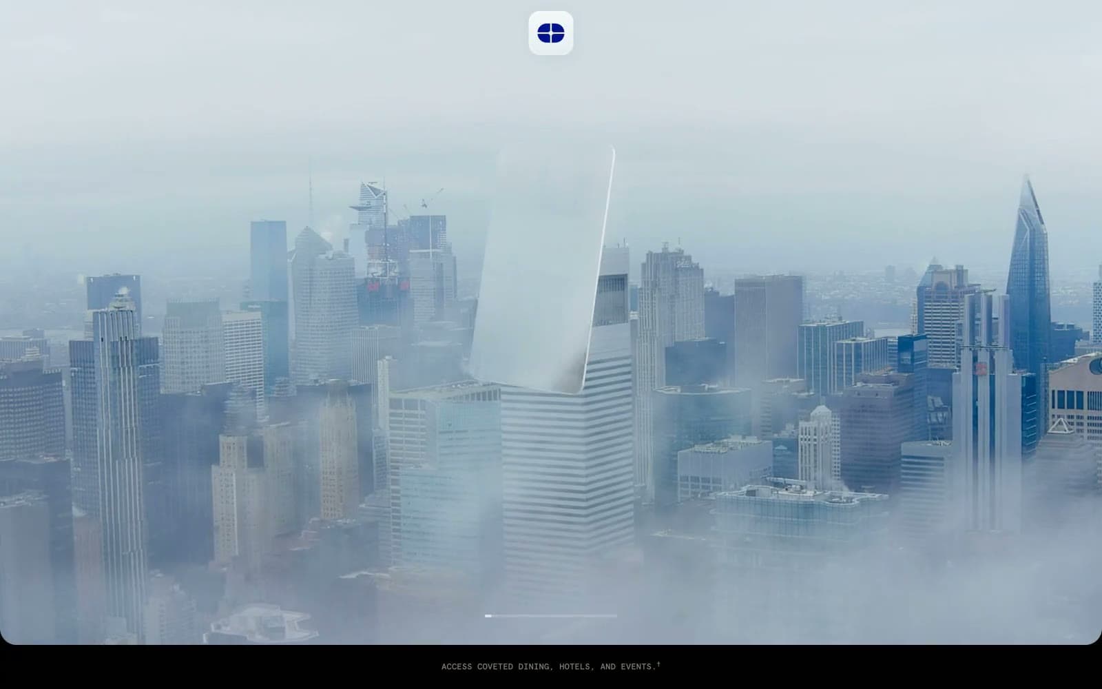
Atlas Card design system

Brand1
Violet supporting accent for decorative details and low-frequency emphasis. Do not promote it to the primary CTA color
Neutrals7
Page canvas, section backgrounds, image masks — pure absorption that lets photography and the blue accent carry all visual weight
Supporting neutral for secondary UI, dividers, and muted labels. Do not promote it to the primary CTA color
Hover states, tertiary surfaces, subtle panel backgrounds — the second elevation step, still achromatic
Secondary text, muted metadata, helper copy, de-emphasized body — sits between the white text and the void
Tertiary text, icon strokes on dark, disabled foregrounds — lighter than Ash but never as bright as primary text
Primary body and heading text, button text on filled controls — chosen over pure white for a softer, less clinical read on black
Logo badge background, icon fills on light photography, maximum-emphasis text — reserved for logo lockups and peak contrast moments
Try a pairing
Pick any two colors from the palette to check whether text stays readable on top.
Aa
Pure White on Sapphire Volt
13.98 : 1 contrast
- Body textPasses AA 4.5
- Large textPasses AA 3
- StrictPasses AAA 7
More DESIGN.md files. Same web, different personalities.
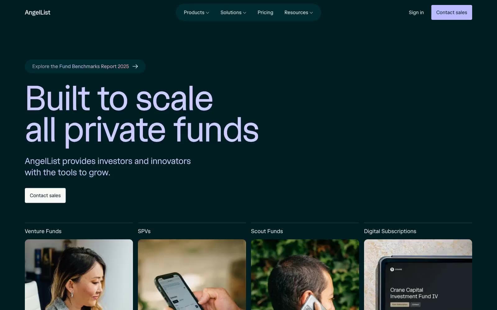
AngelList
Finance
Boostinsurance
Finance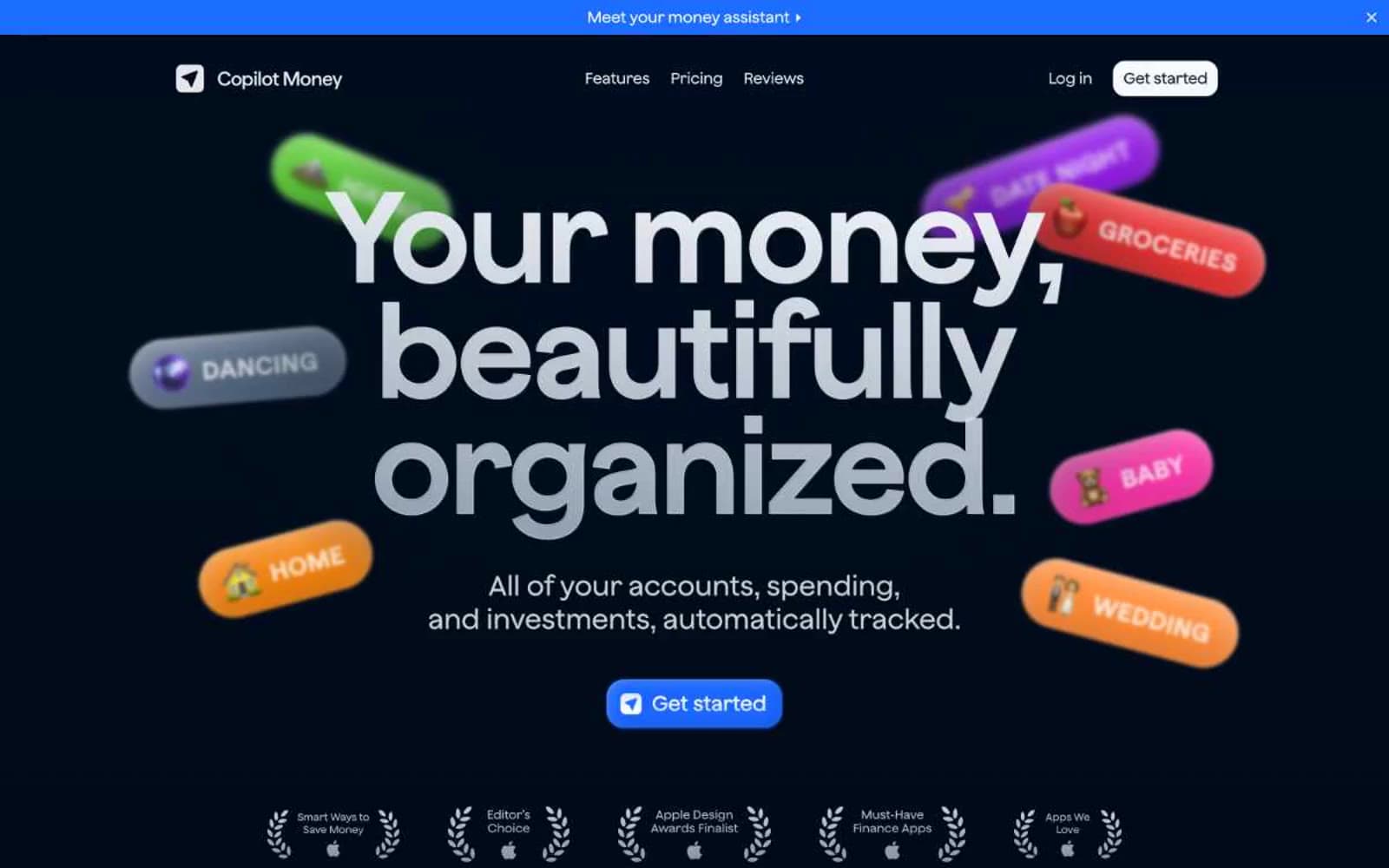
Copilot Money
Finance
Design
Finance
DNA
Finance
Fey
Finance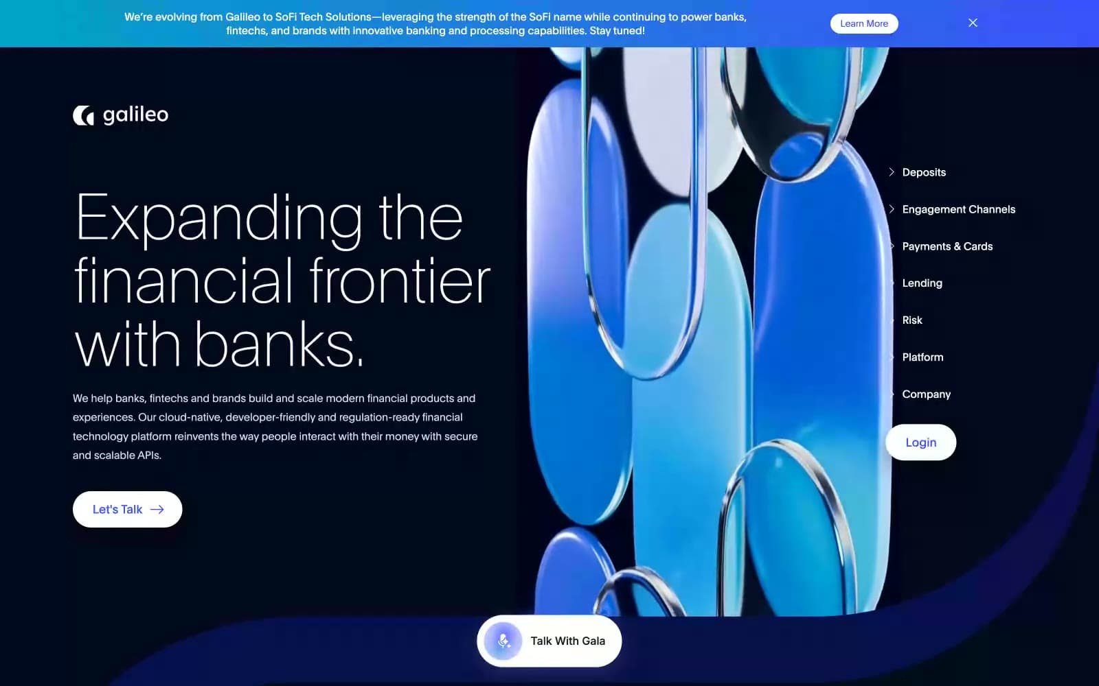
Galileo-ft
Finance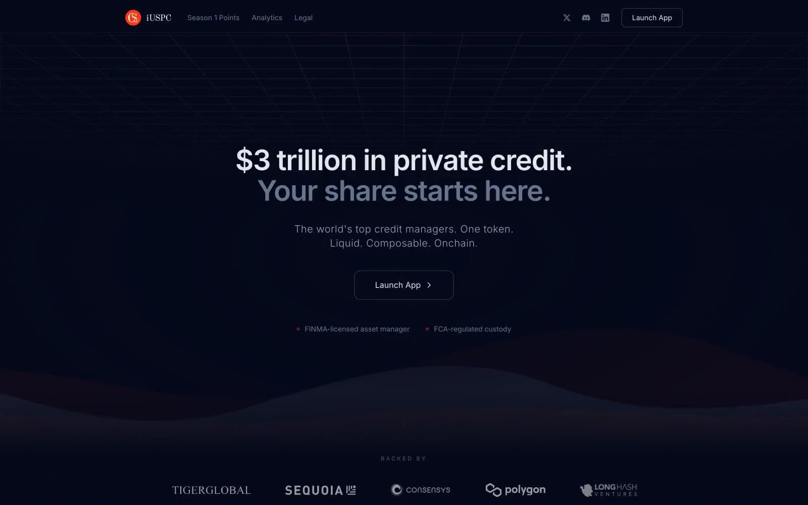
iUSPC by Coinshift
Finance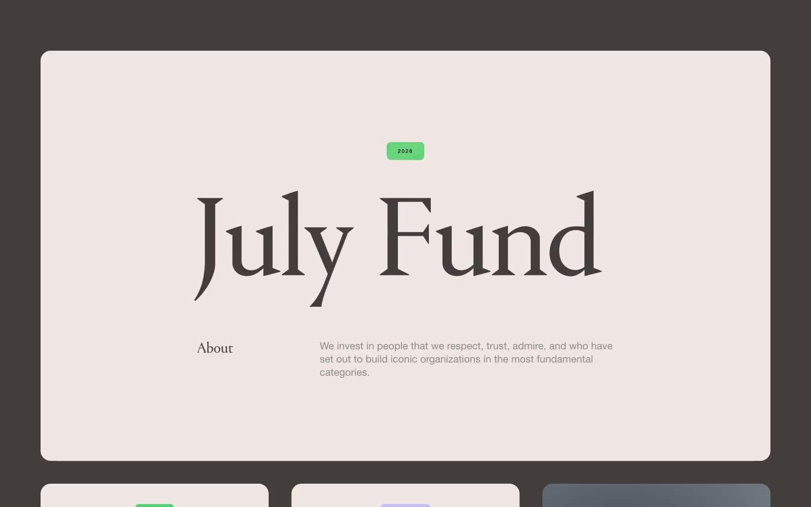
July Fund
Finance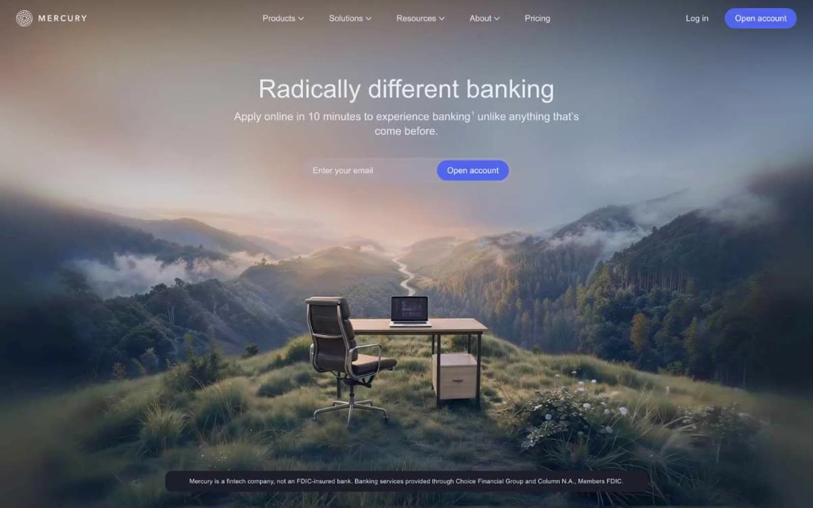
Mercury
Finance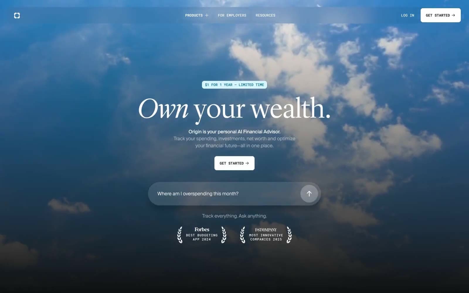
Origin Financial
Finance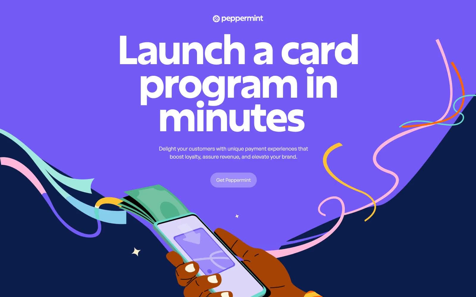
Peppermint
Finance


