
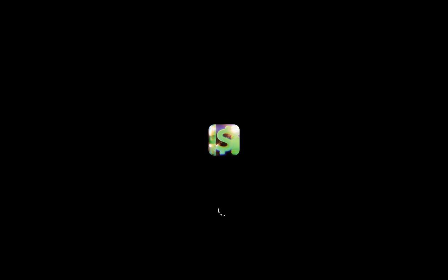
Design. Neon green glyph in a dark void.
- Finance
- Dark theme
- 5 colors
- 1 typeface
Cash App's design system is a dark-mode monolith: near-black canvas, white type that ranges from whisper-quiet 10px labels to 122px display monuments, and exactly one chromatic accent — electric Cash Green — that appears almost never but defines the brand when it does. Depth is communicated through typographic scale and whitespace rather than shadows or layered surfaces; hairline silver borders (#e5e7eb) at sub-1px visual weight separate regions without breaking the void. The type scale is intentionally extreme: no medium headings exist between 16px body and 86px display, forcing dramatic contrast that makes every page feel like an editorial spread. Spacing is generous (64px section gaps, 30px internal padding) and density stays low — this system rewards restraint and punishes decoration.
Design design system

Neutrals5
Page canvas, inverted surfaces, display type on light blocks
Muted body text, secondary labels, list items, metadata
Tertiary text, disabled states, icon strokes, subtle UI annotations
Hairline dividers, section borders, card outlines, link borders — the only structural separator in the system
Primary text, high-contrast headings, logo lockup fills
Try a pairing
Pick any two colors from the palette to check whether text stays readable on top.
Aa
Snow on Obsidian
21.00 : 1 contrast
- Body textPasses AA 4.5
- Large textPasses AA 3
- StrictPasses AAA 7
More DESIGN.md files. Same web, different personalities.
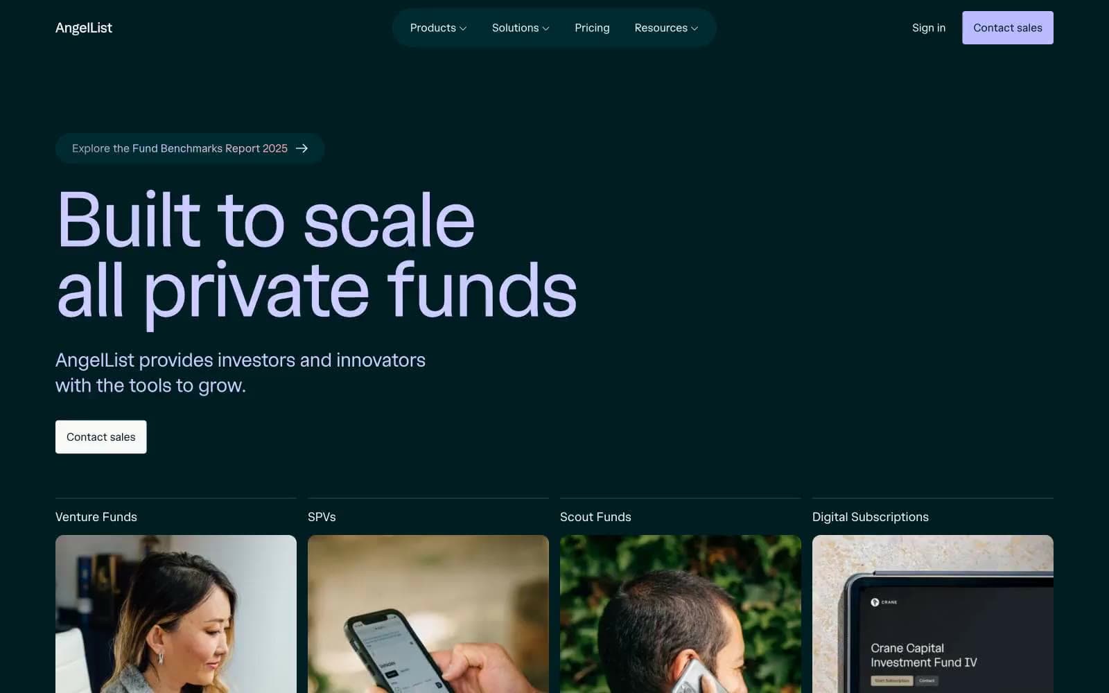
AngelList
Finance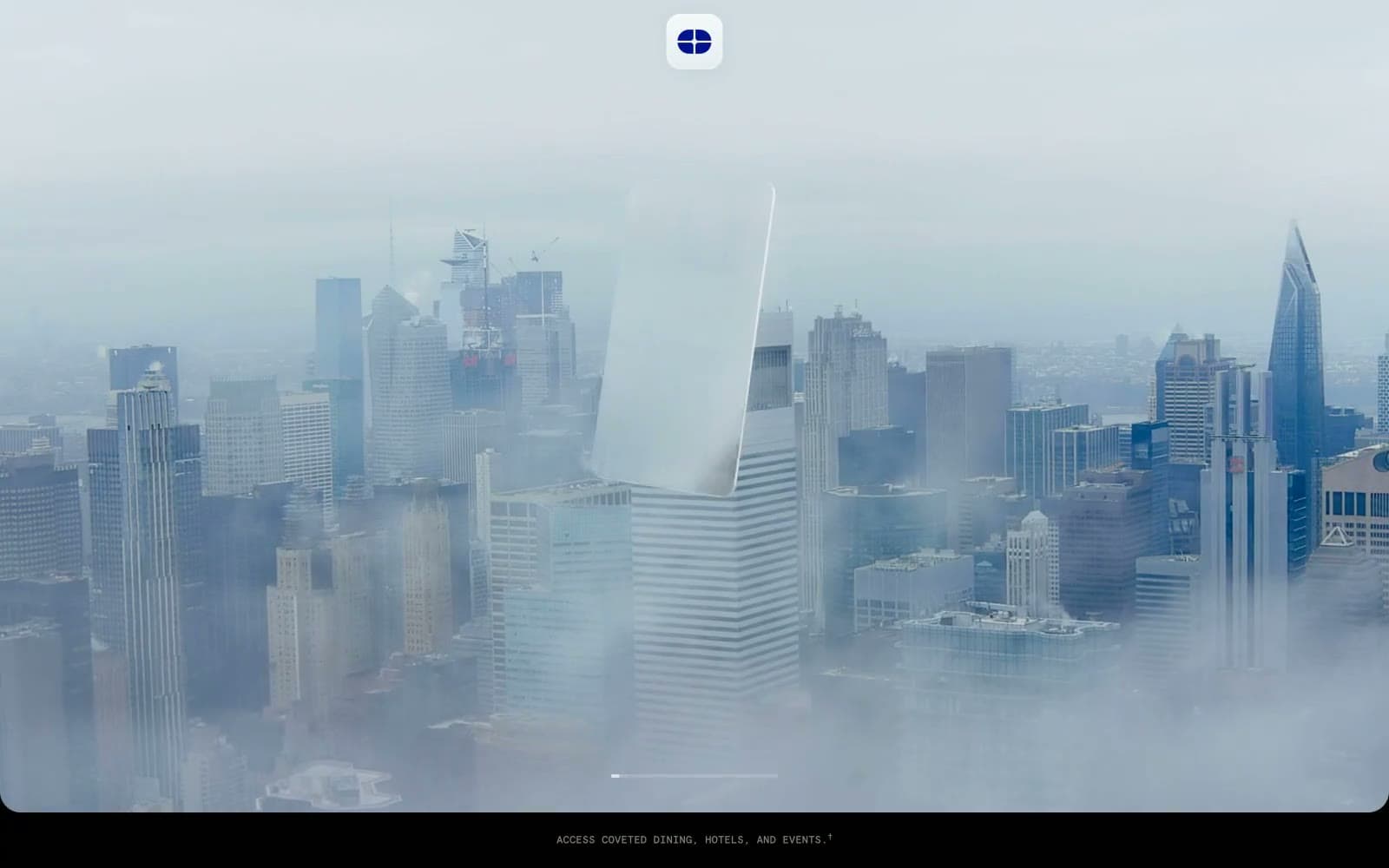
Atlas Card
Finance
Boostinsurance
Finance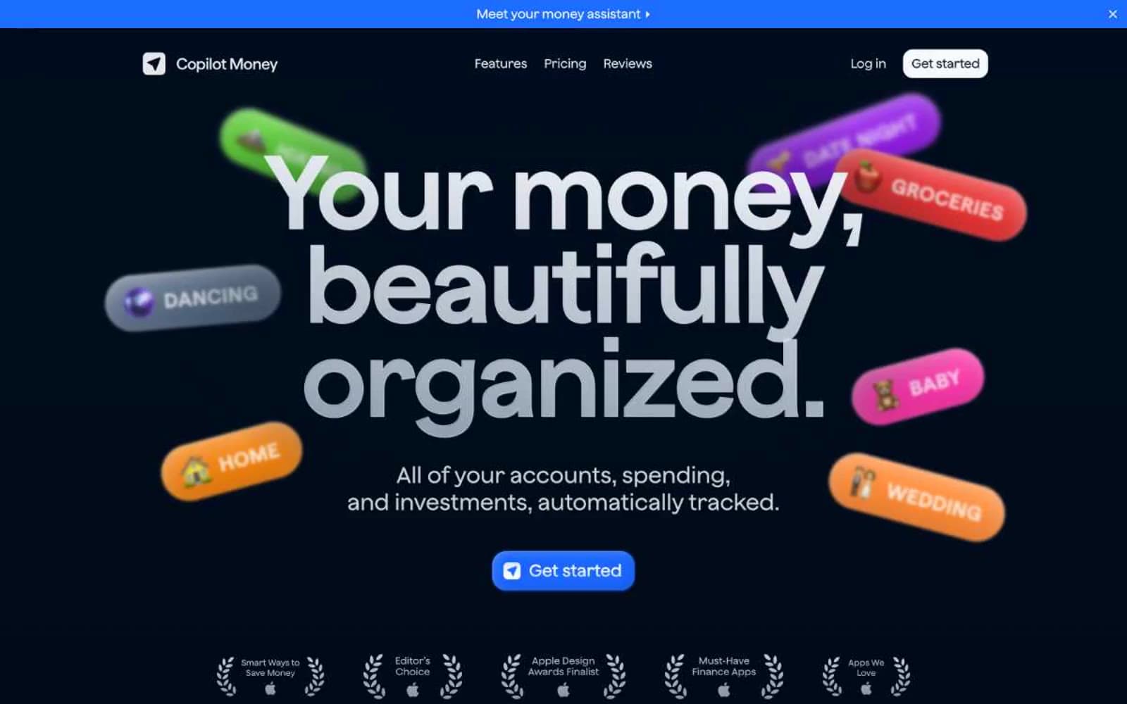
Copilot Money
Finance
DNA
Finance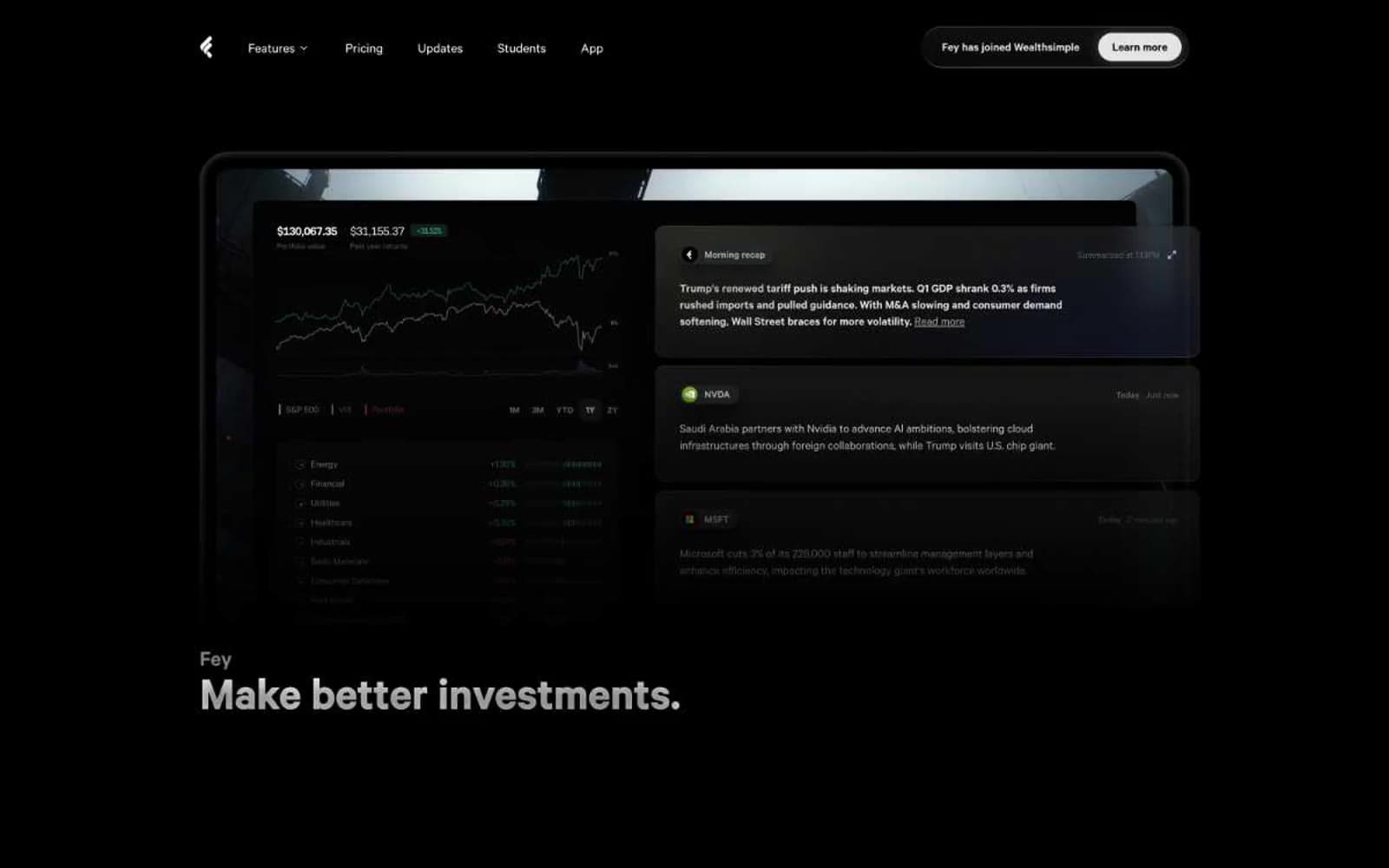
Fey
Finance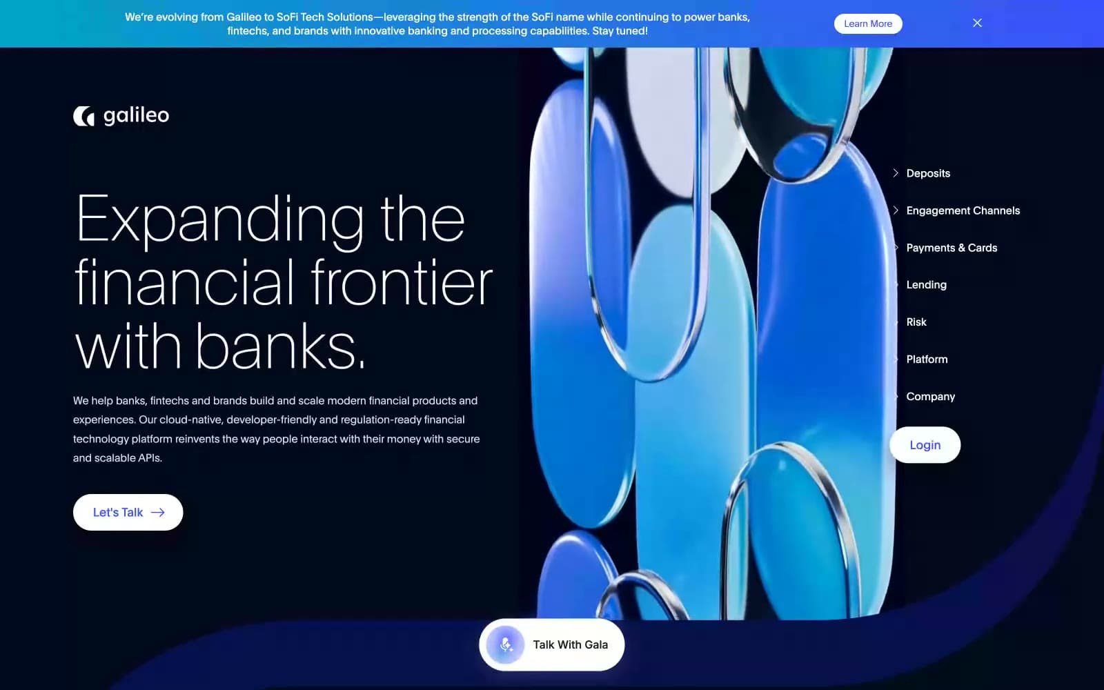
Galileo-ft
Finance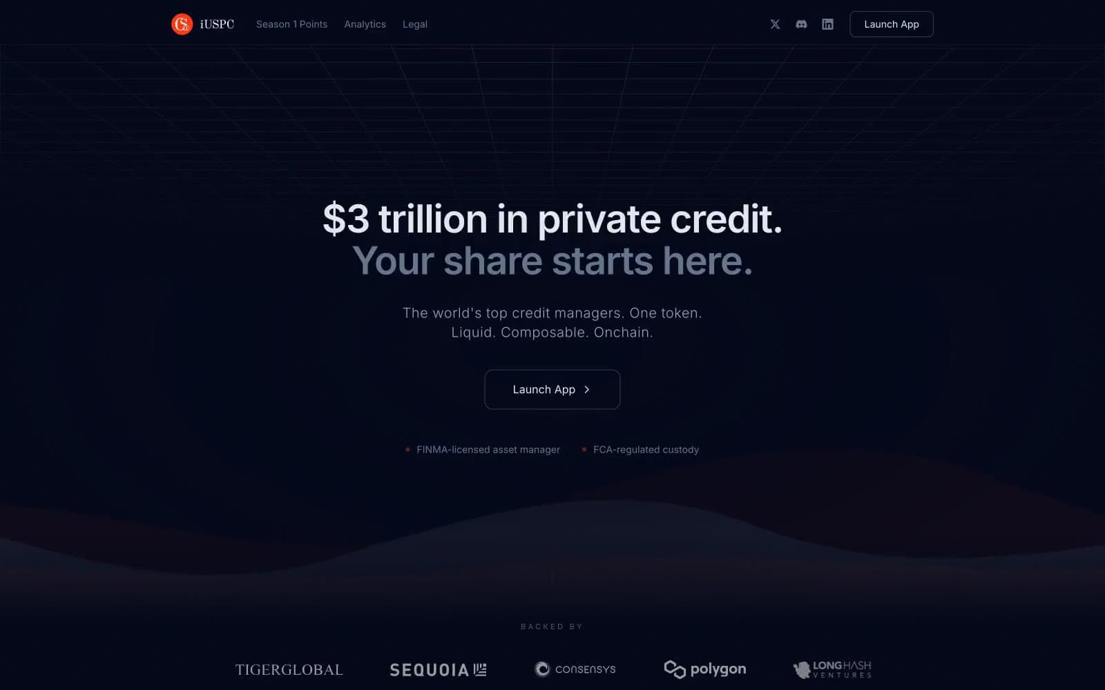
iUSPC by Coinshift
Finance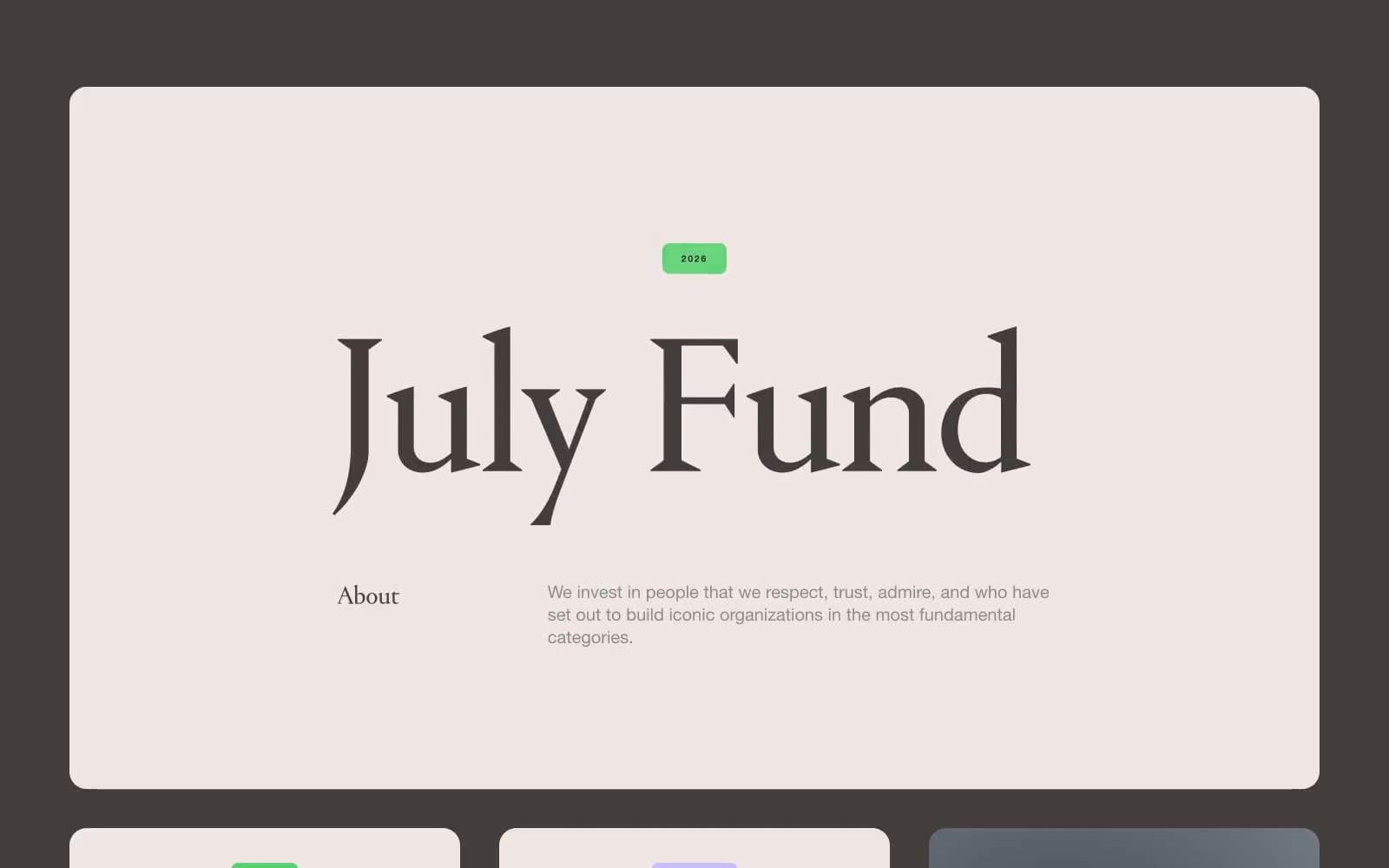
July Fund
Finance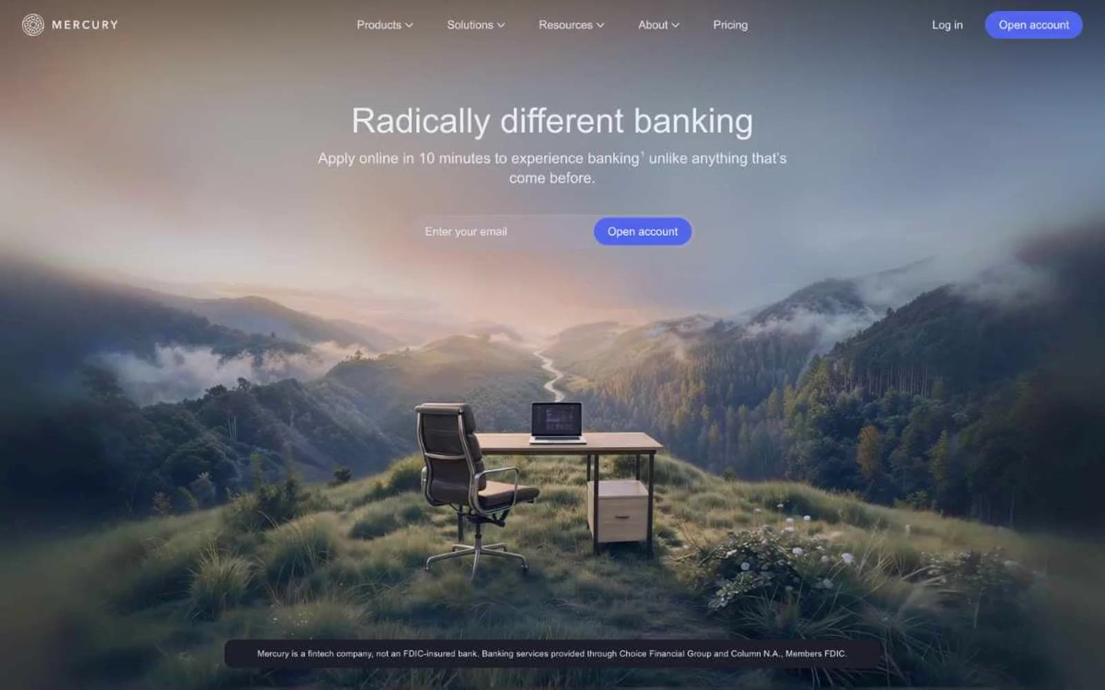
Mercury
Finance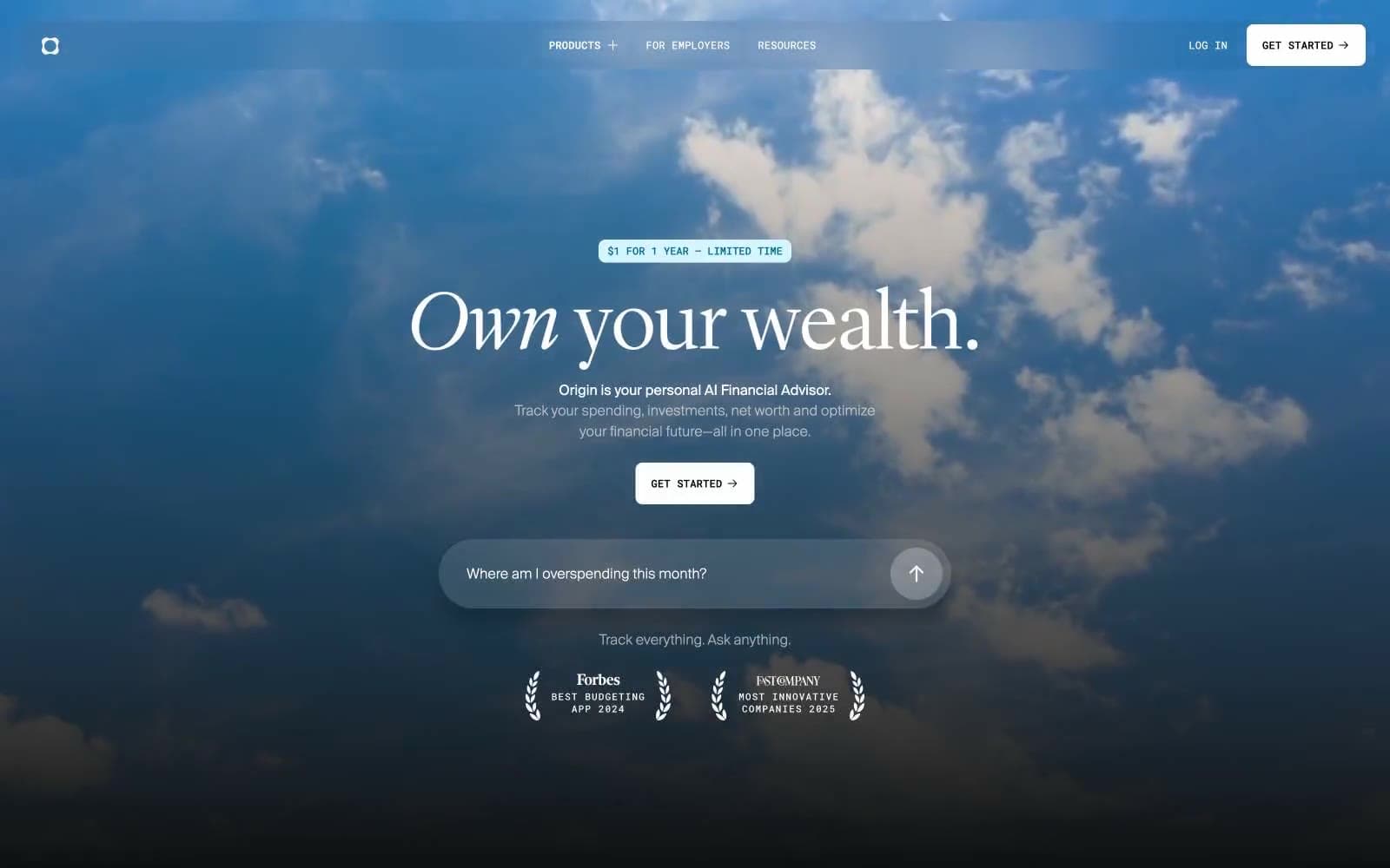
Origin Financial
Finance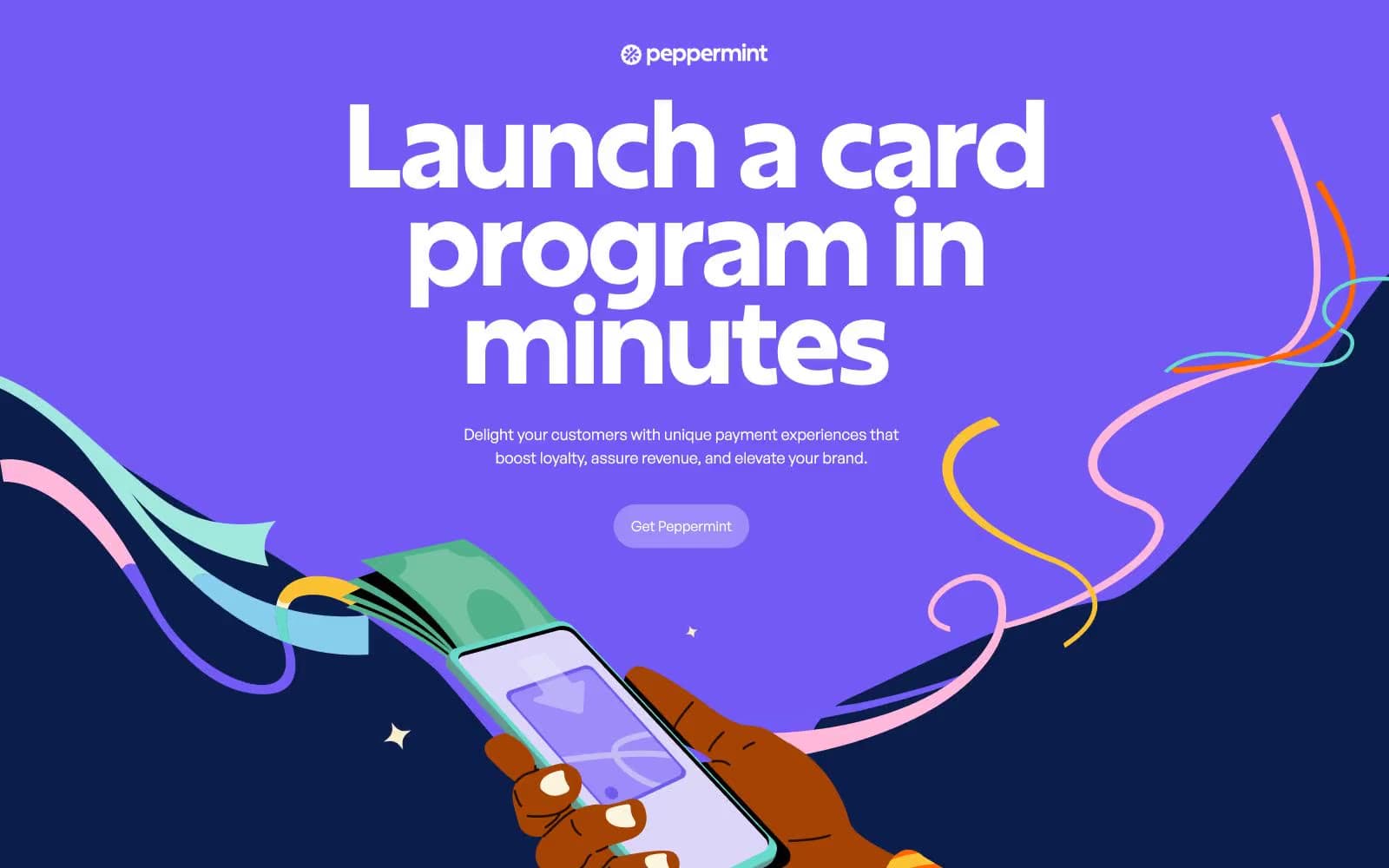
Peppermint
Finance


