
Fey. Nocturnal Bloomberg terminal, matte-black with luminous type.
- Finance
- Dark theme
- 15 colors
- 1 typeface
Fey operates in a nocturnal financial terminal aesthetic: deep matte-black canvas, a single typographic voice (calibre) doing all the heavy lifting, and chromatic color deployed as signal rather than decoration. The interface feels like a Bloomberg terminal redesigned by an Apple hardware team — data-dense product surfaces float on near-black, white type glows with AAA contrast, and orange/blue/green appear only where meaning demands attention (accented words, price direction, status pills). Components are built from generous 16px card radii and pill-shaped 99px controls, with soft black halos creating depth instead of hard elevation. The signature move is typographic: tight tracking on large display sizes (-0.08em) compresses confident statements into compact, premium-feeling headlines, while weight 400 does most of the work — there is no shouting, only calm authority. Every surface lives in the #0b0b0b→#191919 range, making any chromatic accent feel intentionally switched on.

Fey design system

Accent5
Warm accent for highlighted headline words and warm gradient terminus — orange-on-black reads as urgency and premium warmth; Warm hero gradient — Ember fading into deep brown for product showcase atmosphere
Navigation underline, active link border, cool accent — vivid blue draws the eye to current location and trust indicators
Green outline accent for tags, dividers, and focused UI edges. Use as a supporting accent, not as a status color
Cool gradient accent — pale blue fading into slate for secondary product showcase
Highlight gradient — electric yellow-green fading into deep olive for standout elements
Neutrals10
Shadow base color, deepest possible background — used in 0.8-opacity halos and gradient termini
Primary canvas and card surfaces — the near-black that everything floats on
Tertiary surface, input backgrounds, subtle elevated layers
Elevated card surface, secondary panels — one step lighter than the canvas for nested depth
Deep dividers, shadow-tinted borders, very low-emphasis strokes
Muted secondary text, subdued borders, disabled labels — the workhorse mid-gray for everything that is not the headline
Low-emphasis borders and secondary text — sits between Graphite and Smoke
Icon strokes, subtle links, tertiary borders — a step brighter than Graphite for elements that need more presence
Subtle body borders, ghost button outlines, light strokes — the lightest non-white neutral
Primary text, decorative borders, hairlines — the dominant color of the system, used for typography and 554+ border occurrences
Try a pairing
Pick any two colors from the palette to check whether text stays readable on top.
Aa
Fey Abyss on Fey Signal
7.61 : 1 contrast
- Body textPasses AA 4.5
- Large textPasses AA 3
- StrictPasses AAA 7
More DESIGN.md files. Same web, different personalities.
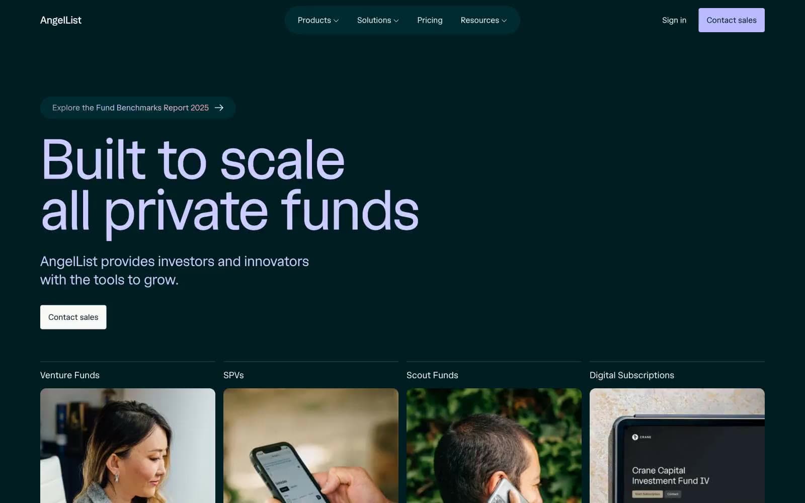
AngelList
Finance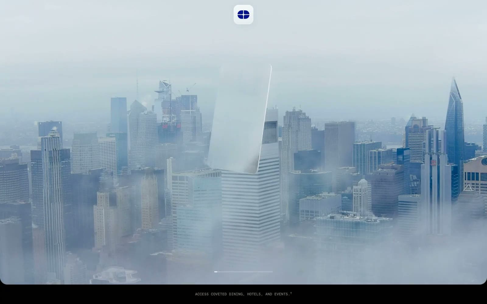
Atlas Card
Finance
Boostinsurance
Finance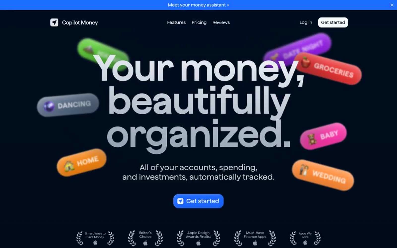
Copilot Money
Finance
Design
Finance
DNA
Finance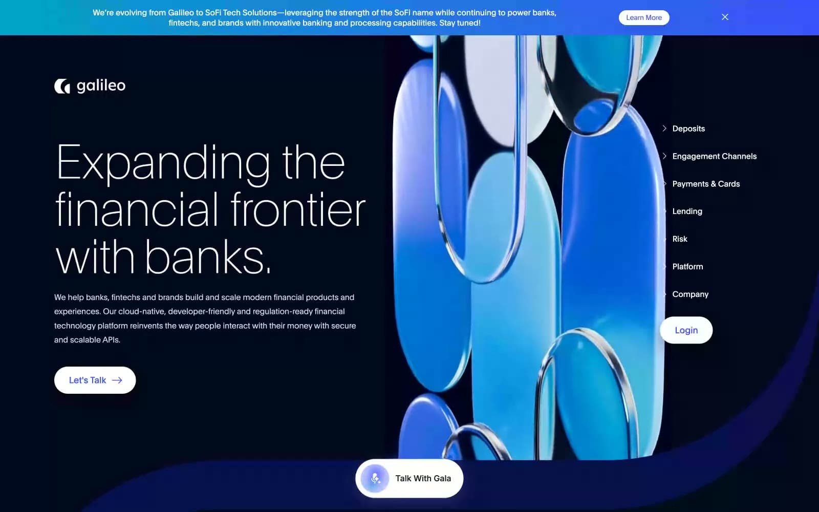
Galileo-ft
Finance
iUSPC by Coinshift
Finance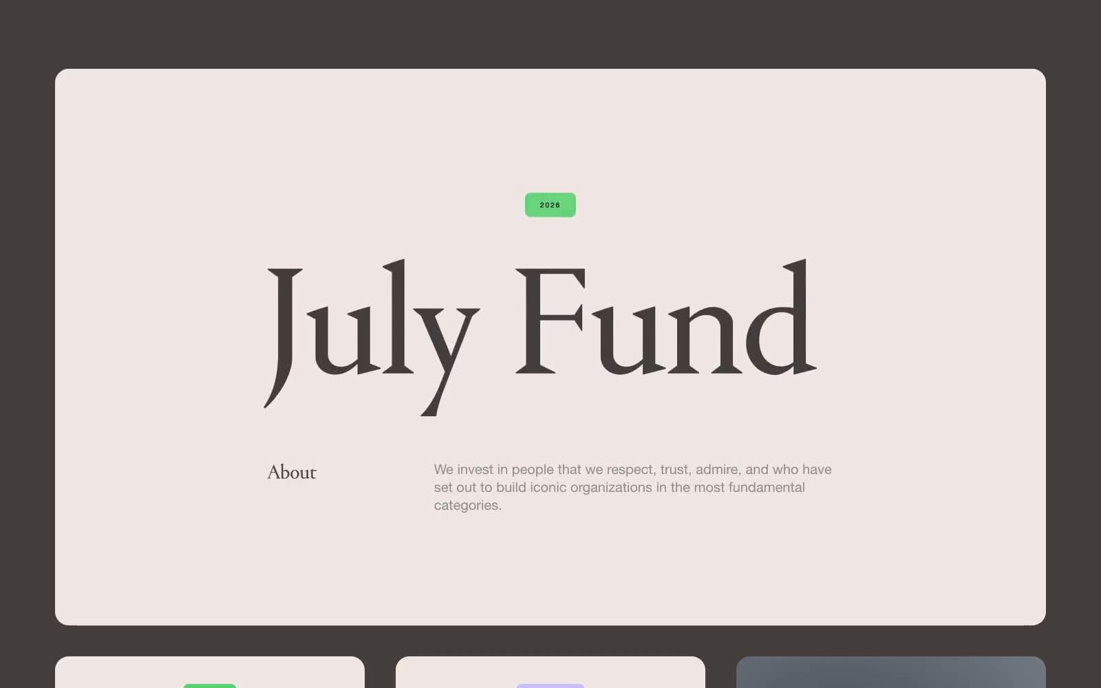
July Fund
Finance
Mercury
Finance
Origin Financial
Finance
Peppermint
Finance


