
iUSPC by Coinshift. Cold slate surfaces, a single ember pilot light, and grid lines drawn on darkness.
- Finance
- Dark theme
- 11 colors
- 2 typefaces
iUSPC is a midnight trading floor rendered in near-grayscale: a near-black canvas with a faint blue cast, flat surfaces separated by hairline borders rather than shadows, and a single ember accent that glows from the edges like a pilot light. The system communicates institutional weight through restraint — Inter at weight 300–400 dominates, with all-caps tracked labels providing the only typographic punctuation. Color is rationed: 97% of the surface stays cold and neutral, the remaining 3% is a warm red-orange used only for atmospheric glow, focus states, and the live signal dot. Ghost controls replace filled buttons; the page is full-bleed with centered max-width content blocks separated by generous vertical breathing room. The grid lines visible in the hero background signal a financial-instrument sensibility — precise, measured, and architectural.
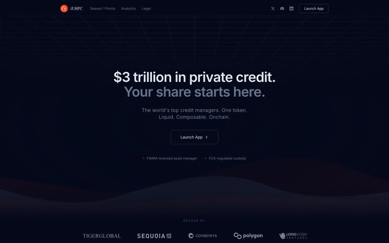
iUSPC by Coinshift design system

Brand2
Supporting palette color for small decorative accents when the core palette needs contrast.
Deep red border tone for warm-bordered emphasis elements and the underside of the gradient wave
Accent1
Green text accent for links, tags, and emphasized short phrases. Use as a supporting accent, not as a status color
Neutrals8
Page canvas, hero background, section backgrounds — the base surface every other color sits on
Elevated surfaces, card backgrounds, subtle surface lift from the canvas
Outlined button borders, ghost control frames, subtle elevated dividers
Card body text, secondary paragraph copy, low-emphasis content
Tertiary text, muted sub-headlines, nav secondary items, icon fills at rest
Micro-copy, fine-print detail, rare light text accents
Body text, secondary headlines, hairline borders, divider lines — the workhorse neutral that draws the structural lines of the page
Primary headline text, logo wordmark, highest-emphasis content
Try a pairing
Pick any two colors from the palette to check whether text stays readable on top.
Aa
Abyss Ink on Ember Glow
5.42 : 1 contrast
- Body textPasses AA 4.5
- Large textPasses AA 3
- StrictFails AAA 7
More DESIGN.md files. Same web, different personalities.
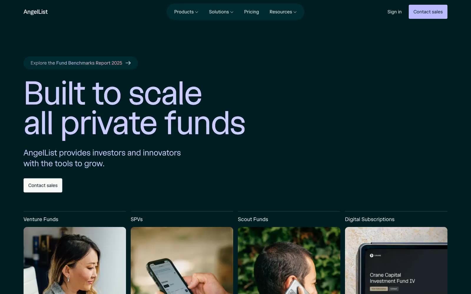
AngelList
Finance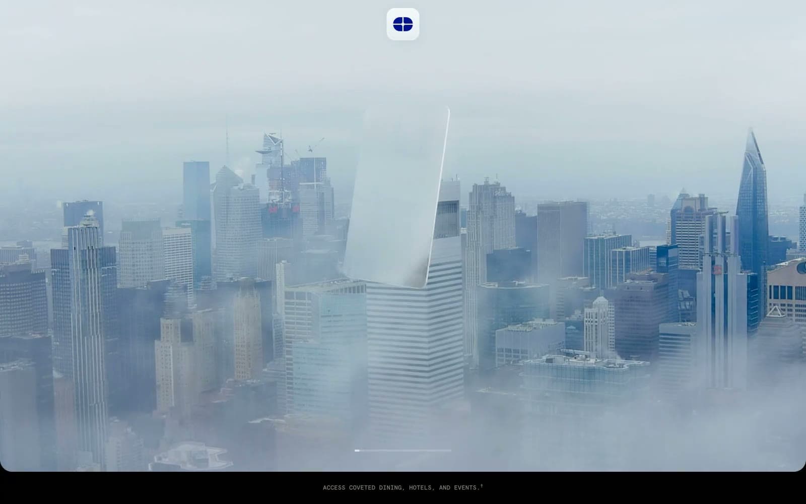
Atlas Card
Finance
Boostinsurance
Finance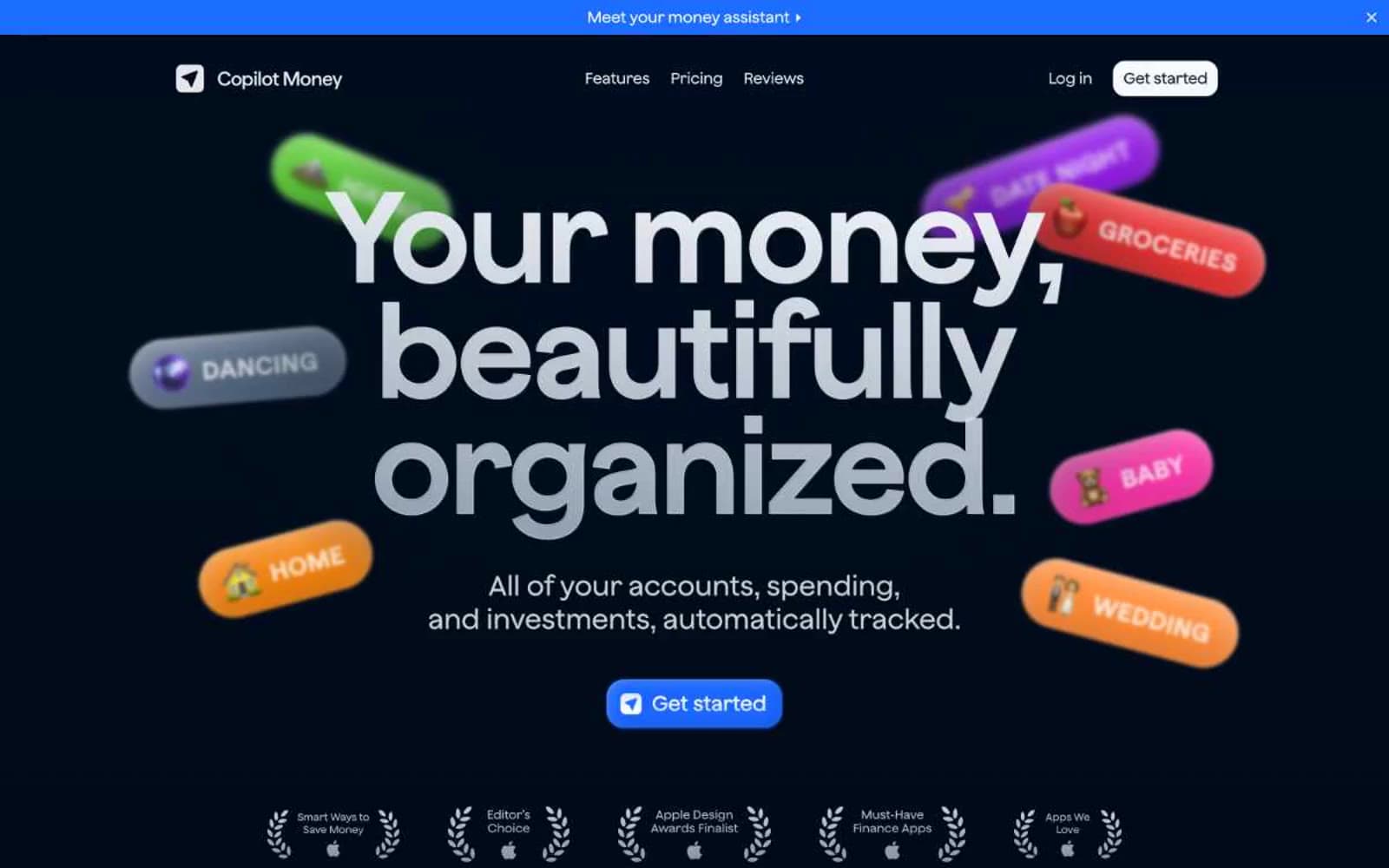
Copilot Money
Finance
Design
Finance
DNA
Finance
Fey
Finance
Galileo-ft
Finance
July Fund
Finance
Mercury
Finance
Origin Financial
Finance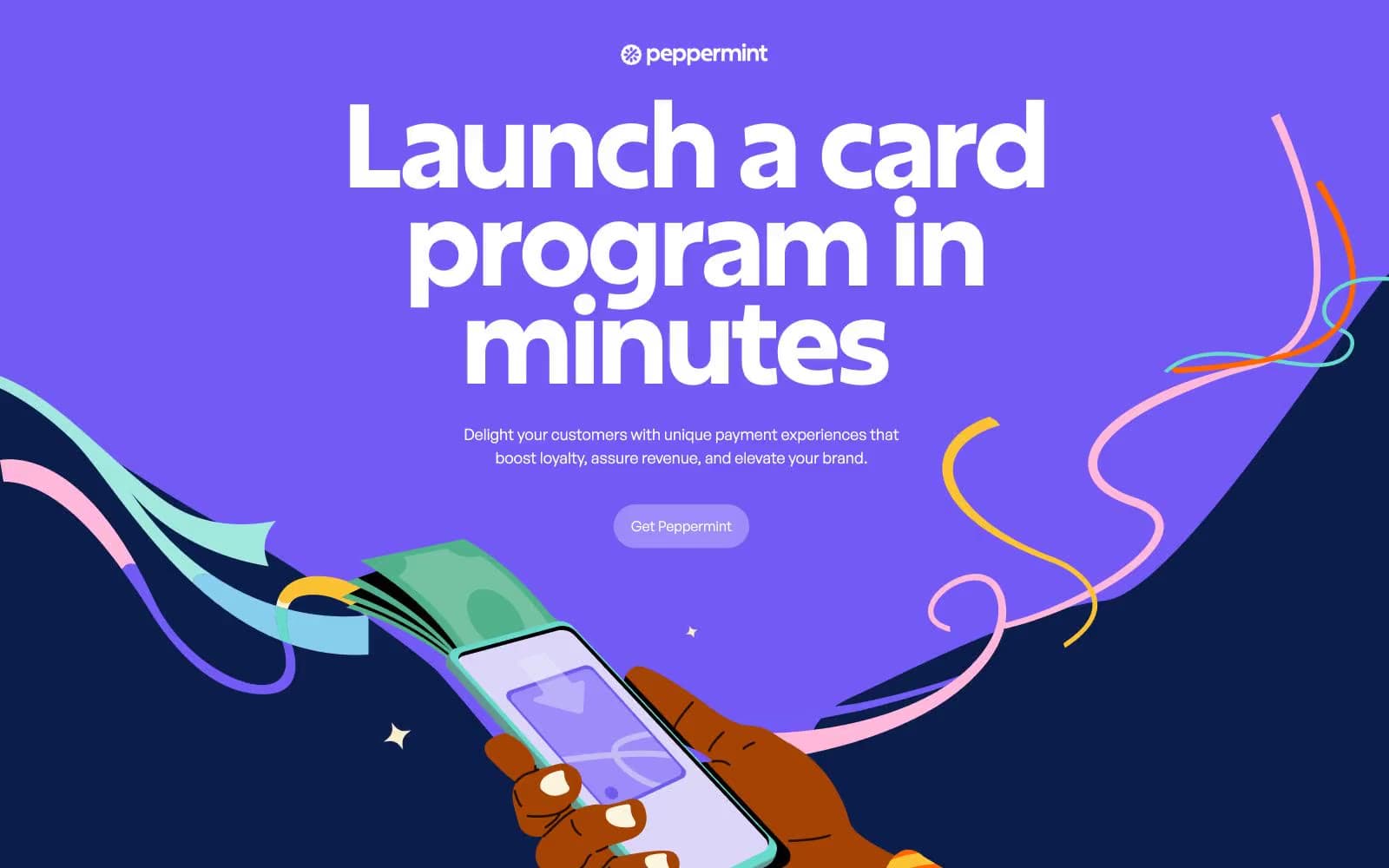
Peppermint
Finance


