
Origin Financial. Midnight gallery of quiet wealth.
- Finance
- Dark theme
- 16 colors
- 6 typefaces
Origin presents personal finance as a nocturnal gallery: near-black canvases, whisper-weight serif display headlines at 80-96px (Lyon Display at weight 300), and chromatic feature cards that hover like illuminated color panels. Most surfaces stay quiet and monochromatic, with saturated color appearing only as full-bleed category tiles for spending, investing, and forecasting modules, and as data signals (chart lines, sparklines). Typography splits into three distinct voices: a high-contrast serif for emotive statements, a neo-grotesque sans for UI, and a monospace for uppercase technical labels and data, producing an editorial-meets-precision feel. White-on-black is the only primary action; the rest of the interface recedes into the dark.
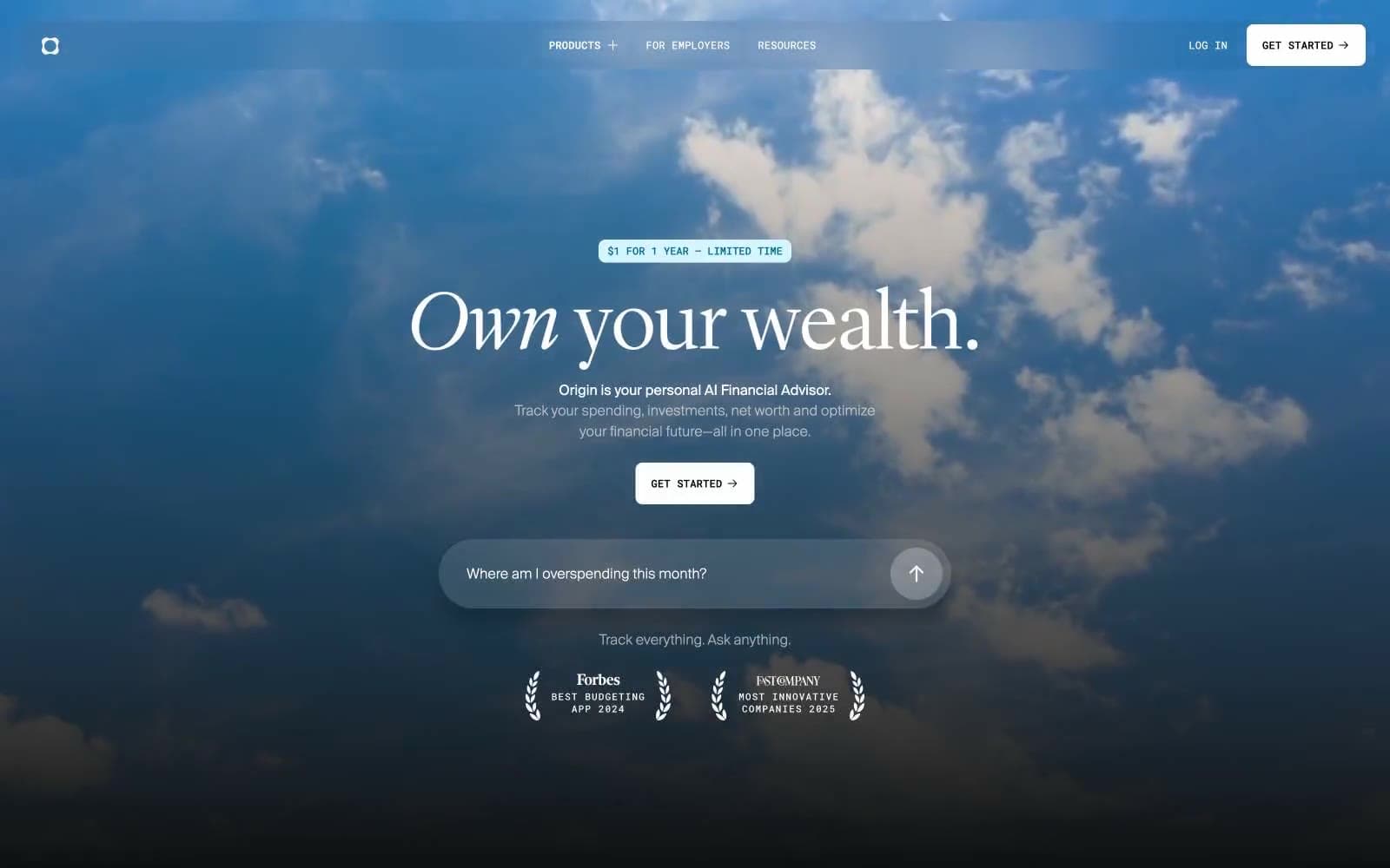
Origin Financial design system

Brand1
Primary chromatic accent for feature category cards — the signature violet that appears most often across module tiles
Accent5
Data accent — chart lines, sparkline strokes, and forecasting indicators on dark surfaces
Light variant of the brand violet for softer category panels and background washes
Dark variant of the brand violet for shaded category panels and hover states
Pink category card for lifestyle/spending modules — warm contrast against the cool palette
Soft blue category card for advisory or couples modules
Neutrals10
Icon fills, button text on white fills, and input backgrounds
Slightly deeper than Obsidian for subtle stacked sections and shadow tone
Page canvas — the dominant dark surface that everything floats on
Mid-dark card surface for elevated modules and data panels
Hover/pressed surface for interactive elements and secondary raised panels
Muted text and disabled-link color
Body text, descriptions, and secondary links — never full white
Light card surface for inverted panels, stat blocks, and testimonial cards
Heading text variant for softer white display where #ffffff feels too sterile
Primary text, primary action fill, and nav icon strokes — the brightest element in the system
Try a pairing
Pick any two colors from the palette to check whether text stays readable on top.
Aa
Void on Iris Gleam
6.36 : 1 contrast
- Body textPasses AA 4.5
- Large textPasses AA 3
- StrictFails AAA 7
More DESIGN.md files. Same web, different personalities.
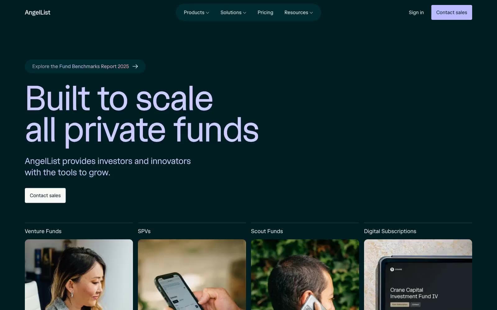
AngelList
Finance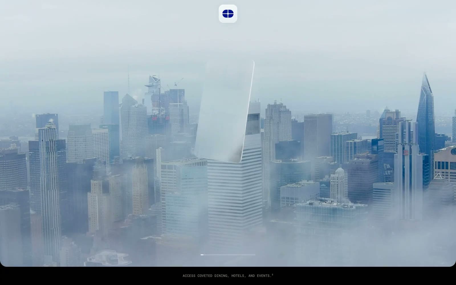
Atlas Card
Finance
Boostinsurance
Finance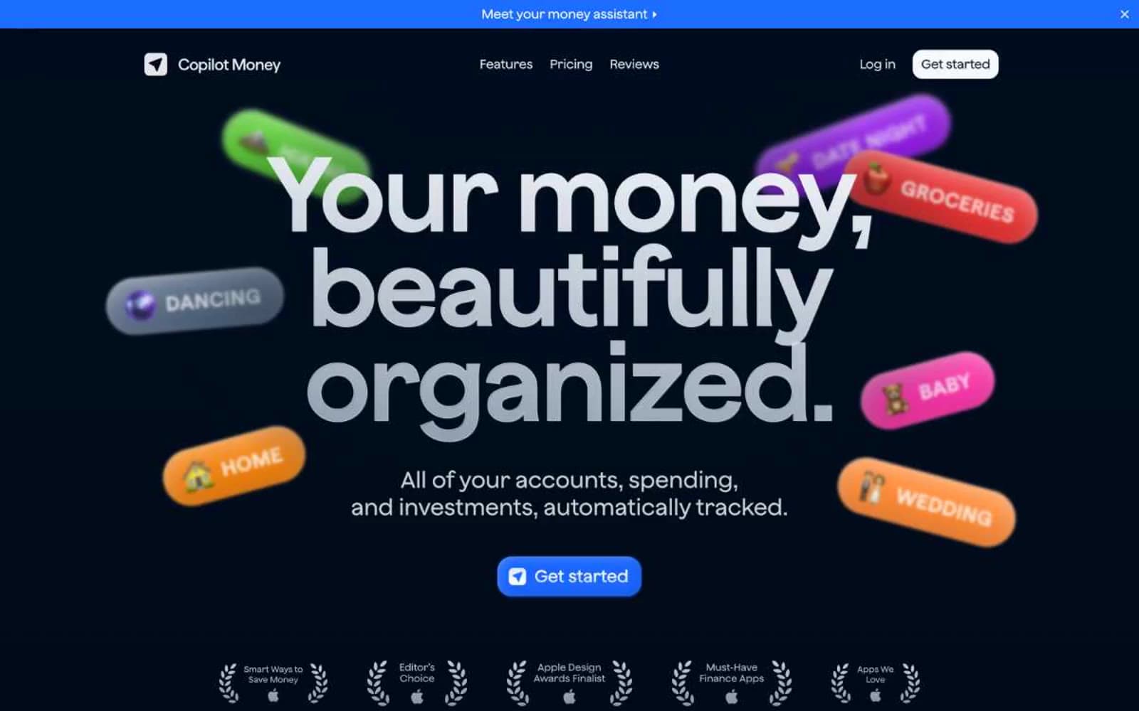
Copilot Money
Finance
Design
Finance
DNA
Finance
Fey
Finance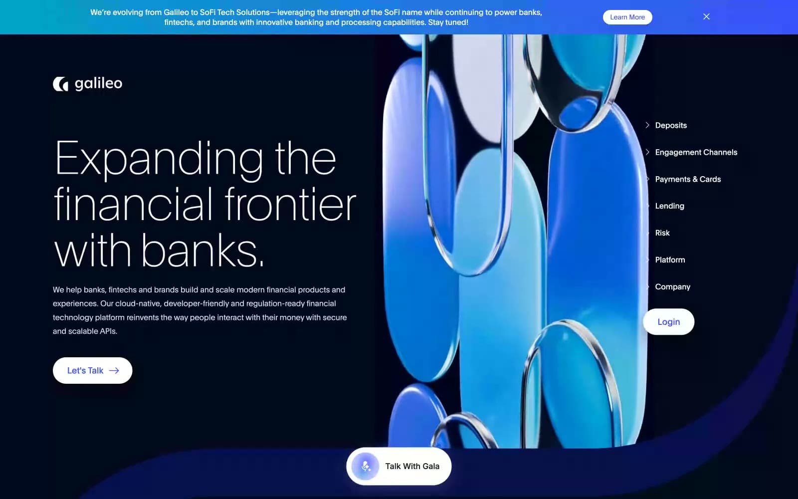
Galileo-ft
Finance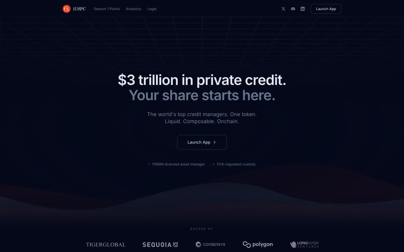
iUSPC by Coinshift
Finance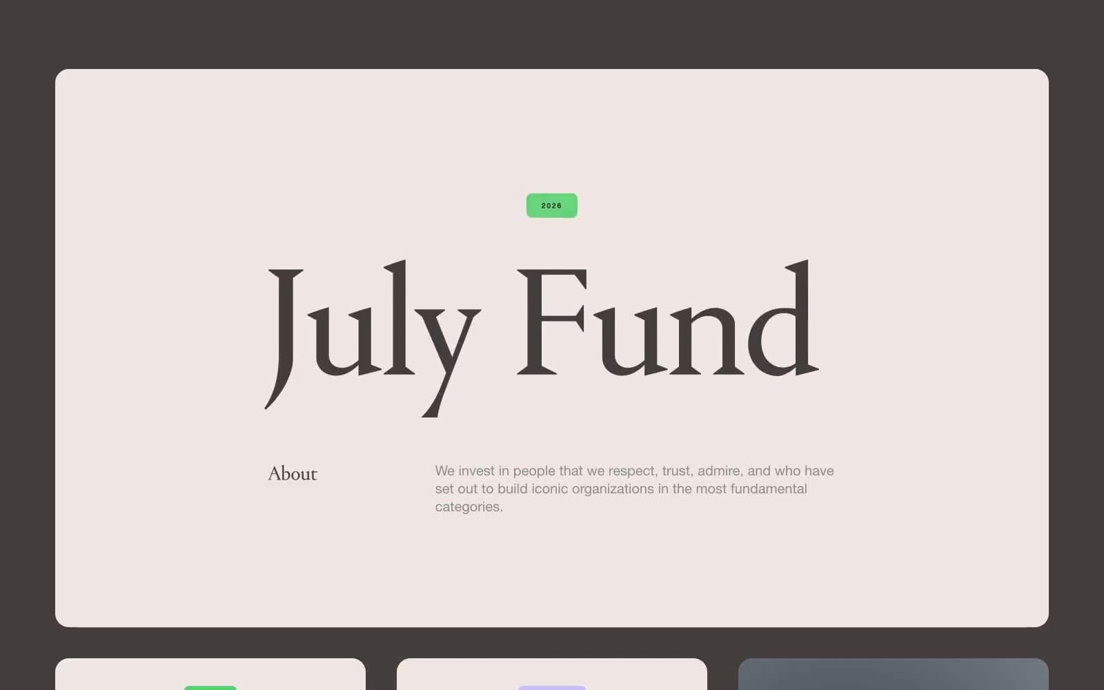
July Fund
Finance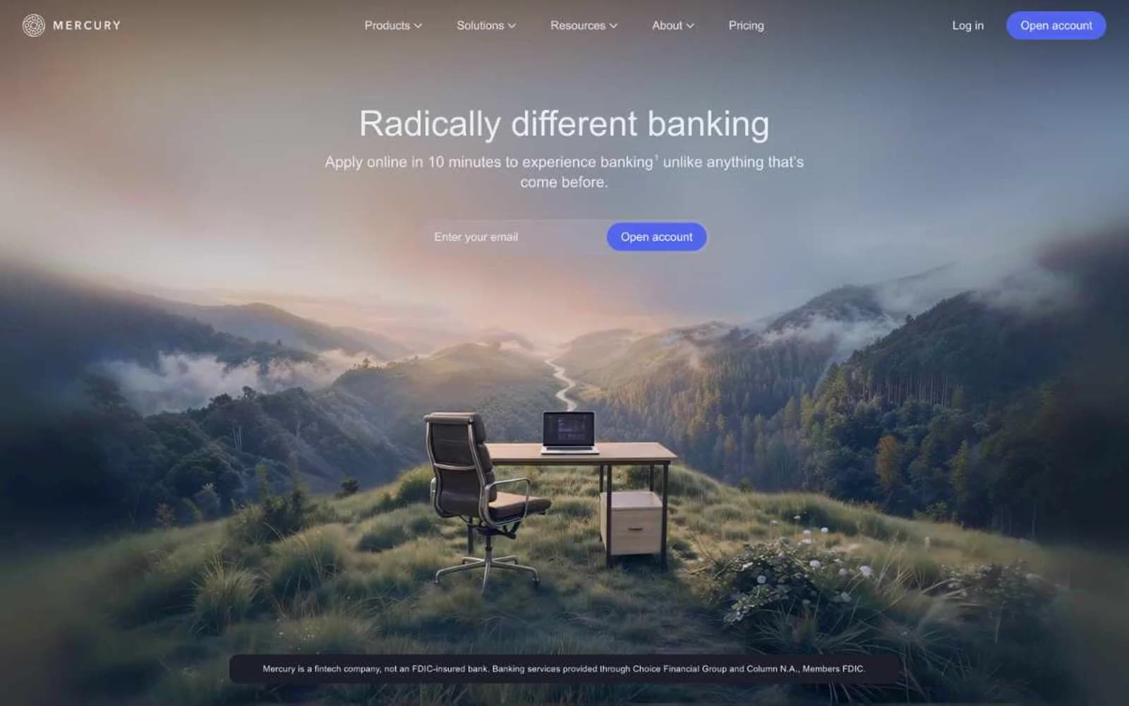
Mercury
Finance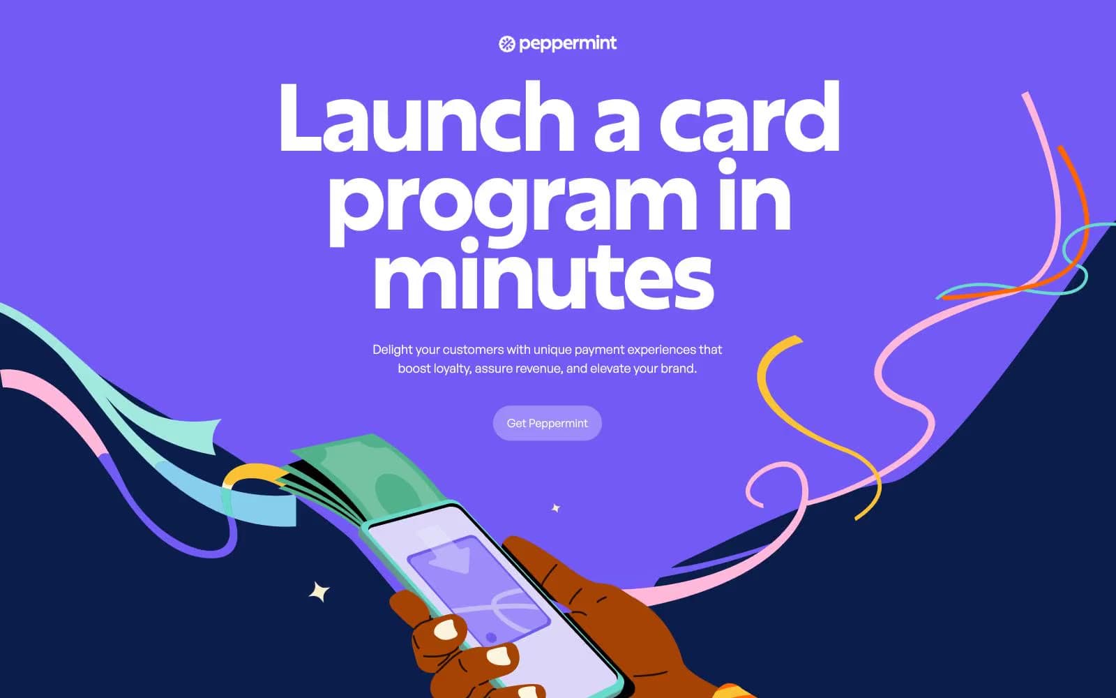
Peppermint
Finance


