
SICK AGENCY. A maximalist zine spread screaming from a screen.
- Studio
- Mixed theme
- 6 colors
- 4 typefaces
Sick Agency treats the browser as a printed broadside, not a software interface. The system is unapologetically maximalist: three saturated color fields (voltage yellow, radioactive orange, electric blue) alternate as full-bleed section backgrounds, and those colors do not play a supporting role — they are the surface. Display typography is the primary content: condensed black-weight faces at 122–229px are set with line-heights as tight as 0.70, filling the viewport edge-to-edge with no margin for safety. There are no cards, no shadows, no neutral grays, no subtle elevation — the visual hierarchy comes from color contrast and type scale jumps of 5–10x, not from spacing or depth. Interactive elements are pill-shaped and stark, not soft. The overall logic is poster-first: every screen should look like a layer of a zine spread.
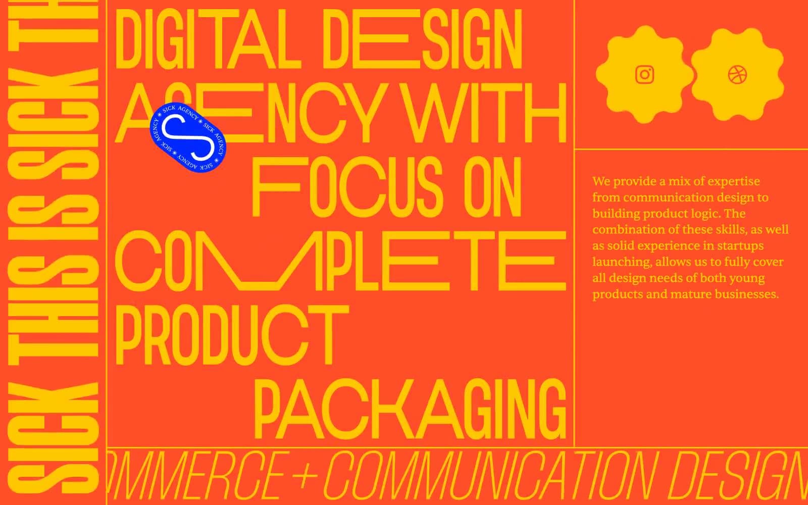
SICK AGENCY design system

Brand3
Primary section background and dominant display text color. Headings, borders, and full-bleed canvas bands. Carries the highest visual weight on the page
Secondary section background and accent border color. Outlined action borders, dividers, icon strokes, and full-bleed canvas bands that create contrast with the yellow
Primary action background and tertiary section background. The only filled button color in the system; also used for full-bleed canvas bands and decorative sticker badges
Neutrals2
Body text on light/yellow backgrounds, and the dominant border color across all surface bands. Functions as a hairline outline and text color wherever contrast is needed against yellow or white
Body text and button text on cobalt and orange surfaces. The inverse of Ink Black — the two together carry all foreground-to-background contrast in the system
semantic1
Error and warning state. Input border in invalid state. Reads as a deep brick-red against the lighter orange, preserving the system’s warm-color vocabulary
Try a pairing
Pick any two colors from the palette to check whether text stays readable on top.
Aa
Ink Black on Voltage Yellow
13.42 : 1 contrast
- Body textPasses AA 4.5
- Large textPasses AA 3
- StrictPasses AAA 7
More DESIGN.md files. Same web, different personalities.

Cuberto
Studio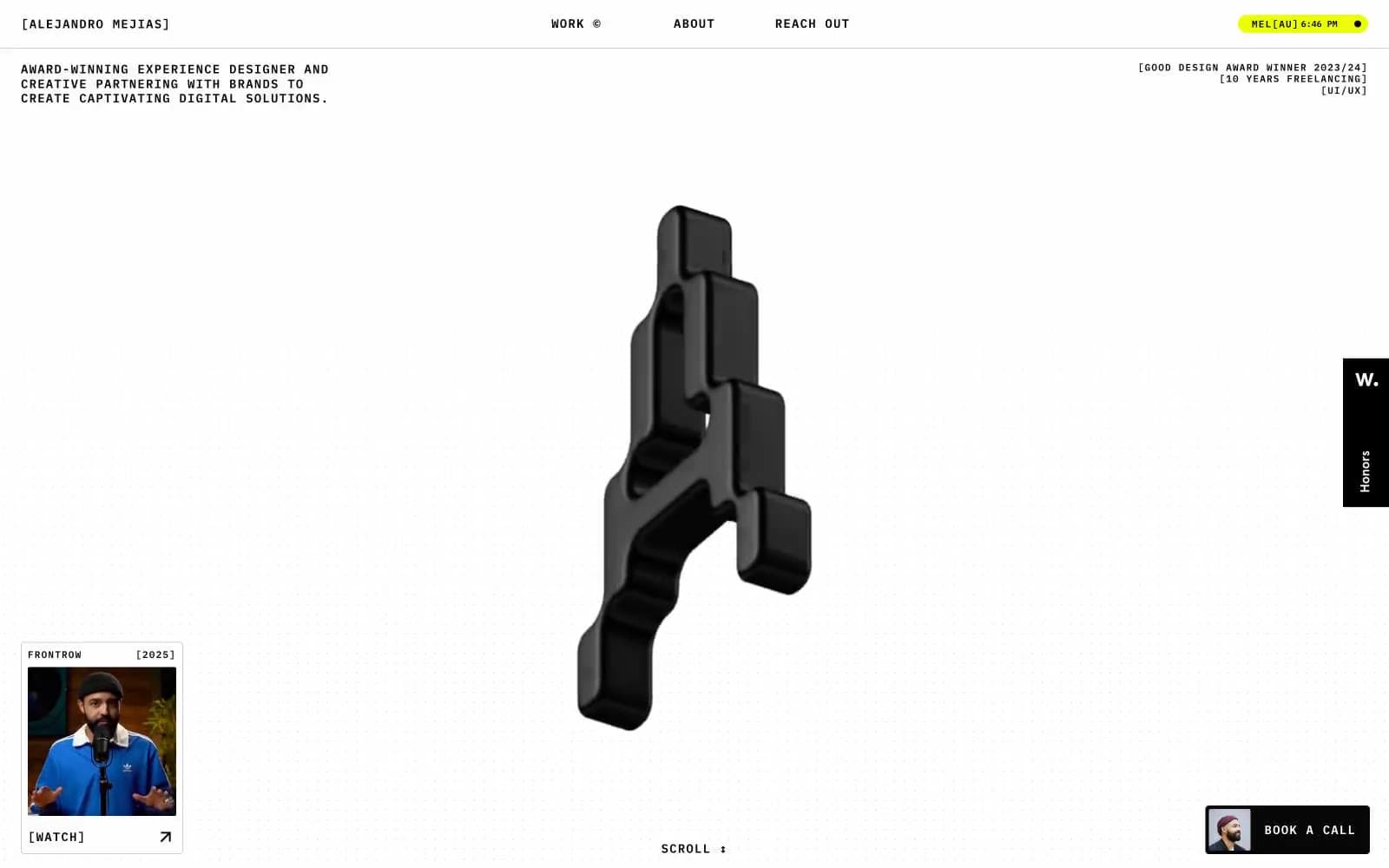
Alejandro Mejias
Studio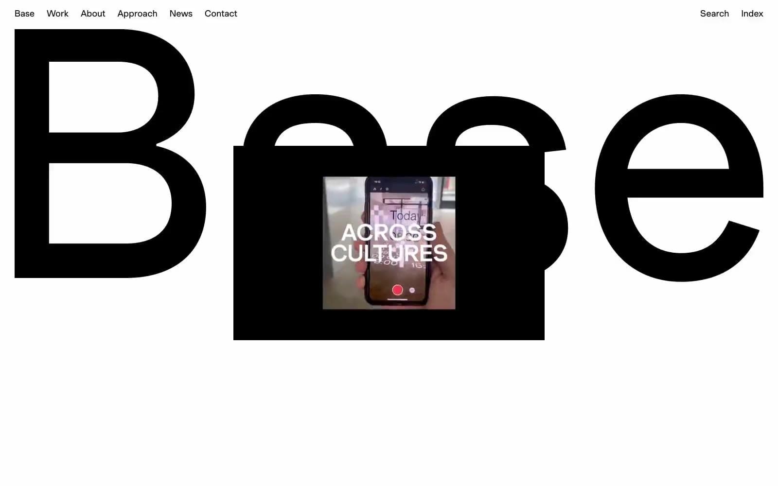
Base Design
Studio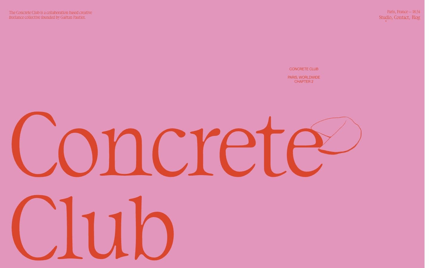
Concrete Club Studio
Studio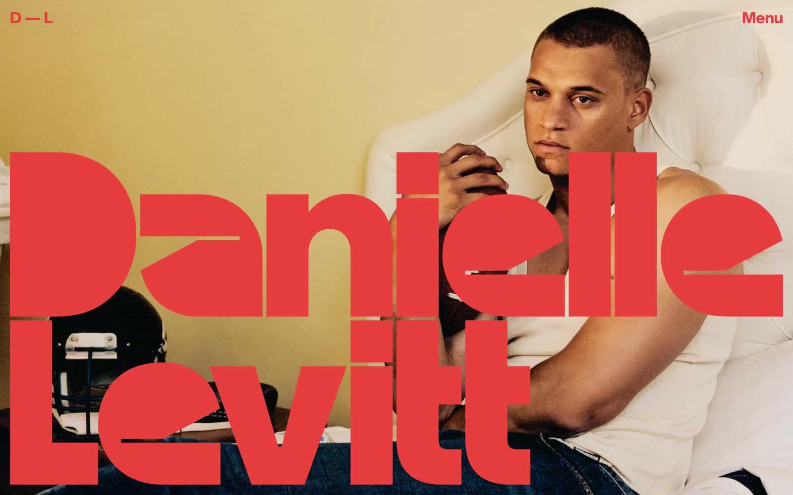
Daniellelevitt
Studio
DrawHistory
Studio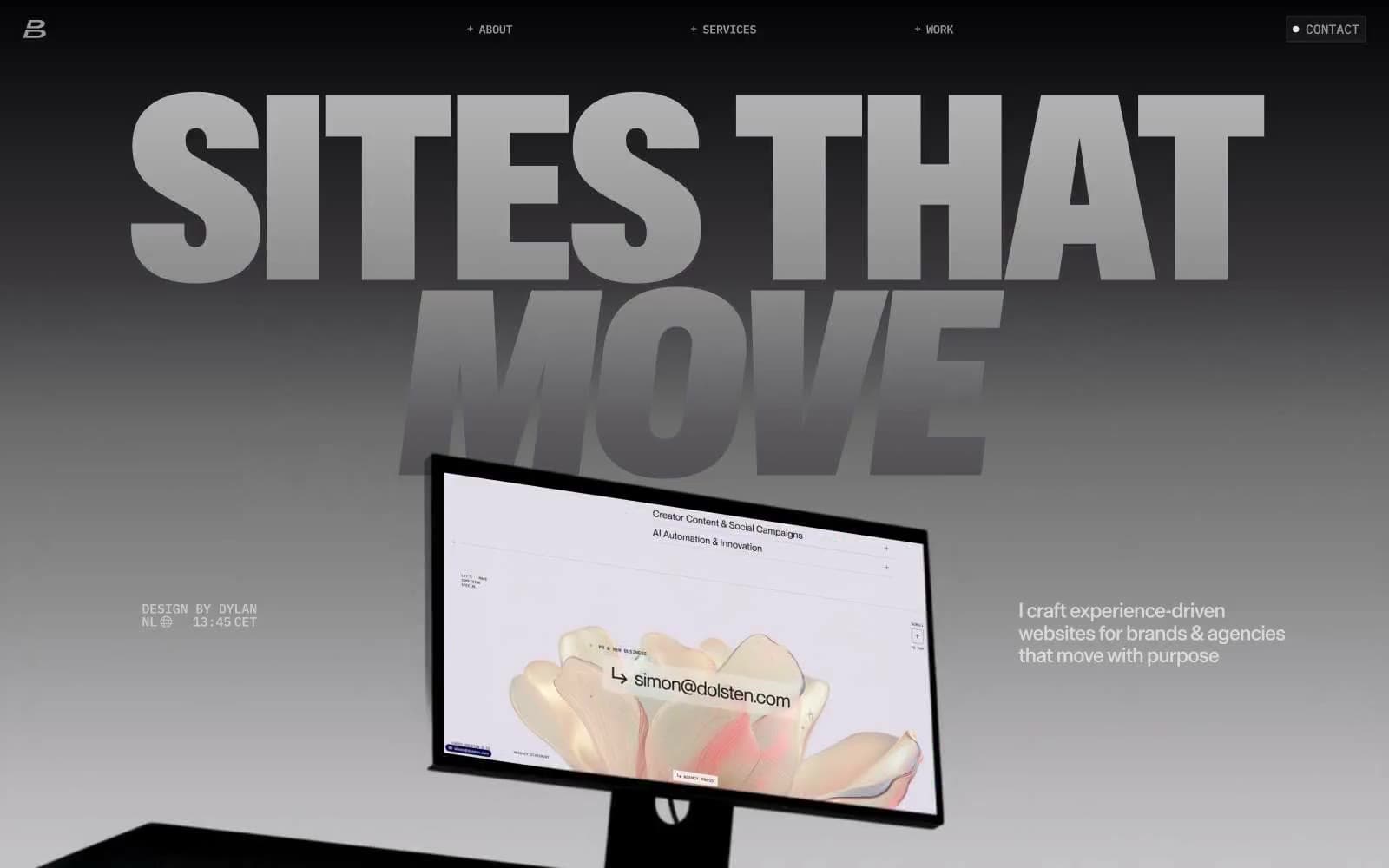
Dylanbrouwer
Studio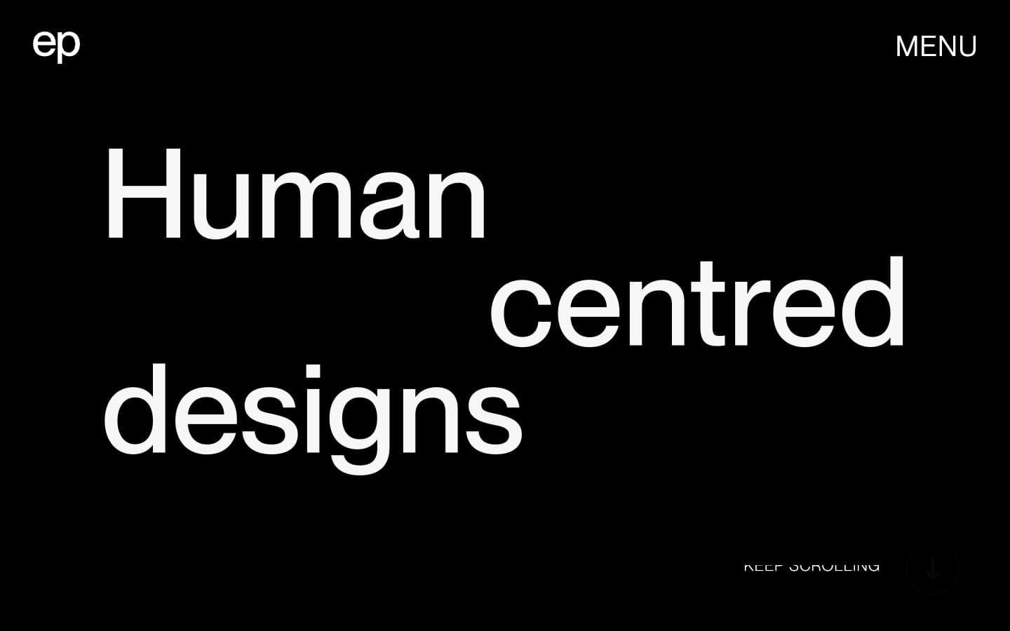
Elvina Prasad
Studio
Freytag Anderson
Studio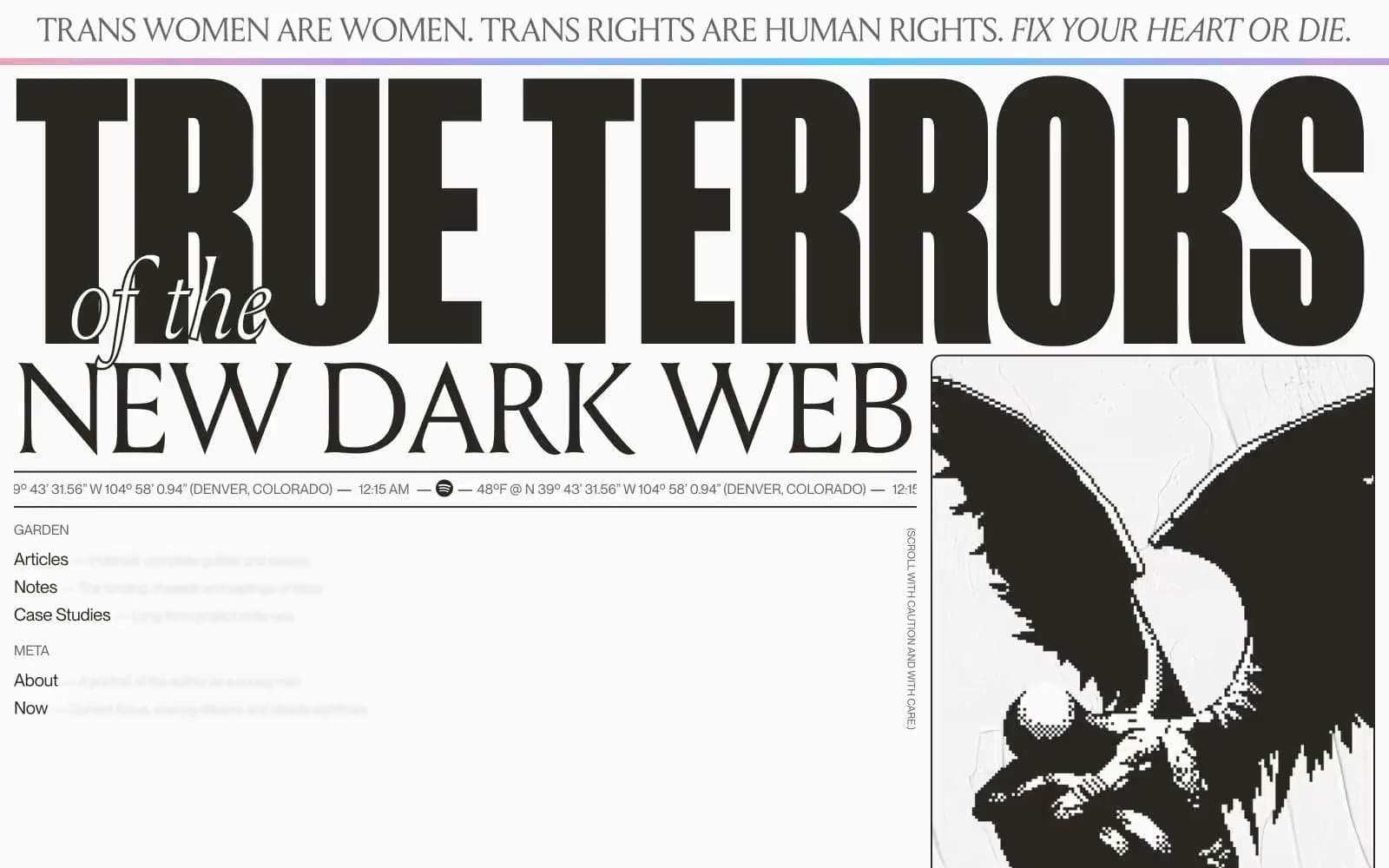
Henry
Studio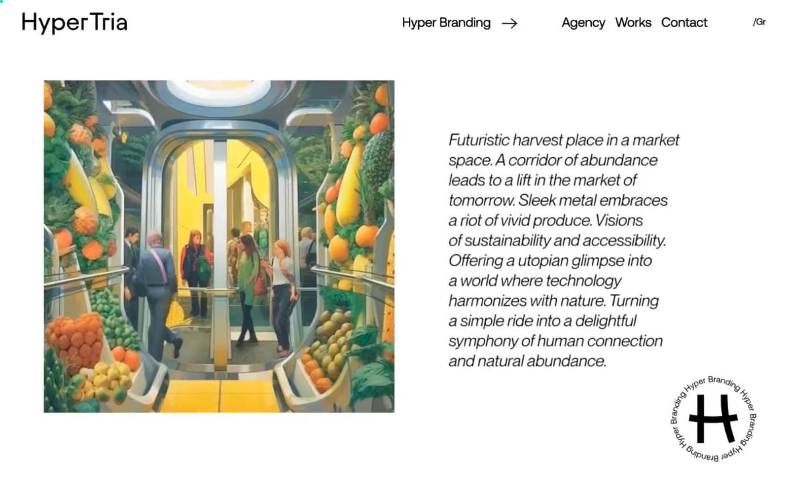
Hyper Tria
Studio
Maëlan Le Meur
Studio


