Shuttle. One blue spark on infinite paper.
- Developer tools
- Light theme
- 13 colors
- 1 typeface
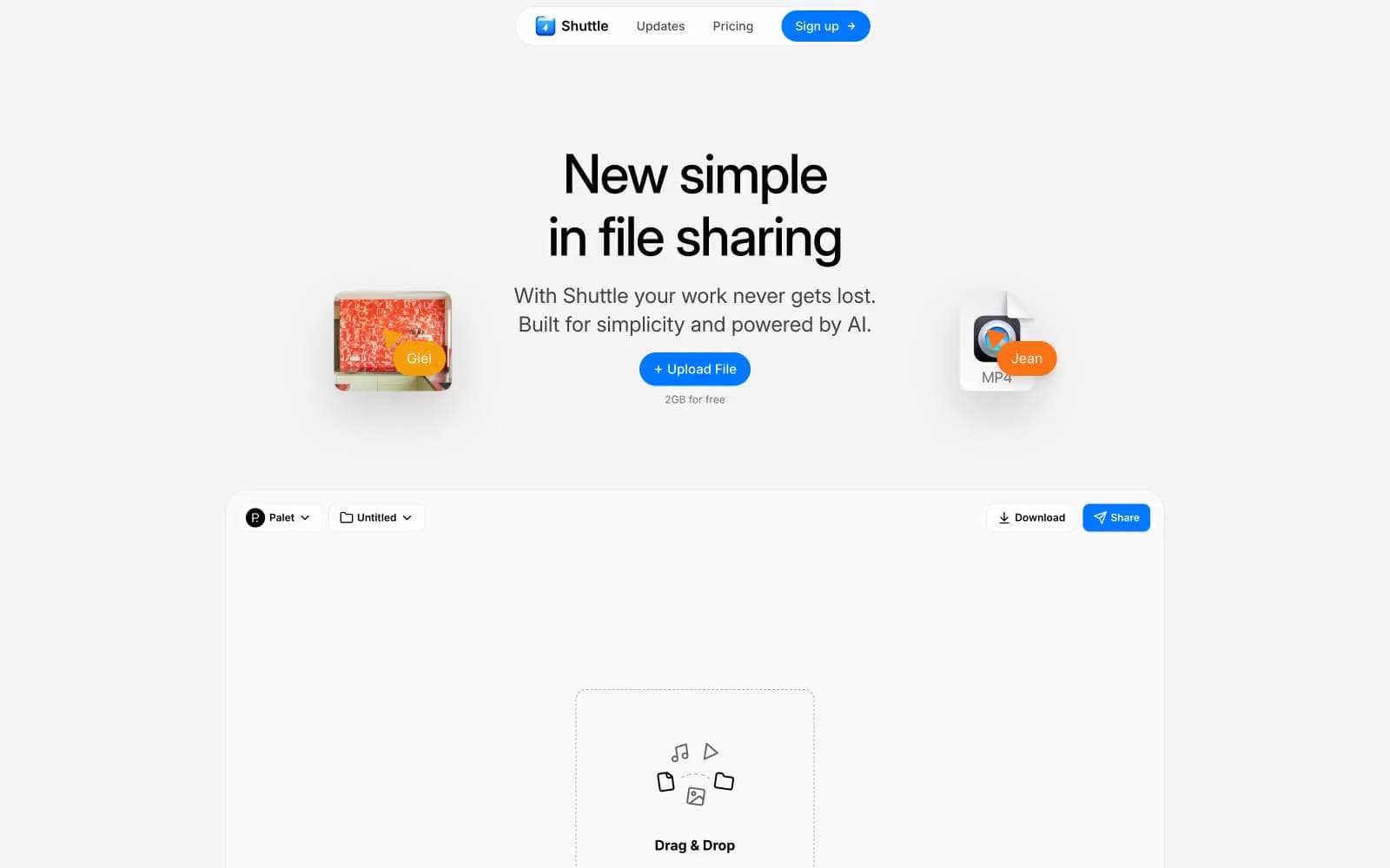
Shuttle renders as a single floating pill bar adrift in near-total white space — the entire brand hinges on that one chrome-plated capsule at the top of every page, and a single electric blue that punctuates it. The interface below is deliberately sparse, relying on a tight monochrome spine of black text, gray hairlines, and white surfaces to create a laboratory-clean canvas. Components sit flat against the page with whisper-thin 1px shadows rather than elevation stacks; cards, buttons, and inputs all share an 8px radius, while decorative images and content cards use a softer 16px. Inter Variable carries the whole voice at a tightened -0.025em tracking, ranging from a 62px display whisper down to 10px micro-labels. The result reads like a tool that has been stripped to its chassis — every pixel earns its place, and the blue is the only sound in the room.
Shuttle design system
Brand1
Primary CTA fill, active nav state, single accent across the entire interface — the only saturated color permitted on chrome, everything else recedes to monochrome
Accent4
Decorative illustration accent, warm icon fill — permitted only in graphics, never on chrome
Decorative illustration accent, warm icon fill — pairs with Ember in artwork
Red text accent for links, tags, and emphasized short phrases
Secondary blue used only in illustrations and icon sets — not an interface color
Neutrals8
Primary text, icon strokes, hairline borders, logo mark — the dominant typographic and structural color
Secondary body text, muted link color, list items — readable but clearly secondary to Ink
Tertiary text, icon strokes at rest, placeholder content, button secondary labels
Decorative SVG strokes, disabled icon state, subtle ornamental linework
Quiet border accent, nearly invisible dividers in dense layouts
Shadow tint, secondary border accent, button box-shadow base — the only non-black/white value used in elevation
Borders, dividers, card edges, input outlines, image frames — the structural skeleton running through the entire system
Page canvas, card surfaces, button text on Signal Blue, pill navigation fill — the default surface at every level
Try a pairing
Pick any two colors from the palette to check whether text stays readable on top.
Aa
Ink on Signal Blue
5.08 : 1 contrast
- Body textPasses AA 4.5
- Large textPasses AA 3
- StrictFails AAA 7
More DESIGN.md files. Same web, different personalities.

Tailwind CSS
Developer tools
Atoms
Developer tools
Browserbase
Developer tools
Cursor
Developer tools
Deno
Developer tools
Drizzle ORM
Developer tools
Earlydog
Developer tools
Expo
Developer tools
Fingerprint
Developer tools
Flatfile
Developer tools
Flox
Developer tools
Fly.io
Developer tools


