
Sequel. A single warm lamp in an otherwise unlit cinema.
- Brand
- Dark theme
- 6 colors
- 2 typefaces
Sequel is a private screening after dark — a pitch-black canvas hosting cinematic, warm-toned portraiture and a single warm off-white accent that acts like lamplight in an otherwise unlit room. The system is strictly achromatic (0% colorfulness): pure black, warm cream, and three neutral grays carry the entire visual language, and the absence of chromatic color is itself the brand position — money this old doesn't need to shout. Typography is editorial and restrained, pairing a custom geometric sans (VisueltPro) with a display serif (Bradford) reserved for the aspirational word "legacy" set in italic. Weight 300 headlines whisper instead of declare; uppercase tracked labels (0.05–0.08em) do the typographic work most sites assign to color. Components are glassy and precise — pill controls, frosted chips with an inner top highlight, flat #202020 cards that sit one step above the void — and the only shadows in the system are functional: a soft drop under the cream button and a rim-lit glass effect on badges.
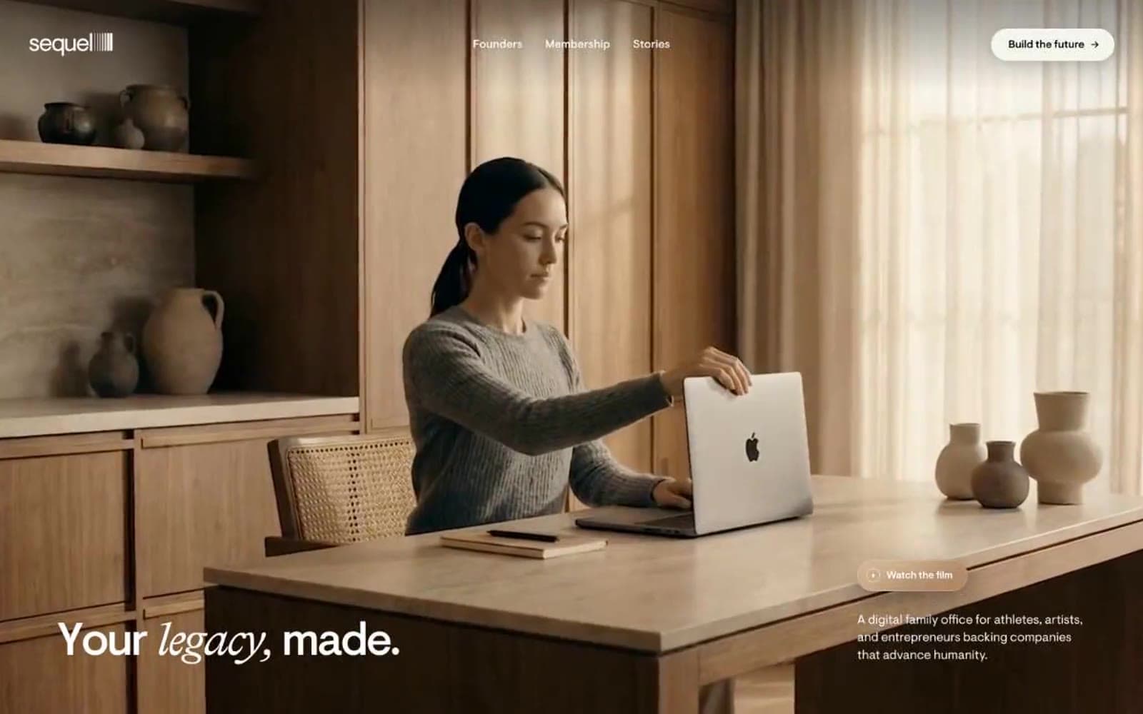
Sequel design system

Brand1
Primary filled action button background — the only chromatic-temperature accent; warm off-white reads as lamplight against pure black and keeps CTAs from feeling sterile
Neutrals5
Page canvas, nav background, icon fill — the default state of the page; everything is built ON the void, not against it
Elevated card surface, secondary panels — the single quiet step above the canvas that implies elevation without shadow
Hairline borders, badge outlines, subtle dividers — sits between surface and text, never decorative
Light text on dark surfaces, inverse labels, and high-contrast captions. Do not promote it to the primary CTA color
Primary text, heading fill, ghost button stroke, icon stroke — the reading and structural color
Try a pairing
Pick any two colors from the palette to check whether text stays readable on top.
Aa
Void Black on Lamp Cream
19.20 : 1 contrast
- Body textPasses AA 4.5
- Large textPasses AA 3
- StrictPasses AAA 7
More DESIGN.md files. Same web, different personalities.

21 TSI
Brand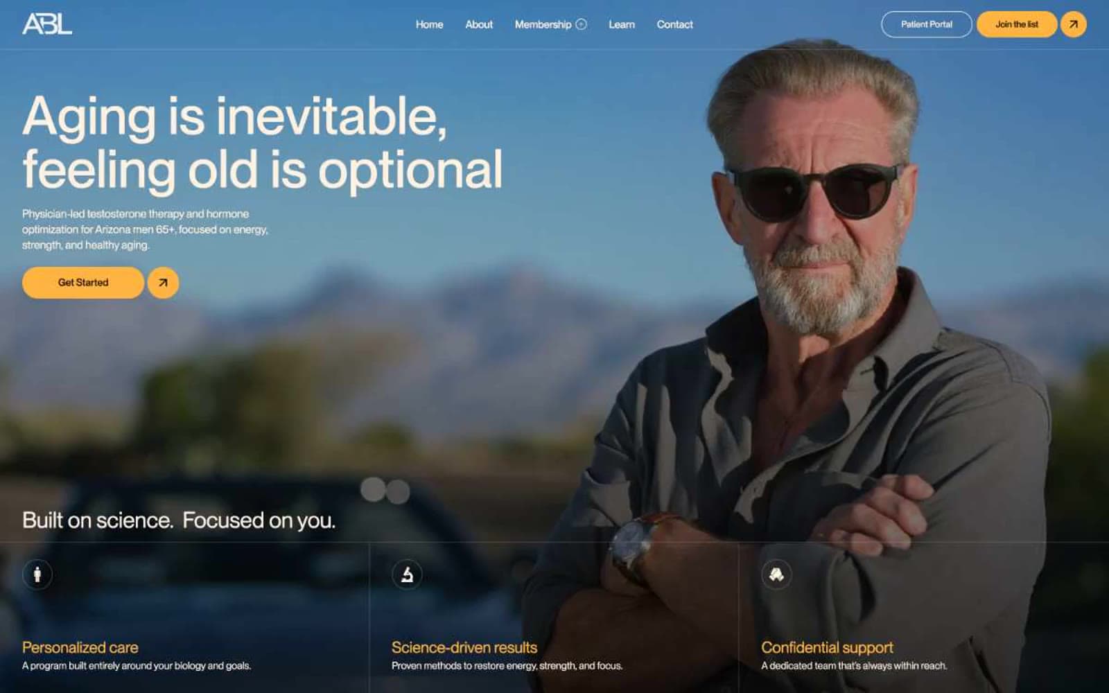
Abetterlou
Brand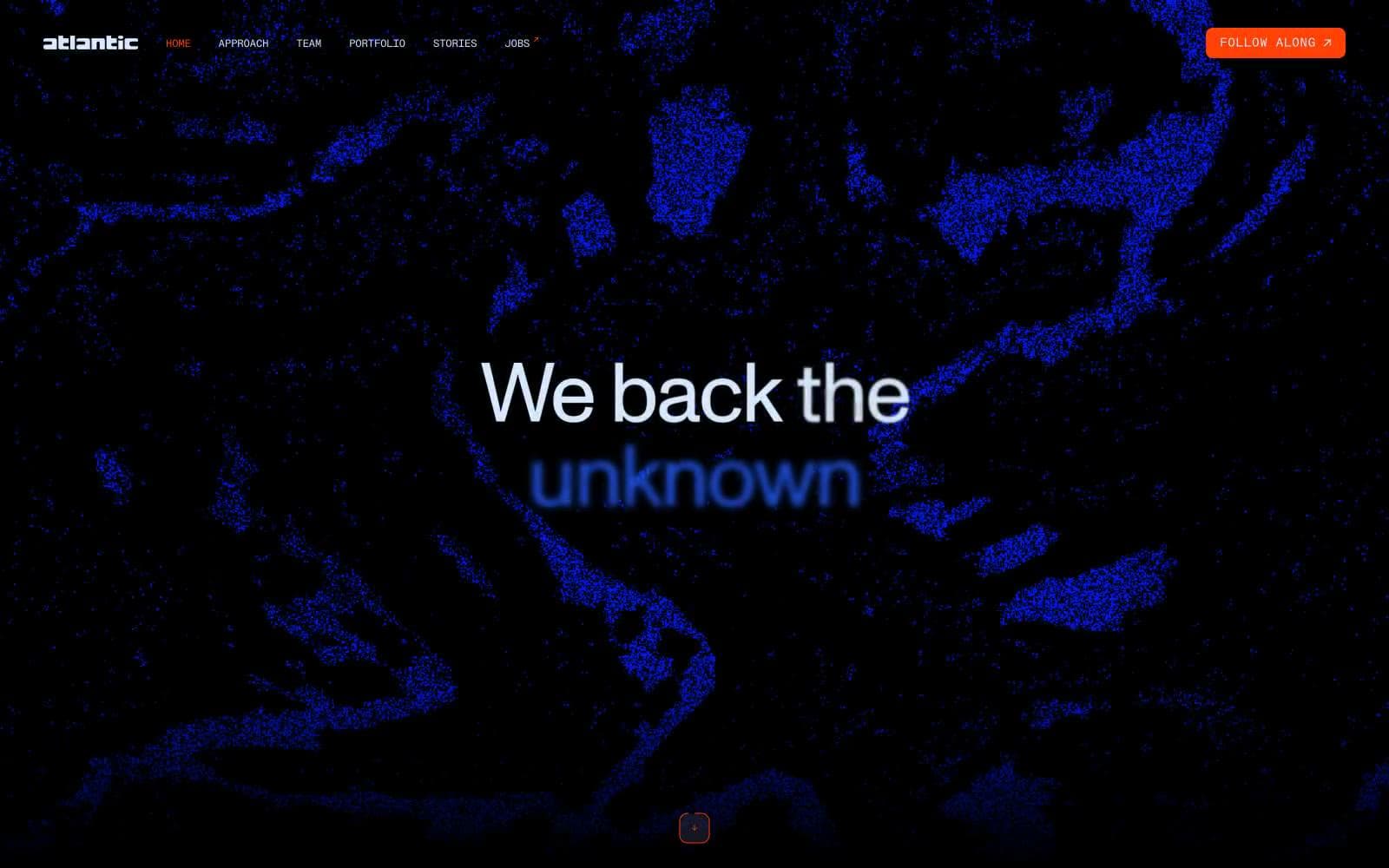
Atlantic.vc
Brand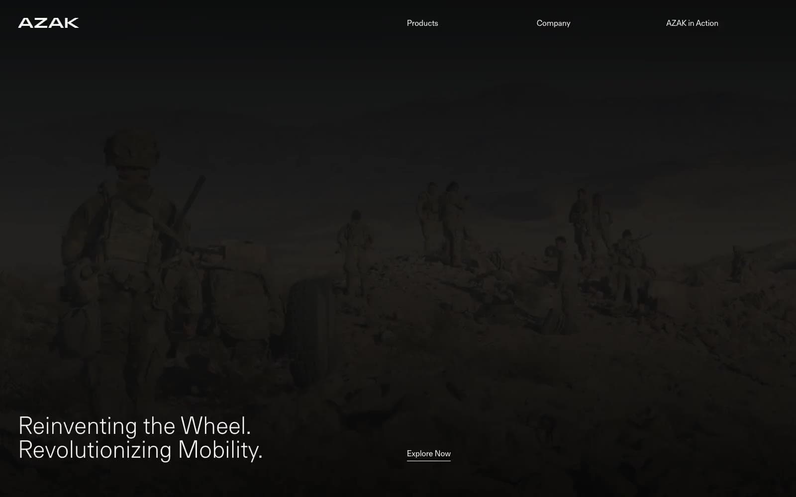
AZAK
Brand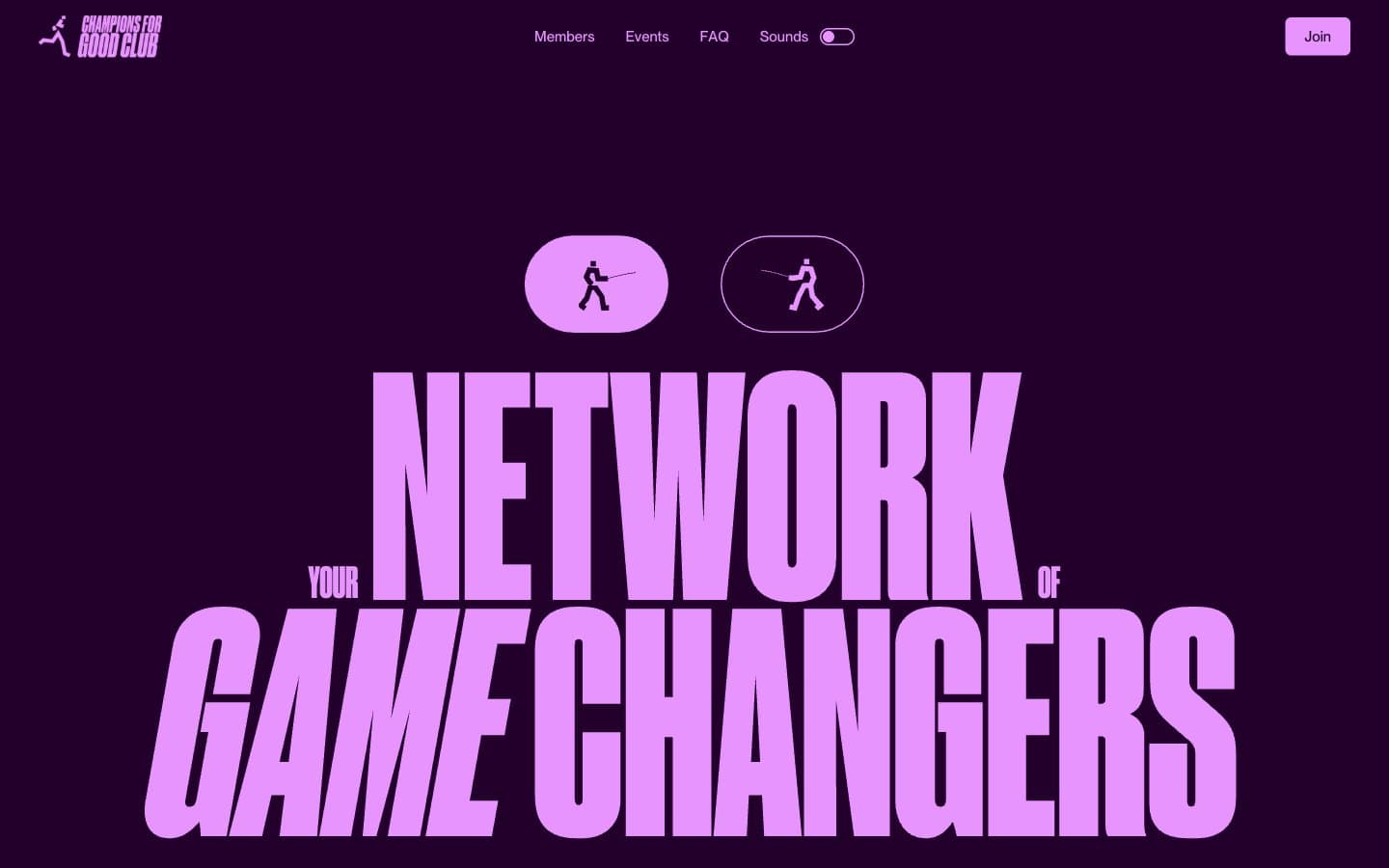
Champions4good
Brand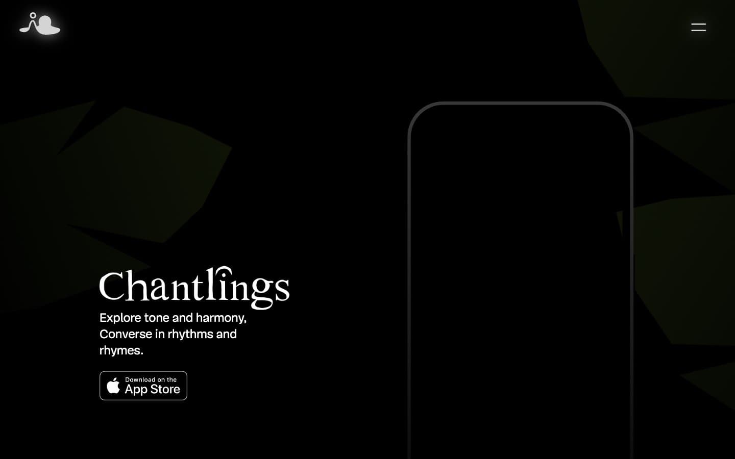
Chantlings
Brand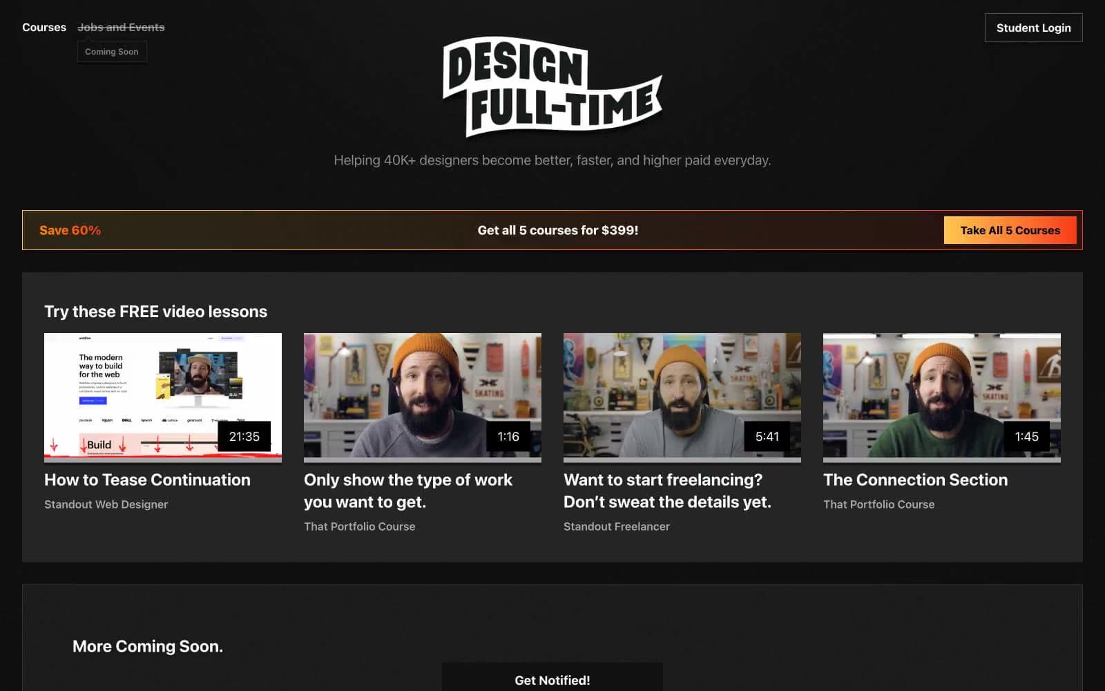
Design Full-Time
Brand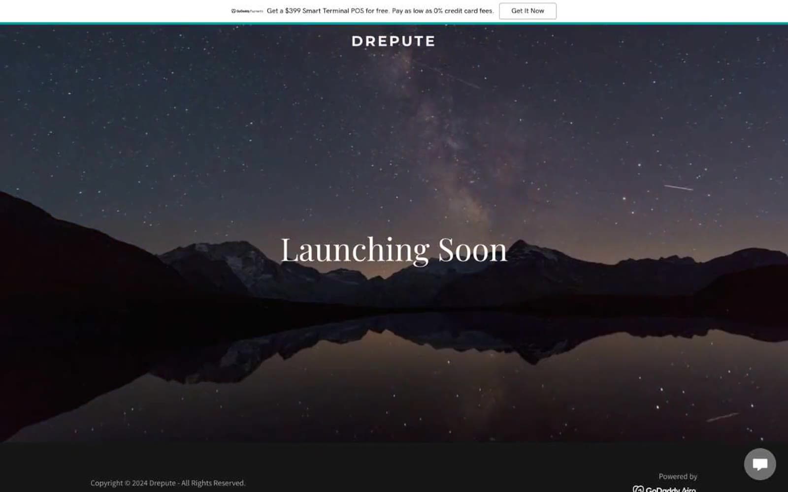
Drepute
Brand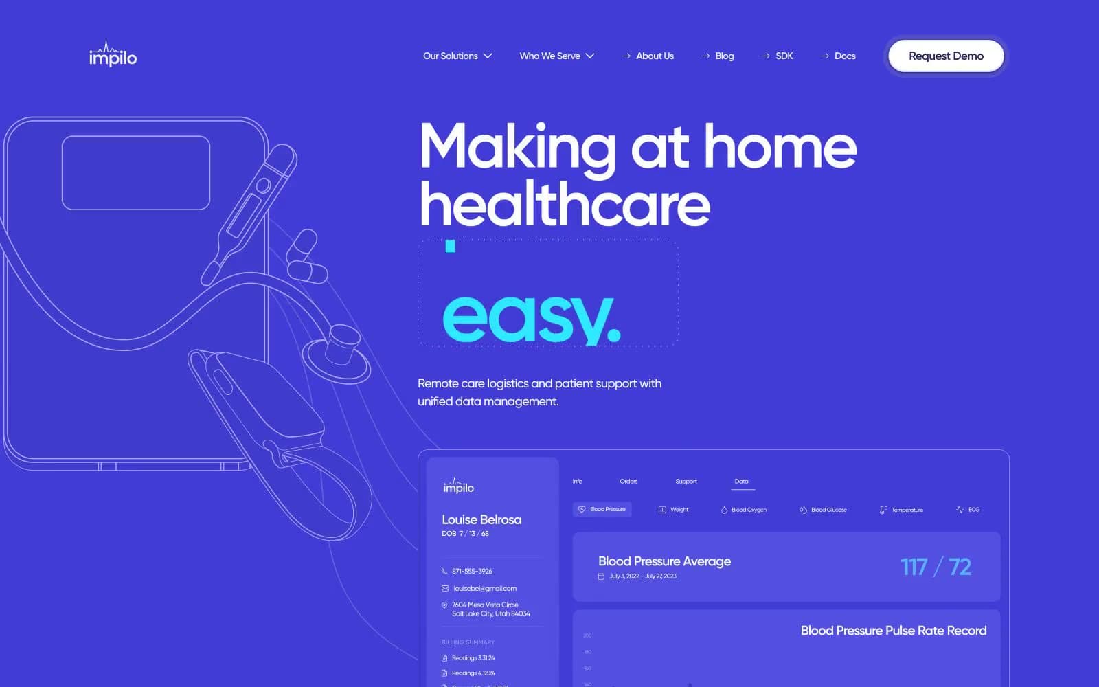
Impilo
Brand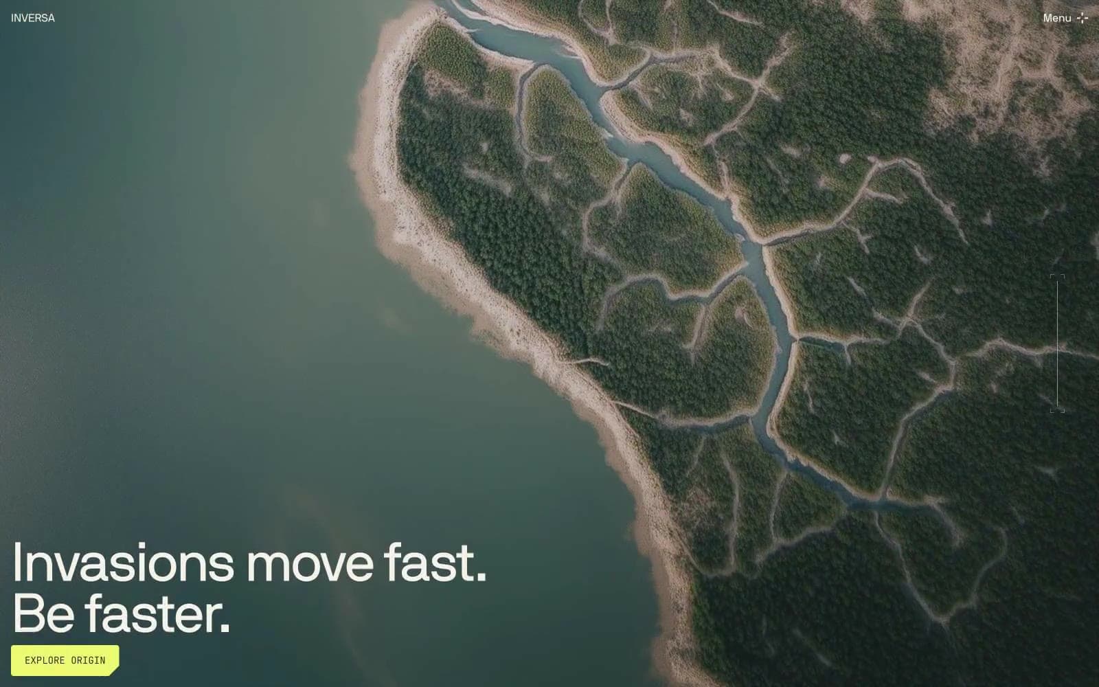
INVERSA
Brand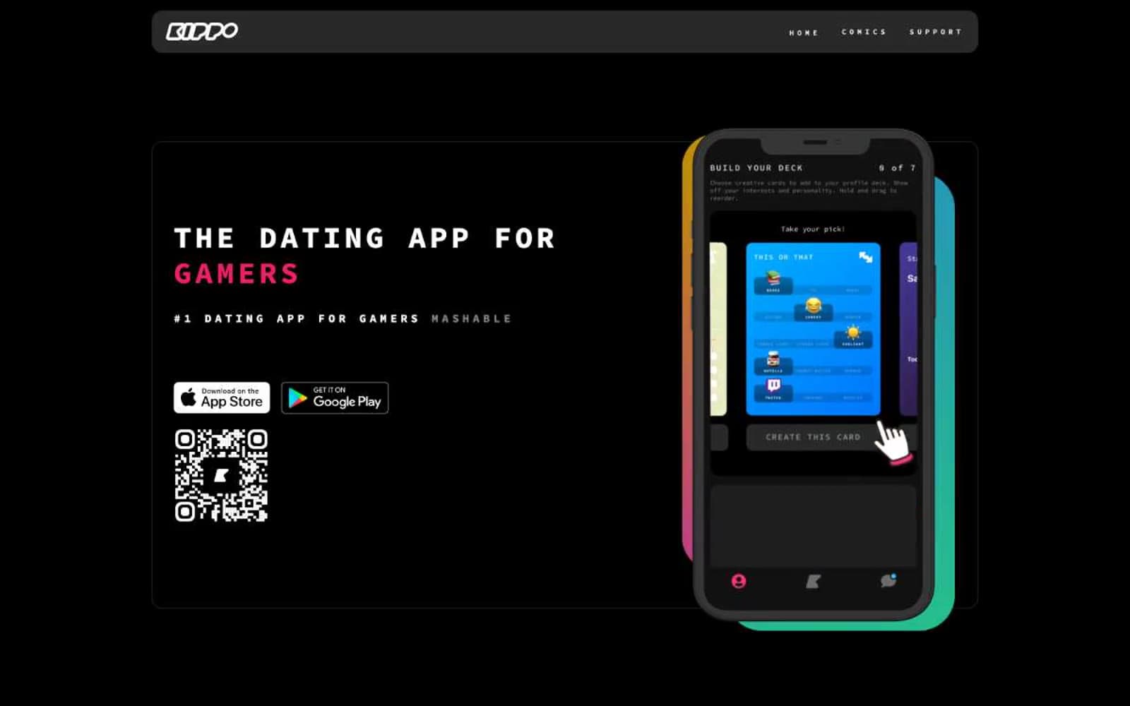
Kippo
Brand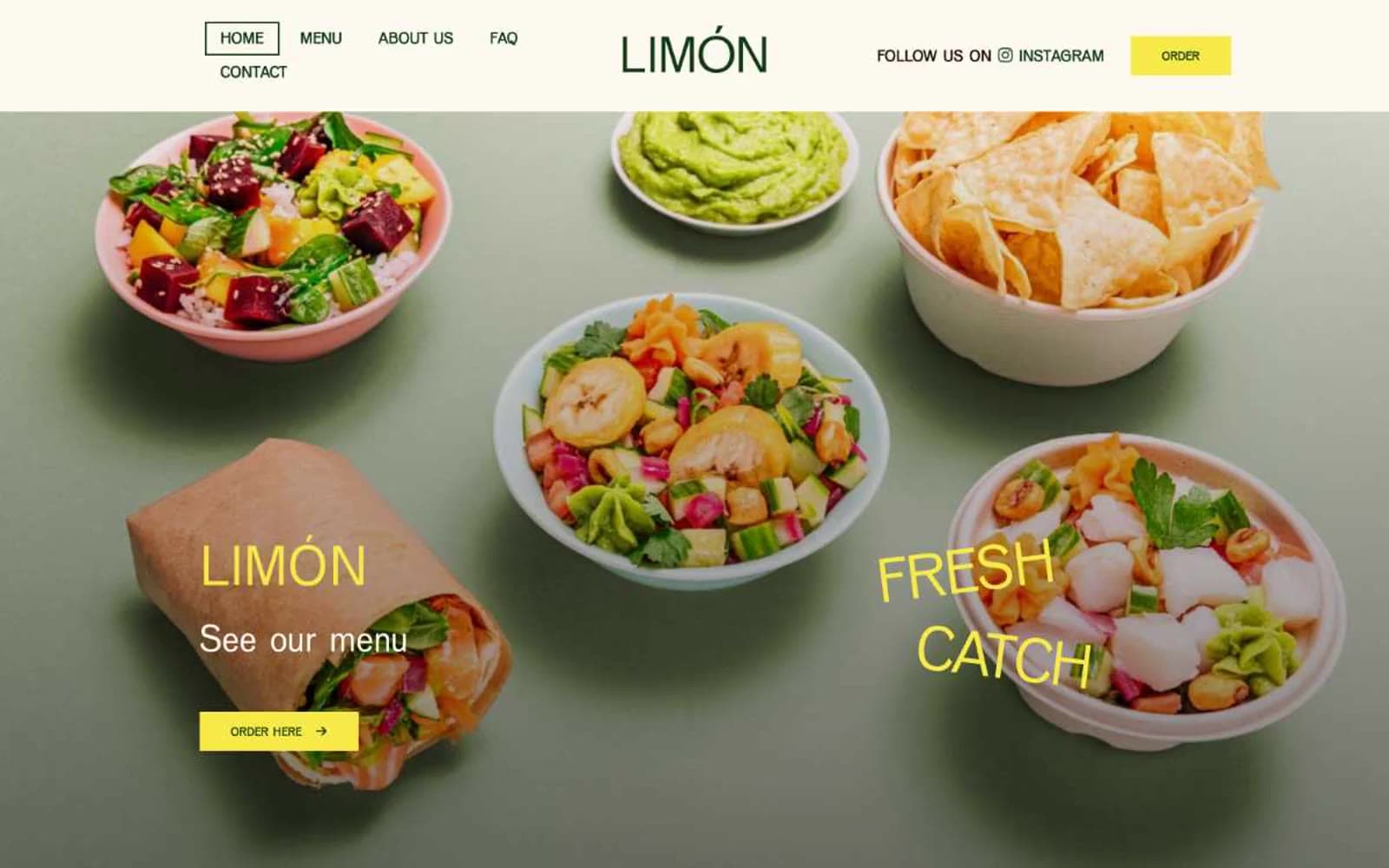
Limón
Brand


