
Sandclock. Green signal lights on a matte black console.
- Crypto
- Dark theme
- 6 colors
- 3 typefaces
Sandclock is a DeFi yield terminal dressed in matte black: near-zero chrome, one vivid mint-green signal color, and typography that does all the work. The interface reads like a Bloomberg terminal reimagined for DeFi — dark canvas (#0a0a0a), hairline graphite borders (#222222), flat surfaces with no decorative elevation, and Inter for utility text paired with a custom Aeonik display face for the rare 72px headline. Green (#3fe280) appears as functional punctuation only: active nav underline, primary CTAs, and accent borders on live stat cards. Every other surface stays achromatic so the green reads as a live signal, not decoration. Components feel like a trading dashboard — compact, information-dense in numbers, but breathing with generous section gaps. No gradients, no drop shadows beyond a single subtle button lift, no colorful illustration chrome. Trust is communicated through restraint: the design says 'your money is here' by staying quiet.
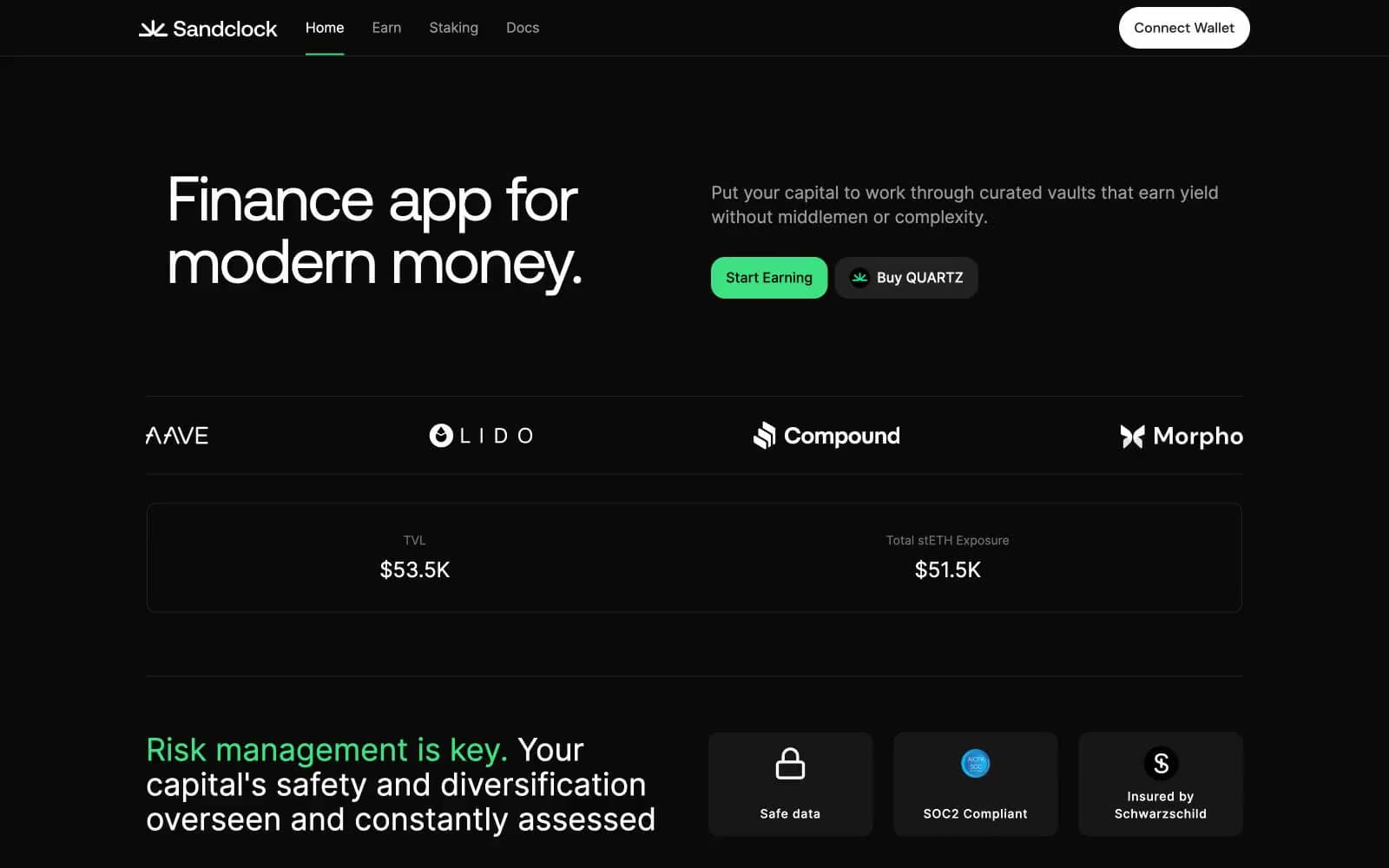
Sandclock design system

Brand1
Sole chromatic accent — active nav underline, primary CTA fills (Start Earning), and the highlight border on the TVL stat card. Appears sparingly so each instance reads as a live, money-moving action rather than decoration
Neutrals5
Page canvas and primary background — the entire site lives on this near-black surface so the mint accent reads as a live signal against pure darkness
Elevated card and panel surface — used for stat cards, security badges, and announcement containers that need to lift off the canvas without introducing color
Hairline borders, dividers, and the highest-frequency structural color in the system. Carries 356 borderColor uses — it is the wireframe that defines every container
Muted secondary text, helper labels, and de-emphasized nav items. The only non-white text color — reserves #ffffff for content that must be read first
Primary text, icons, and the Connect Wallet button fill. Maximum contrast against Abyss (19.8:1) ensures legibility on the darkest possible surface
Try a pairing
Pick any two colors from the palette to check whether text stays readable on top.
Aa
Abyss on Signal Mint
11.69 : 1 contrast
- Body textPasses AA 4.5
- Large textPasses AA 3
- StrictPasses AAA 7
More DESIGN.md files. Same web, different personalities.
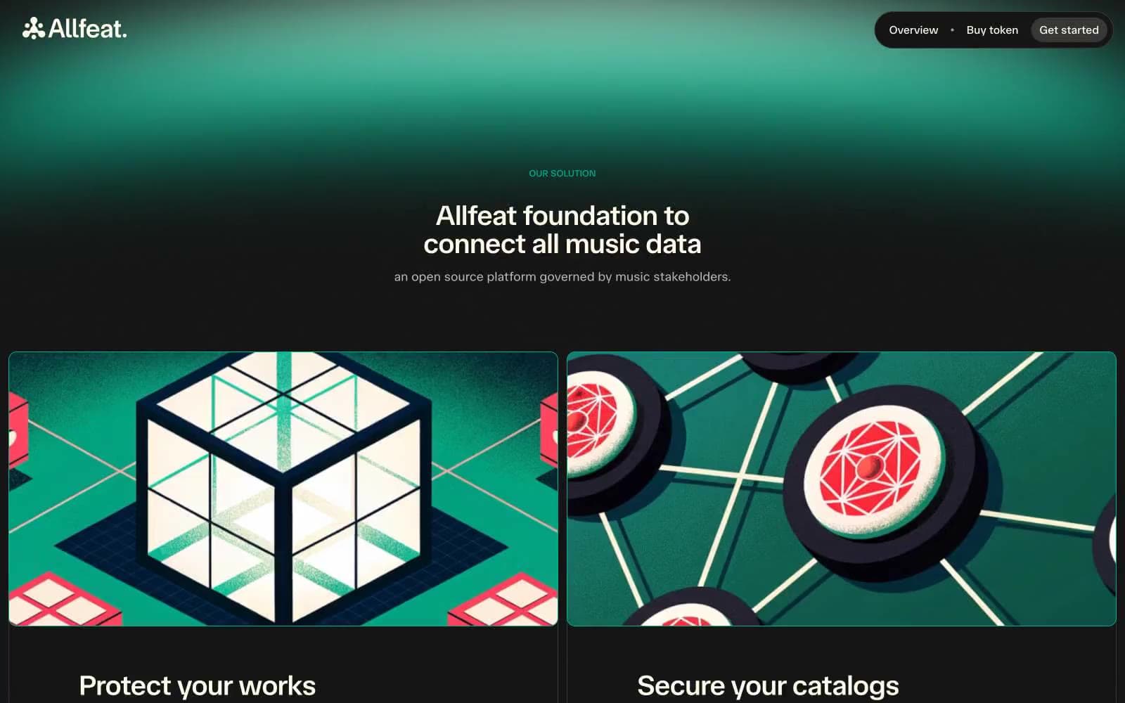
Allfeat
Crypto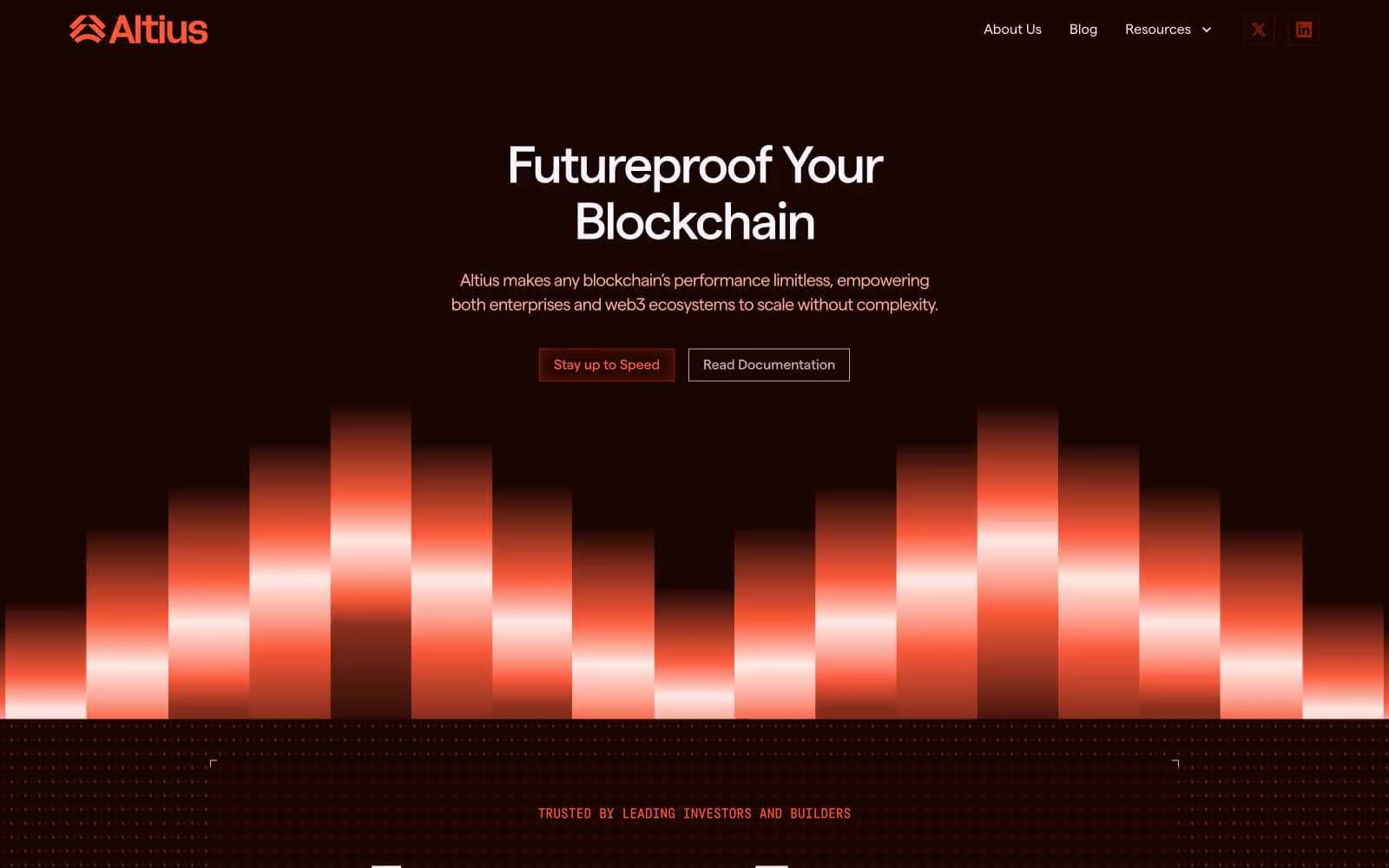
Altius
Crypto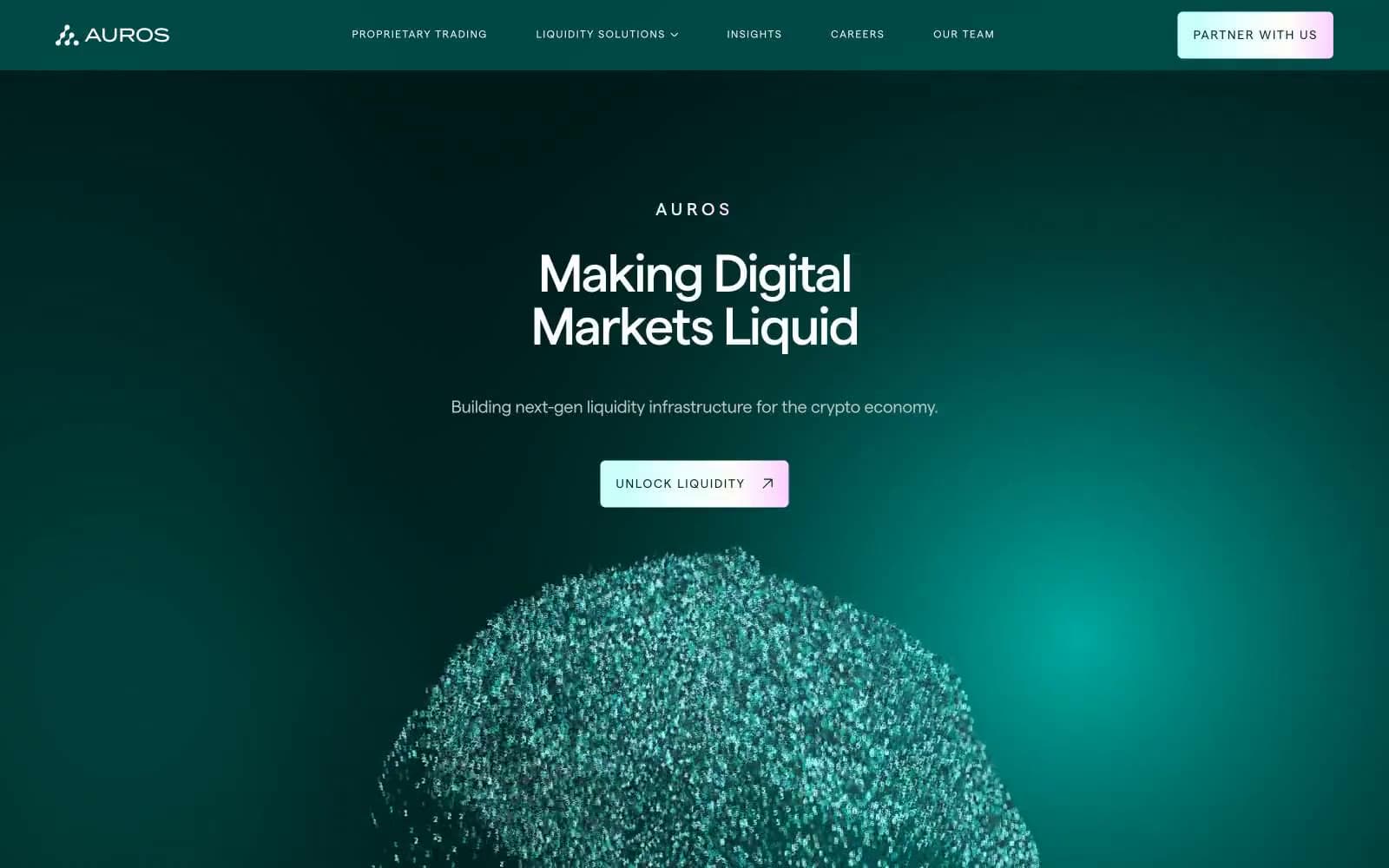
Auros
Crypto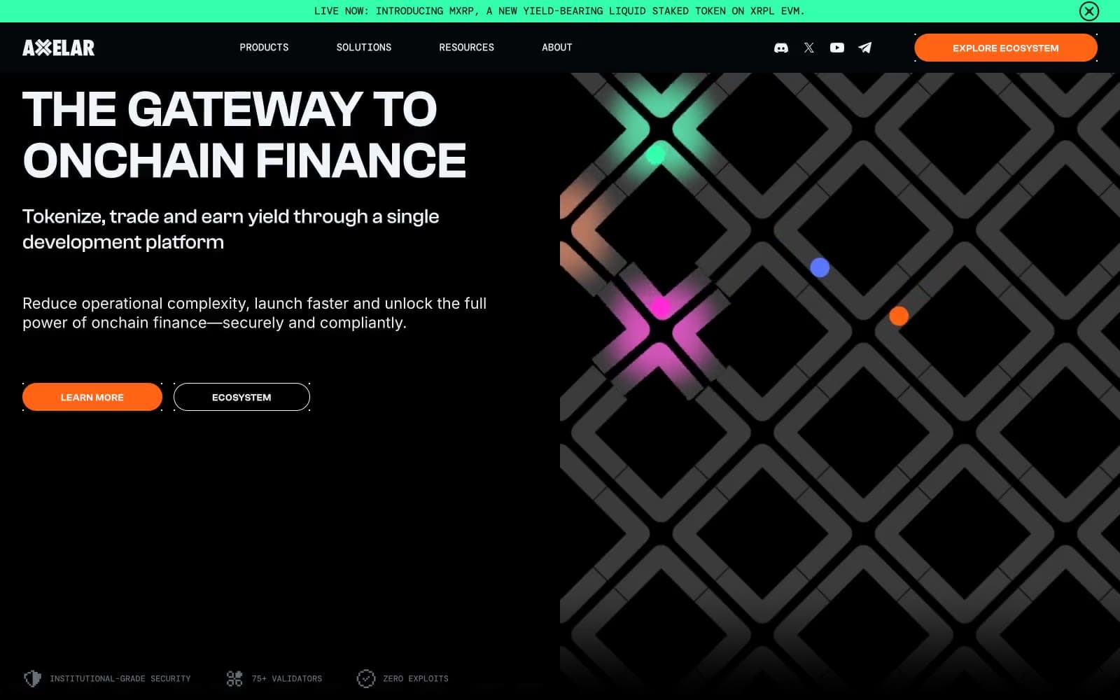
Axelar
Crypto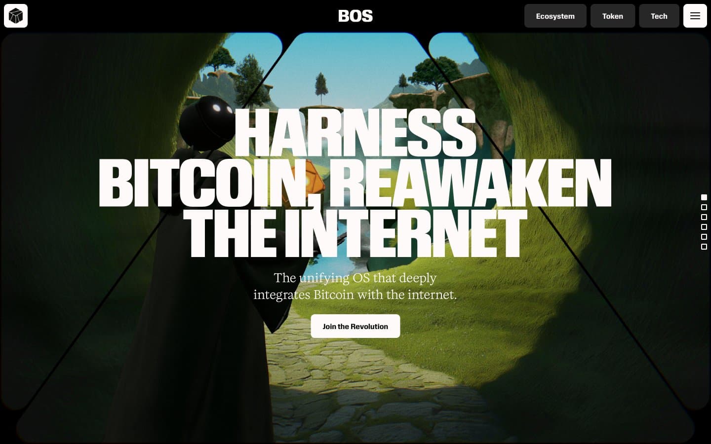
BitcoinOS
Crypto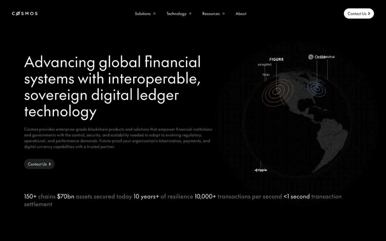
Cosmos Network
Crypto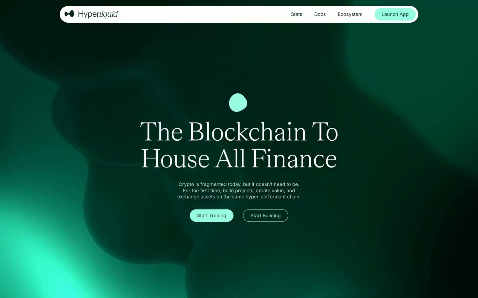
Hyper Foundation
Crypto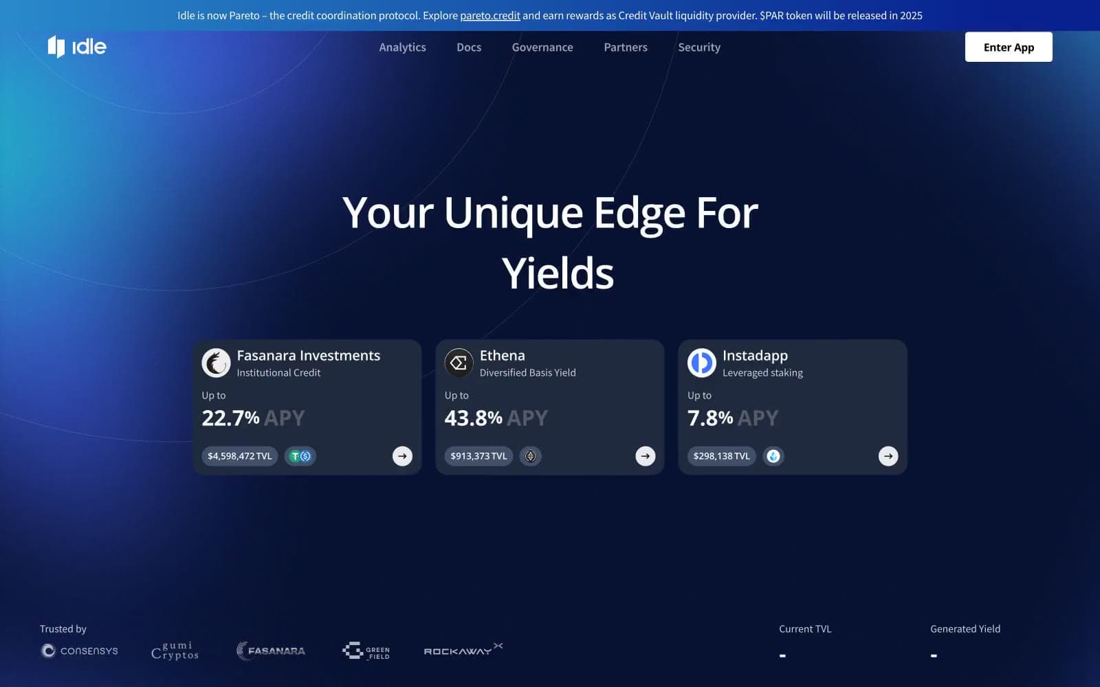
Idle Finance
Crypto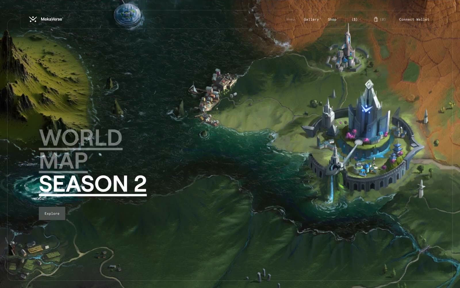
MekaVerse
Crypto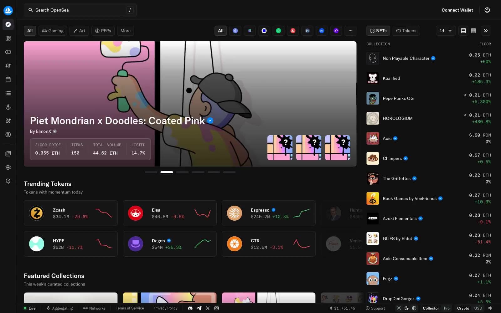
OpenSea
Crypto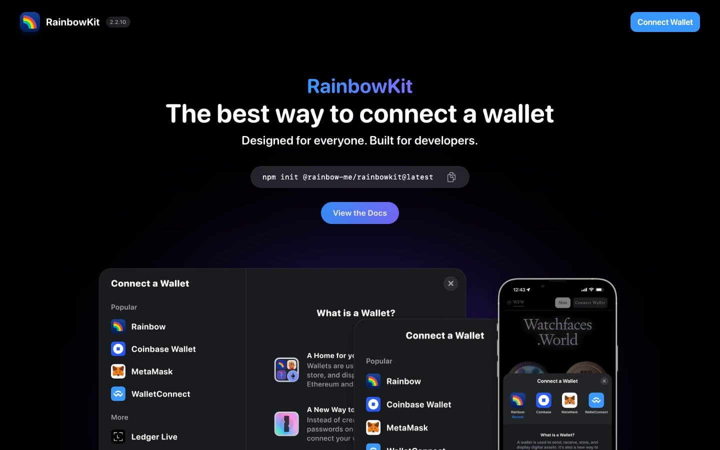
RainbowKit
Crypto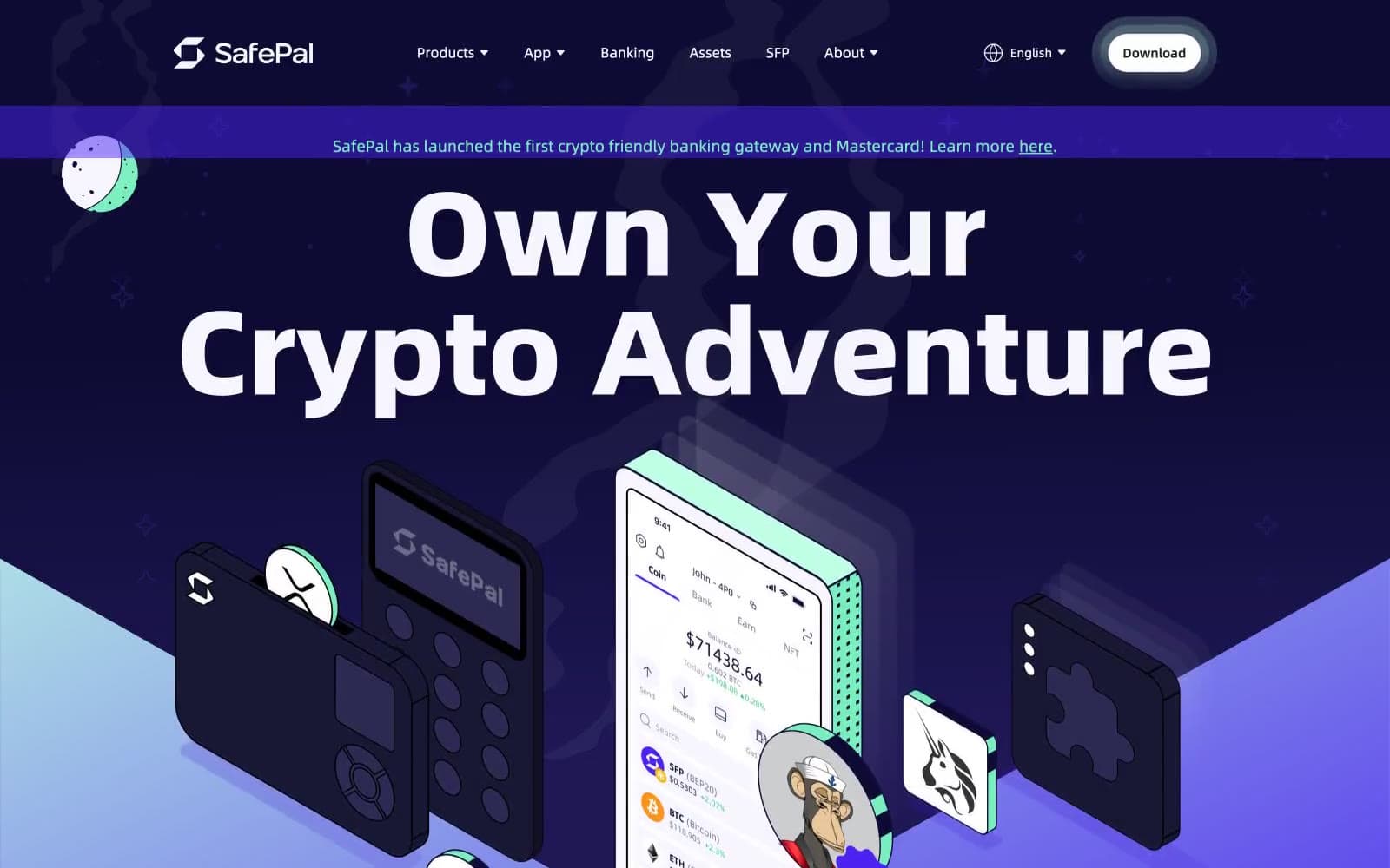
Safepal
Crypto


