
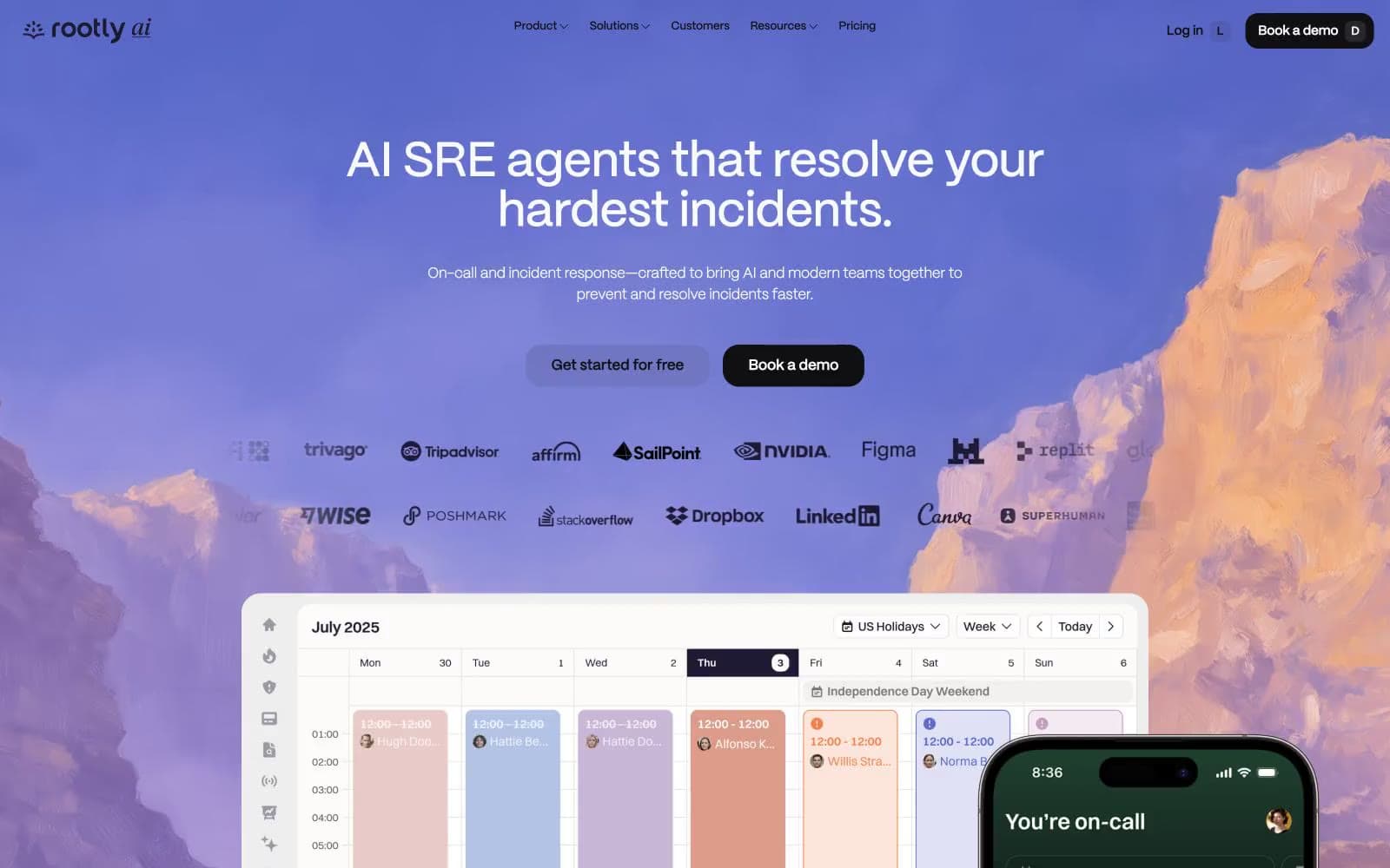
Rootly. Thin whisper-type on near-white, with one vivid violet accent rising into a luminous gradient sky.
- Developer tools
- Light theme
- 12 colors
- 1 typeface
Rootly is a near-monochrome system with a single violet pulse running through it. The canvas is a barely-tinted off-white (#fbfaff) sitting under crisp white cards, with the near-black #100f12 doing almost all of the structural heavy-lifting — borders, text, filled CTAs. Violet (#8d6fde) and its lavender washes (#ebe5ff, #d9cffa) appear as small functional accents, never as decorative floods. Typography is the most opinionated choice: the custom Ppmori at weight 200 renders headlines as whisper-thin glyphs that feel almost handwritten, while body and UI lock to weight 500. Every interactive element is a full pill (1440px radius) — buttons, inputs, nav links, tags — sitting next to gently rounded cards (~17px). The hero is the one place the system breaks its own restraint: a dramatic violet-to-rose gradient over mountain photography that reads like dawn breaking above a cloud line. Everything else stays calm, high-contrast, and quiet.
Rootly design system

Brand4
Brand accent — outlined actions, decorative borders, highlight strokes, iconography. Vivid enough to claim attention but used in thin strokes, not large fills, so it punctuates rather than floods
Violet accent for outlined action borders, linked labels, and lightweight interactive emphasis.
Gradient stop — hero sky anchor. The saturated violet that opens the morning gradient
Gradient stop — hero sky terminus. Warm rose that softens the violet into dawn warmth
Accent2
Soft highlight surfaces, tag fills, muted card backgrounds. The brand's pastel floor — used when a surface needs warmth without saturation
Input borders, tag outlines, decorative hairlines. A mid-violet that reads as a line, not a fill — the border counterpart to the brand accent
Neutrals6
Primary text, dominant borders, filled CTA buttons, badge borders. Near-black with a barely-perceptible violet undertone that makes it warmer than pure black against the lavender-tinted canvas
Mid-weight borders and dividers, secondary text emphasis. Sits between Ink and the body grays for hierarchy layers
Body text, helper copy, subdued labels. Neutral mid-gray that keeps copy readable without competing with headings
Lighter borders, muted text, form-field outlines. Carries the cool-violet cast that ties the gray scale to the brand washes
Page canvas and outer backgrounds. A whisper of violet lifts it above pure white so it harmonizes with the brand washes
Card surfaces, elevated panels, secondary button fills. Pure white stacked on Snow creates depth without shadows
Try a pairing
Pick any two colors from the palette to check whether text stays readable on top.
Aa
Ink on Iris
4.97 : 1 contrast
- Body textPasses AA 4.5
- Large textPasses AA 3
- StrictFails AAA 7
More DESIGN.md files. Same web, different personalities.

Tailwind CSS
Developer tools
Atoms
Developer tools
Browserbase
Developer tools
Cursor
Developer tools
Deno
Developer tools
Drizzle ORM
Developer tools
Earlydog
Developer tools
Expo
Developer tools
Fingerprint
Developer tools
Flatfile
Developer tools
Flox
Developer tools
Fly.io
Developer tools


