
Riptype Foundry. The type is the only bright thing in the room.
- Brand
- Dark theme
- 6 colors
- 1 typeface
Riptype is a specimen-book for a type foundry: a dark matte canvas the type sits on like ink on black paper. Monochrome structure is absolute — the only chromatic element is a single acid yellow-green (#d9ff00) that functions as a signal flare, marking interactive moments and decorative accents without ever becoming decorative. Typography is the product, so the layout is dense and editorial, with characters rendered at spec-sheet size and minimal chrome between them. Components are flat, border-driven, and near-invisible — the system gets out of the way so the typeforms can speak. The mood is workshop-dark: process-oriented, print-referenced, confident in restraint.
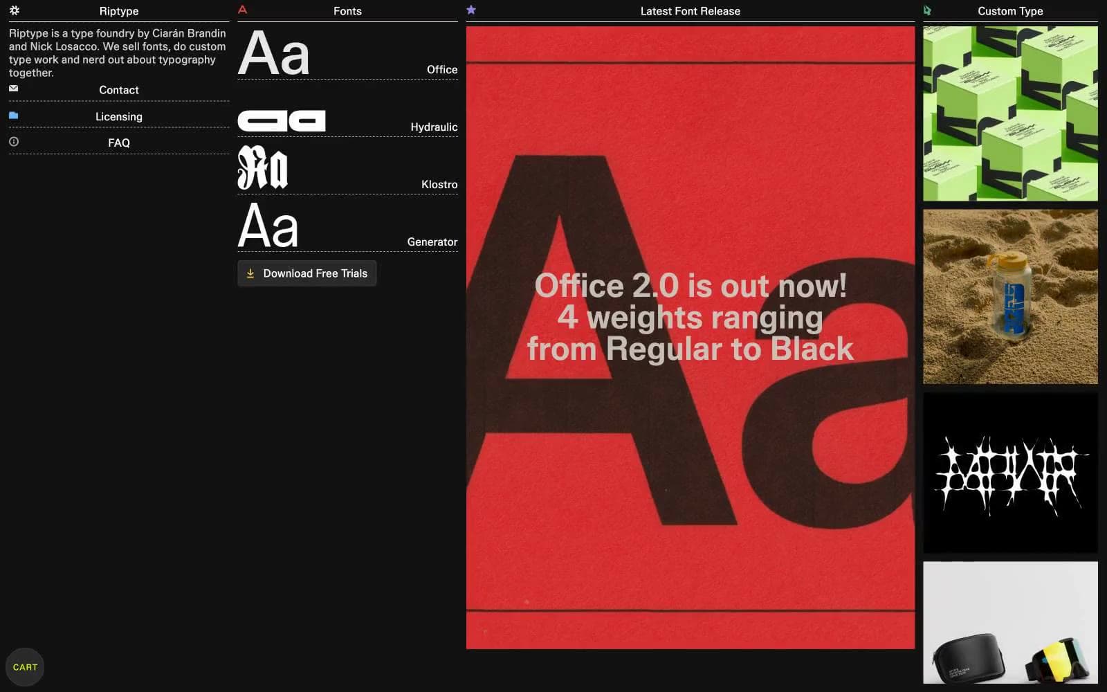
Riptype Foundry design system

Brand1
Green outline accent for tags, dividers, and focused UI edges. Do not promote it to the primary CTA color
Neutrals5
Page background, primary canvas — the dark surface the type sits on
Raised surface for buttons, hover fills, interactive plate
Secondary text, metadata, subdued borders and captions
Default body text, link strokes, hairline rules, icon outlines
Headings, display type, high-contrast text, image borders
Try a pairing
Pick any two colors from the palette to check whether text stays readable on top.
Aa
Workshop Black on Acid Flash
16.28 : 1 contrast
- Body textPasses AA 4.5
- Large textPasses AA 3
- StrictPasses AAA 7
More DESIGN.md files. Same web, different personalities.
21 TSI
Brand
Abetterlou
Brand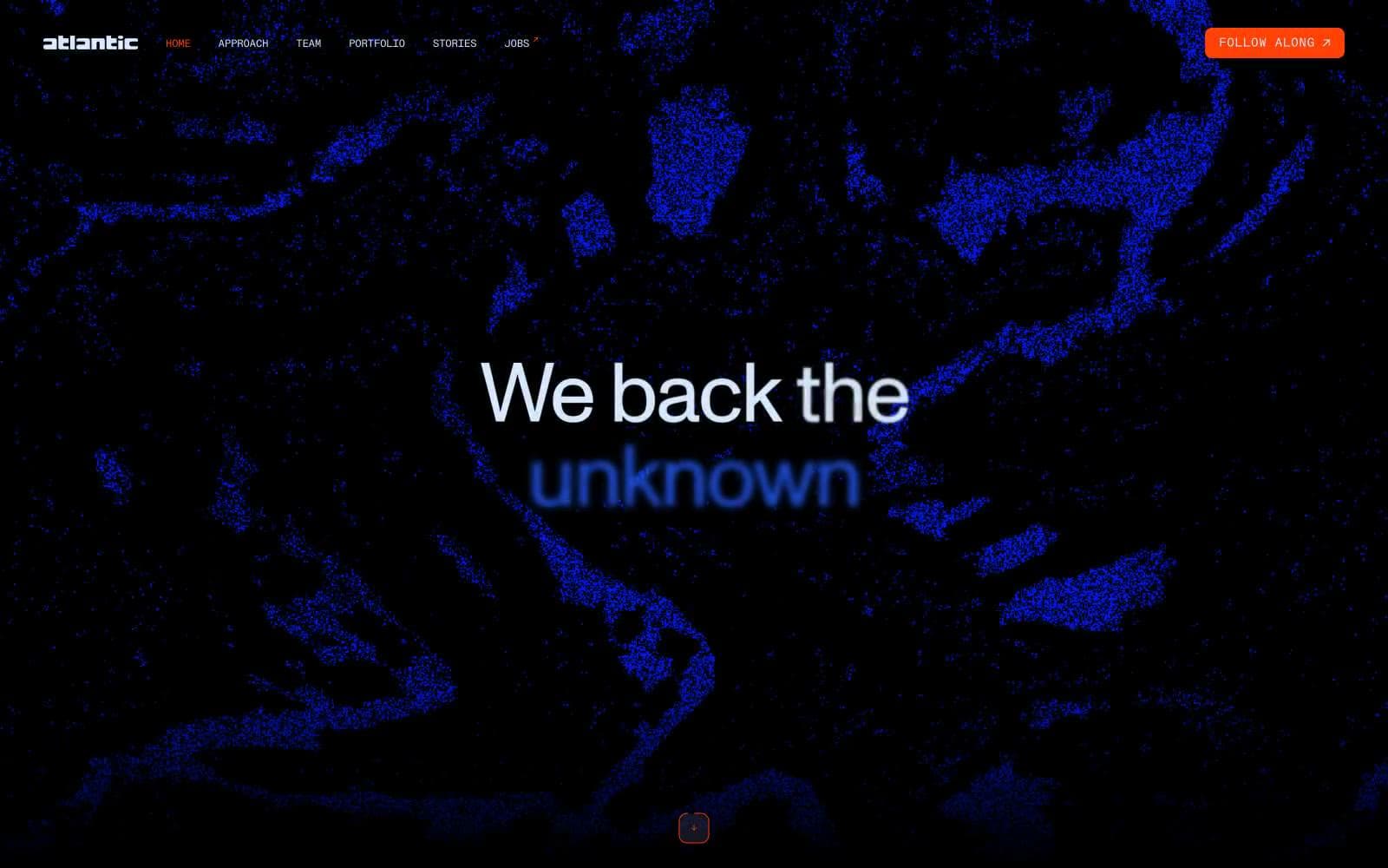
Atlantic.vc
Brand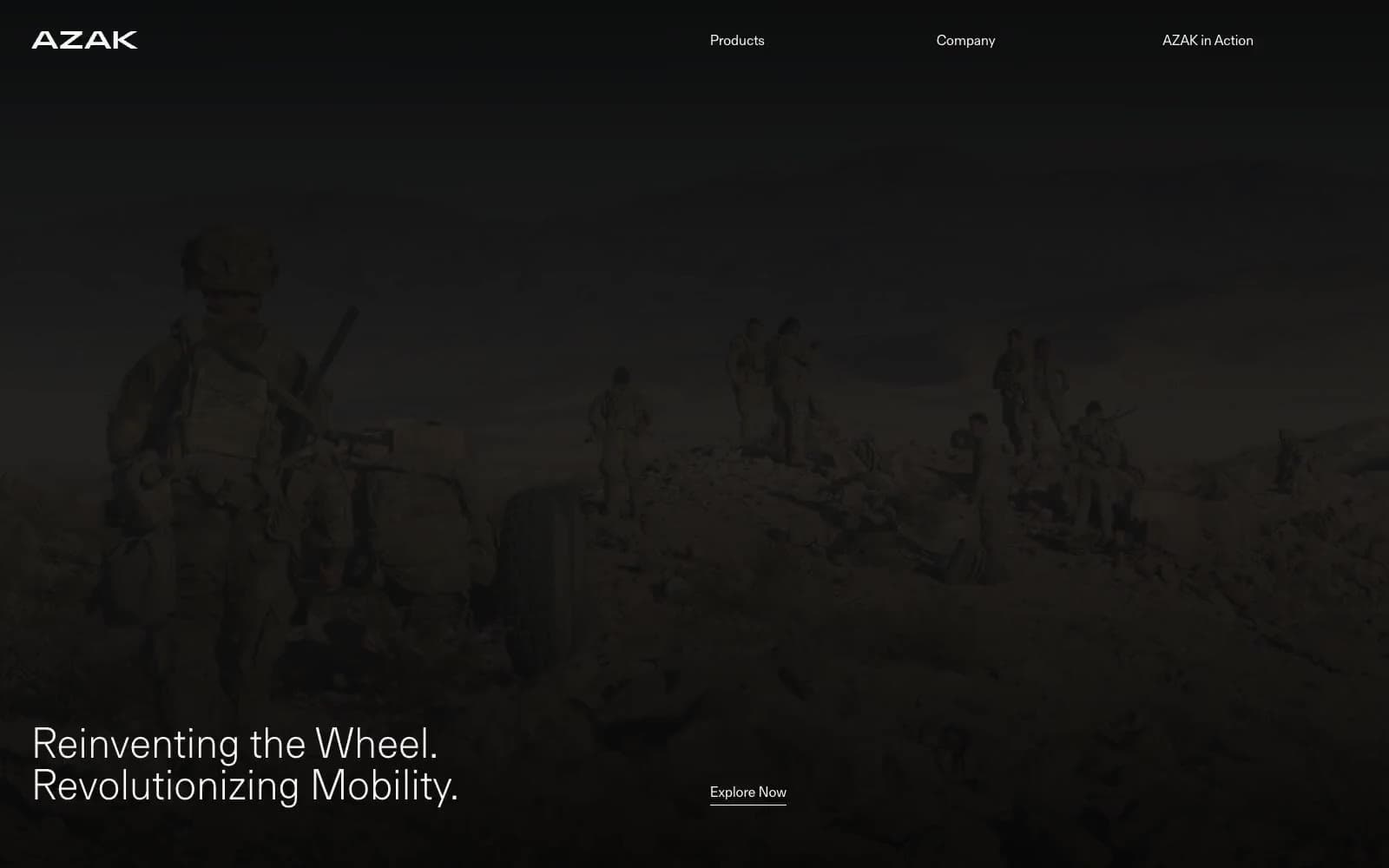
AZAK
Brand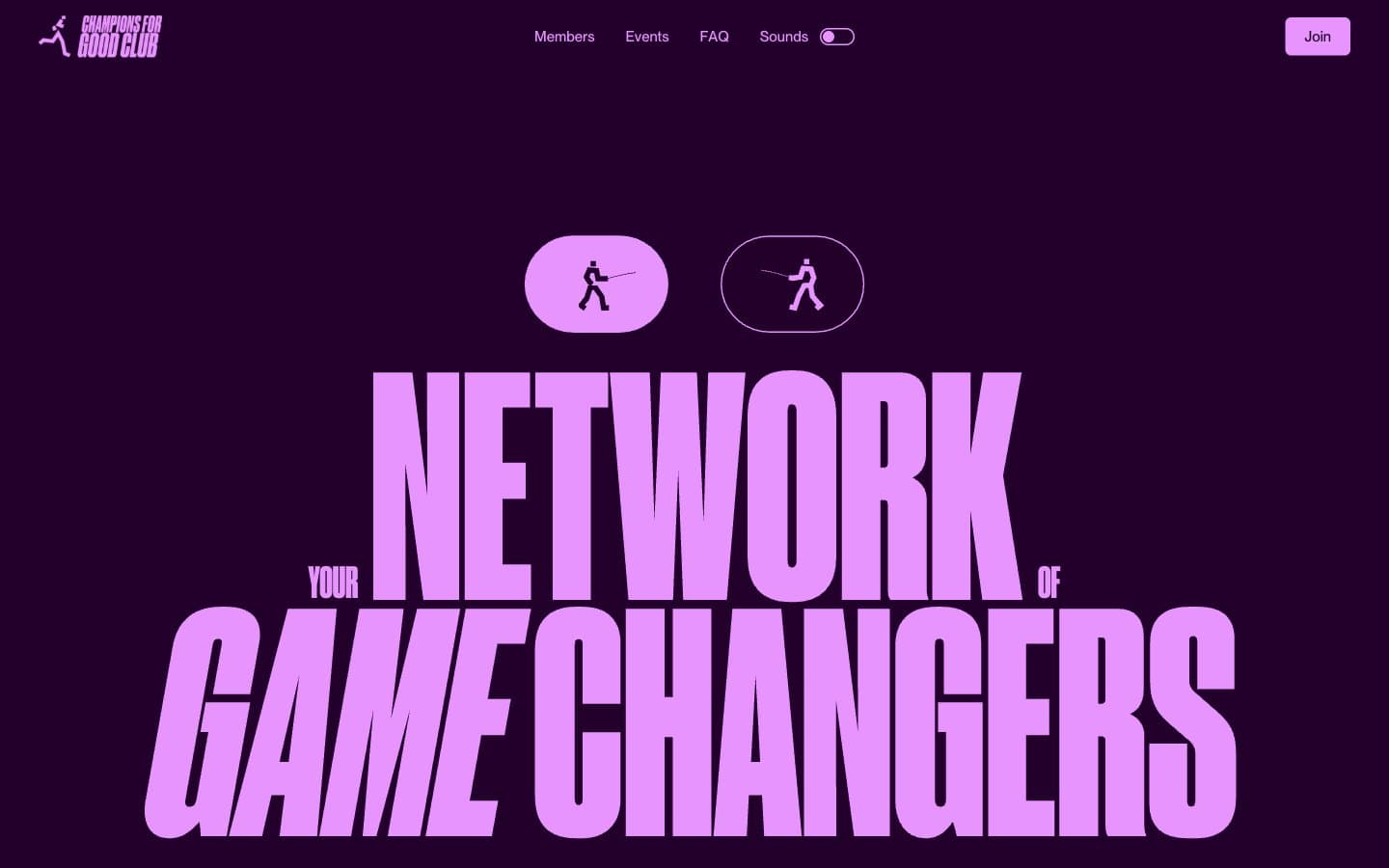
Champions4good
Brand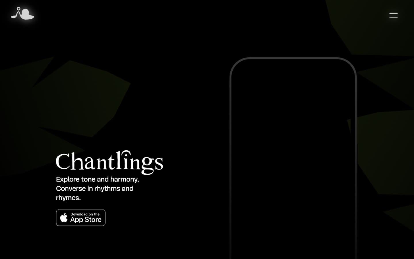
Chantlings
Brand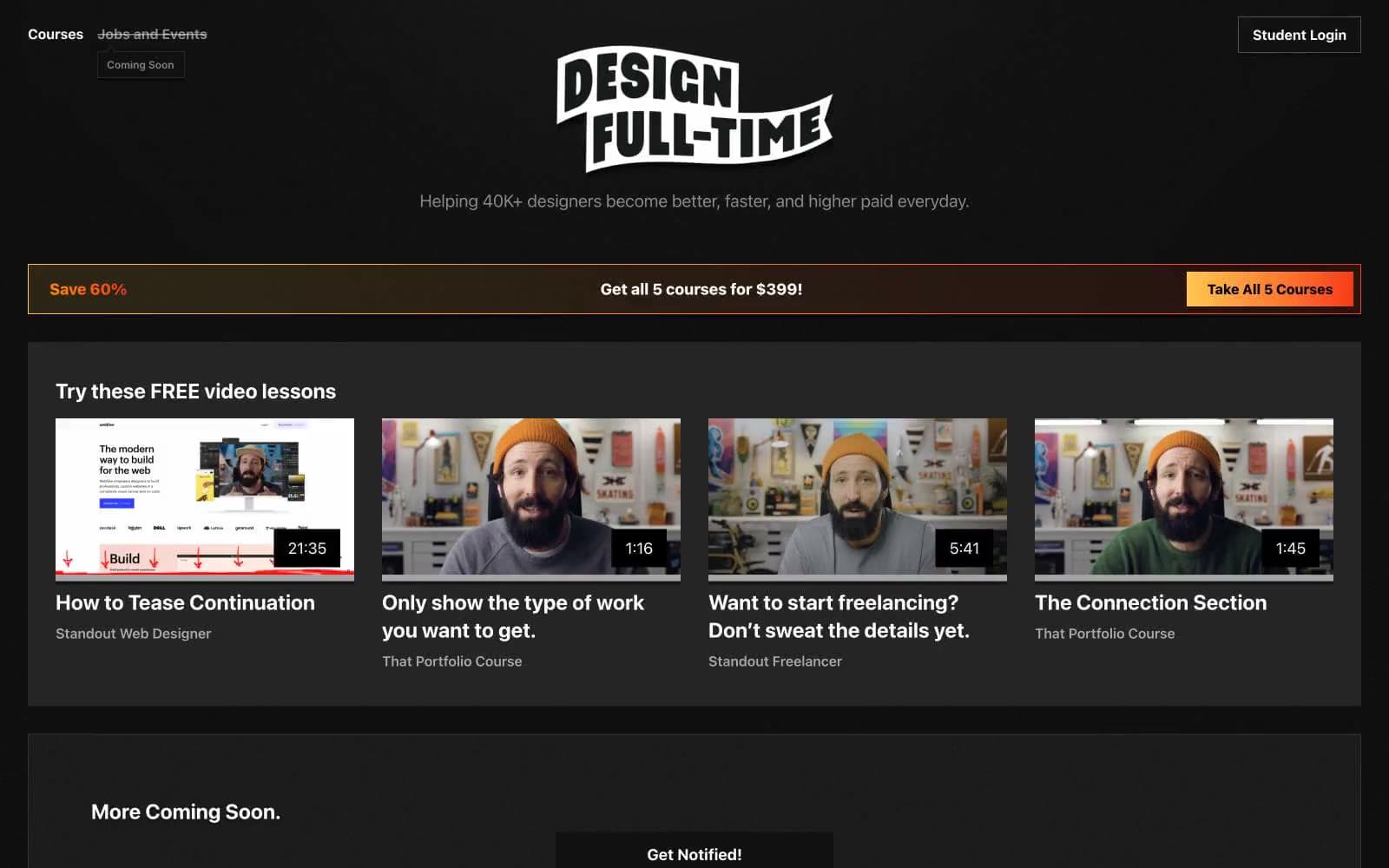
Design Full-Time
Brand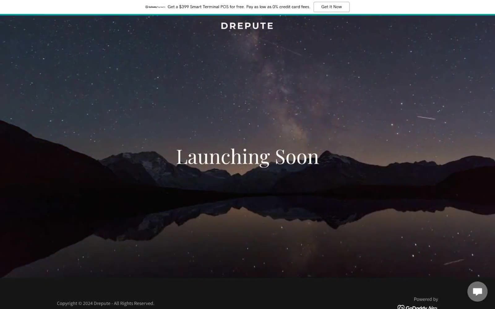
Drepute
Brand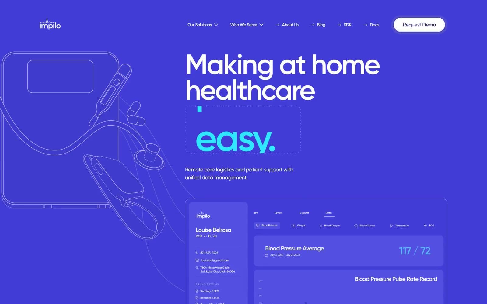
Impilo
Brand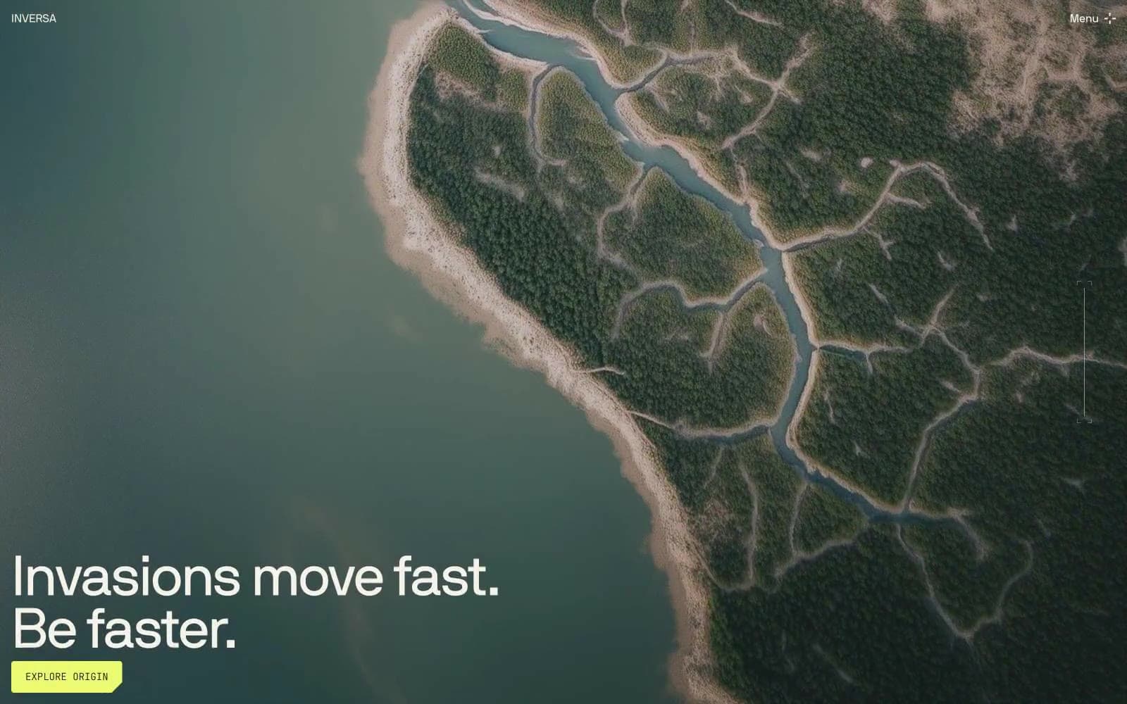
INVERSA
Brand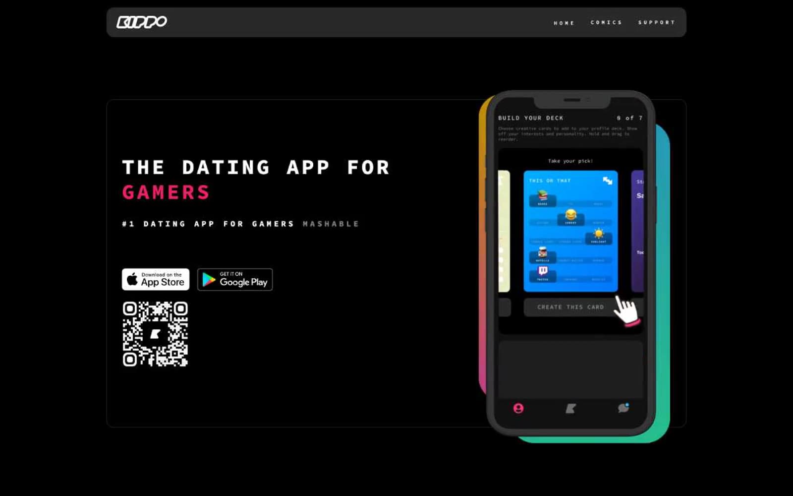
Kippo
Brand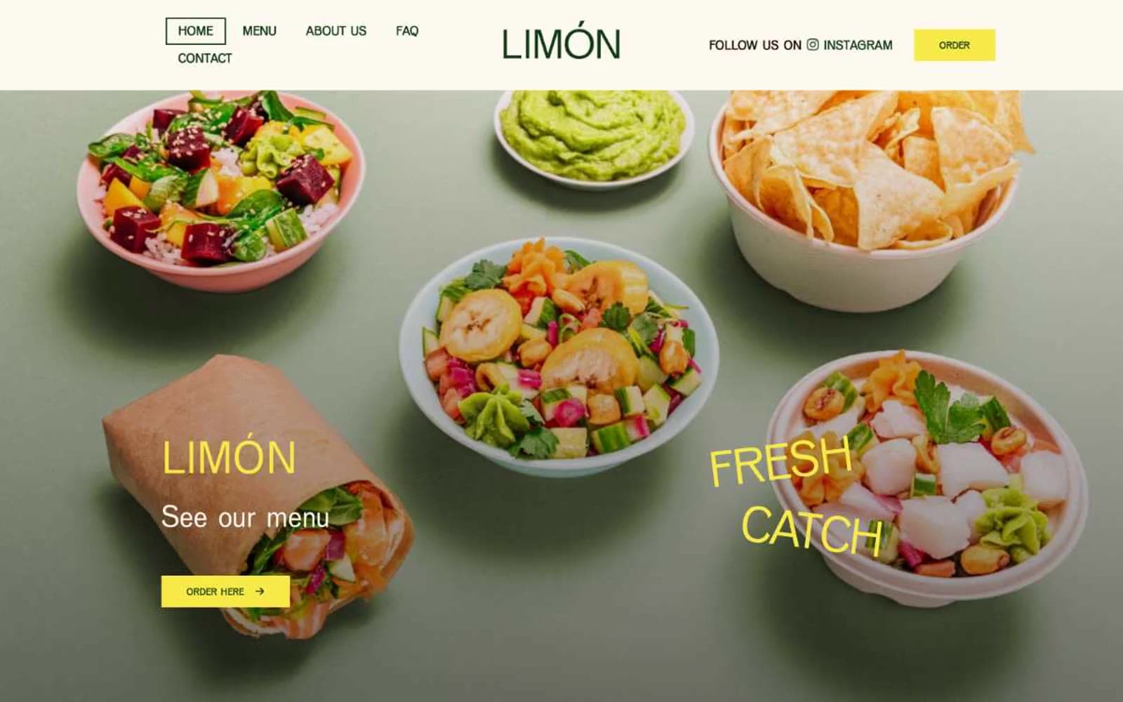
Limón
Brand


