
Revenuecat. Generous, airy, and confidently understated.
- Developer tools
- Light theme
- 19 colors
- 2 typefaces
RevenueCat speaks in a calm, developer-trusted visual register: cloud-white canvases, deep-navy ink, and a single periwinkle accent that carries every interactive moment. The headline voice is generous and oversized (up to 80px) but whispers through ultra-light weights and tight negative tracking, letting the typographic mass do the work that color and decoration normally would. Surfaces are flat and airy — soft cards on a near-white field with violet-tinted ambient shadows — and the whole system leans on shape (16px corners, 9999px pill buttons) rather than chrome to define hierarchy. Warm coral red and mint green appear as quiet decorative punctuation for category icons and chart highlights, never competing with the periwinkle for interactive priority.
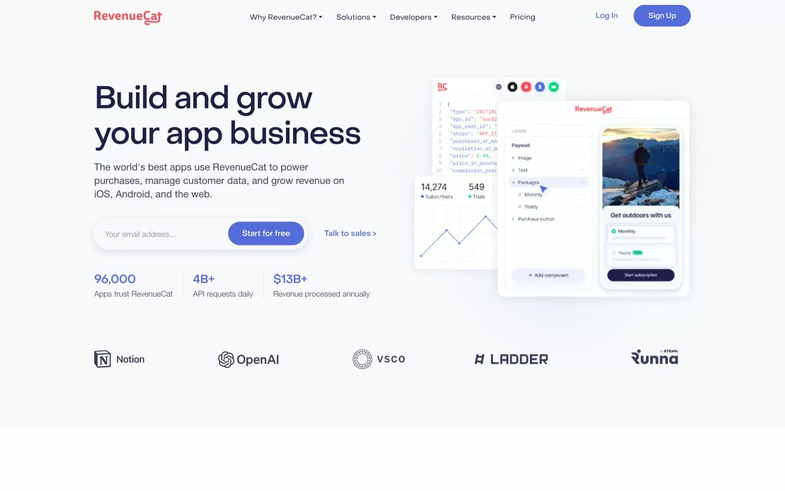
Revenuecat design system

Brand1
Violet supporting accent for decorative details and low-frequency emphasis. Do not promote it to the primary CTA color
Accent7
Soft tinted borders, periwinkle-derived dividers, subtle hover backgrounds
Pill backgrounds, tag fills, light decorative wash — the pale sibling of the brand accent
Secondary icon backgrounds, muted chart highlights
Category icon fills, chart accents, decorative highlight markers — the warm counterweight to periwinkle
Soft coral background, pastel category tag fill
Decorative chart fill, pastel category tag — used sparingly for icon and illustration variety
Green supporting accent for decorative details and low-frequency emphasis
Neutrals11
Body text default, high-contrast copy — the achromatic black of the system
Primary heading text, nav links, high-emphasis body — anchors the palette with near-black authority carrying a faint cool tint
Secondary text, input values, subdued body copy — sits between indigo and gray for medium-emphasis reading
Muted inline links, secondary metadata, caption-level annotations
Helper text, placeholder copy, low-emphasis labels in form and card contexts
Disabled states, very low-emphasis metadata
Stronger borders, input outlines, shadow-tinted strokes
Alternate surface fill for secondary cards or muted backgrounds
Hairline borders, card edges, divider lines — the default 1px separator
Page canvas, hero backdrop, outer sections — slightly cool off-white that softens the entire site
Card surfaces, nav bar, input fills, elevated panels — true white against the off-white canvas creates a subtle lift
Try a pairing
Pick any two colors from the palette to check whether text stays readable on top.
Aa
Paper on Periwinkle Signal
4.59 : 1 contrast
- Body textPasses AA 4.5
- Large textPasses AA 3
- StrictFails AAA 7
More DESIGN.md files. Same web, different personalities.

Tailwind CSS
Developer tools
Atoms
Developer tools
Browserbase
Developer tools
Cursor
Developer tools
Deno
Developer tools
Drizzle ORM
Developer tools
Earlydog
Developer tools
Expo
Developer tools
Fingerprint
Developer tools
Flatfile
Developer tools
Flox
Developer tools
Fly.io
Developer tools


