
replit. Warm workshop with coral sparks.
- Developer tools
- Light theme
- 19 colors
- 3 typefaces
Replit's design language is a warm, creator-friendly canvas: a soft cream background (#faf6f1) acts as a permanent stage for a single vivid orange (#ff3c00) that punctuates everything with energy. The system feels like a modern makerspace — generous whitespace, confident oversized type (60-69px displays), pill-shaped controls, and large rounded cards (40-60px radii) that float on the warm canvas. Color is used sparingly as functional emphasis: the orange owns CTAs, active states, and brand surfaces (the peach gradient cards), while the rest of the interface stays neutral in warm grays. Components are flat, border-driven rather than shadow-driven, with hairline #312e2 and #898c94 strokes carrying structure instead of elevation. The overall rhythm alternates between quiet monochrome informational blocks and vivid coral/orange feature bento cards, creating a visual conversation between calm and creative spark.
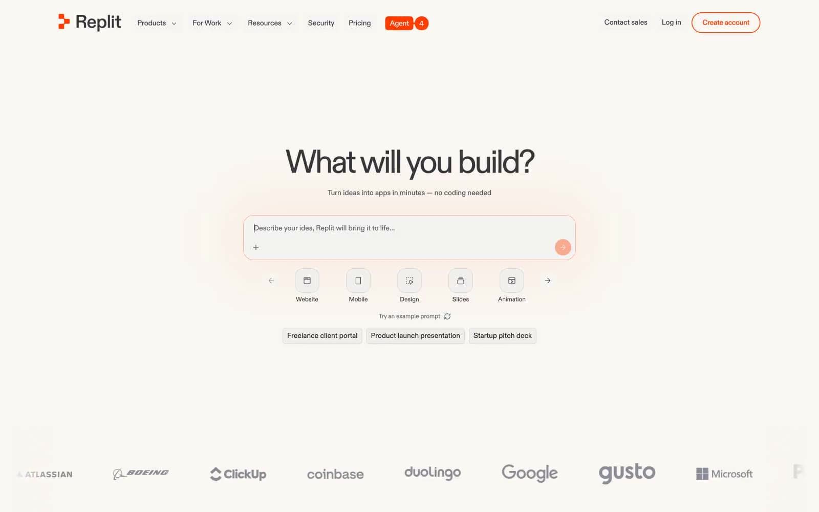
replit design system

Brand4
Primary CTAs, active nav indicators, brand accents, interactive icon strokes — vivid saturated orange that makes every action feel switched on
Feature card backgrounds, decorative gradient fills, secondary accent surfaces
Soft feature card backgrounds, heading accents, warm wash fills for highlighted sections
Orange outline accent for tags, dividers, and focused UI edges. Do not promote it to the primary CTA color
Accent1
Secondary nav highlight, link emphasis — used sparingly for differentiation from orange
Neutrals14
Primary text, dominant borders, strong structural strokes — the workhorse near-black
Dark surface text, card dark-mode text, button borders
Card borders, secondary text, button borders — warm dark gray for structure
Icon borders, input borders, secondary button strokes
Nav borders, heading borders, body text emphasis
Body text, secondary paragraph copy
Subtle body borders, very low-emphasis text
Link borders, helper text, tertiary descriptive copy
Muted borders, tertiary text, icon fills, decorative structure lines
Card borders, subtle background fills — warm light neutral
Light card backgrounds, soft dividers, warm-tinted borders
Alternate surface background, subtle wash fills
Primary page background, nav surface, card resting surface — the dominant warm cream that defines the system
Card surface, input fields, button text, elevated content blocks — the brightest surface layer
Try a pairing
Pick any two colors from the palette to check whether text stays readable on top.
Aa
Ink Black on Ember Orange
5.42 : 1 contrast
- Body textPasses AA 4.5
- Large textPasses AA 3
- StrictFails AAA 7
More DESIGN.md files. Same web, different personalities.

Tailwind CSS
Developer tools
Atoms
Developer tools
Browserbase
Developer tools
Cursor
Developer tools
Deno
Developer tools
Drizzle ORM
Developer tools
Earlydog
Developer tools
Expo
Developer tools
Fingerprint
Developer tools
Flatfile
Developer tools
Flox
Developer tools
Fly.io
Developer tools


