
Replay. Editorial red-pen on white blueprint.
- Developer tools
- Light theme
- 14 colors
- 2 typefaces
Replay reads as a serious developer-tool brand dressed in quiet confidence: an almost entirely achromatic canvas where charcoal text and white surfaces do 95% of the work, and a single saturated coral-red acts as surgical punctuation on headlines, buttons, and the active nav state. The signature typographic move is emphatic color-splitting inside display headlines — a dark line in #111827 immediately followed by a line in the brand red — which makes the voice feel editorial and opinionated rather than corporate. Components stay lightweight: pill buttons, thin hairline borders, cards that float on soft elevation, and almost no decorative gradient beyond a thin top banner. Every surface earns its place; color is rationed like a resource, not applied as decoration.
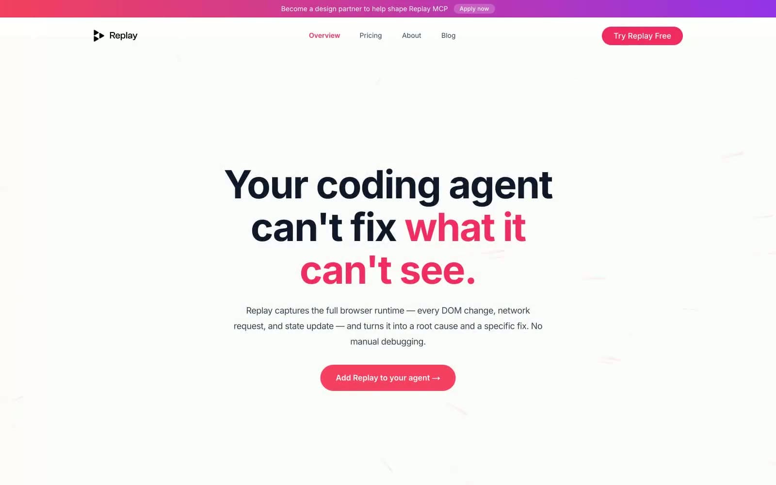
Replay design system

Brand3
Brand emphasis color — highlights one line of display headlines, marks active nav links, outlines ghost CTA borders, the coral-red ink of the editorial system
Red action color for filled buttons, selected navigation states, and focused conversion moments.
Top announcement banner — pink to violet sweep signals urgency and brand energy without adding permanent surface noise
Accent2
Violet text accent for links, tags, and emphasized short phrases. Do not promote it to the primary CTA color
Decorative card border tint on case-study cards — a barely-there violet that softens the otherwise monochrome system
Neutrals9
Primary body text, headline base, nav text — the default foreground against every surface
Dark surface fills for secondary buttons, dark cards, reverse sections
Secondary text, button borders on outlined/ghost actions, list markers
Muted helper text, secondary link text, inactive nav
Icon strokes, tertiary metadata, placeholder text
Disabled controls, subtle borders, secondary dividers
Hairline borders, icon outlines, the dominant UI border color across the system
Page background, list rows, subtle section tints
Card surfaces, elevated panels, button text on dark fills, the top of the surface stack
Try a pairing
Pick any two colors from the palette to check whether text stays readable on top.
Aa
#111111 on Coral Pulse
4.71 : 1 contrast
- Body textPasses AA 4.5
- Large textPasses AA 3
- StrictFails AAA 7
More DESIGN.md files. Same web, different personalities.

Tailwind CSS
Developer tools
Atoms
Developer tools
Browserbase
Developer tools
Cursor
Developer tools
Deno
Developer tools
Drizzle ORM
Developer tools
Earlydog
Developer tools
Expo
Developer tools
Fingerprint
Developer tools
Flatfile
Developer tools
Flox
Developer tools
Fly.io
Developer tools


