Render. Blueprint on brushed aluminum.
- Developer tools
- Light theme
- 14 colors
- 3 typefaces
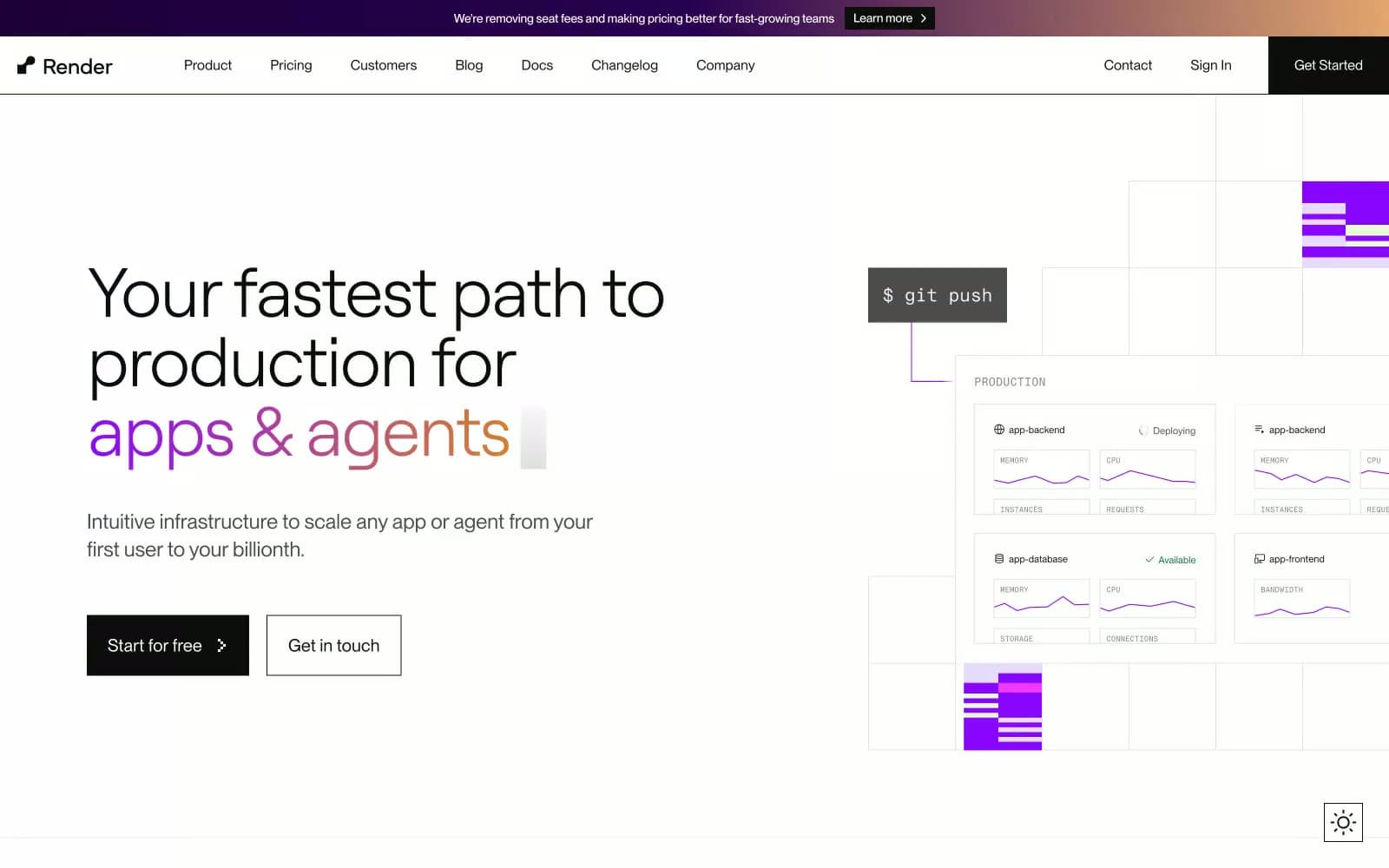
Render presents a clinical, paper-white canvas for cloud infrastructure — an interface that feels like a well-organized technical schematic rather than a marketing surface. The system is overwhelmingly achromatic: #0d0d0d text on #ffffff surfaces, separated by hairline #e3e3e3 borders, with one vivid violet (#8a05ff) acting as the singular brand punctuation and a warm-to-cool gradient (violet→orange) reserved for hero emphasis. Typography is the primary expressive tool — Roobert at light weight 300 with tight tracking carries headlines with geometric quietness, while PPNeueMontreal handles UI with workmanlike neutrality. Code-adjacent elements use PPNeueMontrealMono, lending technical credibility without resorting to cliché terminal aesthetics. Components are square-cornered, border-defined, and low-elevation; the interface reads as a grid of confident panels rather than floating cards. Color appears sparingly — a violet step number, a soft tinted surface, a gradient text phrase — so when it does appear, it carries weight.
Render design system
Brand3
Brand accent — step indicators, decorative illustration fills, link highlights, gradient text origin — the single chromatic mark that makes this interface feel like Render; Hero emphasis text and promotional banners — the signature warm-to-cool transition that defines Render's expressive typography moments
Soft violet surface wash for tinted cards, hero illustration backgrounds, highlight panels — a 12% saturation tint of the brand violet that creates brand presence without commitment; Soft highlight wash behind hero text and illustration panels — a barely-there violet tint that signals brand presence on neutral surfaces
Violet supporting accent for decorative details and low-frequency emphasis. Do not promote it to the primary CTA color
Accent5
Gradient text terminus (violet→orange), warm accent in illustrations — the chromatic counterweight to Plasma Violet in the signature gradient
Decorative illustration accent, infographic data points — used in product mockups to add warmth and color variety
Green supporting accent for decorative details and low-frequency emphasis
Decorative accent in product illustrations, secondary data visualization — a clear electric blue for chart and metric highlights
Decorative accent in gradient text and illustration hotspots — the highest-chroma pink used sparingly for energy bursts
Neutrals6
Dark supporting neutral for text, icons, and strong contrast. Do not promote it to the primary CTA color
Deep surface tone for code blocks, terminal-style badges — a near-black with a whisper of warmth for developer-flavored elements
Secondary text, muted nav, footer copy — the soft mid-gray for de-emphasized but still readable text
Tertiary text, helper labels, inactive metadata — the quietest text tier for non-essential guidance
Borders, dividers, subtle surface tints — the workhorse neutral at 4000+ occurrences that defines structural edges throughout the UI
Page canvas, card surfaces, button text on dark fills — the dominant base against which all content rests
Try a pairing
Pick any two colors from the palette to check whether text stays readable on top.
Aa
Paper White on Deep Indigo
12.69 : 1 contrast
- Body textPasses AA 4.5
- Large textPasses AA 3
- StrictPasses AAA 7
More DESIGN.md files. Same web, different personalities.

Tailwind CSS
Developer tools
Atoms
Developer tools
Browserbase
Developer tools
Cursor
Developer tools
Deno
Developer tools
Drizzle ORM
Developer tools
Earlydog
Developer tools
Expo
Developer tools
Fingerprint
Developer tools
Flatfile
Developer tools
Flox
Developer tools
Fly.io
Developer tools


