
ProtoPie. A designer's clean white drafting table where one electric purple pencil marks every interactive idea.
- Developer tools
- Light theme
- 10 colors
- 3 typefaces
ProtoPie uses a sunlit prototyping-workshop language: a white canvas, near-black ink, and one confident violet that functions as the only chromatic voice in the system. Display type is set in Gilroy at generous sizes (48–62px) with weight 700, giving headlines a friendly, designer-made feel rather than a corporate one. The interface stays predominantly monochrome; violet appears as functional accent on buttons, links, icons, and active states, never as decorative tint. Components feel like tools in a studio tray: 16px card radius, 12px button radius, pill-shaped tags, and a single near-imperceptible shadow that lifts without announcing itself. Backgrounds are white with whisper-soft radial gradient washes in pastel teal and lavender, creating depth that never competes with content.
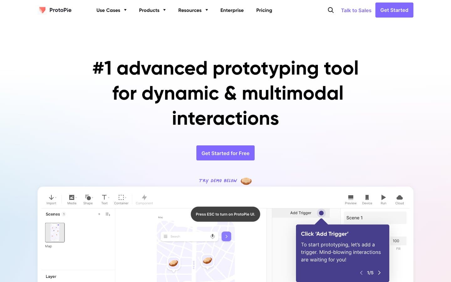
ProtoPie design system

Brand2
Violet supporting accent for decorative details and low-frequency emphasis. Do not promote it to the primary CTA color
Pressed and hover state of Electric Violet — used for filled-element interaction feedback and slightly deeper icon strokes
Accent3
Light accent wash — decorative gradient stops, soft tag backgrounds, muted selected states, and atmospheric color bleeds at section edges
Decorative gradient stop — pastel teal radial wash on hero left side, atmospheric background tint that never fills a UI element
Decorative gradient stop — pastel lavender radial wash on hero right side and section-edge color bleeds, creating depth at zero contrast cost
Neutrals5
Primary text, hero headlines, high-contrast icons. The strongest typographic color, reserved for content the eye should land on first
Navigation text, input borders, near-black UI surfaces, button labels. Softer than pure black so it reads as interface, not print
Body text, supporting copy, secondary labels, paragraph running text under headlines
Muted text, placeholders, disabled labels, captions, subtitle hierarchy. The quietest text tier, used only for de-emphasized content
Page canvas, card surfaces, button text on filled violet, elevated panel backgrounds
Try a pairing
Pick any two colors from the palette to check whether text stays readable on top.
Aa
Ink Black on Electric Violet
5.40 : 1 contrast
- Body textPasses AA 4.5
- Large textPasses AA 3
- StrictFails AAA 7
More DESIGN.md files. Same web, different personalities.

Tailwind CSS
Developer tools
Atoms
Developer tools
Browserbase
Developer tools
Cursor
Developer tools
Deno
Developer tools
Drizzle ORM
Developer tools
Earlydog
Developer tools
Expo
Developer tools
Fingerprint
Developer tools
Flatfile
Developer tools
Flox
Developer tools
Fly.io
Developer tools


